

Transition mainly includes four attribute value introductions

Transition mainly contains four attribute values:
Properties for executing the transformation: transition-property,
Time for the continuation of the transformation: transition-duration,
During the duration period, the rate of transformation changestransition-timing-function,
transition delay timetransition-delay.
Let’s look at these four attribute values separately
1. Transition-property
Syntax:
transition-property : none | all | [ <IDENT> ] [ ',' <IDENT> ]*
transition-property is used to specify that the transition effect will be executed when one of the attributes of the element changes. It mainly has the following values: none (no attribute changes); all (all attributes change). This is also its default value; indent (element attribute name) ). When its value is none, the transition will stop executing immediately. When it is specified as all, the transition effect will be executed when any attribute value of the element changes. ident can specify a certain attribute value of the element. The corresponding types are as follows:
1. Color: Transformed through red, green, blue and transparency components (each numerical value is processed) such as: background-color, border-color, color, CSS attributes such as outline-color;
2. Length: real numbers such as: word-spacing, width, vertical-align, top, right, bottom, left, padding, outline- properties such as width, margin, min-width, min-height, max-width, max-height, line-height, height, border-width, border-spacing, background-position;
3. Percentage: real numbers such as: word-spacing, width, vertical-align, top, right, bottom, left, min-width, min-height, max-width, max-height, line-height, height , background-position and other attributes;
4, integer discrete steps (whole number), occur in the real number space, and when using floor() to convert to an integer, such as: outline-offset , z-index and other attributes;
5. number real (floating point) value, such as: zoom, opacity, font-weight, and other attributes;
6. Transform list: For details, please refer to: "CSS3 Transform"
7. Rectangle: Transform through x, y, width and height (converted to numerical values), Such as: crop
- ##8, visibility: discrete steps, within the range of 0 to 1, 0 means "hidden", 1 means completely "shown", such as: visibility
- 9. Shadow: Acts on color, x, y and blur (blur) attributes, such as: text-shadow
- 10. Gradient: Through each The position and color of the stop change. They must have the same type (radial or linear) and the same stop value in order to perform animation, such as: background-image
- 11, paint server (SVG): only supported The following situation: from gradient to gradient and color to color, then the work is similar to the above
- #12. space-separated list of above: If the list has the same item value, then each list will An item changes according to the above rules, otherwise there is no change
- 13. a shorthand property: If all parts of the abbreviation can be animated, it will change like all single property changes
transition-duration : <time> [, <time>]*
transition-duration is used to specify the duration of the element conversion process Time, value: <time> is a numerical value, the unit is s (seconds) or ms (milliseconds), it can be applied to all elements, including :before and :after pseudo-elements. Its default value is 0, which means the transformation is immediate.
transition-timing-function : ease | linear | ease-in | ease-out | ease-in-out | cubic-bezier(<number>, <number>, <number>, <number>)
 [, ease | linear | ease-in | ease-out | ease-in-out | cubic-bezier(<number>, <number>, <number>, <number>)]*
transition-timing- The value of function allows you to change the transformation rate of the attribute value according to the advancement of time. The transition-timing-function has 6 possible values:
- 1, ease: (gradually changes Slow) default value, ease function is equivalent to Bezier curve (0.25, 0.1, 0.25, 1.0).
- 2, linear: (uniform speed), linear function is equivalent to Bezier curve Curve (0.0, 0.0, 1.0, 1.0).
- 3. ease-in: (acceleration), the ease-in function is equivalent to the Bezier curve (0.42, 0, 1.0, 1.0).
- 4. ease-out: (deceleration), the ease-out function is equivalent to the Bezier curve (0, 0, 0.58, 1.0).
- 5. ease-in-out: (accelerate and then decelerate), the ease-in-out function is equivalent to the Bezier curve (0.42, 0, 0.58, 1.0)
- 6. Cubic-bezier: (This value allows you to customize a time curve), a specific cubic-bezier curve. The four values (x1, y1, x2, y2) are specific to points P1 and P2 on the curve. All values must be within the [0, 1] range, otherwise they will be invalid.
transition-delay : <time> [, <time>]*
transition-delay是用来指定一个动画开始执行的时间,也就是说当改变元素属性值后多长时间开始执行transition效果,其取值:
有时我们不只改变一个css效果的属性,而是想改变两个或者多个css属性的transition效果,那么我们只要把几个transition的声明串在一起,用逗号(“,”)隔开,然后各自可以有各自不同的延续时间和其时间的速率变换方式。但需要值得注意的一点:transition-delay与transition-duration的值都是时间,所以要区分它们在连写中的位置,一般浏览器会根据先后顺序决定,第一个可以解析为时间的怭值为transition-duration,第二个为transition-delay。如:
a {-moz-transition: background 0.5s ease-in,color 0.3s ease-out;
-webkit-transition: background 0.5s ease-in,color 0.3s ease-out;
-o-transition: background 0.5s ease-in,color 0.3s ease-out;
transition: background 0.5s ease-in,color 0.3s ease-out;
}如果你想给元素执行所有transition效果的属性,那么我们还可以利用all属性值来操作,此时他们共享同样的延续时间以及速率变换方式,如:
a {-moz-transition: all 0.5s ease-in;
-webkit-transition: all 0.5s ease-in;-o-transition: all 0.5s ease-in;
transition: all 0.5s ease-in;
}综合上述我们可以给transition一个速记法:transition:
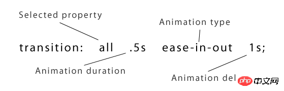
相对应的一个示例代码:
p {
  -webkit-transition: all .5s ease-in-out 1s;
  -o-transition: all .5s ease-in-out 1s;
  -moz-transition: all .5s ease-in-out 1s;
  transition: all .5s ease-in-out 1s;
}
The above is the detailed content of Transition mainly includes four attribute value introductions. For more information, please follow other related articles on the PHP Chinese website!

Hot AI Tools

Undresser.AI Undress
AI-powered app for creating realistic nude photos

AI Clothes Remover
Online AI tool for removing clothes from photos.

Undress AI Tool
Undress images for free

Clothoff.io
AI clothes remover

Video Face Swap
Swap faces in any video effortlessly with our completely free AI face swap tool!

Hot Article
Hot Tools

Notepad++7.3.1
Easy-to-use and free code editor

SublimeText3 Chinese version
Chinese version, very easy to use

Zend Studio 13.0.1
Powerful PHP integrated development environment

Dreamweaver CS6
Visual web development tools

SublimeText3 Mac version
God-level code editing software (SublimeText3)
Hot Topics
 1677
1677
 14
1431
52
1334
25
1279
29
1257
24
14
1431
52
1334
25
1279
29
1257
24

 How to achieve wave effect with pure CSS3? (code example)
Jun 28, 2022 pm 01:39 PM
How to achieve wave effect with pure CSS3? (code example)
Jun 28, 2022 pm 01:39 PM
How to achieve wave effect with pure CSS3? This article will introduce to you how to use SVG and CSS animation to create wave effects. I hope it will be helpful to you!
 CSS tip: Use transition to retain hover state
Sep 27, 2022 pm 02:01 PM
CSS tip: Use transition to retain hover state
Sep 27, 2022 pm 02:01 PM
How to preserve hover state? The following article will introduce to you how to retain the hover state without using JavaScript. I hope it will be helpful to you!
 Use CSS skillfully to realize various strange-shaped buttons (with code)
Jul 19, 2022 am 11:28 AM
Use CSS skillfully to realize various strange-shaped buttons (with code)
Jul 19, 2022 am 11:28 AM
This article will show you how to use CSS to easily realize various weird-shaped buttons that appear frequently. I hope it will be helpful to you!
 How to hide elements in css without taking up space
Jun 01, 2022 pm 07:15 PM
How to hide elements in css without taking up space
Jun 01, 2022 pm 07:15 PM
Two methods: 1. Using the display attribute, just add the "display:none;" style to the element. 2. Use the position and top attributes to set the absolute positioning of the element to hide the element. Just add the "position:absolute;top:-9999px;" style to the element.
 It turns out that text carousel and image carousel can also be realized using pure CSS!
Jun 10, 2022 pm 01:00 PM
It turns out that text carousel and image carousel can also be realized using pure CSS!
Jun 10, 2022 pm 01:00 PM
How to create text carousel and image carousel? The first thing everyone thinks of is whether to use js. In fact, text carousel and image carousel can also be realized using pure CSS. Let’s take a look at the implementation method. I hope it will be helpful to everyone!
 How to implement lace borders in css3
Sep 16, 2022 pm 07:11 PM
How to implement lace borders in css3
Sep 16, 2022 pm 07:11 PM
In CSS, you can use the border-image attribute to achieve a lace border. The border-image attribute can use images to create borders, that is, add a background image to the border. You only need to specify the background image as a lace style; the syntax "border-image: url (image path) offsets the image border width inward. Whether outset is repeated;".
 How to enlarge the image by clicking the mouse in css3
Apr 25, 2022 pm 04:52 PM
How to enlarge the image by clicking the mouse in css3
Apr 25, 2022 pm 04:52 PM
Implementation method: 1. Use the ":active" selector to select the state of the mouse click on the picture; 2. Use the transform attribute and scale() function to achieve the picture magnification effect, the syntax "img:active {transform: scale(x-axis magnification, y Axis magnification);}".
 How to set animation rotation speed in css3
Apr 28, 2022 pm 04:32 PM
How to set animation rotation speed in css3
Apr 28, 2022 pm 04:32 PM
In CSS3, you can use the "animation-timing-function" attribute to set the animation rotation speed. This attribute is used to specify how the animation will complete a cycle and set the speed curve of the animation. The syntax is "element {animation-timing-function: speed attribute value;}".
