Regarding the issue of BFC and height collapse
I probably came into contact with this concept last year. I briefly recorded it, but did not study it in depth. It coincides with the recent autumn recruitment, so I will write about it here to deepen my impression.
What is BFC?
Elements in the page all have an implicit attribute Block Formatting Context (block-level formatting ization context) referred to as BFC.
What is the use of BFC? How to enable BFC? What happens after turning on BFC?
Here we first look at a few small situations. And throw out a few other questions
(1) 
<p class="p1">
    <p class="p2">p2</p>
<p class="p3">p3</p></p><p class="p4"></p> .p1{
width: 50px;
background-color: #bfc;
margin-bottom:50px;
}
.p2{
width: 50px; height: 50px;
background-color: #0000FF;
margin-bottom:50px;
color: #fff;
}
.p3{
width: 50px;height: 50px;
background-color: #0000FF;
margin:50px 0 50px 0;
color: #fff;
}
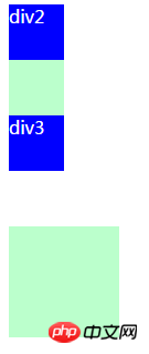
.p4{width: 100px; height: 100px;background-color: #bfc; }①Let’s take a look, there are four boxes here, the blue one is 50px; The margin-bottom is both 50px
It is obvious that the margins of the parent and child elements overlap, and the bottom margin from the bottom p is 50px instead of 100px.
②What about the sibling elements? The distance between p2 and p3 is also 50px, which means that the vertical margins between them are also collapsed.
Okay, then let’s discuss what situations will trigger the overlap of vertical margins.
①First of all, make it clear that the horizontal margins will not overlap under any circumstances, so the first point is vertical.
② Adjacent, what is adjacent is that the elements are not separated by clear, content, padding, and border. (We can clarify the principles of common methods of clearing floats later)
It can be seen from the code that p1 and p3, p2 and p3 are all adjacent relationships. So the vertical margins are collapsed.
\ welcome\| So suppose we have such a requirement that the vertical margins should not overlap (in practice, there is rarely such a requirement), then BFC comes in handy. Let’s see the effect first and then talk about how to do it.
After p1 and p3 turn on BFC (the overflow of p1 is auto or hidden, and p3 floats), we can see that the margins between p2 and p3 are added together. It’s not overlapping,
The bottom margins of p1 and p3 are also separated. To add, if the parent element turns on BFC, it can cancel the overlap of the margins with the adjacent child elements (the child does not need to be opened). It is fully enabled here to demonstrate the relationship between adjacent sibling elements
 time effect.
Adjacent]
If clear, content, padding, border are separated in the middle, the outer margins will still overlapWell, this is the first function of
turning on BFC: to prevent the margins of adjacent elements from overlapping.
In fact, as long as one of the adjacent elements has BFC turned on, of course, in this case, the floating problem must be considered, such as just now For example, if p3 turns on floating and p1 does not turn on BFC, a high degree of collapse will occur.
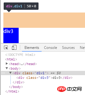
(2) 还是刚刚的例子,把p2和p4去掉,p3开启浮动,此时父元素p1发生高度塌陷
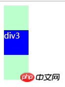
当我们开启p1的BFC后 成功解决由于浮动引起的高度塌陷。原理是开启了BFC的元素,其子元素也会参与到高度计算中。
即第二个作用就是避免浮动引起的高度塌陷
接下来来说说如何开启BFC:overflow(非visible)【注意在处理父子外边距折叠时应是父元素开启BFC】、float(非none)、position(非static和relative)、display(inlined-block、table-cell、table-caption)。其中之一即可。
兼容:在ie6中没有BFC,但有hasLayout,与BFC类似。开启:直接将元素的zoom设置为1。 zoom表示放大的意思,后面跟一个数字,即放大倍数。
那么有的时候的需求是父元素不能动overflow,那要解决高度塌陷怎么办,还有另外的清除浮动方案。
挺多的,百度都有,那这里就举一个最常用的例子吧。
.clear:after{
    content: '';
    clear: both;
    display: block;
}把这个类添加到高度塌陷的父元素上即可。
这里顺便讲讲这个做法的原理吧。
一个元素开启浮动后,其旁边的留白部分如果够后面的元素补上,后面的元素就会补上,后面的元素(一定要非浮动)加了clear后,就可以清除其周围浮动的效果,使其不会补到上面去,就可以把父元素的高度撑开。
利用这个原理,我们在父元素后面增加一个:after伪元素,让其清除浮动,又不至于补上浮动的留白,从css增加空的content对比直接增加空p的好处就是避免增加多余的dom节点。
The above is the detailed content of Regarding the issue of BFC and height collapse. For more information, please follow other related articles on the PHP Chinese website!

Hot AI Tools

Undresser.AI Undress
AI-powered app for creating realistic nude photos

AI Clothes Remover
Online AI tool for removing clothes from photos.

Undress AI Tool
Undress images for free

Clothoff.io
AI clothes remover

Video Face Swap
Swap faces in any video effortlessly with our completely free AI face swap tool!

Hot Article

Hot Tools

Notepad++7.3.1
Easy-to-use and free code editor

SublimeText3 Chinese version
Chinese version, very easy to use

Zend Studio 13.0.1
Powerful PHP integrated development environment

Dreamweaver CS6
Visual web development tools

SublimeText3 Mac version
God-level code editing software (SublimeText3)

Hot Topics
 Clustering effect evaluation problem in clustering algorithm
Oct 10, 2023 pm 01:12 PM
The clustering effect evaluation problem in the clustering algorithm requires specific code examples. Clustering is an unsupervised learning method that groups similar samples into one category by clustering data. In clustering algorithms, how to evaluate the effect of clustering is an important issue. This article will introduce several commonly used clustering effect evaluation indicators and give corresponding code examples. 1. Clustering effect evaluation index Silhouette Coefficient Silhouette coefficient evaluates the clustering effect by calculating the closeness of the sample and the degree of separation from other clusters.
 Solve the 'error: redefinition of class 'ClassName'' problem that appears in C++ code
Aug 25, 2023 pm 06:01 PM
Solve the "error:redefinitionofclass'ClassName'" problem in C++ code. In C++ programming, we often encounter various compilation errors. One of the common errors is "error:redefinitionofclass 'ClassName'" (redefinition error of class 'ClassName'). This error usually occurs when the same class is defined multiple times. This article will
 What to do if win10 cannot download steam
Jul 07, 2023 pm 01:37 PM
Steam is a very popular game platform with many high-quality games, but some win10 users report that they cannot download steam. What is going on? It is very likely that the user's IPv4 server address is not set properly. To solve this problem, you can try to install Steam in compatibility mode, and then manually modify the DNS server to 114.114.114.114, and you should be able to download it later. What to do if Win10 cannot download Steam: Under Win10, you can try to install it in compatibility mode. After updating, you must turn off compatibility mode, otherwise the web page will not load. Click the properties of the program installation to run the program in compatibility mode. Restart to increase memory, power
 Teach you how to diagnose common iPhone problems
Dec 03, 2023 am 08:15 AM
Known for its powerful performance and versatile features, the iPhone is not immune to the occasional hiccup or technical difficulty, a common trait among complex electronic devices. Experiencing iPhone problems can be frustrating, but usually no alarm is needed. In this comprehensive guide, we aim to demystify some of the most commonly encountered challenges associated with iPhone usage. Our step-by-step approach is designed to help you resolve these common issues, providing practical solutions and troubleshooting tips to get your equipment back in peak working order. Whether you're facing a glitch or a more complex problem, this article can help you resolve them effectively. General Troubleshooting Tips Before delving into specific troubleshooting steps, here are some helpful
 Solve PHP error: problems encountered when inheriting parent class
Aug 17, 2023 pm 01:33 PM
Solving PHP errors: Problems encountered when inheriting parent classes In PHP, inheritance is an important feature of object-oriented programming. Through inheritance, we can reuse existing code and extend and improve it without modifying the original code. Although inheritance is widely used in development, sometimes you may encounter some error problems when inheriting from a parent class. This article will focus on solving common problems encountered when inheriting from a parent class and provide corresponding code examples. Question 1: The parent class is not found. During the process of inheriting the parent class, if the system does not
 How to solve the problem that jQuery cannot obtain the form element value
Feb 19, 2024 pm 02:01 PM
To solve the problem that jQuery.val() cannot be used, specific code examples are required. For front-end developers, using jQuery is one of the common operations. Among them, using the .val() method to get or set the value of a form element is a very common operation. However, in some specific cases, the problem of not being able to use the .val() method may arise. This article will introduce some common situations and solutions, and provide specific code examples. Problem Description When using jQuery to develop front-end pages, sometimes you will encounter
 Label acquisition problem in weakly supervised learning
Oct 08, 2023 am 09:18 AM
The label acquisition problem in weakly supervised learning requires specific code examples. Introduction: Weakly supervised learning is a machine learning method that uses weak labels for training. Different from traditional supervised learning, weakly supervised learning only needs to use fewer labels to train the model, rather than each sample needs to have an accurate label. However, in weakly supervised learning, how to accurately obtain useful information from weak labels is a key issue. This article will introduce the label acquisition problem in weakly supervised learning and give specific code examples. Introduction to the label acquisition problem in weakly supervised learning:
 How to remove the height attribute of an element with jQuery?
Feb 28, 2024 am 08:39 AM
How to remove the height attribute of an element with jQuery? In front-end development, we often encounter the need to manipulate the height attributes of elements. Sometimes, we may need to dynamically change the height of an element, and sometimes we need to remove the height attribute of an element. This article will introduce how to use jQuery to remove the height attribute of an element and provide specific code examples. Before using jQuery to operate the height attribute, we first need to understand the height attribute in CSS. The height attribute is used to set the height of an element


