
 Web Front-end
H5 Tutorial
HTML5/CSS3 Special Topic CSS3 creates a classic case of Baidu Tieba's 3D flop effect
Web Front-end
H5 Tutorial
HTML5/CSS3 Special Topic CSS3 creates a classic case of Baidu Tieba's 3D flop effect
HTML5/CSS3 Special Topic CSS3 creates a classic case of Baidu Tieba's 3D flop effect
Mar 10, 2017 pm 03:44 PMToday I will bring you a flip effect made by CSS3. When you move the mouse over an element, you can feel that you can see the information behind the element. If you make Lianliankan, poker-type games that test your memory, or even write some words to your girlfriend, you can try it after putting them in the photo album made using this example, ha~
Rendering:

Some new CSS3 properties used in the example:
a. -webkit-perspective: 800px;
Perspective (perspective, perspective): Attribute defines the distance of the 3D element from the view, in pixels. This property allows you to change the 3D element's view of the 3D element. Determines whether what you see is a 2D transform or a 3D transform.
b, -webkit-transform-style: preserve-3d;
The transform-style attribute specifies how to render nested elements in 3D space. The default is flat, we use 3D effect, and then select 3D.
c, -webkit-backface-visibility: hidden; Whether to display the selected element after it is rotated to the back.
d、-webkit-transform: rotateY(0); The element rotates around the Y axis.
The above attributes will give you a perceptual understanding first. After reading the examples, you can then taste these attributes carefully, or use Baidu or Google Shenma.
Example:
Html:
1 2 3 4 5 6 7 8 9 10 11 12 13 14 15 16 17 18 19 20 21 22 23 24 25 26 27 28 29 30 31 32 33 34 35 36 37 38 39 40 41 42 43 44 45 46 47 48 49 50 51 52 53 54 55 56 57 58 59 60 |
|
is still quite simple:
ul is a set of pictures, and there is a in each li (Because we hope that clicking on the picture can jump), a contains two p's, one is displayed normally (that is, the picture is displayed), and the other is displayed after the picture is rotated (that is, the introduction).
CSS:
1 2 3 4 5 6 7 8 9 10 11 12 13 14 15 16 17 18 19 20 21 22 23 24 25 26 27 28 29 30 31 32 33 34 35 36 37 38 39 40 41 42 43 44 45 46 47 48 49 50 51 52 53 54 55 56 57 58 59 60 61 62 63 64 65 66 67 68 69 70 71 72 73 74 75 76 77 78 79 80 81 82 83 84 85 86 87 88 89 90 91 92 93 94 95 96 97 98 99 100 101 102 103 104 105 106 |
|
Okay, in the above CSS you can find the CSS properties mentioned earlier in the article.
1. The most important thing is to understand rotateY, which rotates around the y-axis. Remember that I also used a similar attribute transform: rotate in HTML5 CSS3 Beautiful Case: Implementing VCD Packaging Box Personalized Slideshow (2520deg); uses 2D rotation.
rotateY literally rotates around the y-axis. Someone must ask where the y-axis is:
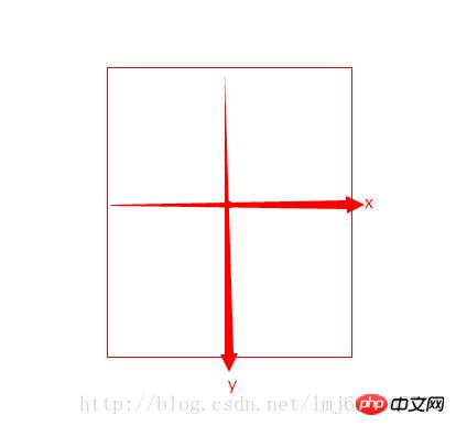
The default center point of the rotated element is the rotation center (You can modify through transform-origin). The x and y axes are both on the graph, and the z axis is the arrow going out from the center (the arrow pointing towards your head from the screen).
In our example, the default image rotateY=0; the mouse pointer is rotateY=-180, a negative number means counterclockwise rotation around the y-axis, a positive number means clockwise rotation; the same applies to the other two axes;
The core of our example is that when the mouse points to: picture (p:first-child), it rotates 180 degrees counterclockwise around the y-axis from 0 degrees to -180 degrees; introduction (p:last-child) starts from 180 Rotate 180 degrees counterclockwise around the y-axis to reach 0 degrees. Creates the effect of two counterclockwise rotations together. Some people may ask why the default introduction is not 0 degrees. Note here that the introduction is in a frontal state after being rotated 180 degrees counterclockwise, so when the image is covered, it is equivalent to a 180-degree clockwise rotation from the normal state, because when the mouse points Need to return to normalcy.
Perspective, there is a trick for setting the stage (the parent element of the animation).
Transform-style’s 3D changes are of course 3D, there’s nothing much to say.
There are many more attributes related to the 3D effect of CSS3. If there is a chance, future examples will deliberately use unused ones~
The above is the detailed content of HTML5/CSS3 Special Topic CSS3 creates a classic case of Baidu Tieba's 3D flop effect. For more information, please follow other related articles on the PHP Chinese website!

Hot Article
Hot tools Tags
Hot Article
Hot Article Tags

Notepad++7.3.1
Easy-to-use and free code editor

SublimeText3 Chinese version
Chinese version, very easy to use

Zend Studio 13.0.1
Powerful PHP integrated development environment

Dreamweaver CS6
Visual web development tools

SublimeText3 Mac version
God-level code editing software (SublimeText3)


