

Classic case of HTML5/CSS3 3D cube rotation animation
Mar 10, 2017 pm 04:13 PMRendering:

Knowledge points:
1, perspective, review of transform
2, css3 backgroud Realize the grid background, that is, the small grid on the face
3, @-webkit-keyframes Realize animation
HTML:
<body>


<p class="stage">
    <p class="cube">
        <p class="font"></p>
        <p class="back"></p>
        <p class="left"></p>
        <p class="right"></p>
        <p class="top"></p>
        <p class="bottom"></p>
    </p>

</p>


</body>
Already shown in the previous 3D product display I have already mentioned how to make a cube, and there are numbers on it. Theoretically, it is more complicated than this, although it is not that cool~ I won’t go into details here.
CSS:
 html
        {
            background: -webkit-radial-gradient(center, ellipse, #430d6d 0%, #000000 100%);
            background: radial-gradient(ellipse at center, #430d6d 0%, #000000 100%);
            height: 100%;
        }

        .stage
        {
            -webkit-perspective: 1000px;
            width: 20em;
            height: 20em;
            left: 50%;
            top: 50%;
            margin-left: -10em;
            margin-top: -10em;
            position: absolute;
        }

        .cube
        {
            position: absolute;
            width: 100%;
            height: 100%;
            -webkit-transform-style: preserve-3d;
            -webkit-transform: rotateX(-20deg) rotateY(-20deg);
        }

        .cube *
        {
            background: -webkit-linear-gradient(left, rgba(54, 226, 248, 0.5) 0px, rgba(54, 226, 248, 0.5) 3px, rgba(0, 0, 0, 0) 0px),
            -webkit-linear-gradient(top, rgba(54, 226, 248, 0.5) 0px, rgba(54, 226, 248, 0.5) 3px, rgba(0, 0, 0, 0) 0px);
            -webkit-background-size: 2.5em 2.5em;

            background-color: rgba(0, 0, 0, 0.5);
            position: absolute;
            width: 100%;
            height: 100%;
            border: 2px solid rgba(54, 226, 248, 0.5);
            -webkit-box-shadow: 0 0 5em rgba(0, 128, 0, 0.4);

        }

        .font
        {
            -webkit-transform: translateZ(10em);
        }

        .back
        {
            -webkit-transform: rotateX(180deg) translateZ(10em);
        }

        .left
        {
            -webkit-transform: rotateY(-90deg) translateZ(10em);
        }

        .right
        {
            -webkit-transform: rotateY(90deg) translateZ(10em);
        }

        .top
        {
            -webkit-transform: rotateX(90deg) translateZ(10em);
        }

        .bottom
        {
            -webkit-transform: rotateX(-90deg) translateZ(10em);
        }
Similarly: stage serves as the stage, cube sets the effect of the sub-element to 3d, then each face is rotated and translateZ is set to form a cube.
Set the backgroud for each surface and set the small grid code:
     background: -webkit-linear-gradient(
                left,
                rgba(54, 226, 248, 0.5) 0px,
                rgba(54, 226, 248, 0.5) 3px,
                rgba(0, 0, 0, 0) 0px),
                        -webkit-linear-gradient(
                top,
                rgba(54, 226, 248, 0.5) 0px,
                rgba(54, 226, 248, 0.5) 3px,
                rgba(0, 0, 0, 0) 0px);

-webkit-background-size: 2.5em 2.5em;Background settings, 3 pixel strips from left to right, from top to bottom Go to the 3 pixel bar below; then set the background size to 2.5em 2.5em, and then repeat the background, the effect is as follows (I added a border):

#The complete effect now:
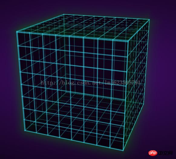
You can see that the cube has been formed, just add animation at the end, no need I think the animation is very complicated, but it is actually very simple~
Define an animation frame:
 @-webkit-keyframes spin
        {
            from
            {
                -webkit-transform: translateZ(-10em) rotateX(0) rotateY(0deg);
                transform: translateZ(-10em) rotateX(0) rotateY(0deg);
            }

            to
            {
                -webkit-transform: translateZ(-10em) rotateX(360deg) rotateY(360deg);
                transform: translateZ(-10em) rotateX(360deg) rotateY(360deg);
            }
        }
The name is spin, and it starts with translateZ(-10em) rotateX(0) rotateY(0deg); At the end: translateZ(-10em) rotateX(360deg) rotateY(360deg); That is, rotate 360 degrees around the x and y axes at the same time.
Finally add this animation attribute to our cube:
  .cube
        {
            -webkit-animation: 6s spin linear infinite;
            position: absolute;
            width: 100%;
            height: 100%;
            -webkit-transform-style: preserve-3d;
            -webkit-transform: rotateX(-20deg) rotateY(-20deg);
        }
Set the time to animation time 6s, animation spin, speed to uniform linear, infinite loop infinite;
For more detailed parameter settings, you can refer to w3cSchool~ In the future, I will also write a separate blog introducing the properties of CSS3~
Okay, the final effect is complete~
For The original website looks slightly different:
Because it adds an extra radial gradient to each face, then we add:
    .cube *:before
        {
            display: block;
            background: -webkit-radial-gradient(center, ellipse, rgba(0, 0, 0, 0) 30%, rgba(0, 128, 0, 0.2) 100%);
            background: radial-gradient(ellipse at center, rgba(0, 0, 0, 0) 30%, rgba(0, 128, 0, 0.2) 100%);
            content: '';
            height: 100%;
            width: 100%;
            position: absolute;
}The above is the detailed content of Classic case of HTML5/CSS3 3D cube rotation animation. For more information, please follow other related articles on the PHP Chinese website!

Hot Article

Hot tools Tags

Hot Article

Hot Article Tags

Notepad++7.3.1
Easy-to-use and free code editor

SublimeText3 Chinese version
Chinese version, very easy to use

Zend Studio 13.0.1
Powerful PHP integrated development environment

Dreamweaver CS6
Visual web development tools

SublimeText3 Mac version
God-level code editing software (SublimeText3)


