How to achieve the animation effect of picture rotation in html5
This time I will show you how to achieve the animation effect of the picture turning in html5. What are the precautions for realizing the animation effect of the picture turning in html5. The following is a practical case, let's take a look.
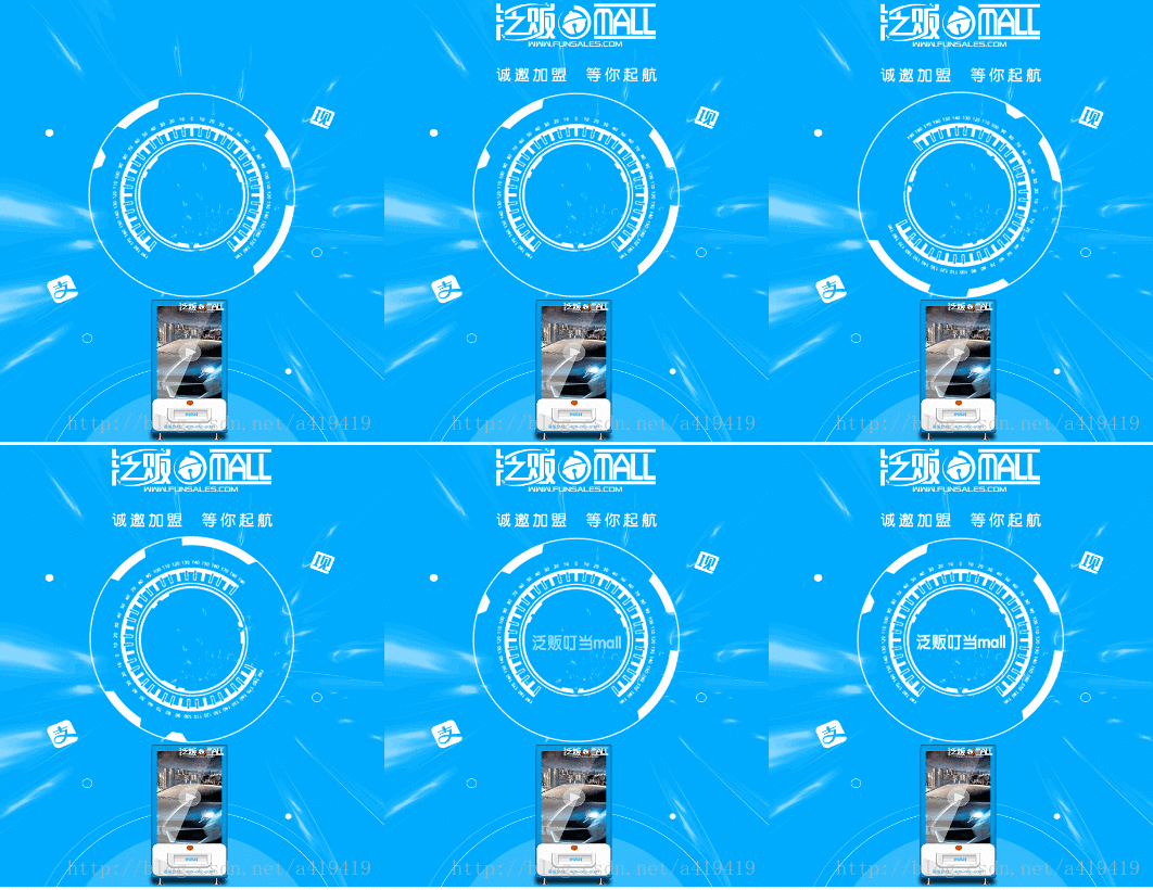
1. Take a look at the effect first:

2. The code is like this:
<img  src="/static/imghw/default1.png" data-src="images/circle.png" class="lazy" alt="How to achieve the animation effect of picture rotation in html5" >
@mixin ani-btnRotate{
    @keyframes btnRotate{
        from{transform: rotateZ(0);}
        to{transform: rotateZ(360deg);}
    }
}
@include ani-btnRotate;
#circle{
    position: absolute;
    left: 50%;
    width: REM(338);
    height:  REM(338);
    margin-top: REM(200);
    margin-left: REM(-338/2);
    transform-origin: center center ;
    animation: btnRotate 1s 1s linear forwards;
}The picture used is This: (It’s the white rotating picture)

I believe you have mastered the method after reading the case in this article , for more exciting content, please pay attention to other related articles on the php Chinese website!
Recommended reading:
How to add a prompt icon to the right of the select drop-down box
How to use canvas to implement the custom avatar function
Detailed explanation of Drag and Drop in H5
The above is the detailed content of How to achieve the animation effect of picture rotation in html5. For more information, please follow other related articles on the PHP Chinese website!

Hot AI Tools

Undresser.AI Undress
AI-powered app for creating realistic nude photos

AI Clothes Remover
Online AI tool for removing clothes from photos.

Undress AI Tool
Undress images for free

Clothoff.io
AI clothes remover

Video Face Swap
Swap faces in any video effortlessly with our completely free AI face swap tool!

Hot Article

Hot Tools

Notepad++7.3.1
Easy-to-use and free code editor

SublimeText3 Chinese version
Chinese version, very easy to use

Zend Studio 13.0.1
Powerful PHP integrated development environment

Dreamweaver CS6
Visual web development tools

SublimeText3 Mac version
God-level code editing software (SublimeText3)

Hot Topics
 1664
1664
 14
14
 1421
1421
 52
52
 1315
1315
 25
25
 1266
1266
 29
29
 1239
1239
 24
24
 Table Border in HTML
Sep 04, 2024 pm 04:49 PM
Guide to Table Border in HTML. Here we discuss multiple ways for defining table-border with examples of the Table Border in HTML.
 Nested Table in HTML
Sep 04, 2024 pm 04:49 PM
This is a guide to Nested Table in HTML. Here we discuss how to create a table within the table along with the respective examples.
 HTML margin-left
Sep 04, 2024 pm 04:48 PM
Guide to HTML margin-left. Here we discuss a brief overview on HTML margin-left and its Examples along with its Code Implementation.
 HTML Table Layout
Sep 04, 2024 pm 04:54 PM
Guide to HTML Table Layout. Here we discuss the Values of HTML Table Layout along with the examples and outputs n detail.
 HTML Input Placeholder
Sep 04, 2024 pm 04:54 PM
Guide to HTML Input Placeholder. Here we discuss the Examples of HTML Input Placeholder along with the codes and outputs.
 HTML Ordered List
Sep 04, 2024 pm 04:43 PM
Guide to the HTML Ordered List. Here we also discuss introduction of HTML Ordered list and types along with their example respectively
 HTML onclick Button
Sep 04, 2024 pm 04:49 PM
Guide to HTML onclick Button. Here we discuss their introduction, working, examples and onclick Event in various events respectively.
 Moving Text in HTML
Sep 04, 2024 pm 04:45 PM
Guide to Moving Text in HTML. Here we discuss an introduction, how marquee tag work with syntax and examples to implement.


