Android custom circular LoadingView effect
This article mainly introduces in detail the method of customizing the ring LoadingView effect in Android. It has certain reference value. Interested friends can refer to it.
There are recent projects that need to use the ring. Progress bar, there is a similar DashedCircularProgress control on Github, but the progress it draws is spaced by setting the dotted line effect of the brush: progressPaint.setPathEffect(new DashPathEffect(new float[]{dashWith, dashSpace}, dashSpace)); If there is another layer of rings in the inner layer, there will be a slight deviation between the inner layer and the outer layer during dynamic setting. So I changed one on the original basis to achieve the effect I wanted (you can choose to add animation or not when setting the progress) Add animation):
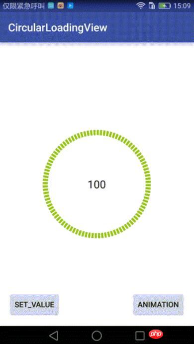
Control implementation:
This control inherits RelativeLayout and does two things during onDraw :
1. First draw the black ring at the bottom;
2. Draw the outer green ring of corresponding proportion according to the current progress value.
Provide an interface to the outside world to call back the current Progress value:
public interface OnValueChangeListener {
  void onValueChange(float value);
} Core drawing class:
InternalCirclePainterImp2, drawing the inner black ring:
/**
 * @author Chuck
 */
public class InternalCirclePainterImp2 implements InternalCirclePainter {

  private RectF internalCircle;//画出圆弧时,圆弧的外切矩形
  private Paint internalCirclePaint;
  private int color;
  private float startAngle = 270f;
  int arcQuantity=100;//等分(圆弧加间隔),比如arcQuantity=100时,表示将有100个圆弧,和100个空白间隔
  float ratio=0.5f;//每段圆弧与圆弧加间隔之和的比例,ratio=0.5表示每个圆弧与相邻的间隔弧度比是1:1
  private int width;
  private int height;
  private int internalStrokeWidth = 48;//圆环宽度

  public InternalCirclePainterImp2(int color, int progressStrokeWidth, int arcQuantity,float ratio) {
    this.color = color;
    this.internalStrokeWidth = progressStrokeWidth;
    this.arcQuantity = arcQuantity;
    if(ratio>0&&ratio<1){
      this.ratio = ratio;
    }

    init();
  }

  private void init() {
    initExternalCirclePainter();
  }

  private void initExternalCirclePainter() {
    internalCirclePaint = new Paint();
    internalCirclePaint.setAntiAlias(true);
    internalCirclePaint.setStrokeWidth(internalStrokeWidth);
    internalCirclePaint.setColor(color);
    internalCirclePaint.setStyle(Paint.Style.STROKE);

  }

  //圆弧外切矩形
  private void initExternalCircle() {
    internalCircle = new RectF();
    float padding = internalStrokeWidth * 0.5f;
    internalCircle.set(padding, padding , width - padding, height - padding);
    initExternalCirclePainter();
  }


  @Override
  public void draw(Canvas canvas) {

    float eachAngle=360f/arcQuantity;

    float eachArcAngle=eachAngle*ratio;

    for(int i=0;i<arcQuantity*2;i++){
      if(i%2==0){//遇到偶数就画圆弧,基数则跳过
        canvas.drawArc(internalCircle, startAngle+eachAngle*i/2, eachArcAngle, false, internalCirclePaint);
      }
      else{
        continue;
      }
    }

  }

  public void setColor(int color) {
    this.color = color;
    internalCirclePaint.setColor(color);
  }

  @Override
  public int getColor() {
    return color;
  }

  @Override
  public void onSizeChanged(int height, int width) {
    this.width = width;
    this.height = height;
    initExternalCircle();
  }
}ProgressPainterImp2, draw the inner black ring:
/**
 * @author Chuck
 */
public class ProgressPainterImp2 implements ProgressPainter {

  private RectF progressCircle;
  private Paint progressPaint;
  private int color = Color.RED;
  private float startAngle = 270f;
  private int internalStrokeWidth = 48;
  private float min;
  private float max;
  private int width;
  private int height;

  private int currentPecent;//当前的百分比

  int arcQuantity=100;//等分(圆弧加间隔),比如arcQuantity=100时,表示将有100个圆弧,和100个空白间隔
  float ratio=0.5f;//每段圆弧与圆弧加间隔之和的比例,ratio=0.5表示每个圆弧与相邻的间隔弧度比是1:1

  public ProgressPainterImp2(int color, float min, float max, int progressStrokeWidth, int arcQuantity,float ratio) {
    this.color = color;
    this.min = min;
    this.max = max;
    this.internalStrokeWidth = progressStrokeWidth;
    this.arcQuantity = arcQuantity;
    this.ratio = ratio;
    init();
    Log.e("ProgressPainterImp","构造函数执行");
  }

  private void init() {
    initInternalCirclePainter();

  }

  private void initInternalCirclePainter() {
    progressPaint = new Paint();
    progressPaint.setAntiAlias(true);
    progressPaint.setStrokeWidth(internalStrokeWidth);
    progressPaint.setColor(color);
    progressPaint.setStyle(Paint.Style.STROKE);

  }

  //初始化外切的那个矩形
  private void initInternalCircle() {
    progressCircle = new RectF();
    float padding = internalStrokeWidth * 0.5f;
    progressCircle.set(padding, padding , width - padding, height - padding);

    initInternalCirclePainter();
  }

  @Override
  public void draw(Canvas canvas) {

    float eachAngle=360f/arcQuantity;

    float eachArcAngle=eachAngle*ratio;

    int quantity=2*arcQuantity*currentPecent/100;
    for(int i=0;i<quantity;i++){
      if(i%2==0){//遇到偶数就画圆弧,基数则跳过
        canvas.drawArc(progressCircle, startAngle+eachAngle*i/2, eachArcAngle, false, progressPaint);
      }
      else{
        continue;
      }
    }
  }

  public float getMin() {
    return min;
  }

  public void setMin(float min) {
    this.min = min;
  }

  public float getMax() {
    return max;
  }

  public void setMax(float max) {
    this.max = max;
  }

  public void setValue(float value) {
    this.currentPecent = (int) (( 100f * value) / max);
  }

  @Override
  public void onSizeChanged(int height, int width) {
    Log.e("ProgressPainterImp","onSizeChanged执行");

    this.width = width;
    this.height = height;
    initInternalCircle();
  }

  public int getColor() {
    return color;
  }

  public void setColor(int color) {
    this.color = color;
    progressPaint.setColor(color);
  }
}Can be customized Attribute:
<declare-styleable name="CircularLoadingView">
  <attr name="base_color" format="color" /> <!--内层圆环的颜色-->
  <attr name="progress_color" format="color" /><!--进度圆环的颜色-->
  <attr name="max" format="float" /><!--最小值-->
  <attr name="min" format="float" /><!--最大值-->
  <attr name="duration" format="integer" /><!--动画时长-->
  <attr name="progress_stroke_width" format="integer" /><!--圆环宽度-->

  <!--等分(圆弧加间隔),比如arcQuantity=100时,表示将有100个圆弧,和100个空白间隔-->
  <attr name="argQuantity" format="integer" />

  <!--每段圆弧与圆弧加间隔之和的比例,ratio=0.5表示每个圆弧与相邻的间隔弧度比是1:1-->
  <attr name="ratio" format="float" />
</declare-styleable>
Call:
main_activity.xml:
<?xml version="1.0" encoding="utf-8"?>
<RelativeLayout
  xmlns:android="http://schemas.android.com/apk/res/android"
  android:layout_width="match_parent"
  android:layout_height="match_parent"
  android:paddingBottom="@dimen/activity_vertical_margin"
  android:paddingLeft="@dimen/activity_horizontal_margin"
  android:paddingRight="@dimen/activity_horizontal_margin"
  android:paddingTop="@dimen/activity_vertical_margin"
  xmlns:custom="http://schemas.android.com/apk/res-auto"
  android:background="#ffffff"
  >

  <!--自定义控件,继承RelativeLayout-->
  <qdong.com.mylibrary.CircularLoadingView
    android:id="@+id/simple"
    custom:base_color="@color/pager_bg"
    custom:min="0"
    custom:max="100"
    custom:argQuantity="100"
    custom:ratio="0.6"
    custom:progress_color="@android:color/holo_green_light"
    custom:progress_icon="@mipmap/ic_launcher"
    custom:duration="1000"
    custom:progress_stroke_width="28"
    android:layout_centerInParent="true"
    android:layout_width="200dp"
    android:layout_height="200dp">

    <RelativeLayout
      android:layout_centerInParent="true"
      android:layout_width="match_parent"
      android:layout_height="match_parent">


        <TextView
          android:layout_centerInParent="true"

          android:textSize="20sp"
          android:layout_centerHorizontal="true"
          android:id="@+id/number"
          android:text="0"
          android:gravity="center"
          android:textColor="@color/pager_bg"
          android:layout_width="wrap_content"
          android:layout_height="wrap_content" />

    </RelativeLayout>

  </qdong.com.mylibrary.CircularLoadingView>

  <Button
    android:layout_width="wrap_content"
    android:layout_height="wrap_content"
    android:text="Set_Value"
    android:id="@+id/button"
    android:layout_alignParentBottom="true"
    android:layout_alignParentStart="true"/>

  <Button
    android:layout_width="wrap_content"
    android:layout_height="wrap_content"
    android:text="Animation"
    android:id="@+id/button3"
    android:layout_alignTop="@+id/button"
    android:layout_alignParentEnd="true"/>
</RelativeLayout>MainActivity:
findViewById(R.id.button).setOnClickListener(new View.OnClickListener() {
  @Override
  public void onClick(View view) {
    try {
      mDashedCircularProgress.setValue(66);//没有动画的,直接设置
    } catch (Exception e) {
      e.printStackTrace();
    }
  }
});
findViewById(R.id.button3).setOnClickListener(new View.OnClickListener() {
  @Override
  public void onClick(View view) {
    try {
      mDashedCircularProgress.setValue(0);//无动画,归零
      mDashedCircularProgress.setValueWithAnimation(100,2000);//带动画
    } catch (Exception e) {
      e.printStackTrace();
    }
  }
});Github address: https://github.com/506954774/AndroidCircularLoadingView
Above That’s the entire content of this article. I hope it will be helpful to everyone’s study. For more related content, please pay attention to the PHP Chinese website!
Related recommendations:
AJAX simple pop-up layer effect implemented by jQuery
How to download blob files using jQuery's ajax
The above is the detailed content of Android custom circular LoadingView effect. For more information, please follow other related articles on the PHP Chinese website!

Hot AI Tools

Undresser.AI Undress
AI-powered app for creating realistic nude photos

AI Clothes Remover
Online AI tool for removing clothes from photos.

Undress AI Tool
Undress images for free

Clothoff.io
AI clothes remover

Video Face Swap
Swap faces in any video effortlessly with our completely free AI face swap tool!

Hot Article

Hot Tools

Notepad++7.3.1
Easy-to-use and free code editor

SublimeText3 Chinese version
Chinese version, very easy to use

Zend Studio 13.0.1
Powerful PHP integrated development environment

Dreamweaver CS6
Visual web development tools

SublimeText3 Mac version
God-level code editing software (SublimeText3)

Hot Topics
 1658
1658
 14
14
 1415
1415
 52
52
 1309
1309
 25
25
 1257
1257
 29
29
 1231
1231
 24
24
 New report delivers damning assessment of rumoured Samsung Galaxy S25, Galaxy S25 Plus and Galaxy S25 Ultra camera upgrades
Sep 12, 2024 pm 12:23 PM
In recent days, Ice Universe has been steadily revealing details about the Galaxy S25 Ultra, which is widely believed to be Samsung's next flagship smartphone. Among other things, the leaker claimed that Samsung only plans to bring one camera upgrade
 Samsung Galaxy S25 Ultra leaks in first render images with rumoured design changes revealed
Sep 11, 2024 am 06:37 AM
OnLeaks has now partnered with Android Headlines to provide a first look at the Galaxy S25 Ultra, a few days after a failed attempt to generate upwards of $4,000 from his X (formerly Twitter) followers. For context, the render images embedded below h
 IFA 2024 | TCL\'s NXTPAPER 14 won\'t match the Galaxy Tab S10 Ultra in performance, but it nearly matches it in size
Sep 07, 2024 am 06:35 AM
Alongside announcing two new smartphones, TCL has also announced a new Android tablet called the NXTPAPER 14, and its massive screen size is one of its selling points. The NXTPAPER 14 features version 3.0 of TCL's signature brand of matte LCD panels
 Vivo Y300 Pro packs 6,500 mAh battery in a slim 7.69 mm body
Sep 07, 2024 am 06:39 AM
The Vivo Y300 Pro just got fully revealed, and it's one of the slimmest mid-range Android phones with a large battery. To be exact, the smartphone is only 7.69 mm thick but features a 6,500 mAh battery. This is the same capacity as the recently launc
 Samsung Galaxy S24 FE billed to launch for less than expected in four colours and two memory options
Sep 12, 2024 pm 09:21 PM
Samsung has not offered any hints yet about when it will update its Fan Edition (FE) smartphone series. As it stands, the Galaxy S23 FE remains the company's most recent edition, having been presented at the start of October 2023. However, plenty of
 Motorola Razr 50s shows itself as possible new budget foldable in early leak
Sep 07, 2024 am 09:35 AM
Motorola has released countless devices this year, although only two of them are foldables. For context, while most of the world has received the pair as the Razr 50 and Razr 50 Ultra, Motorola offers them in North America as the Razr 2024 and Razr 2
 Xiaomi Redmi Note 14 Pro Plus arrives as first Qualcomm Snapdragon 7s Gen 3 smartphone with Light Hunter 800 camera
Sep 27, 2024 am 06:23 AM
The Redmi Note 14 Pro Plus is now official as a direct successor to last year'sRedmi Note 13 Pro Plus(curr. $375 on Amazon). As expected, the Redmi Note 14 Pro Plus heads up the Redmi Note 14 series alongside theRedmi Note 14and Redmi Note 14 Pro. Li
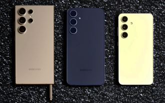 New report delivers damning assessment of rumoured Samsung Galaxy S25, Galaxy S25 Plus and Galaxy S25 Ultra camera upgrades
Sep 12, 2024 pm 12:22 PM
In recent days, Ice Universe has been steadily revealing details about the Galaxy S25 Ultra, which is widely believed to be Samsung's next flagship smartphone. Among other things, the leaker claimed that Samsung only plans to bring one camera upgrade


