
This article brings you an example of converting a jpg image into an svg text path animation (with code). It has certain reference value. Friends in need can refer to it. I hope it will be helpful to you.
I am very interested in svg animation recently. Using svg css can achieve some eye-catching effects. The svg animation appears on the first screen of the Ant Design official website, coding The SVG animation also appears on the homepage of the official website. The effect may seem ordinary to non-front-end developers, but in the eyes of front-end developers, this effect is low-key and flamboyant! This is what you did jq Compare the animate animations and decide the difference! What else do you want to say?
My goal is to create animation effects like Ant Design. I want to create a simpler effect first, such as this text stroke animation effect
How?

This jpg is my avatar, and the final effect is based on this picture.
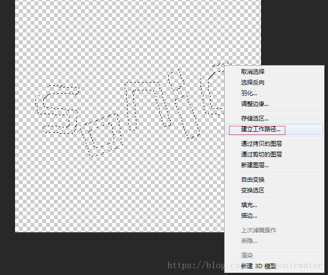
First, convert the selected area of the image into a path in PS
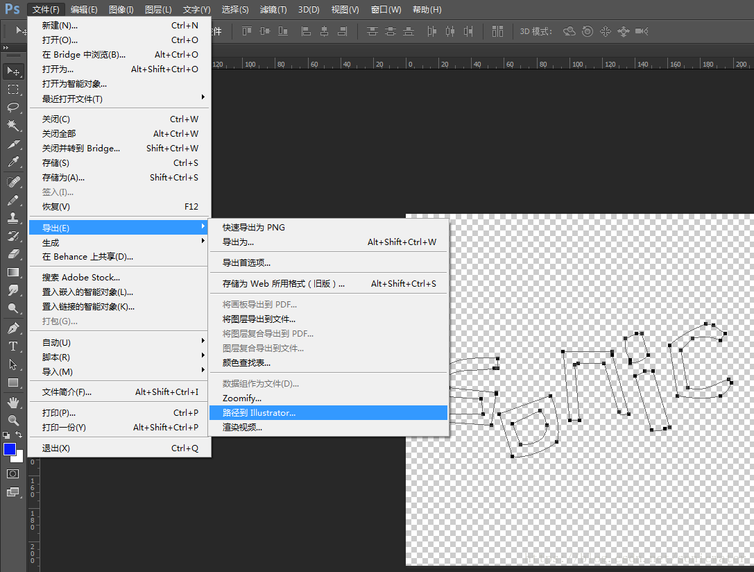
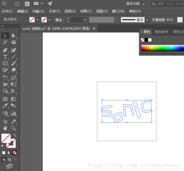

 ##It should be noted that the path of the second letter consists of two parts , a large selection on the outside and a small selection on the inside. Here you need to select "Window" → "Pathfinder" and select "Difference" for the shape mode.
Save it in svg format and get the code:
<svg version="1.1" id="图层_1" xmlns="http://www.w3.org/2000/svg" xmlns:xlink="http://www.w3.org/1999/xlink" x="0px" y="0px"
     viewBox="0 0 215 215" style="enable-background:new 0 0 215 215;" xml:space="preserve"><style type="text/css">
    .st0{fill-rule:evenodd;clip-rule:evenodd;fill:#30479B;}</style><g>
    <path class="st0" d="M197,101c-7.9,2.1-13.8,8.2-25,5c-1.3-7.7-2.7-15.3-4-23c2.3-2.3,4.7-4.7,7-7c5.5-1.6,11.3-3.4,15,1
        c4.5-1.4,3.6-0.5,5-5c-3.7-1.7-7.3-3.3-11-5c-10.1,4.6-14.5,6.3-22,12c1.3,9.7,2.7,19.3,4,29c3.8,6.1,18.2,5.6,26,3
        c4.1-2,5-3.9,7-8C198.3,102.3,197.7,101.7,197,101z"/>
    <path class="st0" d="M144,73c-1.3,0-2.7,0-4,0c-2.3,1-4.7,2-7,3c1.3,5.3,2.7,10.7,4,16c3.3-1,6.7-2,10-3
        C148.1,83.3,145.3,79.1,144,73z"/>
    <path class="st0" d="M126,84c-10,0-20,0-30,0c1.3,14,2.7,28,4,42c2,0,4,0,6,0c-1-11.3-2-22.7-3-34c0.7-0.3,1.3-0.7,2-1
        c5.3,0,10.7,0,16,0c3,10,6,20,9,30c1.2,3.1,2,1.2,6,1c-3.3-12-6.7-24-10-36C126,85.3,126,84.7,126,84z"/>
    <path class="st0" d="M18,97c0.3,4.7,0.7,9.3,1,14c9,0.7,18,1.3,27,2c0.3,3,0.7,6,1,9c-7.7,0-15.3,0-23,0c0,1.7,0,3.3,0,5
        c5,0.7,10,1.3,15,2c4.3,0,8.7,0,13,0c0.7-6.3,1.3-12.7,2-19c-4.2-4-20.4-4.2-28-4c-0.3-2.3-0.7-4.7-1-7c7.8-5.5,19.4-2.3,29-5
        c0.7,0,1.3,0,2,0c0-2,0-4,0-6C34.4,87.6,30.9,88,18,97z"/>
    <path class="st0" d="M146,96c-1.7,0.7-3.3,1.3-5,2c-2.1,11.1,6.7,23,9,34c3.4,0.8,5.1,0.7,8-1c1-0.3,2-0.7,3-1
        c-3.3-11.3-6.7-22.7-10-34C149.3,96,147.7,96,146,96z"/>
    <path class="st0" d="M57,122c2.7,8.7,5.3,17.3,8,26c9.5,1.9,19.2-5.2,28-8c1.2-5.9-0.6-23.6-5-29C77.7,114.7,67.3,118.3,57,122z
M70,141c-1.7-4.3-3.3-8.7-5-13c5.7-2.7,11.3-5.3,17-8c2.5,2.4,2.9,5,4,9C85.8,138.6,78.7,140.6,70,141z"/></g></svg>Modify the css
.st0{fill: none;
stroke-width:2;
stroke:#30479B;
stroke-linejoin:round;
stroke-linecap:round;
stroke-dasharray: 250, 250;
animation: lineMove 5s ease-out infinite;
}
@keyframes lineMove {
    0%{
    stroke-dasharray: 0, 250;
    }
    100%{
    stroke-dasharray: 250, 250;
    }
}Regarding the combination of svg and css, use this example as a reference:
- fill represents the fill color, and the value of none represents no color- stroke is the color of the border
- stroke-width defines the thickness of the border
- stroke-dasharray The first parameter of this attribute defines the length of the border dash line, The second parameter is the spacing of the dotted lines. What is a "border dotted line"? You can think that the border is a dotted line instead of a solid line, but the spacing of the dotted lines is 0, which looks like a solid line.
- The @keyframes feature of CSS3 is used here to control the transition animation in the stroke-dasharray style.
The final overall code is as follows
<!DOCTYPE html><html><head>
    <meta charset="UTF-8">
    <title>Document</title>
    <style type="text/css">

        svg{width: 250px;height: 250px;}
    </style></head><body style="background: #f1f1f1">
    <?xml version="1.0" encoding="utf-8"?>
    <!-- Generator: Adobe Illustrator 21.0.0, SVG Export Plug-In . SVG Version: 6.00 Build 0)  -->
    <svg version="1.1" id="图层_1" xmlns="http://www.w3.org/2000/svg" xmlns:xlink="http://www.w3.org/1999/xlink" x="0px" y="0px"
         viewBox="0 0 215 215" style="enable-background:new 0 0 215 215;" xml:space="preserve">
    <style type="text/css">
        .st0{fill: none;
        stroke-width:2;
        stroke:#30479B;
        stroke-dasharray: 250;
        animation: lineMove 5s ease-out infinite;
        }
        @keyframes lineMove {
            0%{
            stroke-dasharray: 0, 250;
            }
            100%{
            stroke-dasharray: 250, 250;
            }
        }
        </style>
    <g>
        <path class="st0" d="M197,101c-7.9,2.1-13.8,8.2-25,5c-1.3-7.7-2.7-15.3-4-23c2.3-2.3,4.7-4.7,7-7c5.5-1.6,11.3-3.4,15,1
            c4.5-1.4,3.6-0.5,5-5c-3.7-1.7-7.3-3.3-11-5c-10.1,4.6-14.5,6.3-22,12c1.3,9.7,2.7,19.3,4,29c3.8,6.1,18.2,5.6,26,3
            c4.1-2,5-3.9,7-8C198.3,102.3,197.7,101.7,197,101z"/>
        <path class="st0" d="M144,73c-1.3,0-2.7,0-4,0c-2.3,1-4.7,2-7,3c1.3,5.3,2.7,10.7,4,16c3.3-1,6.7-2,10-3
            C148.1,83.3,145.3,79.1,144,73z"/>
        <path class="st0" d="M126,84c-10,0-20,0-30,0c1.3,14,2.7,28,4,42c2,0,4,0,6,0c-1-11.3-2-22.7-3-34c0.7-0.3,1.3-0.7,2-1
            c5.3,0,10.7,0,16,0c3,10,6,20,9,30c1.2,3.1,2,1.2,6,1c-3.3-12-6.7-24-10-36C126,85.3,126,84.7,126,84z"/>
        <path class="st0" d="M18,97c0.3,4.7,0.7,9.3,1,14c9,0.7,18,1.3,27,2c0.3,3,0.7,6,1,9c-7.7,0-15.3,0-23,0c0,1.7,0,3.3,0,5
            c5,0.7,10,1.3,15,2c4.3,0,8.7,0,13,0c0.7-6.3,1.3-12.7,2-19c-4.2-4-20.4-4.2-28-4c-0.3-2.3-0.7-4.7-1-7c7.8-5.5,19.4-2.3,29-5
            c0.7,0,1.3,0,2,0c0-2,0-4,0-6C34.4,87.6,30.9,88,18,97z"/>
        <path class="st0" d="M146,96c-1.7,0.7-3.3,1.3-5,2c-2.1,11.1,6.7,23,9,34c3.4,0.8,5.1,0.7,8-1c1-0.3,2-0.7,3-1
            c-3.3-11.3-6.7-22.7-10-34C149.3,96,147.7,96,146,96z"/>
        <path class="st0" d="M57,122c2.7,8.7,5.3,17.3,8,26c9.5,1.9,19.2-5.2,28-8c1.2-5.9-0.6-23.6-5-29C77.7,114.7,67.3,118.3,57,122z
             M70,141c-1.7-4.3-3.3-8.7-5-13c5.7-2.7,11.3-5.3,17-8c2.5,2.4,2.9,5,4,9C85.8,138.6,78.7,140.6,70,141z"/>
    </g>
    </svg>
    </body>
</html>Recommended related articles:
How to make icon from symbol in svgSVG Drawing function: svg realizes drawing a flower (with code)The above is the detailed content of Example of converting jpg image into svg text path animation (with code). For more information, please follow other related articles on the PHP Chinese website!
 What is mobile phone HD?
 What are the domain name error correction systems?
 How to run code with vscode
 How to use php sleep
 Introduction to laravel components
 What are the electronic contract signing platforms?
 How to round in Matlab
 What are the virtual currency trading platforms?
 Convert text to numeric value


