

Introduction to the use of several styles of Extjs4 GridPanel_extjs

Simple form
Sort, display a certain column, read local data
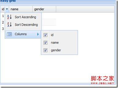
//Local data
var datas = [
['1', 'gao', 'man'], ['2', 'gao', 'man'], ['3', 'gao', 'man']
];
//Create panel
Ext.create('Ext.grid.Panel', {
title: 'easy grid',
width: 400,
height: 300,
renderTo: Ext.getBody(),
frame: true,
viewConfig: {
forceFit: true,
stripRows: true
},
store: {//Configuration data proxy
fields: ['id', 'name', 'gender'],
proxy: {
type: 'memory',
data: datas,
reader: 'array' //The data reader reads data
},
autoLoad: true
},
columns: [{ //Custom column information
header: 'id' ,
width: 30,
dataIndex: 'id', //Fields in bound fields
sortable: true
}, {
header: 'name',
width : 80,
dataIndex: 'name',
sortable: true
}, {
header: 'gender',
width: 80,
dataIndex: 'gender',
sortable: true
}
]
})
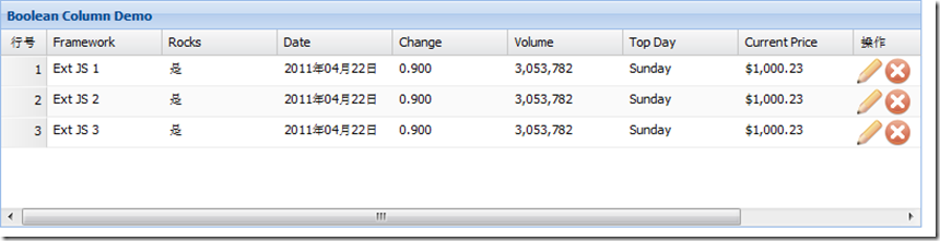
Table column:
row number, bool row conversion, date format formatted output (date, top day), number data type formatted output (change, volume), Action column (operation column)
Code;
Ext.tip.QuickTipManager.init ();
Ext.create('Ext.data.Store', {
storeId: 'sampleStore',
fields: [{
name: 'framework',
type: ' string'
}, {
name: 'rocks',
type: 'boolean'
}, {
name: 'volume',
type: 'number'
}, {
name: 'topday',
type: 'date'
}, {
name: 'change',
type: 'number'
}, {
name: 'date',
type: 'date'
}, {
name: 'price',
type: 'number'
}
],
data: {
'items': [{
"framework": "Ext JS 1",
"rocks": true,
"symbol": "goog",
"date": '2011/04/22',
"change": 0.8997,
"volume": 3053782,
"topday": '04/11/2010',
"price": 1000.23
}, {
"framework": "Ext JS 2",
"rocks": true,
"symbol": "goog",
"date": '2011/04/22',
"change": 0.8997,
"volume": 3053782,
"topday": '04/11/2010',
" price": 1000.23
}, {
"framework": "Ext JS 3",
"rocks": true,
"symbol": "goog",
" date": '2011/04/22',
"change": 0.8997,
"volume": 3053782,
"topday": '04/11/2010',
"price" : 1000.23
}]
},
proxy: {
type: 'memory',
reader: {
type: 'json',
root: 'items'
}
}
});
Ext.create('Ext.grid.Panel', {
title: 'Boolean Column Demo',
store: Ext.data.StoreManager.lookup('sampleStore'),
columns: [
Ext.create('Ext.grid.RowNumberer', { text: 'Row Number', width: 40 }),
{
text: 'Framework',
dataIndex: 'framework',
width: 100
}, {
xtype: 'booleancolumn',
text: 'Rocks ',
trueText: 'Yes',
falseText: 'No',
dataIndex: 'rocks'
}, {
text: 'Date',
dataIndex: 'date ',
xtype: 'datecolumn',
format: 'Y year m month d day'
}, {
text: 'Change',
dataIndex: 'change',
xtype: 'numbercolumn',
format: '0.000'
}, {
text: 'Volume',
dataIndex: 'volume',
xtype: 'numbercolumn',
format: '0,000'
}, {
text: 'Top Day',
dataIndex: 'topday',
xtype: 'datecolumn',
format: 'l'
}, {
text: 'Current Price',
dataIndex: 'price',
renderer: Ext.util.Format.usMoney
}, {
header: 'Operation',
xtype: 'actioncolumn', //Action column
width: 100,
items: [{
icon: 'e.gif', //Edit image address
tooltip : 'Edit', //To use this function for text displayed by mouseover, Ext.tip.QuickTipManager.init();
handler: function (grid, rowIndex, colIndex) {
var rec = grid.getStore ().getAt(rowIndex);
alert("Edit " rec.get('framework'));
}
}, {
icon: 'd.gif',
tooltip: 'Delete',
handler: function (grid, rowIndex,
colIndex) {
var rec = grid.getStore().getAt(rowIndex);
alert("Terminate " rec. get('framework'));
}
}]
}, {
}
],
height: 200,
width: 800,
renderTo: Ext.getBody()
});
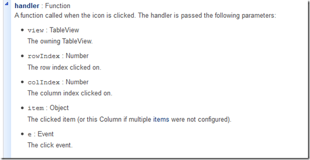
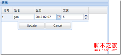
The picture below is the details of the callback function triggered by clicking the operation (edit, delete) button.
The following demonstrates the custom rendering function
Effect: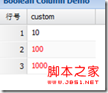
Ext.tip.QuickTipManager.init();
function customFunction(value, metadata) {
if (value > 10) {
metadata.style = 'color:red';
}
return value;
}
Ext.create('Ext.data.Store', {
storeId: 'sampleStore',
fields: [ {
name: 'custom',
type: 'number'
}
],
data: {
'items': [{
"custom": 10
} , {
"custom": 100
}, {
"custom": 1000
}]
},
proxy : {
type: 'memory',
reader: {
type: 'json',
root: 'items'
}
}
});
Ext.create('Ext.grid.Panel', {
title: 'Boolean Column Demo',
store: Ext.data.StoreManager.lookup('sampleStore'),
columns : [
Ext.create('Ext.grid.RowNumberer', { text: 'RowNumber', width: 40 }),
{
text: 'custom',
dataIndex: ' custom',
renderer: customFunction //Call custom function to render
}
],
height: 200,
width: 800,
renderTo: Ext.getBody()
});
Selection mode: Selection
Selection modes are divided into three categories:
1, row selection (default)
2. Cell selection
3. Checkbox selection (checkbox group)
Demo cell selection code:
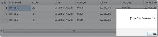
Just add
tbar: [
{
text: 'Get the selected cell',
handler: function () {
var cell = grid.getSelectionModel().getCurrentPosition(); / /getSelectionModel() gets the current selection mode, getCurrentPosition() gets the currently selected cell
alert(Ext.JSON.encode(cell));
}
}
],
selType :'cellmodel' //Set the selection mode to cell selection
row selection:
Effect: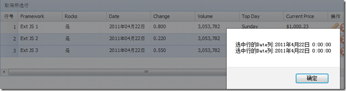
tbar: [
{
text: 'Get the selected rows',
handler: function () {
var rows = grid.getSelectionModel().getSelection(); //getSelection(); Get the currently selected record array
var msg = [];
for (var i = 0; i < rows.length; i ) {
var row = rows[i];
var myDate = new Date(row .get('date'));
msg.push('Date column of selected row:' myDate.toLocaleString()); //Convert time format
}
alert(msg. join('n'));
}
}
],
selType: 'rowmodel', //The selection mode is row selection
simpleSelect: true, //Simple Enable selection function
multiSelect: true, // Enable multi-line selection
enableKeyNav: true //Enable keyboard navigation
Check box selection:
Effect: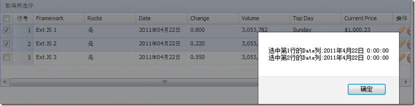
tbar: [
var rows = grid.getSelectionModel().getSelection(); //getSelection(); Get the currently selected record array
var msg = []; For (var i = 0; i < rows.length; i ) {
var row = rows[i];
var myDate = new Date(row.get('date'));
var s = grid.getstore (); // Get the data source of grid
var number = s.indexof (row) 1; // Get line number 1 because the line number starts from 0
msg.push('Select the Date column of row 'number':' myDate.toLocaleString());
simpleSelect: true, //Simple selection function is turned on
multiSelect: true, / / Enable multi-line selection enableKeyNav: true //Enable keyboard navigation
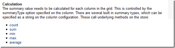
Table feature: Feature
Table summary Ext.grid.feature.Summary
Summary value calculation is calculated based on each column of the table. The calculation method is determined by the specified summaryType. The default is
5 types in the picture above.
This example applies sum and average
Copy code
 The code is as follows:
Ext.define('TestResult', {
extend: 'Ext.data.Model',
fields: ['student', {
name: 'mark',
type: 'int'
}]
});
var grid = Ext.create('Ext.grid.Panel', {
width: 200,
height: 140,
renderTo: document.body,
features: [{
ftype: 'summary'
}],
store: {
model: 'TestResult',
data: [{
student: 'Student 1',
mark: 84
}, {
student: 'Student 2',
mark: 72
}, {
student: 'Student 3',
mark: 96
}, {
student: 'Student 4',
mark: 68
}]
},
columns: [{
dataIndex: 'student',
text: 'Name',
summaryType: 'count', //进行汇总的列名
summaryRenderer: function (value) {
grid.getStore()
return Ext.String.format('{0} student{1}', value, value !== 1 ? 's' : '');
}
}, {
dataIndex: 'mark',
text: 'Mark',
summaryType: 'average'
}]
})
var grid = Ext.create('Ext.grid.Panel', {
width: 200,
height: 140,
renderTo: document.body,
features: [{
ftype: 'summary'
}],
store: {
model: 'TestResult',
data: [{
student: 'Student 1',
mark: 84
}, {
student: 'Student 2',
mark: 72
}, {
student: 'Student 3',
mark: 96
}, {
student: 'Student 4',
mark: 68
}]
},
columns: [{
dataIndex: 'student',
text: 'Name',
summaryType: 'count', //进行汇总的列名
summaryRenderer: function (value) {
// grid.getStore()
return Ext.String.format('{0} student{1}', value, value !== 1 ? 's' : '');
}
}, {
dataIndex: 'mark',
text: 'Mark',
summaryType: 'average',
,
summaryRenderer: function (value) {
{0}', value);
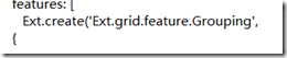
Table grouping: Ext.grid.feature.Grouping
Code: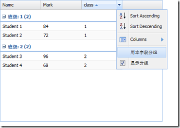
name: 'mark',
type: 'int'
}]
});
var grid = Ext.create('Ext.grid.Panel', {
width: 400,
height: 300,
renderTo: document .body,
features: [
Ext.create('Ext.grid.feature.Grouping',
{
groupByText: 'Group by this field',
showGroupsText: 'Display group',
groupHeaderTpl: 'Class: {name} ({rows.length})', //Template for group display
startCollapsed: true //Set whether the initial group is collapsed
} )
],
store: {
model: 'TestResult',
groupField: 'class',
data: [{
student: 'Student 1',
class: '1',
mark: 84
}, {
student: 'Student 2',
class: '1',
mark: 72
}, {
student: 'Student 3',
class: '2',
mark: 96
}, {
student: 'Student 4',
class: '2',
mark: 68
}]
},
columns: [{
dataIndex: 'student',
text: 'Name',
summaryType: 'count', / /Column name for summary
summaryRenderer: function (value) {
grid.getStore()
return Ext.String.format('{0} student{1}', value, value !== 1 ? 's' : '');
}
}, {
dataIndex: 'mark',
text: 'Mark',
summaryType: 'average'
} ,
{ dataIndex: 'class',
text: 'class'
}]
})
//Click "Group by this field" under different columns and the table will Change grouping rules immediately.
The code only needs to change the above  Grouping to GroupingSummary
 Form plugin: plugin
Cell Editing Ext.grid.plugin.CellEditing

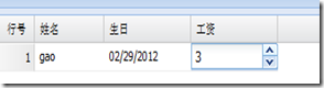 Code:
Code: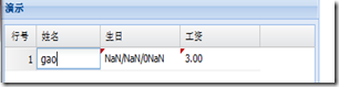
title: 'Demo',
frame: true,
renderTo: Ext.getBody(),
width: 400,
height: 300,
store: {
fields: ['name', 'birth', 'salary '],
data: datas,
proxy: {
type: 'memory',
data: datas,
reader: 'array'
},
autoLoad: true
},
plugins: [
Ext.create('Ext.grid.plugin.CellEditing', {
clicksToEdit: 1
})
],
selType: 'cellmodel',
columns: [Ext.create('Ext.grid.RowNumberer', { text: 'RowNumber', width: 40 }),
{
header: ' name',
width: 80,
dataIndex: 'name',
editor: {//Define field
xtype: 'textfield',
allowBlank: false,
}
}
,
{
header: 'birthday',
width: 100,
dataIndex: 'birth',
xtype: 'datecolumn',
editor: {//Definition fields
xtype: 'datefield',
format: 'Y-m-d',
allowBlank: false
}
}
,
{
header: 'salary',
width: 100,
dataIndex: 'salary', xtype: 'numbercolumn',
editor: {//Define fields
xtype: 'numberfield',
format: '$0,000',
allowBlank: false
}
}
]
})
Table row editor Ext.grid.plugin.RowEditing
The code only needs: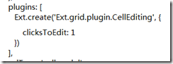 Change CellEditing to RowEditing
To obtain the modified data, ajax requests the server and responds.
grid.on('edit', onEdit, this); //Add edit event and get data
')); //get() parameter is the field name.
. 🎜>
The code is as follows:
})
}
}

Hot AI Tools

Undresser.AI Undress
AI-powered app for creating realistic nude photos

AI Clothes Remover
Online AI tool for removing clothes from photos.

Undress AI Tool
Undress images for free

Clothoff.io
AI clothes remover

Video Face Swap
Swap faces in any video effortlessly with our completely free AI face swap tool!

Hot Article
Hot Tools

Notepad++7.3.1
Easy-to-use and free code editor

SublimeText3 Chinese version
Chinese version, very easy to use

Zend Studio 13.0.1
Powerful PHP integrated development environment

Dreamweaver CS6
Visual web development tools

SublimeText3 Mac version
God-level code editing software (SublimeText3)
Hot Topics
 1665
1665
 14
1423
52
1321
25
1269
29
1249
24
14
1423
52
1321
25
1269
29
1249
24

 macOS: How to change the color of desktop widgets
Oct 07, 2023 am 08:17 AM
macOS: How to change the color of desktop widgets
Oct 07, 2023 am 08:17 AM
In macOS Sonoma, widgets don't have to be hidden off-screen or forgotten in the Notification Center panel like they did in previous versions of Apple's macOS. Instead, they can be placed directly on your Mac’s desktop – they’re also interactive. When not in use, macOS desktop widgets fade into the background in a monochrome style, reducing distractions and allowing you to focus on the task at hand in the active application or window. However, when you click on the desktop, they return to full color. If you prefer a drab look and want to retain that aspect of uniformity on your desktop, there's a way to make it permanent. The following steps demonstrate how it is done. Open the System Settings app
 Guide to solving misalignment of WordPress web pages
Mar 05, 2024 pm 01:12 PM
Guide to solving misalignment of WordPress web pages
Mar 05, 2024 pm 01:12 PM
Guide to solving misaligned WordPress web pages In WordPress website development, sometimes we encounter web page elements that are misaligned. This may be due to screen sizes on different devices, browser compatibility, or improper CSS style settings. To solve this misalignment, we need to carefully analyze the problem, find possible causes, and debug and repair it step by step. This article will share some common WordPress web page misalignment problems and corresponding solutions, and provide specific code examples to help develop
 CSS web background image design: create various background image styles and effects
Nov 18, 2023 am 08:38 AM
CSS web background image design: create various background image styles and effects
Nov 18, 2023 am 08:38 AM
CSS web page background image design: Create various background image styles and effects, specific code examples are required Summary: In web design, background images are an important visual element, which can effectively enhance the attractiveness and readability of the page. This article will introduce some common CSS background image design styles and effects, and provide corresponding code examples. Readers can select and apply these background image styles and effects according to their own needs and preferences to achieve better visual effects and user experience. Keywords: CSS, background image, design style, effect, code representation
 Use the :nth-last-child(2) pseudo-class selector to select the style of the second-to-last child element
Nov 20, 2023 am 11:22 AM
Use the :nth-last-child(2) pseudo-class selector to select the style of the second-to-last child element
Nov 20, 2023 am 11:22 AM
Use the :nth-last-child(2) pseudo-class selector to select the style of the penultimate child element. Specific code examples are required. In CSS, the pseudo-class selector is a very powerful tool that can be used to select the document tree. specific elements. One of them is the :nth-last-child(2) pseudo-class selector, which selects the second-to-last child element and applies styles to it. First, let's create a sample HTML document so that we can use this pseudo-class selector in it. by
 CSS web navigation bar design: making various navigation bar styles
Nov 18, 2023 pm 04:41 PM
CSS web navigation bar design: making various navigation bar styles
Nov 18, 2023 pm 04:41 PM
CSS web navigation bar design: To create various navigation bar styles, specific code examples are required. The navigation bar is one of the most important components in web design. It not only facilitates users to browse different pages of the website, but also provides a clear guide to the website structure. . When designing a navigation bar, the problem we often face is how to create a navigation bar that is both beautiful and functional. This article will introduce some common CSS navigation bar design methods and give corresponding code examples to help readers better understand and apply them. Basic navigation bar Basic navigation bar is the most common
 Use the :root pseudo-class selector to select the style of the root element of the document
Nov 20, 2023 pm 02:18 PM
Use the :root pseudo-class selector to select the style of the root element of the document
Nov 20, 2023 pm 02:18 PM
Using the :root pseudo-class selector to select the style of the root element of the document requires specific code examples. In CSS, we can use the :root pseudo-class selector to select the root element of the document and specify a specific style for it. The :root pseudo-class selector is equivalent to selecting html elements in most cases, but when a namespace exists in the document, the :root pseudo-class selector will select the root element of the default namespace. Here is a concrete code example that shows how to use the :root pseudo-class selector to select the root element of the document.
 CSS text effects: add various special effects and styles to text
Nov 18, 2023 am 10:30 AM
CSS text effects: add various special effects and styles to text
Nov 18, 2023 am 10:30 AM
CSS text effects: Adding various special effects and styles to text requires specific code examples 1. Introduction In web design, text is an indispensable part. By adding special effects and styles to the text, you can make the page more lively and interesting and improve the user's reading experience. This article will introduce some common CSS text effects and provide corresponding code examples for readers' reference and learning. 2. Text color Text color is one of the most basic text effects. By setting the color property, you can change the color of the text. Here is an example
 Front-end and back-end responsibilities and skill requirements
Mar 25, 2024 pm 07:00 PM
Front-end and back-end responsibilities and skill requirements
Mar 25, 2024 pm 07:00 PM
Front-end and back-end are two indispensable parts of software development, and they respectively bear different responsibilities and skill requirements. This article will explore the job content and requirements of front-end and back-end development engineers in terms of responsibilities and skills. 1. Responsibilities and skill requirements of front-end engineers Front-end engineers are responsible for implementing user interface and interactive functions and facing users directly. They need to have the following responsibilities and skill requirements: implement the user interface design of the website or application to ensure good page visual effects and interactive experience; Work closely with UI/UX designers to transform design drafts into
