 Web Front-end
 JS Tutorial
 Mobile terminal development: dealing with the horizontal and vertical screens of mobile devices
Mobile terminal development: dealing with the horizontal and vertical screens of mobile devices
This article mainly introduces the basics of Mobile Web development - dealing with the horizontal and vertical screens of mobile devices. The window.orientation property, onorientationchange event and media query method are two solutions that need to be noted during the development process. Friends in need You can refer to the following
In order to cope with the fragmentation of mobile device screens, when we develop Mobile Web applications, one of the best practices is to adopt a fluid layout to ensure that the limited screen space is utilized to the maximum extent possible. Due to the directionality of the screen, after the user switches the direction of the screen, some design or implementation problems will become apparent - we at least need to deal with the adaptation of the width of the current display element (of course, we may have to do more than only this). Many times, we need to design corresponding application display modes for different screen orientations. At this time, it is extremely important to know the vertical screen status of the device in real time.
window.orientation attribute and onorientationchange event
window.orientation: This attribute gives the screen orientation of the current device, 0 means vertical screen, plus or minus 90 means horizontal Screen (left and right) mode
onorientationchange: This window event will be triggered every time the screen direction is switched between horizontal and vertical screens. The usage is similar to the traditional event
1: Use onorientationchange event The callback function to dynamically add an attribute called orient to the body tag, and at the same time define the corresponding style in css in the form of body[orient=landspace] or body[orient=portrait], so that it can be implemented on different screens Different styles are displayed in the mode. The following code example:
<!Doctype html>
<html>
 <head>
  <meta charset="utf-8">
  <meta id="viewport" name="viewport" content="width=device-width,initial-scale=1.0;">
  <title>横竖屏切换检测</title>
  <style type="text/css">
   body[orient=landscape]{
    background-color: #ff0000;
   }

   body[orient=portrait]{
    background-color: #00ffff;
   }
  </style>
 </head>
 <body orient="landspace">
  <p>
   内容
  </p>
  <script type="text/javascript">
   (function(){
    if(window.orient==0){
     document.body.setAttribute("orient","portrait");
    }else{
     document.body.setAttribute("orient","landscape");
    }
   })();
   window.onorientationchange=function(){
    var body=document.body;
    var viewport=document.getElementById("viewport");
    if(body.getAttribute("orient")=="landscape"){
     body.setAttribute("orient","portrait");
    }else{
     body.setAttribute("orient","landscape");
    }
   };
  </script>
 </body>
</html>2: Similar ideas are not implemented through CSS attribute selectors. The following code implementation plan:
<!Doctype html>
<html>
 <head>
  <meta charset="utf-8">
  <meta id="viewport" name="viewport" content="width=device-width,initial-scale=1.0;">
  <title>横竖屏切换检测</title>
  <style type="text/css">
   .landscape body {
    background-color: #ff0000;
   }

   .portrait body {
    background-color: #00ffff;
   }
  </style>
 </head>
 <body orient="landspace">
  <p>
   内容
  </p>
  <script type="text/javascript">
   (function(){
    var init=function(){
     var updateOrientation=function(){
      var orientation=window.orientation;
      switch(orientation){
       case 90:
       case -90:
        orientation="landscape";
        break;
       default:
        orientation="portrait";
        break;
      }
      document.body.parentNode.setAttribute("class",orientation);
     };

     window.addEventListener("orientationchange",updateOrientation,false);
     updateOrientation();
    };
    window.addEventListener("DOMContentLoaded",init,false);
   })();
  </script>
 </body>
</html>
Use media query method
This is a more convenient way, using pure CSS to achieve the corresponding function, the following code demonstration:
<!Doctype html>
<html>
 <head>
  <meta charset="utf-8">
  <meta id="viewport" name="viewport" content="width=device-width,initial-scale=1.0;">
  <title>横竖屏切换检测</title>
  <style type="text/css">
   @media all and (orientation : landscape) {
    body {
     background-color: #ff0000;
    }
   }

   @media all and (orientation : portrait){
    body {
     background-color: #00ff00;
    }
   }
  </style>
 </head>
 <body>
  <p>
   内容
  </p>
 </body>
</html> Smooth downgrade of lower version browsers
If the target mobile browser does not support media query and window.orientation does not exist, we need to use another way to achieve it———— Use a timer to compare the ratio of the height (window.innerHeight) and width (window.innerWidth) of the current window in "pseudo real-time" to determine the current horizontal and vertical screen status. As shown in the following code:
<!Doctype html>
<html>
 <head>
  <meta charset="utf-8">
  <meta id="viewport" name="viewport" content="width=device-width,initial-scale=1.0;">
  <title>按键</title>
  <style type="text/css">
   .landscape body {
    background-color: #ff0000;
   }

   .portrait body {
    background-color: #00ffff;
   }
  </style>
  <script type="text/javascript">
   (function(){
    var updateOrientation=function(){
     var orientation=(window.innerWidth > window.innerHeight)? "landscape" : "portrait";
     document.body.parentNode.setAttribute("class",orientation);
    };

    var init=function(){
     updateOrientation();
     window.setInterval(updateOrientation,5000);
    };
    window.addEventListener("DOMContentLoaded",init,false);
   })();
  </script>
 </head>
 <body>
  <p>
   内容
  </p>
 </body>
</html> Unified solution
By integrating the above two solutions, a cross-browser solution can be achieved, as follows Code:
<!Doctype html>
<html>
 <head>
  <meta charset="utf-8">
  <meta id="viewport" name="viewport" content="width=device-width,initial-scale=1.0;">
  <title>横竖屏切换检测</title>
  <style type="text/css">
   .landscape body {
    background-color: #ff0000;
   }

   .portrait body {
    background-color: #00ffff;
   }
  </style>
  <script type="text/javascript">
   (function(){
    var supportOrientation=(typeof window.orientation == "number" && typeof window.onorientationchange == "object");

    var updateOrientation=function(){
     if(supportOrientation){
      updateOrientation=function(){
       var orientation=window.orientation;
       switch(orientation){
        case 90:
        case -90:
         orientation="landscape";
         break;
        default:
         orientation="portrait";
       }
       document.body.parentNode.setAttribute("class",orientation);
      };
     }else{
      updateOrientation=function(){
       var orientation=(window.innerWidth > window.innerHeight)? "landscape":"portrait";
       document.body.parentNode.setAttribute("class",orientation);
      };
     }
     updateOrientation();
    };

    var init=function(){
     updateOrientation();
     if(supportOrientation){
      window.addEventListener("orientationchange",updateOrientation,false);
     }else{
      window.setInterval(updateOrientation,5000);
     }
    };
    window.addEventListener("DOMContentLoaded",init,false);
   })();
  </script>
 </head>
 <body>
  <p>
   内容
  </p>
 </body>
</html>The above is the detailed content of Mobile terminal development: dealing with the horizontal and vertical screens of mobile devices. For more information, please follow other related articles on the PHP Chinese website!

Hot AI Tools

Undresser.AI Undress
AI-powered app for creating realistic nude photos

AI Clothes Remover
Online AI tool for removing clothes from photos.

Undress AI Tool
Undress images for free

Clothoff.io
AI clothes remover

Video Face Swap
Swap faces in any video effortlessly with our completely free AI face swap tool!

Hot Article

Hot Tools

Notepad++7.3.1
Easy-to-use and free code editor

SublimeText3 Chinese version
Chinese version, very easy to use

Zend Studio 13.0.1
Powerful PHP integrated development environment

Dreamweaver CS6
Visual web development tools

SublimeText3 Mac version
God-level code editing software (SublimeText3)

Hot Topics
 1655
1655
 14
14
 1413
1413
 52
52
 1306
1306
 25
25
 1252
1252
 29
29
 1226
1226
 24
24
 Samsung Galaxy S25 Ultra mobile phone leaked: 6.86 inches, horizontal screen-to-body ratio 94.1%
Aug 17, 2024 pm 01:49 PM
According to news on August 17, the source @ibinguniverse posted on Weibo today, stating that the exact size of Apple iPhone 16 Pro Max is 6.88 inches, and the exact size of Galaxy S25 Ultra is 6.86 inches. Both can be regarded as 6.9 inches. Sources indicate that the Samsung Galaxy S25 Ultra has a narrower body and a wider screen than the S24 Ultra, with a horizontal screen-to-body ratio of 94.1%, while the S24 Ultra’s horizontal screen-to-body ratio is 91.5%. Fenye checked the relevant Weibo of the source. He also commented on the newly exposed photos of iPhone 16 Pro Max and believed that it was wrong to be close to a micro-curve. The phone is actually a straight screen + 2.5D glass.
 'Tandem OLED' has been popularized by Apple. How is it better than OLED?
Aug 19, 2024 am 04:42 AM
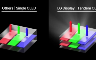
Although Apple has been criticized for its lack of innovation in recent years, Apple has not always stood still. At least in terms of hardware design, with the support of the high unit prices of Apple products, its engineers can easily try some new technologies without having to consider too much cost issues. For example, iPad Pro, as Apple's favorite "display technology" test field, iPad Pro has been at the forefront of display technology for portable smart devices from miniLED in 2021 to tandem OLED in 2024. Although the iPad Pro is not the first portable smart device equipped with a miniLED screen (MSI released a miniLED laptop a year earlier than Apple), when you compare the parameters of the two, you will quickly realize that they are not the same
 Hynix is the first to demonstrate UFS 4.1 flash memory: based on V9 TLC NAND particles
Aug 09, 2024 pm 03:33 PM
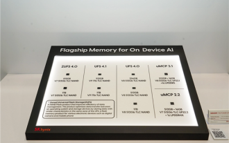
According to news on August 9, at the FMS2024 Summit, SK Hynix demonstrated its latest storage products, including UFS4.1 universal flash memory that has not yet officially released specifications. According to the official website of the JEDEC Solid State Technology Association, the latest UFS specification currently announced is UFS4.0 in August 2022. Its theoretical interface speed is as high as 46.4Gbps. It is expected that UFS4.1 will further improve the transmission rate. 1. Hynix demonstrated 512GB and 1TBUFS4.1 general-purpose flash memory products, based on 321-layer V91TbTLCNAND flash memory. SK Hynix also exhibited 3.2GbpsV92TbQLC and 3.6GbpsV9H1TbTLC particles. Hynix shows off V7-based
 The first 1.5K under-screen camera! Nubia Z70 Ultra is here: the world's first Snapdragon 8 Gen4 true full-screen phone
Aug 19, 2024 pm 03:47 PM
According to news on August 19, Nubia has been adhering to the true full-screen design since the release of Z50 Ultra, and has been continuously exploring the field of proactive photography under high-pixel screens. Today, digital blogger Wisdom Pikachu broke the news that the Nubia Z70 Ultra, which will be released in the second half of this year, will debut with 1.5K under-screen camera technology, which is the highest-resolution UDC solution in the industry so far. It is reported that ZTE’s under-screen proactive solution has advanced to the sixth generation. The latest under-screen proactive solution is available in the Nubia Z60 Ultra and Red Magic 9S Pro series. The screen resolution is 2480x1116, which is between 1080P and 1.5K resolution. This time Nubia will break through the limitations of existing resolutions and set a new benchmark in the industry.
 To run Google's Gemini Nano AI model locally, the Samsung Galaxy S25 Ultra phone was revealed to be equipped with 16GB of memory
Jul 31, 2024 pm 05:55 PM
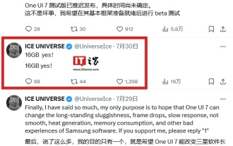
According to news on July 31, the source @ibinguniverse posted a tweet on the Equipped with 16GB of memory. Samsung mobile phone memory capacity update Samsung has launched 16GB memory on Galaxy S20 Ultra and Galaxy S21 Ultra mobile phones. Starting from Galaxy S22 Ultra, including the latest flagship Galaxy S24 Ultra mobile phone, the memory capacity of Samsung mobile phones is capped at 12GB. It is reported that the upcoming Samsung Galaxy S25 and Galaxy S25+ will use 12GB LPDD
 Produced by Ningde New Energy Technology Company, Samsung Galaxy S25 Ultra mobile phone battery exposed
Jul 31, 2024 pm 04:57 PM
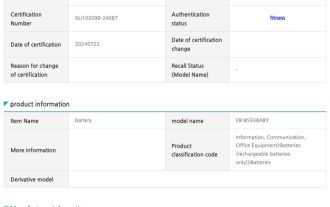
According to news on July 31, technology media SamMobile published a blog post yesterday (July 30) and found battery information suitable for Samsung Galaxy S25 Ultra mobile phones on the SafetyKorea certification website. According to the public information, the battery models exposed this time are EB-BS938ABY and EB-BS938ABE. It is not yet clear what the difference between the two models is. fenye Samsung Galaxy S25 Ultra mobile phone will not use the dual battery solution of Galaxy Z Fold6 and Galaxy Z Flip 6 folding mobile phones, but will adopt a single battery design. It has been previously reported that Samsung will not upgrade and optimize the battery specifications of the Galaxy S25 Ultra mobile phone, and will still use
 Apple and Huawei both wanted to make a buttonless phone, but Xiaomi made it first?
Aug 29, 2024 pm 03:33 PM
According to a report from Smartprix, Xiaomi is developing a buttonless mobile phone codenamed "Suzaku". According to this news, this mobile phone codenamed Zhuque will be designed with an integrated concept, use an under-screen camera, and be equipped with Qualcomm Snapdragon 8gen4 processor. If the plan does not change, we are likely to see its arrival in 2025. When I saw this news, I thought I was back in 2019 - at that time, Xiaomi released the Mi MIX Alpha concept phone, and the surround-screen button-less design was quite amazing. This is the first time I have seen the charm of a buttonless mobile phone. If you want a piece of "magic glass", you must first kill the buttons. In "The Biography of Steve Jobs", Jobs once expressed that he hoped that the mobile phone could be like a piece of "magic glass".
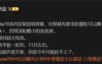 Huawei Mate 70 series configuration leaked: All series have 1.5K screens and super large batteries
Aug 08, 2024 pm 10:21 PM
According to news on August 8, the detailed configuration information of Huawei Mate70 series mobile phones has been recently exposed. This series of mobile phones is expected to be released in the fourth quarter of 2024. 1. According to reports, the entire Mate70 series will use customized top-level 1.5K resolution screens to meet users’ requirements for screen clarity. It is expected that Huawei Mate70Pro and the extra-large cup version will be equipped with fourth-depth screens, while the standard Mate70 may adopt a slightly smaller straight-screen design. In addition to screen upgrades, the Huawei Mate70 series will also be equipped with ultra-large-capacity batteries with new base materials, which heralds a breakthrough in the battery life of Huawei Mate series mobile phones. Although Huawei is developing ultrasonic fingerprint unlocking technology, this year’s Mate70 series will not be equipped with this feature. this


