

Sharing experience in using Bootstrap tree control

jquery tree control is a very lightweight control based on jquery+bootstrap, completely handwritten with js and styles. It has simple functions and good user experience. It is more practical for displaying some simple hierarchical relationships. Trees are used in many projects to show hierarchical relationships, and some trees are used to select items and then call the selected items elsewhere. Today, the editor of Script House brings you experience sharing on using Bootstrap tree control. Friends who need it can refer to it. I hope it can help everyone.
jquery tree control
Preface: Many times we need to use trees in projects. Some trees are just for displaying hierarchical relationships, some are for displaying and editing hierarchical relationships, and some trees are for displaying and editing hierarchical relationships. It is to select the item and then call the selected item elsewhere. No matter what, the tree control is one of the indispensable components in many projects. Today, the blogger plans to share here based on his own experience and some good tree controls found on the Internet, hoping to help everyone find the most suitable control. Still the same sentence: There is no best control, only the most suitable.
1. JQuery tree control
Jquery tree control is a very lightweight control based on JQuery+bootstrap, completely handwritten through js and styles. It can be found in many places on the Internet. See its shadow. It has simple functions and a good user experience. It is more practical to display some simple hierarchical relationships, but it is not easy to add, delete or modify nodes. If you have to do it, you may need to encapsulate it yourself.
1. First glimpse
Collapse all
Expand one level
Expand all
2. Code example
This control is also very simple to implement. You only need to reference jQuery and bootstrap components.
<link href="~/Content/Tree1/css/bootstrap.min.css" rel="external nofollow" rel="stylesheet" />
<link href="~/Content/Tree1/css/style.css" rel="external nofollow" rel="stylesheet" />
<script src="~/Scripts/jquery-1.10.2.js"></script>
<script type="text/javascript">
$(function(){
$('.tree li:has(ul)').addClass('parent_li').find(' > span').attr('title', 'Collapse this branch');
$('.tree li.parent_li > span').on('click', function (e) {
var children = $(this).parent('li.parent_li').find(' > ul > li');
if (children.is(":visible")) {
children.hide('fast');
$(this).attr('title', 'Expand this branch').find(' > i').addClass('icon-plus-sign').removeClass('icon-minus-sign');
} else {
children.show('fast');
$(this).attr('title', 'Collapse this branch').find(' > i').addClass('icon-minus-sign').removeClass('icon-plus-sign');
}
e.stopPropagation();
});
});
</script>
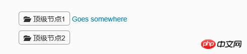
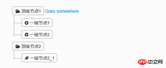
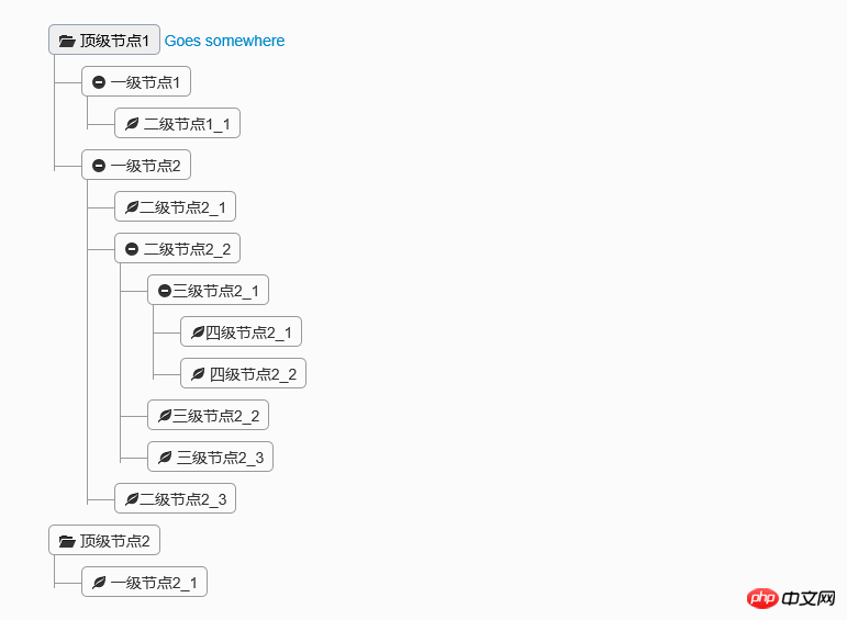
<p class="tree well">
<ul>
<li>
<span><i class="icon-folder-open"></i> 顶级节点1</span> <a href="">Goes somewhere</a>
<ul>
<li>
<span><i class="icon-minus-sign"></i> 一级节点1</span> <a href=""></a>
<ul>
<li>
<span><i class="icon-leaf"></i> 二级节点1_1</span> <a href=""></a>
</li>
</ul>
</li>
<li>
<span><i class="icon-minus-sign"></i> 一级节点2</span> <a href=""></a>
<ul>
<li>
<span><i class="icon-leaf"></i>二级节点2_1</span> <a href=""></a>
</li>
<li>
<span><i class="icon-minus-sign"></i> 二级节点2_2</span> <a href=""></a>
<ul>
<li>
<span><i class="icon-minus-sign"></i>三级节点2_1</span> <a href=""></a>
<ul>
<li>
<span><i class="icon-leaf"></i>四级节点2_1</span> <a href=""></a>
</li>
<li>
<span><i class="icon-leaf"></i> 四级节点2_2</span> <a href=""></a>
</li>
</ul>
</li>
<li>
<span><i class="icon-leaf"></i>三级节点2_2</span> <a href=""></a>
</li>
<li>
<span><i class="icon-leaf"></i> 三级节点2_3</span> <a href=""></a>
</li>
</ul>
</li>
<li>
<span><i class="icon-leaf"></i>二级节点2_3</span> <a href=""></a>
</li>
</ul>
</li>
</ul>
</li>
<li>
<span><i class="icon-folder-open"></i> 顶级节点2</span> <a href=""></a>
<ul>
<li>
<span><i class="icon-leaf"></i> 一级节点2_1</span> <a href=""></a>
</li>
</ul>
</li>
</ul>
</p>These codes are downloaded directly from the Internet. The icons on the nodes can be modified through the style, and the icon style is also based on bootstrap. If you need to add nodes dynamically, you can encapsulate the components yourself to create HTML, which should be relatively simple to implement. From the above, we can see that this component is lightweight. If you need to add, delete, modify or select nodes, don't worry, the following controls may be more suitable.
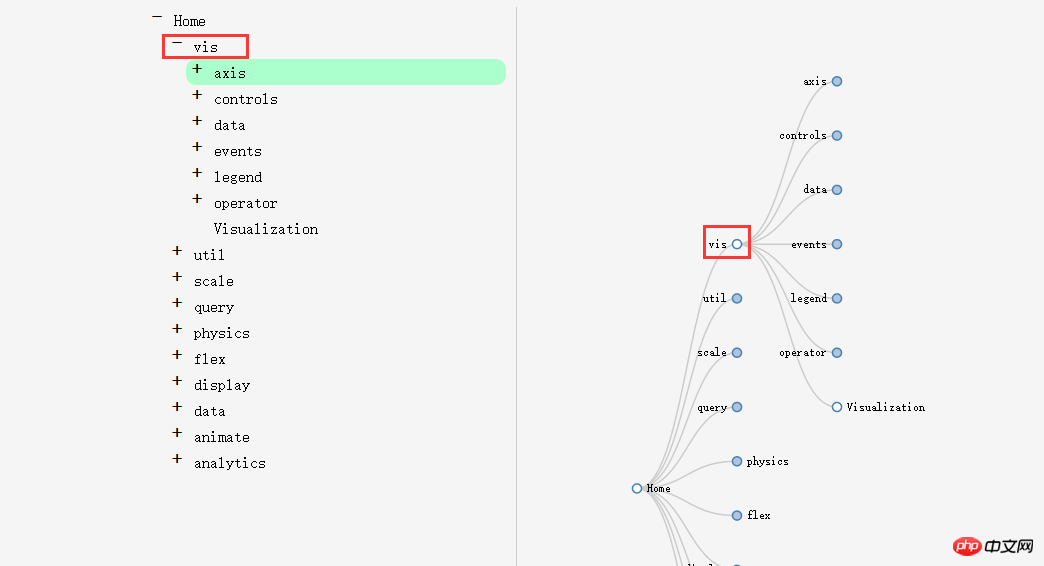
2. File tree editing plug-in Treed
This component was found on the Internet. After the initial demonstration, the members of the group agreed that the effect was great. Because it is displayed in a tree shape, it conveniently provides the addition, deletion and modification of nodes. The scaling effect of nodes is also better. Okay, let’s take a look. Demo and download address: http://www.jq22.com/jquery-info401
1. First sight of Treed
default expansion level
Click the "+" sign on the left and the node on the right to expand the child nodes
Multi-level expansion
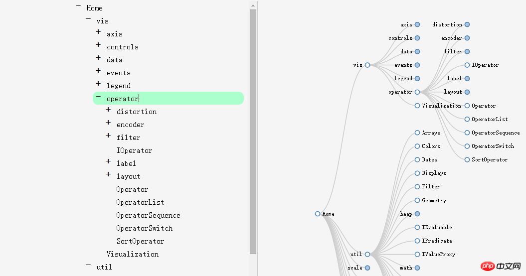
On the left, you can edit the node name
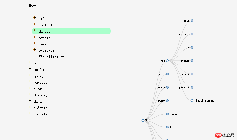
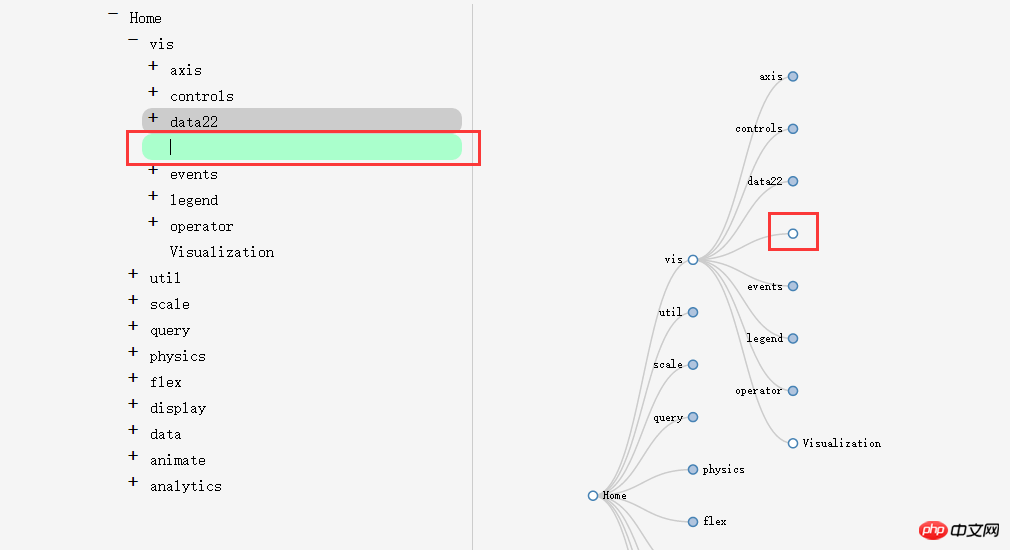
Press Enter to wrap the line to add a sibling node, and delete the line wrap to delete the node.
Press the Enter key and then press the Tab key to add a new child node
It is very powerful. Reviewing the element shows that it is implemented using the svg tag of HTML5, so it has certain requirements for the browser.
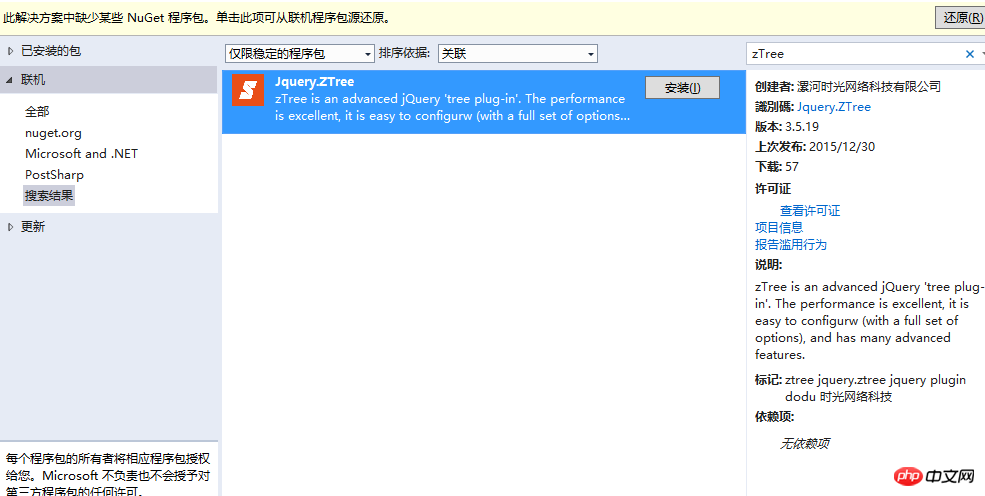
3. Universal tree control - zTree
ztree is a traditional tree component, and its powerful functions determine its status in the tree control world. Whether it is tree display, editing, or node single and multi-selection, it provides a powerful functional API. However, because its interface is not very good-looking, many companies will hesitate when using it. Fortunately, since the flat style was introduced, ztree has also made certain beautifications. For example, its Metro style components are very similar to the bootstrap style. Today, let’s introduce some usage of this component in combination with Metro-style ztree. Demo and download address: http://www.jq22.com/jquery-info941
1. Component usage
This component can be added directly through Nuget.
2. Component effects
Collapse all nodes
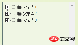
Expand nodes
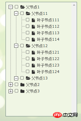
The node is selected. Of course, it can be turned into a single selection if necessary.
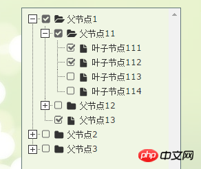
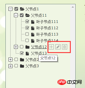
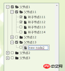
可以增删改节点
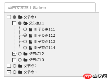
点击文本框出现树
3、代码示例
3.1 直接在界面显示文本框
需要引用的js和css文件
 <script src="~/Scripts/jquery-1.10.2.js"></script>
 <script src="~/Content/bootstrap/js/bootstrap.js"></script>
 <link href="~/Content/bootstrap/css/bootstrap.css" rel="external nofollow" rel="stylesheet" />
 <script src="~/Scripts/jquery.ztree.all-3.5.js"></script>
 <link href="~/Content/zTree.theme.metro.css" rel="external nofollow" rel="stylesheet" />
页面html
<p id="menuContent" class="menuContent" style="width:95%;border:1px solid rgb(170,170,170);z-index:10;">
  <ul id="treeDemo" class="ztree" style="margin-top:0; width:100%; height:auto;"></ul>
 </p>
Js初始化
var setting = {
view: {
addHoverDom: addHoverDom,
removeHoverDom: removeHoverDom,
selectedMulti: false
},
check: {
enable: true
},
data: {
simpleData: {
enable: true
}
},
edit: {
enable: false
}
};
var zNodes = [
{ id: 1, pId: 0, name: "父节点1", open: true },
{ id: 11, pId: 1, name: "父节点11" },
{ id: 111, pId: 11, name: "叶子节点111" },
{ id: 112, pId: 11, name: "叶子节点112" },
{ id: 113, pId: 11, name: "叶子节点113" },
{ id: 114, pId: 11, name: "叶子节点114" },
{ id: 12, pId: 1, name: "父节点12" },
{ id: 121, pId: 12, name: "叶子节点121" },
{ id: 122, pId: 12, name: "叶子节点122" },
{ id: 123, pId: 12, name: "叶子节点123" },
{ id: 124, pId: 12, name: "叶子节点124" },
{ id: 13, pId: 1, name: "父节点13", isParent: true },
{ id: 2, pId: 0, name: "父节点2" },
{ id: 21, pId: 2, name: "父节点21", open: true },
{ id: 211, pId: 21, name: "叶子节点211" },
{ id: 212, pId: 21, name: "叶子节点212" },
{ id: 213, pId: 21, name: "叶子节点213" },
{ id: 214, pId: 21, name: "叶子节点214" },
{ id: 22, pId: 2, name: "父节点22" },
{ id: 221, pId: 22, name: "叶子节点221" },
{ id: 222, pId: 22, name: "叶子节点222" },
{ id: 223, pId: 22, name: "叶子节点223" },
{ id: 224, pId: 22, name: "叶子节点224" },
{ id: 23, pId: 2, name: "父节点23" },
{ id: 231, pId: 23, name: "叶子节点231" },
{ id: 232, pId: 23, name: "叶子节点232" },
{ id: 233, pId: 23, name: "叶子节点233" },
{ id: 234, pId: 23, name: "叶子节点234" },
{ id: 3, pId: 0, name: "父节点3", isParent: true }
];
$(document).ready(function () {
$.fn.zTree.init($("#treeDemo"), setting, zNodes);
});
function addHoverDom(treeId, treeNode) {
var sObj = $("#" + treeNode.tId + "_span");
if (treeNode.editNameFlag || $("#addBtn_" + treeNode.tId).length > 0) return;
var addStr = "<span class='button add' id='addBtn_" + treeNode.tId
+ "' title='add node' onfocus='this.blur();'></span>";
sObj.after(addStr);
var btn = $("#addBtn_" + treeNode.tId);
if (btn) btn.bind("click", function () {
var zTree = $.fn.zTree.getZTreeObj("treeDemo");
zTree.addNodes(treeNode, { id: (100 + newCount), pId: treeNode.id, name: "new node" + (newCount++) });
return false;
});
};
function removeHoverDom(treeId, treeNode) {
$("#addBtn_" + treeNode.tId).unbind().remove();
};3.2 默认隐藏,触发某个事件的时候出现树。这种场景在项目里面非常常见,一般用于选择树节点。所以博主把这个也单独拿出来说下吧。
p默认是隐藏的。
    <input type="text" class="form-control" id="txt_ztree" placeholder="点击文本框出现ztree" onclick="showMenu()" />
  <p id="menuContent2" class="menuContent" style="display:none;position: absolute;width:95%;border:1px solid rgb(170,170,170);z-index:10;">
  <ul id="treeDemo2" class="ztree" style="margin-top:0; width:160px; height:auto;"></ul>
  </p>
在js里面初始化树以及注册showMenu()方法
var setting2 = {
 check: {
 enable: true,
 chkStyle: "radio",
 radioType: "all"
 },
 view: {
 dblClickExpand: false
 },
 data: {
 simpleData: {
  enable: true
 }
 },
 callback: {
 onClick: onClickNode,
 onCheck: onCheck
 }
};
var zNodes = [
 { id: 1, pId: 0, name: "父节点1", open: true },
 { id: 11, pId: 1, name: "父节点11" },
 { id: 111, pId: 11, name: "叶子节点111" },
 { id: 112, pId: 11, name: "叶子节点112" },
 { id: 113, pId: 11, name: "叶子节点113" },
 { id: 114, pId: 11, name: "叶子节点114" },
 { id: 12, pId: 1, name: "父节点12" },
 { id: 121, pId: 12, name: "叶子节点121" },
 { id: 122, pId: 12, name: "叶子节点122" },
 { id: 123, pId: 12, name: "叶子节点123" },
 { id: 124, pId: 12, name: "叶子节点124" },
 { id: 13, pId: 1, name: "父节点13", isParent: true },
 { id: 2, pId: 0, name: "父节点2" },
 { id: 21, pId: 2, name: "父节点21", open: true },
 { id: 211, pId: 21, name: "叶子节点211" },
 { id: 212, pId: 21, name: "叶子节点212" },
 { id: 213, pId: 21, name: "叶子节点213" },
 { id: 214, pId: 21, name: "叶子节点214" },
 { id: 22, pId: 2, name: "父节点22" },
 { id: 221, pId: 22, name: "叶子节点221" },
 { id: 222, pId: 22, name: "叶子节点222" },
 { id: 223, pId: 22, name: "叶子节点223" },
 { id: 224, pId: 22, name: "叶子节点224" },
 { id: 23, pId: 2, name: "父节点23" },
 { id: 231, pId: 23, name: "叶子节点231" },
 { id: 232, pId: 23, name: "叶子节点232" },
 { id: 233, pId: 23, name: "叶子节点233" },
 { id: 234, pId: 23, name: "叶子节点234" },
 { id: 3, pId: 0, name: "父节点3", isParent: true }
];
//初始化
$(document).ready(function () {
 $.fn.zTree.init($("#treeDemo2"), setting2, zNodes);
});
//显示菜单
function showMenu() {
 $("#menuContent2").css({ left: "15px", top: "34px" }).slideDown("fast");
 $("body").bind("mousedown", onBodyDown);
}
//隐藏菜单
function hideMenu() {
 $("#menuContent2").fadeOut("fast");
 $("body").unbind("mousedown", onBodyDown);
}
function onBodyDown(event) {
 if (!(event.target.id == "menuBtn" || event.target.id == "menuContent2" || event.target.id == "txt_ztree" || $(event.target).parents("#menuContent2").length > 0)) {
 hideMenu();
 }
}
//节点点击事件
function onClickNode(e, treeId, treeNode) {
 var zTree = $.fn.zTree.getZTreeObj("treeDemo");
 zTree.checkNode(treeNode, !treeNode.checked, null, true);
 return false;
}
//节点选择事件
function onCheck(e, treeId, treeNode) {
 var zTree = $.fn.zTree.getZTreeObj("treeDemo"),
 nodes = zTree.getCheckedNodes(true),
 v = "";
 var parentid = "";
 var parentlevel = "";
 for (var i = 0, l = nodes.length; i < l; i++) {
 v += nodes[i].name + ",";
 parentid += nodes[i].id + ",";
 parentlevel += nodes[i].menu_level + ",";
 }
 if (v.length > 0) {
 v = v.substring(0, v.length - 1);
 parentid = parentid.substring(0, parentid.length - 1);
 parentlevel = parentlevel.substring(0, parentlevel.length - 1);
 }
 else {
 return;
 }
 hideMenu();
}由于以上都是静态数据,如果需要从后台取数据动态加载树节点,可以去后台构造zNodes这种结构的数组即可。
四、总结
以上三种树形组件,各有千秋,可以根据需求选用不同的组件。
相关推荐:
JS组件系列--Bootstrap 树控件使用经验分享_html/css_WEB-ITnose
javascript 树控件 比较好用_javascript技巧
基于jQuery的树控件实现代码(asp.net+json)_jquery
The above is the detailed content of Sharing experience in using Bootstrap tree control. For more information, please follow other related articles on the PHP Chinese website!

Hot AI Tools

Undresser.AI Undress
AI-powered app for creating realistic nude photos

AI Clothes Remover
Online AI tool for removing clothes from photos.

Undress AI Tool
Undress images for free

Clothoff.io
AI clothes remover

Video Face Swap
Swap faces in any video effortlessly with our completely free AI face swap tool!

Hot Article
Hot Tools

Notepad++7.3.1
Easy-to-use and free code editor

SublimeText3 Chinese version
Chinese version, very easy to use

Zend Studio 13.0.1
Powerful PHP integrated development environment

Dreamweaver CS6
Visual web development tools

SublimeText3 Mac version
God-level code editing software (SublimeText3)
Hot Topics


 How to use bootstrap in vue
Apr 07, 2025 pm 11:33 PM
How to use bootstrap in vue
Apr 07, 2025 pm 11:33 PM
Using Bootstrap in Vue.js is divided into five steps: Install Bootstrap. Import Bootstrap in main.js. Use the Bootstrap component directly in the template. Optional: Custom style. Optional: Use plug-ins.
 How to get the bootstrap search bar
Apr 07, 2025 pm 03:33 PM
How to get the bootstrap search bar
Apr 07, 2025 pm 03:33 PM
How to use Bootstrap to get the value of the search bar: Determines the ID or name of the search bar. Use JavaScript to get DOM elements. Gets the value of the element. Perform the required actions.
 How to do vertical centering of bootstrap
Apr 07, 2025 pm 03:21 PM
How to do vertical centering of bootstrap
Apr 07, 2025 pm 03:21 PM
Use Bootstrap to implement vertical centering: flexbox method: Use the d-flex, justify-content-center, and align-items-center classes to place elements in the flexbox container. align-items-center class method: For browsers that do not support flexbox, use the align-items-center class, provided that the parent element has a defined height.
 How to set up the framework for bootstrap
Apr 07, 2025 pm 03:27 PM
How to set up the framework for bootstrap
Apr 07, 2025 pm 03:27 PM
To set up the Bootstrap framework, you need to follow these steps: 1. Reference the Bootstrap file via CDN; 2. Download and host the file on your own server; 3. Include the Bootstrap file in HTML; 4. Compile Sass/Less as needed; 5. Import a custom file (optional). Once setup is complete, you can use Bootstrap's grid systems, components, and styles to create responsive websites and applications.
 How to write split lines on bootstrap
Apr 07, 2025 pm 03:12 PM
How to write split lines on bootstrap
Apr 07, 2025 pm 03:12 PM
There are two ways to create a Bootstrap split line: using the tag, which creates a horizontal split line. Use the CSS border property to create custom style split lines.
 How to insert pictures on bootstrap
Apr 07, 2025 pm 03:30 PM
How to insert pictures on bootstrap
Apr 07, 2025 pm 03:30 PM
There are several ways to insert images in Bootstrap: insert images directly, using the HTML img tag. With the Bootstrap image component, you can provide responsive images and more styles. Set the image size, use the img-fluid class to make the image adaptable. Set the border, using the img-bordered class. Set the rounded corners and use the img-rounded class. Set the shadow, use the shadow class. Resize and position the image, using CSS style. Using the background image, use the background-image CSS property.
 How to use bootstrap button
Apr 07, 2025 pm 03:09 PM
How to use bootstrap button
Apr 07, 2025 pm 03:09 PM
How to use the Bootstrap button? Introduce Bootstrap CSS to create button elements and add Bootstrap button class to add button text
 How to resize bootstrap
Apr 07, 2025 pm 03:18 PM
How to resize bootstrap
Apr 07, 2025 pm 03:18 PM
To adjust the size of elements in Bootstrap, you can use the dimension class, which includes: adjusting width: .col-, .w-, .mw-adjust height: .h-, .min-h-, .max-h-
