Detailed explanation of CSS classic layout Sticky footer layout
This article mainly introduces the relevant information on the sticky footer layout that explains the classic CSS layout in detail. The editor thinks it is quite good, so I will share it with you now and give it as a reference. Let’s follow the editor to take a look, I hope it can help everyone.
What is Sticky footer layout?
Our common web page layout methods are generally divided into header (header) part, content (content area) part and footer (footer) part. When there is less content in the header area and content area, the footer area is not arranged along with the content area but is always displayed at the bottom of the screen. When there is a lot of content in the content area, the footer can be displayed at the bottom of the page as the document flows. This is the legendary Sticky footer layout. Isn't it easy to understand? It doesn’t matter if you don’t understand. Let me give you a simple example.
For example
When there is less content, the normal document flow is displayed as follows:
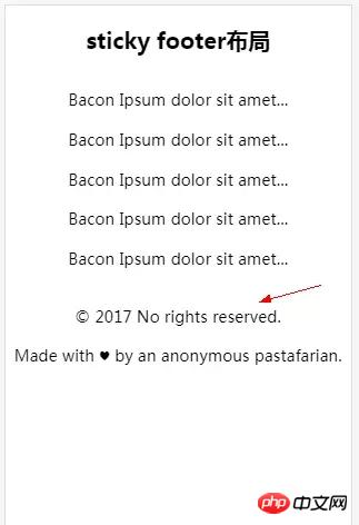
In normal document flow, when there is less content, the footer section is not always fixed at the bottom of the screen. At this time it’s time for the legendary sitcky footer layout to appear.
The sticky footer layout effect is as shown below:
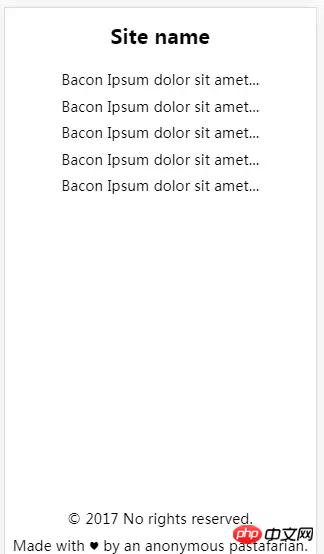
No matter how much content there is in the content area, the footer is always displayed at the bottom of the screen. When the content area exceeds the height of the screen. The footer will always appear at the very bottom of the page. Now that everyone knows the true face of sticky footer, let’s take a look at how it is implemented.
Sticky footer layout implementation
Negative margin layout method
html code:
<p class="detail">
     <p class="wrapper clearfix">
       <p class="title">
        <h1>这里是头部</h1>
       </p>
       <p class="main">
        <p>这里是main content区域...</p>
        <p>这里是main content区域...</p>
        <p>这里是main content区域...</p>
        <p>这里是main content区域...</p>
       </p>
     </p>
     <p class="footer">
       <p>© 2017 No rights reserved.</p>
    <p>Made with ♥ by an anonymous pastafarian.</p>
     </p>
</p>css code:
p,h1,p{margin:0; padding: 0;}
 .detail{
      position:fixed;
      overflow:auto;
      width:100%;
      height:100%;
    }
 .wrapper{
      min-height:100%;
      width:100%;
    }
 .title h1{
      font-size:40px;
      text-align: center;
    }
 .main{
      margin-top:64px;
      padding-bottom:64px;
    }
 .main p{
      font-size: 25px;
      text-align: center;
    }
 .footer{
      margin:-64px auto 0 auto;
      font-size:32px;
    }
 .footer p{
      text-align: center;
    }
 .clearfix::after {
      display: block;
      content: ".";
      height: 0;
      clear: both;
      visibility: hidden;
}Note: The padding-bottom in main and the negative margin value in footer must be consistent.
flex layout method
html code:
<header>
      <h1>Site name</h1>
  </header>
  <p class="main">
      <p>Bacon Ipsum dolor sit amet...</p>
      <p>Bacon Ipsum dolor sit amet...</p>
      <p>Bacon Ipsum dolor sit amet...</p>
      <p>Bacon Ipsum dolor sit amet...</p>
  </p>
  <footer>
      <p>© 2017 No rights reserved.</p>
      <p>Made with ♥ by an anonymous pastafarian.</p>
</footer>css code:
body{display: flex; flex-flow: column; min-height: 100vh; overflow:auto;}
    h1{font-size: 60px; text-align: center;}
    p{font-size: 24px; text-align: center;}
.main{flex:1;}The flex layout structure is simple and the code is streamlined. Because of the compatibility of flex, you need to pay attention when using this method of layout.
Summary
This concludes our discussion. I hope it will be helpful to my friends. This is also my first time recording a blog. I hope you guys will bear with me and provide guidance if there are some imperfections. The sticky footer layout is also a classic layout in CSS. Beginners should be familiar with this layout. Of course, if you use it a lot, you will naturally learn it.
Related recommendations:
Sticky Footer Detailed explanation of two absolute bottom routine examples
What is the layout of Sticky footer?
CSS Sticky Footer: Perfect CSS absolute bottom_html/css_WEB-ITnose
The above is the detailed content of Detailed explanation of CSS classic layout Sticky footer layout. For more information, please follow other related articles on the PHP Chinese website!

Hot AI Tools

Undresser.AI Undress
AI-powered app for creating realistic nude photos

AI Clothes Remover
Online AI tool for removing clothes from photos.

Undress AI Tool
Undress images for free

Clothoff.io
AI clothes remover

Video Face Swap
Swap faces in any video effortlessly with our completely free AI face swap tool!

Hot Article

Hot Tools

Notepad++7.3.1
Easy-to-use and free code editor

SublimeText3 Chinese version
Chinese version, very easy to use

Zend Studio 13.0.1
Powerful PHP integrated development environment

Dreamweaver CS6
Visual web development tools

SublimeText3 Mac version
God-level code editing software (SublimeText3)

Hot Topics
 1655
1655
 14
14
 1413
1413
 52
52
 1306
1306
 25
25
 1252
1252
 29
29
 1226
1226
 24
24
 What should I do if I encounter garbled code printing for front-end thermal paper receipts?
Apr 04, 2025 pm 02:42 PM
Frequently Asked Questions and Solutions for Front-end Thermal Paper Ticket Printing In Front-end Development, Ticket Printing is a common requirement. However, many developers are implementing...
 Demystifying JavaScript: What It Does and Why It Matters
Apr 09, 2025 am 12:07 AM
JavaScript is the cornerstone of modern web development, and its main functions include event-driven programming, dynamic content generation and asynchronous programming. 1) Event-driven programming allows web pages to change dynamically according to user operations. 2) Dynamic content generation allows page content to be adjusted according to conditions. 3) Asynchronous programming ensures that the user interface is not blocked. JavaScript is widely used in web interaction, single-page application and server-side development, greatly improving the flexibility of user experience and cross-platform development.
 Who gets paid more Python or JavaScript?
Apr 04, 2025 am 12:09 AM
There is no absolute salary for Python and JavaScript developers, depending on skills and industry needs. 1. Python may be paid more in data science and machine learning. 2. JavaScript has great demand in front-end and full-stack development, and its salary is also considerable. 3. Influencing factors include experience, geographical location, company size and specific skills.
 How to achieve parallax scrolling and element animation effects, like Shiseido's official website?
or:
How can we achieve the animation effect accompanied by page scrolling like Shiseido's official website?
Apr 04, 2025 pm 05:36 PM
Discussion on the realization of parallax scrolling and element animation effects in this article will explore how to achieve similar to Shiseido official website (https://www.shiseido.co.jp/sb/wonderland/)...
 The Evolution of JavaScript: Current Trends and Future Prospects
Apr 10, 2025 am 09:33 AM
The latest trends in JavaScript include the rise of TypeScript, the popularity of modern frameworks and libraries, and the application of WebAssembly. Future prospects cover more powerful type systems, the development of server-side JavaScript, the expansion of artificial intelligence and machine learning, and the potential of IoT and edge computing.
 How to merge array elements with the same ID into one object using JavaScript?
Apr 04, 2025 pm 05:09 PM
How to merge array elements with the same ID into one object in JavaScript? When processing data, we often encounter the need to have the same ID...
 JavaScript Engines: Comparing Implementations
Apr 13, 2025 am 12:05 AM
Different JavaScript engines have different effects when parsing and executing JavaScript code, because the implementation principles and optimization strategies of each engine differ. 1. Lexical analysis: convert source code into lexical unit. 2. Grammar analysis: Generate an abstract syntax tree. 3. Optimization and compilation: Generate machine code through the JIT compiler. 4. Execute: Run the machine code. V8 engine optimizes through instant compilation and hidden class, SpiderMonkey uses a type inference system, resulting in different performance performance on the same code.
 How to implement panel drag and drop adjustment function similar to VSCode in front-end development?
Apr 04, 2025 pm 02:06 PM
Explore the implementation of panel drag and drop adjustment function similar to VSCode in the front-end. In front-end development, how to implement VSCode similar to VSCode...


