JS implements transparent gradient of navigation bar
This time I will bring you JS to realize the transparent gradient of the navigation bar. What are the precautions for realizing the transparent gradient of the navigation bar with JS. The following is a practical case, let's take a look.
mui has a built-in H5 version of the transparent gradient navigation control. For tutorials, please refer to the mui official website; transparent gradient navigation is a workaround to solve the problem of scroll bars reaching the top. Compared with dual webviews, it has higher performance and better performance. animation effect;
This article will share with you the implementation of MUI navigation bar transparent gradient effect based on native JS. The specific content details are as follows:
First of all, declare: Since the value of backgroundColor uses RGBA, which is not supported by IE8 and below, this effect does not support browsers of IE8 and below
css code
body,p,h1{margin: 0;}
.module-layer{
  width: 100%;
  position: fixed;
  top: 0;
  left: 0;
  z-index: 100000;
}
.module-layer-content{
  position: relative;
  min-width: 320px;
  max-width: 750px;
  width: 100%;
  margin: 0 auto;
  background-color: rgba(255, 0, 0, 0.9);
}
.module-layer-bg{
  width: 100%;
  height: 100%;
  background: #000;
  opacity: .7;
  position: absolute;
  top: 0;
  left: 0;
  z-index: -1;
}
.layer-head-name{
  height: 50px;
  line-height: 50px;
  text-align: center;
  padding: 0 50px;
  font-size: 20px;
}
.layer-return,.layer-share{
  width: 50px;
  height: 50px;
  line-height: 50px;
  text-align: center;
  position: absolute;
  top:0;
  z-index: 1;
}
.layer-return{left: 0;}
.layer-share{right: 0;}
.fixed-layer{
  height: 100%;
  display: none;
  z-index: 100001;
}
.relative-layer{height: 100%;}
.layer-content{
  padding:3%;
  position: relative;
  top: 20%;
}
.layer-close{
  width: 2rem;
  height: 2rem;
  position: absolute;
  top:3%;
  right: 3%;
}
.pr {
  position:relative;
}
#shop-input::-webkit-input-placeholder {
  color:#fff;
}
#shop-input:-moz-placeholder {
  color:#fff;
}
#shop-input::-moz-placeholder {
  color:#fff;
}
#shop-input:-ms-input-placeholder {
  color:#fff;
}
#shop-input {
  border:none;
  outline:none;
  background:transparent;
}
.search-box {
  height:30px;
  border-radius:20px;
  top:10px;
  overflow:hidden;
  z-index:10;
}
.search-box:after {
  content:'';
  display:block;
  width:100%;
  height:30px;
  background:#fff;
  opacity:.5;
  position:absolute;
  top:0;
  left:0px;
  z-index:-1;
}
#shop-input {
  height:28px;
  line-height:28px;
  font-size:16px;
  position:absolute;
  top:0;
  left:30px;
}
.shop-search {
  width:16px;
  height:16px;
  position:absolute;
  top:7px;
  left:6px;
}
.layer-return{
  background: url(images/return.png) no-repeat center center/12px 20px;
}
.layer-share{
  background: url(images/share.png) no-repeat center center/20px 30px;
}
a {
 -webkit-tap-highlight-color: transparent;
 -webkit-touch-callout: none;
 -webkit-user-select: none;
}
.module-content{
  min-width: 320px;
  max-width: 750px;
  width: 100%;
  margin: 0 auto;
  background: #fff;
}
.module-content p:first-child img{margin-top: 0;}
.module-content p img{
  display: block;
  width: 100%;
  margin-top: 10px;
}HTML code
<header class="module-layer">
  <p class="module-layer-content">
    <p class="layer-return"></p>
    <h1 class="layer-head-name">
      <p class="pr search-box">
        <img class="shop-search" src="images/search.png"/>
        <input id="shop-input" type="text" placeholder="搜索店内商品" value="" />
      </p>
    </h1>
    <p class="layer-share"></p>
  </p>
</header>
<p class="module-content">
  <p><img src="images/banner.png"/></p>
  <p><img src="images/banner1.png"/></p>
  <p><img src="images/banner3.png"/></p>
  <p><img src="images/banner4.jpg"/></p>
  <p><img src="images/banner5.png"/></p>
  <p><img src="images/banner6.png"/></p>
  <p><img src="images/banner7.jpg"/></p>
  <p><img src="images/banner8.jpg"/></p>
</p>
JS code
(function(){
//获取滚动条当前位置
function getScrollTop(){
var scrollTop = 0, bodyScrollTop = 0, documentScrollTop = 0;
if(document.body){
bodyScrollTop = document.body.scrollTop;
}
if(document.documentElement){
documentScrollTop = document.documentElement.scrollTop;
}
scrollTop = (bodyScrollTop - documentScrollTop > 0) ? bodyScrollTop : documentScrollTop;
return scrollTop;
}
//获取CSS样式
function getStyle(element, attr){
if(element.currentStyle){
return element.currentStyle[attr];
}else{
return window.getComputedStyle(element,null)[attr];
}
}
//获取原始backgroundColor值
var color = getStyle(document.getElementsByClassName('module-layer-content')[0],'backgroundColor');
//取到RGB
var colorRgb = color.substring(0,color.lastIndexOf(',') + 1);
//取到A
var colorA = color.substring(color.lastIndexOf(',') + 1,color.length - 1);
//对A判断,如果最终值小于0.9,直接设置为1
if(colorA < 0.9){colorA = 1;}
//设置背景色的A的函数
var setCoverOpacity = function() {
document.getElementsByClassName('module-layer-content')[0].style.background = colorRgb + (((getScrollTop() / 550) > colorA) ? colorA : (getScrollTop() / 550)) + ')';
}
//初始化函数
setCoverOpacity();
//绑定滚动监听事件
window.addEventListener('scroll',setCoverOpacity,false);
}())Notice:
Not compatible with IE8 and belowIE browser;
550 is the final transparency of the scroll bar's arrival position, which can be customized as needed;
The A of RGBA of CSS final background color is the final transparency
I believe you have mastered the method after reading the case in this article. For more exciting information, please pay attention to other related articles on the PHP Chinese website!
Recommended reading:
mint-ui loadmore Pull-up loading and pull-down refresh conflict handling method
Templates in ES6 Detailed explanation of string usage
The above is the detailed content of JS implements transparent gradient of navigation bar. For more information, please follow other related articles on the PHP Chinese website!

Hot AI Tools

Undresser.AI Undress
AI-powered app for creating realistic nude photos

AI Clothes Remover
Online AI tool for removing clothes from photos.

Undress AI Tool
Undress images for free

Clothoff.io
AI clothes remover

Video Face Swap
Swap faces in any video effortlessly with our completely free AI face swap tool!

Hot Article

Hot Tools

Notepad++7.3.1
Easy-to-use and free code editor

SublimeText3 Chinese version
Chinese version, very easy to use

Zend Studio 13.0.1
Powerful PHP integrated development environment

Dreamweaver CS6
Visual web development tools

SublimeText3 Mac version
God-level code editing software (SublimeText3)

Hot Topics
 How to solve the black line problem of win11 transparent taskbar
Dec 22, 2023 pm 10:04 PM
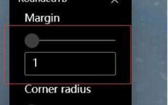
After many friends used translucenttb to set up a transparent taskbar, they found that there was a black line in the win11 transparent taskbar, which looked very uncomfortable. How should I solve it at this time? In fact, it can be solved in the software. There is a black line in the win11 transparent taskbar: Method 1: 1. According to user feedback, you can right-click translucenttb and open settings. 2. Then set the "margin" of the icon option to "1" to solve the problem. Method 2: 1. If it still doesn't work, you can right-click the blank space to open "Personalization" 2. Then select the system default theme to change it. Method three: 1. If all else fails, it is recommended that you uninstall translucenttb. 2. Then replace
 How to implement an online speech recognition system using WebSocket and JavaScript
Dec 17, 2023 pm 02:54 PM
How to use WebSocket and JavaScript to implement an online speech recognition system Introduction: With the continuous development of technology, speech recognition technology has become an important part of the field of artificial intelligence. The online speech recognition system based on WebSocket and JavaScript has the characteristics of low latency, real-time and cross-platform, and has become a widely used solution. This article will introduce how to use WebSocket and JavaScript to implement an online speech recognition system.
 WebSocket and JavaScript: key technologies for implementing real-time monitoring systems
Dec 17, 2023 pm 05:30 PM
WebSocket and JavaScript: Key technologies for realizing real-time monitoring systems Introduction: With the rapid development of Internet technology, real-time monitoring systems have been widely used in various fields. One of the key technologies to achieve real-time monitoring is the combination of WebSocket and JavaScript. This article will introduce the application of WebSocket and JavaScript in real-time monitoring systems, give code examples, and explain their implementation principles in detail. 1. WebSocket technology
 How to use JavaScript and WebSocket to implement a real-time online ordering system
Dec 17, 2023 pm 12:09 PM
Introduction to how to use JavaScript and WebSocket to implement a real-time online ordering system: With the popularity of the Internet and the advancement of technology, more and more restaurants have begun to provide online ordering services. In order to implement a real-time online ordering system, we can use JavaScript and WebSocket technology. WebSocket is a full-duplex communication protocol based on the TCP protocol, which can realize real-time two-way communication between the client and the server. In the real-time online ordering system, when the user selects dishes and places an order
 How to solve the problem of a line on the taskbar transparency in Win11?
Jan 29, 2024 pm 12:12 PM
Many Win11 users will set their taskbar to be transparent when running the system, but many users will see a black line appear on the taskbar after setting it up. So what is going on? Users can use third-party software to set it up. Let this website carefully introduce to users the solution to the problem of a transparent line on the win11 taskbar. Solution to the problem of a transparent line on the win11 taskbar. Method 1: 1. According to user feedback, you can right-click translucenttb and open settings. 2. Then set the margin of the icon option to 1 to solve the problem. 2. Then select the system default theme and change it to solve the problem.
 How to implement an online reservation system using WebSocket and JavaScript
Dec 17, 2023 am 09:39 AM
How to use WebSocket and JavaScript to implement an online reservation system. In today's digital era, more and more businesses and services need to provide online reservation functions. It is crucial to implement an efficient and real-time online reservation system. This article will introduce how to use WebSocket and JavaScript to implement an online reservation system, and provide specific code examples. 1. What is WebSocket? WebSocket is a full-duplex method on a single TCP connection.
 JavaScript and WebSocket: Building an efficient real-time weather forecasting system
Dec 17, 2023 pm 05:13 PM
JavaScript and WebSocket: Building an efficient real-time weather forecast system Introduction: Today, the accuracy of weather forecasts is of great significance to daily life and decision-making. As technology develops, we can provide more accurate and reliable weather forecasts by obtaining weather data in real time. In this article, we will learn how to use JavaScript and WebSocket technology to build an efficient real-time weather forecast system. This article will demonstrate the implementation process through specific code examples. We
 Simple JavaScript Tutorial: How to Get HTTP Status Code
Jan 05, 2024 pm 06:08 PM
JavaScript tutorial: How to get HTTP status code, specific code examples are required. Preface: In web development, data interaction with the server is often involved. When communicating with the server, we often need to obtain the returned HTTP status code to determine whether the operation is successful, and perform corresponding processing based on different status codes. This article will teach you how to use JavaScript to obtain HTTP status codes and provide some practical code examples. Using XMLHttpRequest


