

How to develop component libraries using React
This article mainly introduces the detailed explanation of component library development using React. Now I share it with you and give it as a reference.
Recently, I used react to encapsulate a set of [component libraries] for daily business needs, and roughly recorded my experiences during the entire development process. Due to space reasons, only the selection and packaging, which are more tangled during the development process, will be discussed here, and the packaging of specific components will be discussed later.
Overview
We all know that the component-based development model has greatly improved our development efficiency. By encapsulating the basic components we use daily, we can It greatly simplifies our focus on the basic UI, allows our work to focus on business logic, and separates the business and basic UI codes well, making the entire project more manageable. This is why we want to develop this component library. .
However, there are many existing React open source components, such as ant-design and material-ui, etc. Whether you need to spend effort to create a component library suitable for your own team often needs to be considered appropriately. Let’s take a look at some of the characteristics of my existing team and business:
There are many front-end personnel, they need to cooperate with each other, and they have enough time to develop components
The product business is relatively complex and requires customized development of certain components
There are already mature design specifications that define various basic components, basic styles, etc.
The current project is relatively messy, and the third-party component references are messy
It can be seen that we have the energy and foundation to encapsulate our own components, and we have The need to change the current development status through basic component encapsulation. So, this is something we should and need to get done as soon as possible.
Technical selection
For the encapsulation of component libraries, the first thing we face is technology selection and solution planning. It probably includes the following two points:
The most basic technical solution
Development process and specifications
Technical solution selection
Webpack React Sass
Since the team’s existing projects are all developed based on React Redux, the development language we choose is undoubtedly React.
SASS
For css selection, although now for component development, CSS Modules and CSS-IN-JS are more popular modular solutions, we prefer Our components are customizable. Therefore, for components, we use Sass as a precompiled language to improve efficiency and standardization. With css-modules, we can easily make style changes based on actual needs. For example, we have a Tab component, and we have defined its general style:
.tip-tab {
 border: 1px solid #ccc;
}
.tip-tab-item {
 border: 1px solid #ccc;

 &.active {
  border-color: red;
 }
}In business, for a certain requirement, we need to fine-tune the style of the Tab component. Let the border-color be blue in the active state. Of course you can say that we can let our components expose some props, configure them for these modifications, and pass in different props corresponding to different styles. However, we often cannot meet all business needs, and it is impossible to encapsulate various styles for components. For this solution, we use css-modules to add a unique module style:
<Tab styleName="unique-tab" />
For this module, modify its basic style:
.unique-tab {
 :global {
   .tip-tab-item {
    border-color: #eee;

    &.active {
     border-color: blue;
    }
   }
 }
}In this way, for this module Custom styles can be used to customize styles according to needs without polluting the global style.
Icon
For the project icon, it is planned to use the svg-sprite solution. However, because the product is in the process of continuous iteration, new icons are constantly being added. Currently, we do not package icons uniformly. Instead, we import all icons from the project during each component packaging process. Use the following method to introduce:
import Icon from '@common/lib'
import errorIcon from '@images/error.svg'

<Icon link={errorIcon} />In fact, a better way is to package all icons uniformly and generate svg-spirte files (the specific principle can be found in svg-sprite, which will not be described here). When we use it, we only need to quote it directly to avoid packaging every time and reduce the time webpack takes to process dependencies:
<Icon type="error" />
Development process and specifications
Regarding the development process and specifications, we follow the following principles:
The component library is developed completely independently of the project, which is convenient for subsequent use in multiple projects, etc.
The component library contains three modes: development, testing, packaging, and documentation cases, distinguishing different entrances and states
Use pure-renderautobind, etc. to ensure the performance and performance of components as much as possible Efficiency
Ensure the semantics of props and callbacks. For example, callbacks are processed uniformly using handleXXX
In order to facilitate subsequent expansion, we prefer that the entire The component library is developed completely separate from the project. Ensure that the component library only encapsulates the most basic components and separates the project UI code from business logic.
针对不同的模式下,我们有不同的文件入口,针对开发模式,我们启动一个dev-server, 在里面对组件进行基本的封装,并进行调试。打包时,我们只需对组件内容进行封装,暴露统一的接口。在文档中,我们需要进行案例和说明的展示。所以我们在利用webpack的特性进行各种环境的配置:
npm run dev // 开发
npm run test // 测试
npm run build // 构建
npm run styleguide // 文档开发
npm run styleguide:build // 文档打包
组件库作为项目的最小力度支持,我们需要保证其最基本的渲染效率,因此我们采用pure-render/autobind等对其进行基本的优化。React有很多优化方式,在此不进行赘述。
打包
基础
针对组件库的打包,我们以UMD格式对其进行打包。webpack可以针对输出进行格式设置:(引自cnode)
“var” 以变量方式输出
“this” 以 this 的一个属性输出: this[“Library”] = xxx;
“commonjs” 以 exports 的一个属性输出:exports[“Library”] = xxx;
“commonjs2” 以 module.exports 形式输出:module.exports = xxx;
“amd” 以 AMD 格式输出;
“umd” 同时以 AMD、CommonJS2 和全局属性形式输出。
配置如下:
output: {
 path: config.build.assetsRoot,
 filename: utils.assetsPath('js/[name].js'),
 chunkFilename: utils.assetsPath('js/[id].js'),
 library: 'TipUi',
 libraryTarget: 'umd'
}依赖
很明显,我们封装的是一个针对React的组件库,并不应该把React引用进去。一般我们可以采用externals的方式对其进行处理。
在这里, 我们采用dll方式将其与其他第三方依赖统一进行打包,并将manifest.json和三方依赖的输出文件输出到项目中去,在项目中也使用dllReference进行引用。避免在项目中使用到这些依赖时重复进行打包。
同时,由于我们的组件库处于一个不断维护的状态。这就需要我们维持好项目库和项目之间的打包关系,具体的流程如图所示:
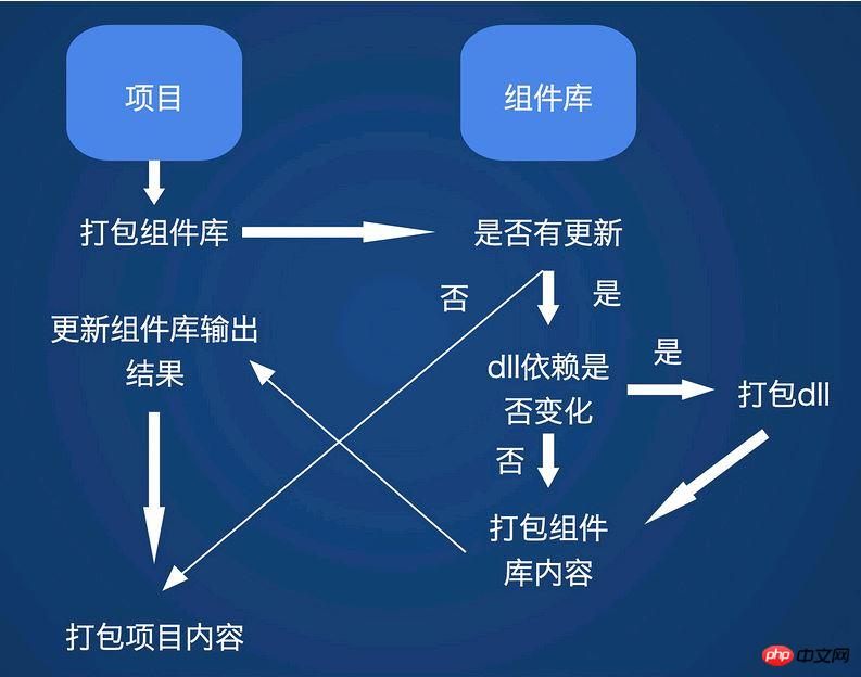
在每次进行项目打包的时候,首先检测UI库是否有更新,若没有更新,则直接进行打包。反之继续检测dll的依赖是否有变化,若有,则打包dll,否则直接打包组件库内容。然后将输出结果同步到项目中,再进行最终打包。
当然,以上的这些流程都是自动进行的。
文档和示例
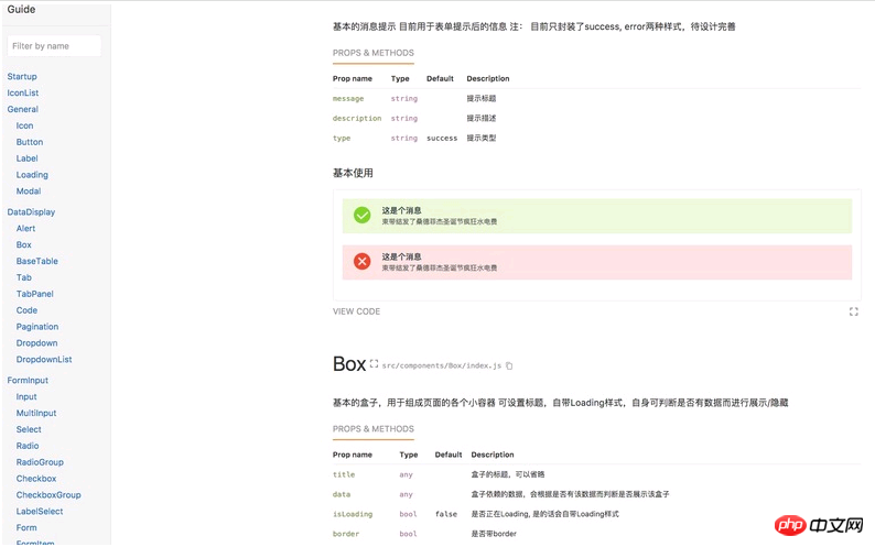
一个完善的文档对于一个组件库是及其重要的,每个组件有什么样的配置参数,拥有哪些事件回调,对应的Demo和展示效果。假设没有这些,除了封装组件的人,没有人知道它该如何使用。但是写文档的过程往往是痛苦的,在这里推荐几个文档生成库,可以极大的简化文档工作:
docsify 基于Vue的组件生成器,轻量好用
react-styleguidist 基于React的组件库文档生成器,自动根据注释生成文档,支持Demo展示。超好用
bisheng ant design自己写的文档生成器
我们使用的styleguidist, 可以将md自动转化为文档,支持在md内直接调用你封装好的组件并进行展示,简单好用。最后封装的文档大概长这样:
总结
其实封装组件库这种工作有很多的东西值得琢磨和钻研,由于篇幅原因,在这里只对开发过程中比较纠结的选型和打包等进行讨论,后续再对具体组件的封装进行讨论。在书写的同时,不断参考下ant design这种优秀的组件库,能学到很多的东西。更深刻的理解封装组件的思想,是一个很好的过程。
上面是我整理给大家的,希望今后会对大家有帮助。
相关文章:
The above is the detailed content of How to develop component libraries using React. For more information, please follow other related articles on the PHP Chinese website!

Hot AI Tools

Undresser.AI Undress
AI-powered app for creating realistic nude photos

AI Clothes Remover
Online AI tool for removing clothes from photos.

Undress AI Tool
Undress images for free

Clothoff.io
AI clothes remover

Video Face Swap
Swap faces in any video effortlessly with our completely free AI face swap tool!

Hot Article
Hot Tools

Notepad++7.3.1
Easy-to-use and free code editor

SublimeText3 Chinese version
Chinese version, very easy to use

Zend Studio 13.0.1
Powerful PHP integrated development environment

Dreamweaver CS6
Visual web development tools

SublimeText3 Mac version
God-level code editing software (SublimeText3)
Hot Topics


 React Router User Guide: How to implement front-end routing control
Sep 29, 2023 pm 05:45 PM
React Router User Guide: How to implement front-end routing control
Sep 29, 2023 pm 05:45 PM
ReactRouter User Guide: How to Implement Front-End Routing Control With the popularity of single-page applications, front-end routing has become an important part that cannot be ignored. As the most popular routing library in the React ecosystem, ReactRouter provides rich functions and easy-to-use APIs, making the implementation of front-end routing very simple and flexible. This article will introduce how to use ReactRouter and provide some specific code examples. To install ReactRouter first, we need
 PHP, Vue and React: How to choose the most suitable front-end framework?
Mar 15, 2024 pm 05:48 PM
PHP, Vue and React: How to choose the most suitable front-end framework?
Mar 15, 2024 pm 05:48 PM
PHP, Vue and React: How to choose the most suitable front-end framework? With the continuous development of Internet technology, front-end frameworks play a vital role in Web development. PHP, Vue and React are three representative front-end frameworks, each with its own unique characteristics and advantages. When choosing which front-end framework to use, developers need to make an informed decision based on project needs, team skills, and personal preferences. This article will compare the characteristics and uses of the three front-end frameworks PHP, Vue and React.
 Vue component library recommendation: Quasar in-depth analysis
Nov 24, 2023 am 08:37 AM
Vue component library recommendation: Quasar in-depth analysis
Nov 24, 2023 am 08:37 AM
Vue component library recommendation: Quasar in-depth analysis introduction: Vue.js is a popular JavaScript framework for building user interfaces. Its ease of use and flexibility make it the first choice among developers. Quasar is a comprehensive UI component library based on Vue.js. It provides a large number of easy-to-use components and tools, which can help us quickly build beautiful and feature-rich web applications. This article will conduct an in-depth analysis of Quasar, explore its internal mechanisms, and provide specific code examples.
 Integration of Java framework and front-end React framework
Jun 01, 2024 pm 03:16 PM
Integration of Java framework and front-end React framework
Jun 01, 2024 pm 03:16 PM
Integration of Java framework and React framework: Steps: Set up the back-end Java framework. Create project structure. Configure build tools. Create React applications. Write REST API endpoints. Configure the communication mechanism. Practical case (SpringBoot+React): Java code: Define RESTfulAPI controller. React code: Get and display the data returned by the API.
 Vue component library recommendation: Element Plus in-depth analysis
Nov 24, 2023 am 08:36 AM
Vue component library recommendation: Element Plus in-depth analysis
Nov 24, 2023 am 08:36 AM
Vue is a popular JavaScript framework that is not only easy to learn and use, but also flexible and extensible. Its component library ElementPlus is a UI component library developed based on Vue3, with rich components and functions. This article will provide an in-depth analysis of ElementPlus and provide specific code examples. 1. What is ElementPlusElementPlus is a component library based on Vue3, which is ElementUI
 What is the difference between css framework and component library
Dec 26, 2023 pm 05:03 PM
What is the difference between css framework and component library
Dec 26, 2023 pm 05:03 PM
CSS framework and component library are two different concepts, but there is a certain relationship between them: 1. CSS framework is a tool that provides a complete set of styles, layouts and components, while component library is for a specific A library for designing and developing components or modules; 2. The CSS framework is used to quickly build web pages and applications, and the component library provides a series of reusable UI components; 3. The framework usually contains a series of predefined CSS Classes and styles, while each component in the component library has independent styles and behaviors.
 Vue.js vs. React: Project-Specific Considerations
Apr 09, 2025 am 12:01 AM
Vue.js vs. React: Project-Specific Considerations
Apr 09, 2025 am 12:01 AM
Vue.js is suitable for small and medium-sized projects and fast iterations, while React is suitable for large and complex applications. 1) Vue.js is easy to use and is suitable for situations where the team is insufficient or the project scale is small. 2) React has a richer ecosystem and is suitable for projects with high performance and complex functional needs.
 What closures does react have?
Oct 27, 2023 pm 03:11 PM
What closures does react have?
Oct 27, 2023 pm 03:11 PM
React has closures such as event handling functions, useEffect and useCallback, higher-order components, etc. Detailed introduction: 1. Event handling function closure: In React, when we define an event handling function in a component, the function will form a closure and can access the status and properties within the component scope. In this way, the state and properties of the component can be used in the event processing function to implement interactive logic; 2. Closures in useEffect and useCallback, etc.
