How to implement folding panels in WeChat mini programs
This article mainly introduces the relevant information of WeChat applet to implement folding panel in detail. It has certain reference value. Interested friends can refer to it.
The example in this article is shared with everyone on WeChat. The specific code of the mini program MUI folding panel is for your reference. The specific content is as follows
Implementation principle
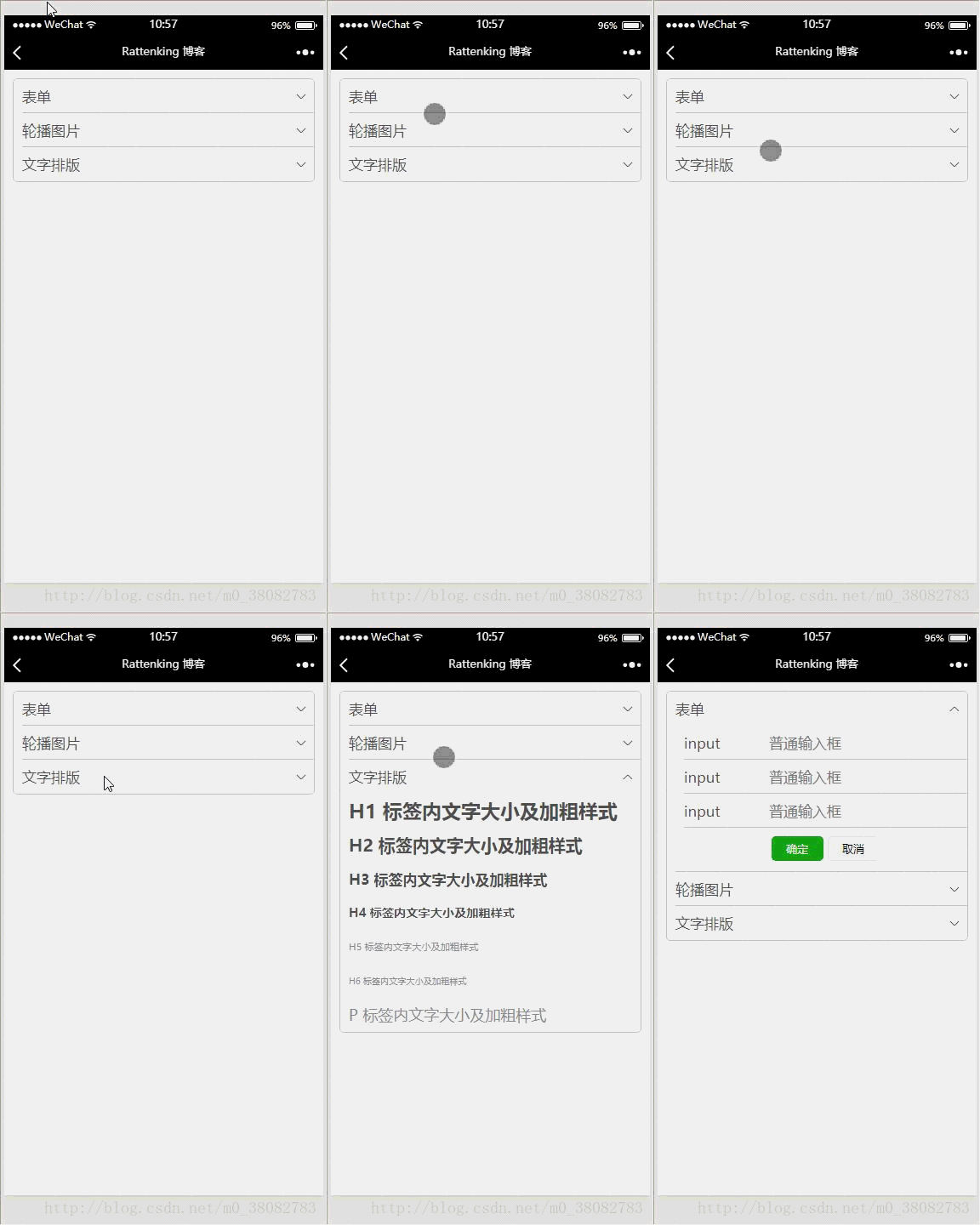
The folding effect is achieved by controlling the display and hiding of the details part. At the same time Toggle the down arrow on the right.
Rendering
<!--pages/accordion/accordion.wxml-->
<view class="tui-accordion-content">
<view class="tui-menu-list {{isShowFrom1 ? 'tui-shangjiantou' : 'tui-xiajiantou'}}">
<view bindtap="showFrom" data-param="1"><text>表单</text></view>
<view class="tui-accordion-from {{isShowFrom1 ? '' : 'tui-hide'}}">
<view class="tui-menu-list tui-clear">
<text class="tui-input-name">input</text>
<input placeholder="普通输入框"></input>
</view>
<view class="tui-menu-list tui-clear">
<text class="tui-input-name">input</text>
<input placeholder="普通输入框"></input>
</view>
<view class="tui-menu-list tui-clear">
<text class="tui-input-name">input</text>
<input placeholder="普通输入框"></input>
</view>
<view class="tui-menu-list tui-clear" style="text-align:center;padding-top:20rpx;">
<button size="mini" type="primary">确定</button>
<button size="mini" style="margin-left:10rpx;">取消</button>
</view>
</view>
</view>
<view class="tui-menu-list {{isShowFrom2 ? 'tui-shangjiantou' : 'tui-xiajiantou'}}">
<view bindtap="showFrom" data-param="2"><text>轮播图片</text></view>
<view class="{{isShowFrom2 ? '' : 'tui-hide'}}">
<swiper class="tui-swiper" indicator-dots="{{indicatorDots}}" vertical="{{vertical}}"
autoplay="{{autoplay}}" interval="{{interval}}" duration="{{duration}}"
indicator-color="#fff" indicator-active-color="red">
<block wx:for-items="{{banner_url}}">
<swiper-item>
<block wx:if="{{item}}">
<image class="tui-img" src="{{item}}" mode="aspectFill"/>
</block>
<block wx:else>
<image src="../../images/default_pic.png" mode="aspectFill"></image>
</block>
</swiper-item>
</block>
</swiper>
</view>
</view>
<view class="tui-menu-list {{isShowFrom3 ? 'tui-shangjiantou' : 'tui-xiajiantou'}}">
<view bindtap="showFrom" data-param="3"><text>文字排版</text></view>
<view class="{{isShowFrom3 ? '' : 'tui-hide'}}">
<view class="tui-h1"><text>H1 标签内文字大小及加粗样式</text></view>
<view class="tui-h2"><text>H2 标签内文字大小及加粗样式</text></view>
<view class="tui-h3"><text>H3 标签内文字大小及加粗样式</text></view>
<view class="tui-h4"><text>H4 标签内文字大小及加粗样式</text></view>
<view class="tui-h5"><text>H5 标签内文字大小及加粗样式</text></view>
<view class="tui-h6"><text>H6 标签内文字大小及加粗样式</text></view>
<view class="tui-p"><text>P 标签内文字大小及加粗样式</text></view>
</view>
</view>
</view>/* pages/accordion/accordion.wxss */
.tui-accordion-content{
margin: 10px;
border: 1px solid #c8c7cc;
border-radius: 5px;
overflow: hidden;
}
.tui-accordion-from{padding-left: 0;}
.tui-accordion-from input{
height: 80rpx;
line-height: 80rpx;
}
.tui-input-name{
height: 80rpx;
float: left;
width: 200rpx;
}var banner = require("../../src/js/banner.js");
Page({
data: {
isShowFrom1: false,
isShowFrom2: false,
isShowFrom3: false,
indicatorDots: true,
vertical: false,
autoplay: true,
interval: 3000,
duration: 800,
banner_url: banner.bannerList
},
onLoad: function (options) {
},
showFrom(e){
var param = e.target.dataset.param;
this.setData({
isShowFrom1: param == 1 ? (this.data.isShowFrom1 ? false : true) : false,
isShowFrom2: param == 2 ? (this.data.isShowFrom2 ? false : true) : false,
isShowFrom3: param == 3 ? (this.data.isShowFrom3 ? false : true) : false
});
}
})Summary:
1 Each folding panel needs a Boolean variable to control;2 When controlling the hiding and display of details, the arrow on the right must be switched accordingly;
3 showFrom The function optimizes the modified ternary expression for each Boolean variable.
How to implement custom instructions in Vue?
How to modify the sub-component style through the parent component in vue
How to implement asynchronous component loading in vue webpack?
The above is the detailed content of How to implement folding panels in WeChat mini programs. For more information, please follow other related articles on the PHP Chinese website!

Hot AI Tools

Undresser.AI Undress
AI-powered app for creating realistic nude photos

AI Clothes Remover
Online AI tool for removing clothes from photos.

Undress AI Tool
Undress images for free

Clothoff.io
AI clothes remover

AI Hentai Generator
Generate AI Hentai for free.

Hot Article

Hot Tools

Notepad++7.3.1
Easy-to-use and free code editor

SublimeText3 Chinese version
Chinese version, very easy to use

Zend Studio 13.0.1
Powerful PHP integrated development environment

Dreamweaver CS6
Visual web development tools

SublimeText3 Mac version
God-level code editing software (SublimeText3)

Hot Topics
 1376
1376
 52
52
 Xianyu WeChat mini program officially launched
Feb 10, 2024 pm 10:39 PM
Xianyu's official WeChat mini program has quietly been launched. In the mini program, you can post private messages to communicate with buyers/sellers, view personal information and orders, search for items, etc. If you are curious about what the Xianyu WeChat mini program is called, take a look now. What is the name of the Xianyu WeChat applet? Answer: Xianyu, idle transactions, second-hand sales, valuations and recycling. 1. In the mini program, you can post idle messages, communicate with buyers/sellers via private messages, view personal information and orders, search for specified items, etc.; 2. On the mini program page, there are homepage, nearby, post idle, messages, and mine. 5 functions; 3. If you want to use it, you must activate WeChat payment before you can purchase it;
 WeChat applet implements image upload function
Nov 21, 2023 am 09:08 AM
WeChat applet implements picture upload function With the development of mobile Internet, WeChat applet has become an indispensable part of people's lives. WeChat mini programs not only provide a wealth of application scenarios, but also support developer-defined functions, including image upload functions. This article will introduce how to implement the image upload function in the WeChat applet and provide specific code examples. 1. Preparatory work Before starting to write code, we need to download and install the WeChat developer tools and register as a WeChat developer. At the same time, you also need to understand WeChat
 Implement the drop-down menu effect in WeChat applet
Nov 21, 2023 pm 03:03 PM
To implement the drop-down menu effect in WeChat Mini Programs, specific code examples are required. With the popularity of mobile Internet, WeChat Mini Programs have become an important part of Internet development, and more and more people have begun to pay attention to and use WeChat Mini Programs. The development of WeChat mini programs is simpler and faster than traditional APP development, but it also requires mastering certain development skills. In the development of WeChat mini programs, drop-down menus are a common UI component, achieving a better user experience. This article will introduce in detail how to implement the drop-down menu effect in the WeChat applet and provide practical
 Implement image filter effects in WeChat mini programs
Nov 21, 2023 pm 06:22 PM
Implementing picture filter effects in WeChat mini programs With the popularity of social media applications, people are increasingly fond of applying filter effects to photos to enhance the artistic effect and attractiveness of the photos. Picture filter effects can also be implemented in WeChat mini programs, providing users with more interesting and creative photo editing functions. This article will introduce how to implement image filter effects in WeChat mini programs and provide specific code examples. First, we need to use the canvas component in the WeChat applet to load and edit images. The canvas component can be used on the page
 Use WeChat applet to achieve carousel switching effect
Nov 21, 2023 pm 05:59 PM
Use the WeChat applet to achieve the carousel switching effect. The WeChat applet is a lightweight application that is simple and efficient to develop and use. In WeChat mini programs, it is a common requirement to achieve carousel switching effects. This article will introduce how to use the WeChat applet to achieve the carousel switching effect, and give specific code examples. First, add a carousel component to the page file of the WeChat applet. For example, you can use the <swiper> tag to achieve the switching effect of the carousel. In this component, you can pass b
 What is the name of Xianyu WeChat applet?
Feb 27, 2024 pm 01:11 PM
The official WeChat mini program of Xianyu has been quietly launched. It provides users with a convenient platform that allows you to easily publish and trade idle items. In the mini program, you can communicate with buyers or sellers via private messages, view personal information and orders, and search for the items you want. So what exactly is Xianyu called in the WeChat mini program? This tutorial guide will introduce it to you in detail. Users who want to know, please follow this article and continue reading! What is the name of the Xianyu WeChat applet? Answer: Xianyu, idle transactions, second-hand sales, valuations and recycling. 1. In the mini program, you can post idle messages, communicate with buyers/sellers via private messages, view personal information and orders, search for specified items, etc.; 2. On the mini program page, there are homepage, nearby, post idle, messages, and mine. 5 functions; 3.
 How to use PHP to develop the second-hand transaction function of WeChat applet?
Oct 27, 2023 pm 05:15 PM
How to use PHP to develop the second-hand transaction function of WeChat applet? As a popular mobile application development platform, WeChat applet is used by more and more developers. In WeChat mini programs, second-hand transactions are a common functional requirement. This article will introduce how to use PHP to develop the second-hand transaction function of the WeChat applet and provide specific code examples. 1. Preparation work Before starting development, you need to ensure that the following conditions are met: the development environment of the WeChat applet has been set up, including registering the AppID of the applet and setting it in the background of the applet.
 Implement image rotation effect in WeChat applet
Nov 21, 2023 am 08:26 AM
To implement the picture rotation effect in WeChat Mini Program, specific code examples are required. WeChat Mini Program is a lightweight application that provides users with rich functions and a good user experience. In mini programs, developers can use various components and APIs to achieve various effects. Among them, the picture rotation effect is a common animation effect that can add interest and visual effects to the mini program. To achieve image rotation effects in WeChat mini programs, you need to use the animation API provided by the mini program. The following is a specific code example that shows how to


