
 Web Front-end
JS Tutorial
JS implements the function of sliding left on the mobile terminal to display the delete button
Web Front-end
JS Tutorial
JS implements the function of sliding left on the mobile terminal to display the delete button
JS implements the function of sliding left on the mobile terminal to display the delete button

When I was working on a mobile project recently, I needed to implement a corresponding delete button when each item on a list page is slid to the left. In fact, it is very simple to implement this function. This article mainly introduces how to realize the delete button when sliding to the left on the mobile terminal based on js. Friends who need it can refer to
Recently when working on a mobile terminal project, it is necessary to realize that each item of a list page moves to the left. The corresponding delete button appears when sliding. I originally thought of using zepto's touch.js plug-in directly, because I had used this plug-in before to achieve the same function. It was quite easy to use at the time. Just use its swipeLeft and swipeRight methods. But when I started to use this function again today, I found that these two methods had no effect when used, and there was no response at all. I checked the information online and downloaded the latest versions of zepto and touch.js, but it didn't work. I don't know why? So this plugin was abandoned.
The following is the code I later implemented. In fact, it uses the touch event of native js, and then combines the coordinates of the touch point to determine the left and right swipes,
<!DOCTYPE html>
<html>
<head>
<meta charset="UTF-8">
<meta name="viewport" content="width=device-width, initial-scale=1.0, maximum-scale=1.0, user-scalable=no">
<title>js侧滑显示删除按钮</title>
<style>
*{margin:0;padding:0;}
body{font-size:.14rem;}
li{list-style:none;}
i{font-style:normal;}
a{color:#393939;text-decoration:none;}
.list{overflow:hidden;margin-top:.2rem;padding-left:.3rem;border-top:1px solid #ddd;}
.list li{overflow:hidden;width:120%;border-bottom:1px solid #ddd;}
.list li a{display:block;height:.88rem;line-height:.88rem;-webkit-transition:all 0.3s linear;transition:all 0.3s linear;}
.list li i{float:right;width:15%;text-align:center;background:#E2421B;color:#fff;}
.swipeleft{transform:translateX(-15%);-webkit-transform:translateX(-15%);}
</style>
<script>
//计算根节点HTML的字体大小
function resizeRoot(){
 var deviceWidth = document.documentElement.clientWidth,
  num = 750,
  num1 = num / 100;
 if(deviceWidth > num){
  deviceWidth = num;
 }
 document.documentElement.style.fontSize = deviceWidth / num1 + "px";
}
//根节点HTML的字体大小初始化
resizeRoot();

window.onresize = function(){
 resizeRoot();
};
</script>
</head>
<body>
<section>
<p class="list">
<ul>
<li><a href="#" rel="external nofollow" rel="external nofollow" rel="external nofollow" >侧滑显示删除按钮1<i>删除</i></a></li>
<li><a href="#" rel="external nofollow" rel="external nofollow" rel="external nofollow" >侧滑显示删除按钮2<i>删除</i></a></li>
<li><a href="#" rel="external nofollow" rel="external nofollow" rel="external nofollow" >侧滑显示删除按钮3<i>删除</i></a></li>
</ul>
</p>
<script>
//侧滑显示删除按钮
var expansion = null; //是否存在展开的list
var container = document.querySelectorAll('.list li a');
for(var i = 0; i < container.length; i++){
var x, y, X, Y, swipeX, swipeY;
container[i].addEventListener('touchstart', function(event) {
x = event.changedTouches[0].pageX;
y = event.changedTouches[0].pageY;
swipeX = true;
swipeY = true ;
if(expansion){ //判断是否展开,如果展开则收起
expansion.className = "";
}
});
container[i].addEventListener('touchmove', function(event){
X = event.changedTouches[0].pageX;
Y = event.changedTouches[0].pageY;
// 左右滑动
if(swipeX && Math.abs(X - x) - Math.abs(Y - y) > 0){
// 阻止事件冒泡
event.stopPropagation();
if(X - x > 10){ //右滑
event.preventDefault();
this.className = ""; //右滑收起
}
if(x - X > 10){ //左滑
event.preventDefault();
this.className = "swipeleft"; //左滑展开
expansion = this;
}
swipeY = false;
}
// 上下滑动
if(swipeY && Math.abs(X - x) - Math.abs(Y - y) < 0) {
swipeX = false;
}
});
}
</script>
</body>
</html>Perhaps you have also noticed that the implementation of native js for mobile adaptation has been added to the beginning of the page, mainly to facilitate the better display of mobile pages on screens of different sizes. , also in order to better present the design draft on screens of different sizes with very small errors. The main unit used is rem.
Mobile terminal adaptive js
<script>
//计算根节点HTML的字体大小
function resizeRoot(){
var deviceWidth = document.documentElement.clientWidth,
num = 750,
num1 = num / 100;
if(deviceWidth > num){
deviceWidth = num;
}
document.documentElement.style.fontSize = deviceWidth / num1 + "px";
}
//根节点HTML的字体大小初始化
resizeRoot();
window.onresize = function(){
resizeRoot();
};
</script>The principle is actually very simple, which is to calculate the root node html according to different screens font-size, and then use the principle of calculation of rem relative to the font-size of the root node html to realize the size, spacing, etc. of different elements.
Some people say that there is no need to use such js to judge. It is also possible to directly use the responsive @media screen of css3. In fact, I think it is so active on Android screens of various sizes. At the moment, @media screen seems a little unable to handle it.
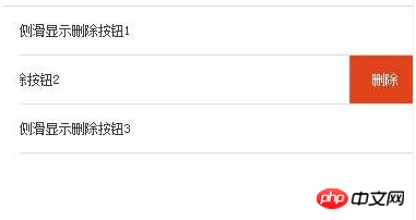
The rendering is as follows:
The above is the entire content of this article. I hope it will be helpful to everyone’s study. Please pay attention to more related content. PHP Chinese website!
Related recommendations:
How to use js to implement the horizontal drag and drop navigation bar function
Restrict the upload of uploadify in js Number
The above is the detailed content of JS implements the function of sliding left on the mobile terminal to display the delete button. For more information, please follow other related articles on the PHP Chinese website!

Hot AI Tools

Undresser.AI Undress
AI-powered app for creating realistic nude photos

AI Clothes Remover
Online AI tool for removing clothes from photos.

Undress AI Tool
Undress images for free

Clothoff.io
AI clothes remover

Video Face Swap
Swap faces in any video effortlessly with our completely free AI face swap tool!

Hot Article
Hot Tools

Notepad++7.3.1
Easy-to-use and free code editor

SublimeText3 Chinese version
Chinese version, very easy to use

Zend Studio 13.0.1
Powerful PHP integrated development environment

Dreamweaver CS6
Visual web development tools

SublimeText3 Mac version
God-level code editing software (SublimeText3)
Hot Topics
 1653
1653
 14
1413
52
1306
25
1251
29
1224
24
14
1413
52
1306
25
1251
29
1224
24

 Recommended: Excellent JS open source face detection and recognition project
Apr 03, 2024 am 11:55 AM
Recommended: Excellent JS open source face detection and recognition project
Apr 03, 2024 am 11:55 AM
Face detection and recognition technology is already a relatively mature and widely used technology. Currently, the most widely used Internet application language is JS. Implementing face detection and recognition on the Web front-end has advantages and disadvantages compared to back-end face recognition. Advantages include reducing network interaction and real-time recognition, which greatly shortens user waiting time and improves user experience; disadvantages include: being limited by model size, the accuracy is also limited. How to use js to implement face detection on the web? In order to implement face recognition on the Web, you need to be familiar with related programming languages and technologies, such as JavaScript, HTML, CSS, WebRTC, etc. At the same time, you also need to master relevant computer vision and artificial intelligence technologies. It is worth noting that due to the design of the Web side
 How to use JS and Baidu Maps to implement map pan function
Nov 21, 2023 am 10:00 AM
How to use JS and Baidu Maps to implement map pan function
Nov 21, 2023 am 10:00 AM
How to use JS and Baidu Map to implement map pan function Baidu Map is a widely used map service platform, which is often used in web development to display geographical information, positioning and other functions. This article will introduce how to use JS and Baidu Map API to implement the map pan function, and provide specific code examples. 1. Preparation Before using Baidu Map API, you first need to apply for a developer account on Baidu Map Open Platform (http://lbsyun.baidu.com/) and create an application. Creation completed
 Essential tools for stock analysis: Learn the steps to draw candle charts with PHP and JS
Dec 17, 2023 pm 06:55 PM
Essential tools for stock analysis: Learn the steps to draw candle charts with PHP and JS
Dec 17, 2023 pm 06:55 PM
Essential tools for stock analysis: Learn the steps to draw candle charts in PHP and JS. Specific code examples are required. With the rapid development of the Internet and technology, stock trading has become one of the important ways for many investors. Stock analysis is an important part of investor decision-making, and candle charts are widely used in technical analysis. Learning how to draw candle charts using PHP and JS will provide investors with more intuitive information to help them make better decisions. A candlestick chart is a technical chart that displays stock prices in the form of candlesticks. It shows the stock price
 How to create a stock candlestick chart using PHP and JS
Dec 17, 2023 am 08:08 AM
How to create a stock candlestick chart using PHP and JS
Dec 17, 2023 am 08:08 AM
How to use PHP and JS to create a stock candle chart. A stock candle chart is a common technical analysis graphic in the stock market. It helps investors understand stocks more intuitively by drawing data such as the opening price, closing price, highest price and lowest price of the stock. price fluctuations. This article will teach you how to create stock candle charts using PHP and JS, with specific code examples. 1. Preparation Before starting, we need to prepare the following environment: 1. A server running PHP 2. A browser that supports HTML5 and Canvas 3
 How to use JS and Baidu Map to implement map click event processing function
Nov 21, 2023 am 11:11 AM
How to use JS and Baidu Map to implement map click event processing function
Nov 21, 2023 am 11:11 AM
Overview of how to use JS and Baidu Maps to implement map click event processing: In web development, it is often necessary to use map functions to display geographical location and geographical information. Click event processing on the map is a commonly used and important part of the map function. This article will introduce how to use JS and Baidu Map API to implement the click event processing function of the map, and give specific code examples. Steps: Import the API file of Baidu Map. First, import the file of Baidu Map API in the HTML file. This can be achieved through the following code:
 How to use JS and Baidu Maps to implement map heat map function
Nov 21, 2023 am 09:33 AM
How to use JS and Baidu Maps to implement map heat map function
Nov 21, 2023 am 09:33 AM
How to use JS and Baidu Maps to implement the map heat map function Introduction: With the rapid development of the Internet and mobile devices, maps have become a common application scenario. As a visual display method, heat maps can help us understand the distribution of data more intuitively. This article will introduce how to use JS and Baidu Map API to implement the map heat map function, and provide specific code examples. Preparation work: Before starting, you need to prepare the following items: a Baidu developer account, create an application, and obtain the corresponding AP
 PHP and JS Development Tips: Master the Method of Drawing Stock Candle Charts
Dec 18, 2023 pm 03:39 PM
PHP and JS Development Tips: Master the Method of Drawing Stock Candle Charts
Dec 18, 2023 pm 03:39 PM
With the rapid development of Internet finance, stock investment has become the choice of more and more people. In stock trading, candle charts are a commonly used technical analysis method. It can show the changing trend of stock prices and help investors make more accurate decisions. This article will introduce the development skills of PHP and JS, lead readers to understand how to draw stock candle charts, and provide specific code examples. 1. Understanding Stock Candle Charts Before introducing how to draw stock candle charts, we first need to understand what a candle chart is. Candlestick charts were developed by the Japanese
 The relationship between js and vue
Mar 11, 2024 pm 05:21 PM
The relationship between js and vue
Mar 11, 2024 pm 05:21 PM
The relationship between js and vue: 1. JS as the cornerstone of Web development; 2. The rise of Vue.js as a front-end framework; 3. The complementary relationship between JS and Vue; 4. The practical application of JS and Vue.
