

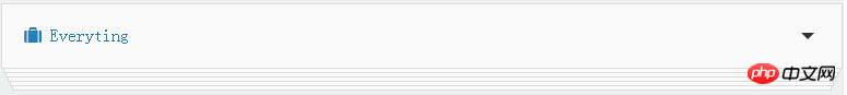
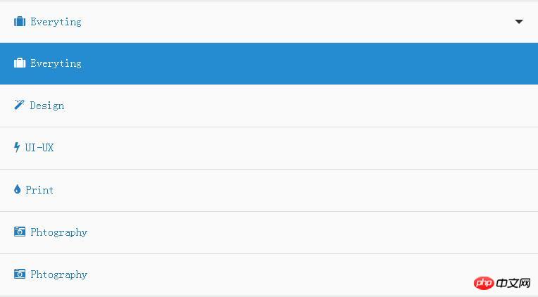
This is a very cool folding card-style drop-down list box effect made using jQuery and CSS3. Interested friends can refer to the
jQuery drop-down list box effect to separate each list The items are all made in the style of a card. Opening and closing it has the feeling of opening and closing blinds. The effect is very good, I would like to share it with everyone.
##Brief Tutorial
HTML structure
The list items of this drop-down list box effect are made using an unordered list, and the element used to switch the open and closed states is a hyperlink element .
<p class="container">
<p class="card-drop">
<a class='toggle' href="#">
<i class='fa fa-suitcase'></i>
<span class='label-active'>Everyting</span>
</a>
<ul>
<li class='active'>
<a data-label="Everyting" href="#"><i class='fa fa-suitcase'></i> Everyting</a>
</li>
......
</ul>
</p>
</p>CSS stylea.toggle element is used to toggle the opening of the drop-down list and closed status. In order to create the effect of flipping the card up when clicked, it is set with the transform-style: preserve-3d; attribute. At the same time, the origin of the transformation transform-origin: 50% 0%; is modified.
.card-drop > a.toggle {
 position: relative;
 z-index: 100;
 -moz-backface-visibility: hidden;
 -webkit-backface-visibility: hidden;
 backface-visibility: hidden;
 -moz-transform-style: preserve-3d;
 -webkit-transform-style: preserve-3d;
 transform-style: preserve-3d;
 -moz-transform-origin: 50% 0%;
 -ms-transform-origin: 50% 0%;
 -webkit-transform-origin: 50% 0%;
 transform-origin: 50% 0%;
 -moz-transition: linear 0.1s;
 -o-transition: linear 0.1s;
 -webkit-transition: linear 0.1s;
 transition: linear 0.1s;
}Corner triangle effect.
.card-drop > a.toggle:active {
 -moz-transform: rotateX(60deg);
 -webkit-transform: rotateX(60deg);
 transform: rotateX(60deg);
}
.card-drop > a.toggle:active:after {
 -moz-transform: rotateX(180deg);
 -webkit-transform: rotateX(180deg);
 transform: rotateX(180deg);
}
.card-drop > a.toggle:before, .card-drop > a.toggle:after {
 content: "";
 position: absolute;
}
.card-drop > a.toggle:before {
 right: 25px;
 top: 50%;
 margin-top: -2.5px;
 border-left: 6px solid transparent;
 border-right: 6px solid transparent;
 border-top: 6px solid rgba(0, 0, 0, 0.8);
}
.card-drop > a.toggle.active:before {
 transform: rotate(180deg);
}.card-drop ul {
position: absolute;
height: 100%;
top: 0;
display: block;
width: 100%;
}
.card-drop ul li {
margin: 0 auto;
-moz-transition: all, ease-out 0.3s;
-o-transition: all, ease-out 0.3s;
-webkit-transition: all, ease-out 0.3s;
transition: all, ease-out 0.3s;
position: absolute;
top: 0;
z-index: 0;
width: 100%;
}
.card-drop ul li a {
border-top: none;
}
.card-drop ul li a:hover {
background-color: #4aa3df;
color: #f3f9fd;
}
.card-drop ul li.active a {
color: #fff;
background-color: #258cd1;
cursor: default;
}
.card-drop ul li.closed a:hover {
cursor: default;
background-color: #3498db;
}JavaScript
In jQuery code, setClosed() function Used to close all list items. They are closed by default.function setClosed() {
li.each(function (index) {
$(this).css('top', index * 4).css('width', width - index * 0.5 + '%').css('margin-left', index * 0.25 + '%');
});
li.addClass('closed');
toggler.removeClass('active');
}
setClosed();toggler.on('mousedown', function () {
var $this = $(this);
if ($this.is('.active')) {
setClosed();
} else {
$this.addClass('active');
li.removeClass('closed');
li.each(function (index) {
$(this).css('top', 60 * (index + 1)).css('width', '100%').css('margin-left', '0px');
});
}
});links.on('click', function (e) {
var $this = $(this), label = $this.data('label');
icon = $this.children('i').attr('class');
li.removeClass('active');
if ($this.parent('li').is('active')) {
$this.parent('li').removeClass('active');
} else {
$this.parent('li').addClass('active');
}
toggler.children('span').text(label);
toggler.children('i').removeClass().addClass(icon);
setClosed();
e.preventDefault;
});About the jQuery plug-in Timelinr to implement timeline effects
JS and CSS realize a pop-up band after the mouse passes Buffer animation gradient effect DIV box
How to implement the balloon game in javascript css3
The above is the detailed content of jQuery and CSS3 folding card drop-down list box to achieve effect. For more information, please follow other related articles on the PHP Chinese website!


![[Web front-end] Node.js quick start](https://img.php.cn/upload/course/000/000/067/662b5d34ba7c0227.png)


