2D conversion module in HTML and CSS
This time I will bring you the 2D conversion module in HTML and CSS. What are the precautions for the 2D conversion module in HTML and CSS. The following is a practical case, let's take a look.
1. 2D conversion module
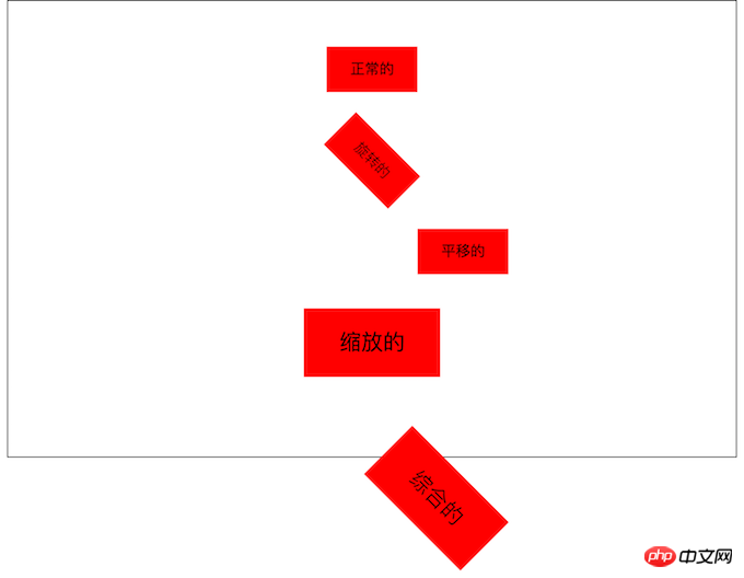
2D conversion module
/*where deg is the unit, representing how many degrees*/
transform: rotate(45deg);/*
First parameter: Horizontal direction
Second parameter: Vertical direction
*/transform: translate(100px, 0px);/*
First parameter: Horizontal direction
Two parameters: vertical direction
Note:
If the value is 1, it means no change
If the value is greater than 1, it means it needs to be enlarged
If the value is less than 1, it means it needs to be reduced
If the horizontal and vertical scaling are the same, then it can be abbreviated as a parameter
*//*transform: scale(0.5, 0.5);*/transform: scale(1.5);/*
Note:
1. If multiple transformations are required, separate them with spaces.
2. The 2D transformation module will modify the coordinate system of the element, so the translation after rotation is not a horizontal translation.
*/transform: rotate(45deg ) translate(100px, 0px);
2D conversion module

/*
第一个参数:水平方向
第二个参数:垂直方向
注意点
取值有三种形式
具体像素
百分比
特殊关键字
*/
/*transform-origin: 200px 0px;*/
/*transform-origin: 50% 50%;*/
/*transform-origin: 0% 0%;*/
/*transform-origin: center center;*/
transform-origin: left top;

<html lang="en"> <head>
<meta charset="UTF-8">
<title>95-2D转换模块-旋转轴向</title>
<style>
*{ margin: 0; padding: 0; }
ul{ width: 800px; height: 500px; margin: 0 auto; }
ul li{ list-style: none; width: 200px; height: 200px; margin: 0 auto; margin-top: 50px; border: 1px solid #000;
/* 1.什么是透视 近大远小
2.注意点 一定要注意, 透视属性必须添加到需要呈现近大远小效果的元素的父元素上面 */
perspective: 500px; } ul li img{ width: 200px; height: 200px;
/*perspective: 500px;*/
} ul li:nth-child(1){
/*默认情况下所有元素都是围绕Z轴进行旋转*/
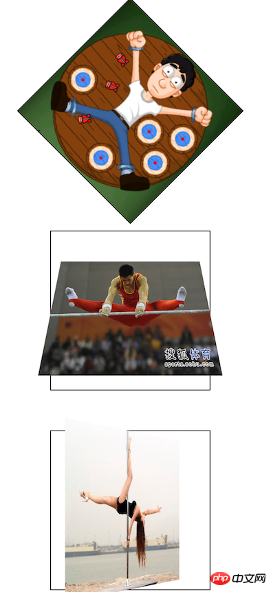
transform: rotateZ(45deg); } ul li:nth-child(2) img{ transform: rotateX(45deg); } ul li:nth-child(3) img{ /* 总结: 想围绕哪个轴旋转, 那么只需要在rotate后面加上哪个轴即可 */ transform: rotateY(45deg); } </style> </head> <body> <ul> <li></li> <li></li> <li></li> </ul> </body> </html>
<html lang="en">
<head>
<meta charset="UTF-8">
<title>96-2D转换模块-练习</title>
<style>
*{ margin: 0; padding: 0; }
p{ width: 310px; height: 438px; border: 1px solid #000;
background-color: skyblue; margin: 100px auto; perspective: 500px; }
p img{ transform-origin: center bottom; transition: transform 1s; }
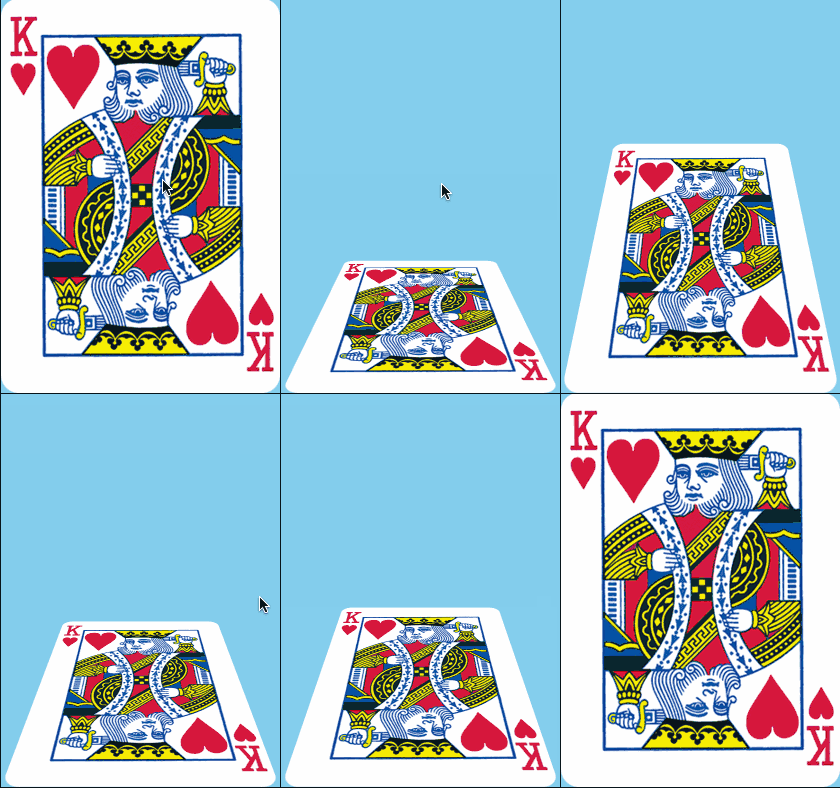
p:hover img{ transform: rotateX(80deg); }
</style> </head> <body> <p>  </p>
</body>
</html>
<html lang="en">
<head>
<meta charset="UTF-8">
<title>97-2D转换模块-相片墙</title>
<style>
*{ margin: 0; padding: 0; }
ul{ height: 400px; border: 1px solid #000;
background-color: skyblue; margin-top: 100px;
text-align: center; }
ul li{ list-style: none;
width: 150px; height: 200px;
background-color: red; display: inline-block;
//转换成行内块级元素,用于水平排版
margin-top: 100px; transition: all 1s;
position: relative; box-shadow: 0 0 10px; }
ul li:nth-child(1){ transform: rotate(30deg); }
ul li:nth-child(2){ transform: rotate(-40deg); }
ul li:nth-child(3){ transform: rotate(10deg); }
ul li:nth-child(4){ transform: rotate(45deg); }
ul li img{ width: 150px; height: 200px;
border: 5px solid #fff; box-sizing: border-box;
}
ul li:hover{ /*transform: rotate(0deg);*/
/*transform: none;*/ transform: scale(1.5);
//之前的旋转被层叠掉, 只执行放大
z-index: 998;
//显示在最上面
}
</style>
</head>
<body>
<ul>
<li></li>
<li></li>
<li></li>
<li></li>
</ul>
</body>
</html> The layout of web pages and clearing floats
The layout of web pages and floating
The above is the detailed content of 2D conversion module in HTML and CSS. For more information, please follow other related articles on the PHP Chinese website!

Hot AI Tools

Undresser.AI Undress
AI-powered app for creating realistic nude photos

AI Clothes Remover
Online AI tool for removing clothes from photos.

Undress AI Tool
Undress images for free

Clothoff.io
AI clothes remover

Video Face Swap
Swap faces in any video effortlessly with our completely free AI face swap tool!

Hot Article

Hot Tools

Notepad++7.3.1
Easy-to-use and free code editor

SublimeText3 Chinese version
Chinese version, very easy to use

Zend Studio 13.0.1
Powerful PHP integrated development environment

Dreamweaver CS6
Visual web development tools

SublimeText3 Mac version
God-level code editing software (SublimeText3)

Hot Topics
 How to use bootstrap in vue
Apr 07, 2025 pm 11:33 PM
Using Bootstrap in Vue.js is divided into five steps: Install Bootstrap. Import Bootstrap in main.js. Use the Bootstrap component directly in the template. Optional: Custom style. Optional: Use plug-ins.
 The Roles of HTML, CSS, and JavaScript: Core Responsibilities
Apr 08, 2025 pm 07:05 PM
HTML defines the web structure, CSS is responsible for style and layout, and JavaScript gives dynamic interaction. The three perform their duties in web development and jointly build a colorful website.
 React's Role in HTML: Enhancing User Experience
Apr 09, 2025 am 12:11 AM
React combines JSX and HTML to improve user experience. 1) JSX embeds HTML to make development more intuitive. 2) The virtual DOM mechanism optimizes performance and reduces DOM operations. 3) Component-based management UI to improve maintainability. 4) State management and event processing enhance interactivity.
 Understanding HTML, CSS, and JavaScript: A Beginner's Guide
Apr 12, 2025 am 12:02 AM
WebdevelopmentreliesonHTML,CSS,andJavaScript:1)HTMLstructurescontent,2)CSSstylesit,and3)JavaScriptaddsinteractivity,formingthebasisofmodernwebexperiences.
 How to set up the framework for bootstrap
Apr 07, 2025 pm 03:27 PM
To set up the Bootstrap framework, you need to follow these steps: 1. Reference the Bootstrap file via CDN; 2. Download and host the file on your own server; 3. Include the Bootstrap file in HTML; 4. Compile Sass/Less as needed; 5. Import a custom file (optional). Once setup is complete, you can use Bootstrap's grid systems, components, and styles to create responsive websites and applications.
 How to write split lines on bootstrap
Apr 07, 2025 pm 03:12 PM
There are two ways to create a Bootstrap split line: using the tag, which creates a horizontal split line. Use the CSS border property to create custom style split lines.
 How to insert pictures on bootstrap
Apr 07, 2025 pm 03:30 PM
There are several ways to insert images in Bootstrap: insert images directly, using the HTML img tag. With the Bootstrap image component, you can provide responsive images and more styles. Set the image size, use the img-fluid class to make the image adaptable. Set the border, using the img-bordered class. Set the rounded corners and use the img-rounded class. Set the shadow, use the shadow class. Resize and position the image, using CSS style. Using the background image, use the background-image CSS property.
 How to use bootstrap button
Apr 07, 2025 pm 03:09 PM
How to use the Bootstrap button? Introduce Bootstrap CSS to create button elements and add Bootstrap button class to add button text


