Bootstrap grid system study notes
How much do you know about the Bootstrap grid system?
1. Introduction
Bootstrap has a built-in responsive, mobile-first fluid grid system. As the screen device or viewport size increases, the system will automatically be divided into up to 12 columns. It contains easy-to-use predefined classes and powerful mixins for generating more semantic layouts.
2. Grid options
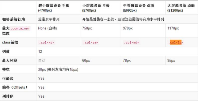
bootstrap3.x uses four grid options to form a grid system. These four options are introduced on the official website as shown below. Many people do not understand. Here is a detailed explanation of the four grids. The only difference between the options is that they are suitable for screen devices of different sizes. Let’s look at the class prefix. Let’s name these four grid options with the prefix. They are col-xs, col-sm, col-md, and col-lg. Those of us who understand English know that lg is large. Abbreviations, md is the abbreviation of mid, sm is the abbreviation of small, and xs is the abbreviation of ***. This naming reflects the different screen widths that these classes adapt to. Below we introduce the characteristics of these classes respectively.
Use the table below to see in detail how Bootstrap's grid system works on various screen devices.

3. Column offset
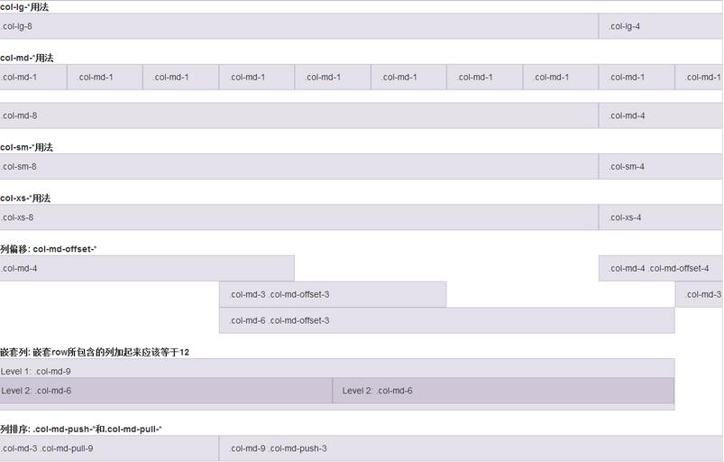
Use .col-md-offset-* to offset the column to the right. These classes increase the left margin of all columns by using the * selector. For example, .col-md-offset-4 moves .col-md-4 to the right by 4 columns of width.
4. Nested columns
In order to use the built-in grid to nest content, just add a new .row and a series of .col-md-* columns to the existing .col-md-* columns. accomplish. The sum of the columns contained in the nested row should equal 12.
5. Column sorting
You can easily change the order of columns by using .col-md-push-* and .col-md-pull-*.
Case
<%@ page language="java" pageEncoding="UTF-8"%>
<%
 String path = request.getContextPath();
%>
<!DOCTYPE html>
<html lang="zh-cn">
 <head>
  <title>栅格</title>
  <meta content="IE=edge" http-equiv="X-UA-Compatible">
  <meta http-equiv="Content-Type" content="text/html; charset=UTF-8" />
  <meta http-equiv="Content-Language" content="zh-cn" />
  <meta name="author" content="linjiqin218@126.com" />
  <meta name="Copyright" content="parami|厦门波罗密网络科技有限公司" />

  <meta http-equiv="pragma" content="no-cache">
  <meta http-equiv="cache-control" content="no-cache">
  <meta http-equiv="expires" content="0">

  <meta http-equiv="keywords" content="keyword1,keyword2,keyword3">
  <meta http-equiv="description" content="This is my page">
  <jsp:include page="/demo/base/js_bootstrap.jsp" />
  <style type="text/css">
  .show-grid [class ^="col-"] {
   padding-top: 10px;
   padding-bottom: 10px;
   background-color: #eee;
   border: 1px solid #ddd;
   background-color: rgba(86, 61, 124, .15);
   border: 1px solid rgba(86, 61, 124, .2);
  }
  </style>
  <script type="text/javascript">
  $(function(){
  });
  </script>
 </head>
 <body>
  <b>col-lg-*用法</b>
  <br/>
  <div class="row show-grid">
   <div class="col-lg-8">.col-lg-8</div>
   <div class="col-lg-4">.col-lg-4</div>
  </div>
  <br/>
  <b>col-md-*用法</b>
  <div class="row show-grid">
   <div class="col-md-1">.col-md-1</div>
   <div class="col-md-1">.col-md-1</div>
   <div class="col-md-1">.col-md-1</div>
   <div class="col-md-1">.col-md-1</div>
   <div class="col-md-1">.col-md-1</div>
   <div class="col-md-1">.col-md-1</div>
   <div class="col-md-1">.col-md-1</div>
   <div class="col-md-1">.col-md-1</div>
   <div class="col-md-1">.col-md-1</div>
   <div class="col-md-1">.col-md-1</div>
   <div class="col-md-1">.col-md-1</div>
   <div class="col-md-1">.col-md-1</div>
  </div>
  <br/>
  <div class="row show-grid">
   <div class="col-md-8">.col-md-8</div>
   <div class="col-md-4">.col-md-4</div>
  </div>
  <br/>
  <b>col-sm-*用法</b>
  <div class="row show-grid">
   <div class="col-sm-8">.col-sm-8</div>
   <div class="col-sm-4">.col-sm-4</div>
  </div>
  <br/>
  <b>col-xs-*用法</b>
  <div class="row show-grid">
   <div class="col-xs-8">.col-xs-8</div>
   <div class="col-xs-4">.col-xs-4</div>
  </div>
  <br/>
  <b>列偏移: col-md-offset-*</b>
  <div class="row show-grid">
   <div class="col-md-4">.col-md-4</div>
   <div class="col-md-4 col-md-offset-4">.col-md-4 .col-md-offset-4</div>
  </div>
  <div class="row show-grid">
   <div class="col-md-3 col-md-offset-3">.col-md-3 .col-md-offset-3</div>
   <div class="col-md-3 col-md-offset-3">.col-md-3 .col-md-offset-3</div>
  </div>
  <div class="row show-grid">
   <div class="col-md-6 col-md-offset-3">.col-md-6 .col-md-offset-3</div>
  </div>
  <br/>
  <b>嵌套列: 嵌套row所包含的列加起来应该等于12</b>
  <div class="row show-grid">
   <div class="col-md-9">
    Level 1: .col-md-9
    <div class="row show-grid">
     <div class="col-md-6">Level 2: .col-md-6</div>
     <div class="col-md-6">Level 2: .col-md-6</div>
    </div>
   </div>
  </div>
  <br/>
  <b>列排序: .col-md-push-*和.col-md-pull-*</b>
  <div class="row show-grid">
   <div class="col-md-9 col-md-push-3">.col-md-9 .col-md-push-3</div>
   <div class="col-md-3 col-md-pull-9">.col-md-3 .col-md-pull-9</div>
  </div>
 </body>
</html>Demonstration effect:


Hot AI Tools

Undresser.AI Undress
AI-powered app for creating realistic nude photos

AI Clothes Remover
Online AI tool for removing clothes from photos.

Undress AI Tool
Undress images for free

Clothoff.io
AI clothes remover

Video Face Swap
Swap faces in any video effortlessly with our completely free AI face swap tool!

Hot Article

Hot Tools

Notepad++7.3.1
Easy-to-use and free code editor

SublimeText3 Chinese version
Chinese version, very easy to use

Zend Studio 13.0.1
Powerful PHP integrated development environment

Dreamweaver CS6
Visual web development tools

SublimeText3 Mac version
God-level code editing software (SublimeText3)

Hot Topics
 1657
1657
 14
14
 1415
1415
 52
52
 1309
1309
 25
25
 1257
1257
 29
29
 1230
1230
 24
24
 How to use bootstrap in vue
Apr 07, 2025 pm 11:33 PM
Using Bootstrap in Vue.js is divided into five steps: Install Bootstrap. Import Bootstrap in main.js. Use the Bootstrap component directly in the template. Optional: Custom style. Optional: Use plug-ins.
 How to get the bootstrap search bar
Apr 07, 2025 pm 03:33 PM
How to use Bootstrap to get the value of the search bar: Determines the ID or name of the search bar. Use JavaScript to get DOM elements. Gets the value of the element. Perform the required actions.
 How to do vertical centering of bootstrap
Apr 07, 2025 pm 03:21 PM
Use Bootstrap to implement vertical centering: flexbox method: Use the d-flex, justify-content-center, and align-items-center classes to place elements in the flexbox container. align-items-center class method: For browsers that do not support flexbox, use the align-items-center class, provided that the parent element has a defined height.
 How to write split lines on bootstrap
Apr 07, 2025 pm 03:12 PM
There are two ways to create a Bootstrap split line: using the tag, which creates a horizontal split line. Use the CSS border property to create custom style split lines.
 How to insert pictures on bootstrap
Apr 07, 2025 pm 03:30 PM
There are several ways to insert images in Bootstrap: insert images directly, using the HTML img tag. With the Bootstrap image component, you can provide responsive images and more styles. Set the image size, use the img-fluid class to make the image adaptable. Set the border, using the img-bordered class. Set the rounded corners and use the img-rounded class. Set the shadow, use the shadow class. Resize and position the image, using CSS style. Using the background image, use the background-image CSS property.
 How to set up the framework for bootstrap
Apr 07, 2025 pm 03:27 PM
To set up the Bootstrap framework, you need to follow these steps: 1. Reference the Bootstrap file via CDN; 2. Download and host the file on your own server; 3. Include the Bootstrap file in HTML; 4. Compile Sass/Less as needed; 5. Import a custom file (optional). Once setup is complete, you can use Bootstrap's grid systems, components, and styles to create responsive websites and applications.
 How to use bootstrap button
Apr 07, 2025 pm 03:09 PM
How to use the Bootstrap button? Introduce Bootstrap CSS to create button elements and add Bootstrap button class to add button text
 How to resize bootstrap
Apr 07, 2025 pm 03:18 PM
To adjust the size of elements in Bootstrap, you can use the dimension class, which includes: adjusting width: .col-, .w-, .mw-adjust height: .h-, .min-h-, .max-h-


