

This article mainly introduces pure CSS to realize the folding tree effect of multi-level folding menu. The checked value of checkbox is used to determine whether the lower-level columns are expanded. This effect is achieved through the checked pseudo-class provided by the CSS3 selector. Interested friends Please refer to it, I hope it can help everyone.
1. Use the checked value of the checkbox to determine whether the lower-level column is expanded. The CSS3 selector provides the pseudo-class: checked. This pseudo-class provides us with execution when the element has the checked value. CSS.
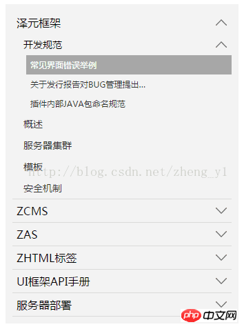
When there is a submenu, there is a downward arrow on the right side of the menu item. When the menu item is collapsed, the arrow points upward. Pictures can be replaced by yourself.
2. Rendering
3. Code snippet
<ol class="tree">
<li>
<label for="folder1" class="folderOne">泽元框架</label> <input type="checkbox" id="folder1" />
<ol>
<li>
<label for="subfolder1"class="folderTwo">开发规范</label> <input type="checkbox" id="subfolder1" />
<ol>
<li class="file folderThree"><a href="#">常见界面错误举例</a></li>
<li class="file folderThree"><a href="#">关于发行报告对BUG管理提出…</a></li>
<li class="file folderThree"><a href="#">插件内部JAVA包命名规范</a></li>
</ol>
</li>
<li class="file folderTwo"><a href="#">概述</a></li>
<li class="file folderTwo"><a href="#">服务器集群</a></li>
<li class="file folderTwo"><a href="#">模板</a></li>
<li class="file folderTwo"><a href="#">安全机制</a></li>
</ol>
</li>
<li>
<label for="folder2" class="folderOne" >ZCMS</label> <input type="checkbox" id="folder2" />
<ol>
<li class="file folderTwo"><a href="#">实时数据</a></li>
<li>
<label for="subfolder2" class="folderTwo">实时数据</label> <input type="checkbox" id="subfolder2" />
<ol>
<li class="file folderThree"><a href="#">实时数据</a></li>
<li class="file folderThree"><a href="#">实时数据</a></li>
<li class="file folderThree"><a href="#">实时数据</a></li>
</ol>
</li>
</ol>
</li>
<li>
<label for="folder3" class="folderOne">ZAS</label> <input type="checkbox" id="folder3" />
<ol>
<li class="file folderTwo"><a href="#">实时数据</a></li>
<li class="file folderTwo"><a href="#">实时数据</a></li>
</ol>
</li>
<li>
<label for="folder4" class="folderOne">ZHTML标签</label> <input type="checkbox" id="folder4"/>
<ol>
<li class="file folderTwo"><a href="#">实时数据</a></li>
<li class="file folderTwo"><a href="#">实时数据</a></li>
</ol>
</li>
<li>
<label for="folder5" class="folderOne">UI框架API手册</label> <input type="checkbox" id="folder5"/>
<ol>
<li class="file folderTwo"><a href="#">实时数据</a></li>
<li class="file folderTwo"><a href="#">实时数据</a></li>
</ol>
</li>
</ol>
<style type="text/css">
.tree {margin: 0;padding: 0;background-color:#f2f2f2;overflow: hidden;}
/*隐藏input*/
.tree li input{position: absolute;left: 0;opacity: 0;z-index: 2;cursor: pointer;height: 1em;width:1em;top: 0;}
/*所有菜单项设置统一样式*/
.tree li {position: relative;list-style: none;}
/*一级菜单加下边线*/
.tree>li{border-bottom: 1px solid #d9d9d9;}
/*给有子菜单的菜单项添加背景图标*/
.tree li label {max-width:999px;cursor: pointer;display: block;margin:0 0 0 -50px;padding: 15px 10px 15px 70px;background: url(../../images/cp-detail-arrow-b.png) no-repeat right center;background-position:95% 50%;white-space:nowrap;overflow:hidden;text-overflow: ellipsis; }
.tree li label:hover,li label:focus{background-color:#a7a7a7;color:#fff;}
/*清除所有展开的子菜单的display*/
.tree li input + ol{display: none;}
/*当input被选中时,给所有展开的子菜单设置样式*/
.tree input:checked + ol {padding-left:14px;height: auto;display: block;}
.tree input:checked + ol > li { height: auto;}
/*末层菜单为A标签,设置样式*/
.tree li.file a{margin:0 -10px 0 -50px;padding: 15px 20px 15px 70px;text-decoration:none;display: block;color:#333333;white-space:nowrap;overflow:hidden;text-overflow: ellipsis;}
.tree li.file a:hover,li.file a:focus{background-color:#a7a7a7;color:#fff;}
/*不同层级的菜单字体大小不同*/
.tree .folderOne{font-size: 18px;}
.tree .folderTwo{font-size:16px;}
.tree .folderThree{font-size:14px;}
</style>
<script type="text/javascript">
$(document).ready(function() {
//每个有子菜单的菜单项添加点击事件
$(".tree label").click(function(){
//获取当前菜单旁边input的check状态
var isChecked = $(this).next("input[type='checkbox']").is(':checked');
//展开和收齐的不同状态下更换右侧小图标
if(isChecked){
$(this).css(
"background-image","url(../images/cp-detail-arrow-b.png)"
);
}else{
$(this).css(
"background-image","url(../images/cp-detail-arrow-t.png)"
);
}
});
});
</script>Introduced below Next CSS menu folding
Let me show you the rendering first:
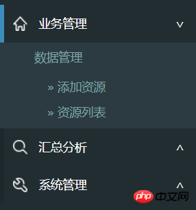
As above, assuming the first-level menu is p, The secondary menu is ul. It looks like:
<p>业务管理<span></span></p>
<ul>
...
<ul>

<p class="collapsed">汇总分析<span></span></</p>
<ul>
...
<ul>

<p class="collapsed">>系统管理<span></span></</p>
<ul>
...
<ul>
When the menu is expanded, there is a blue mark on the left and a fold mark on the right.
The blue mark on the left does not need a table. Just set the border with CSS. It is also very convenient to use CSS on the right.
p span { float:right; padding-right:20px; }
p span:after { content: "∨" }
p.collapsed span:after { content: "∧" }Then let’s talk about the folding effect of the submenu, there is animation:
p.collapsed + ul { height: 0px; transition: height 0.5s ease-out; }
p ul { height: 80px; transition: height 0.5s ease-in; }Note that ul must have height If the specific value of px is not specified, although it can be folded, there will be no animation effect.
The last step is to use jQuery or ezj to switch className. When p is clicked, toggleClass("collapsed") is used.
The above is the detailed content of css to achieve multi-level folding menu effect. For more information, please follow other related articles on the PHP Chinese website!


![[Web front-end] Node.js quick start](https://img.php.cn/upload/course/000/000/067/662b5d34ba7c0227.png)


