 Web Front-end
 PS Tutorial
 PS Web Design Tutorial XV – How to Create a Vibrant Portfolio of Web Designs in Photoshop
PS Web Design Tutorial XV – How to Create a Vibrant Portfolio of Web Designs in Photoshop
As a coder, my art foundation is weak. We can refer to some mature web PS tutorials to improve our design capabilities. To paraphrase a sentence, "If you are familiar with three hundred Tang poems, you can recite them even if you don't know how to compose them."
The tutorials in this series come from online PS tutorials, all from abroad, and all in English. I try to translate these excellent tutorials. Due to limited translation capabilities, the details of the translation still need to be worked out. I hope that netizens will give you some advice.
Convention:
1. The software used in this article is Photoshop CS5 version
2. The screenshots of the original tutorial are in English. I took them again based on the re-production. Chinese version of Figure
3. Some operations in the original text do not give parameters. I measured some parameters through repeated testing, which are shown in red text. For some wrong parameters, the correct parameters are displayed directly in red text
For example: (90, 22, 231, 77) , indicating that the coordinates of the upper left corner of the rectangle are (90, 22) , width 231, height 77
For example: (90,22), indicating that the coordinates of the upper left corner of the rectangle are (90,22), the other two parameters of the rectangle have been specified in the tutorial
4. My own experience will be attached at the end of the tutorial. Some are optimizations of some steps in the tutorial, etc.
In this web design tutorial, we will create a beautiful and colorful portfolio layout using Photoshop. I'll show you many techniques for creating different things like bended paper corners, dashed lines, image carousels, 3D bars, and more! I'll walk you through each step in exact detail so you won't be left guessing how to do a certain technique. We will use the 960 Grid System to create this layout (which I'll cover at the start).
In this tutorial, we are going to create a beautiful and colorful portfolio in PS. I'll show you many techniques used to create different things such as curved paper corners, dotted lines, image marquees, 3D banners, and more! I'll guide you through each step with precise detail so you don't have to guess what particular technique was used. We will create this layout using the 960 grid system (used from the beginning).
Step 1: Understanding the grid
Download the 960 Grid and unzip the archive. Inside the Photoshop template folder, you will find three . PSD files. Each one has a grid with certain number of columns (12, 16, and 24). For this layout, we will use the 16-column grid. So, open the file 960_grid_16_col.psd file in Photoshop. As you can see, you have 16 red (almost pinkish) vertical stripes inside your document. We will create the layout within these red vertical stripes.
In the Layers Panel you have two groups: “16 Col Grid” (which contains all the red vertical stripes) and “Layer 1″ (we don’t need this layer, so you can delete it).
To show or hide the grid, click on the eye icon of the “16 Col Grid” group in the Layers Panel to toggle its visibility. All the elements of the layout should be created beneath this group, so it has to be on top all the time. The .PSD file contains guidelines as well , which will be very helpful. To show or hide the guidelines go to View > Show > Guides (or press Ctrl/Cmd + ;).
This is pretty much everything you need to know about the grid .
Before we begin, make sure that your Info Panel is opened (Window > Info). During the tutorial, I will ask you to create shapes with a certain size and you will be able to see the exact width and height of your shapes in the Info panel while you are creating them.
Step 1: Understand the grid
Download 960 Grid and unzip 's archive. Inside the Photoshop templates folder, you will find three PSD files. Each has a grid with a certain number of columns (12, 16, and 24). For this layout, we will use a 16-column grid. So, open the file, 960_grid_16_col.psd, in Photoshop. You can see that you have 16 red (almost pink) vertical stripes in your document. We will create the web layout on these red vertical stripes.
In the layers panel there are two groups: "16 Col Grid" (which contains all the red vertical stripes) and "Layer 1" (we don't need this layer so you can delete it).
To show or hide the grid, click the eye icon of the "16 Col Grid" group in the Layers panel to toggle its visibility. The left and right elements of the web layout are created below this group, so it is always on top. The PSD file contains guide lines which will be very helpful. To show or hide the guides go to View > Show Guides (or press Ctrl/Cmd + ;).
This is pretty much all you need to know about grids.
In Before we begin, make sure you have the Info panel open (Window > Info). In this tutorial, I will ask you to create a shape with a certain scale. When you create a shape, you are in the Info panel. , you will be able to see the exact width and height.
Basic knowledge points and understanding of the basic situation of the layout system. This translation tutorial does not use a layout system.
Step 2: Modifying the size of the canvas
To give us more room height-wise, we need to increase the size of our canvas. Go to Image > Canvas Size and change the height to 1920px.
Step 2: Modify the size of the canvas
To give us more space in the height direction, we need to increase the size of our canvas. Click: Image > Canvas Size, height 1920px.
Since the 960 layout system is not used, this step is changed to create a new document, size: 1020px*1920px
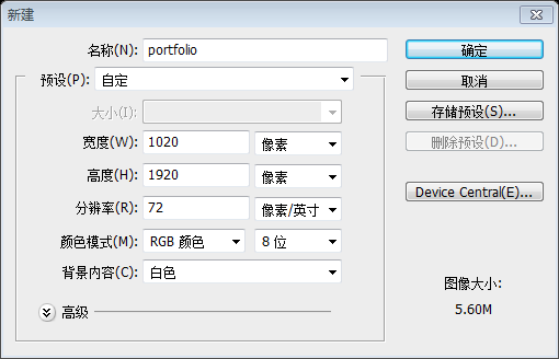
Step 3: Creating the layout's background
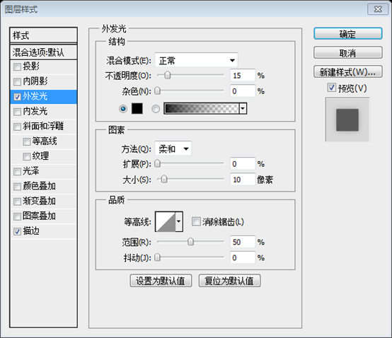
Select the Rectangle Tool (U) and create a white rectangle with the size 940px by 1920px. Make sure that Photoshop's Guides are activated (Ctrl/Cmd + ;) so that you can create the rectangle easily. Name this layer “bg“, double-click on it to open the Layer Style window and use the settings from the following image to apply an Outer Glow and Stroke layer style.
Step 3: Create the background of the layout
Use the Rectangle Tool to create a white rectangle(40,0), size: 940px*1920px. Make sure the PS guides are active (Ctrl/Cmd + ;) so that you can create a rectangle like this easily. Name the layer bg, double-click to open the layer style window, and add outer glow and stroke layer styles to it according to the settings below

Stroke color: #1f1907

Step 4: Creating the header
Create a new group and name it “header“. Then select the Rectangle Tool (U) and create a rectangle using the color #aedee1. Name this layer “header bg“, double-click on it, and use the settings from the following image for a Gradient Overlay layer style.
Step 4: Create the header Area
Create a new group header. Then select the Rectangle Tool and create a rectangle (40, 0, 940, 96) , color: #aedee1. Name it header bg, double-click the layer, and add a gradient overlay layer style according to the settings below


##Step 5: Site name letterpress type treatment
Select the Type Tool (T) and write the name of your layout using the color#93b9bb. I have used the font Museo 700 for the word “creative” and Museo 300 for “folio”.
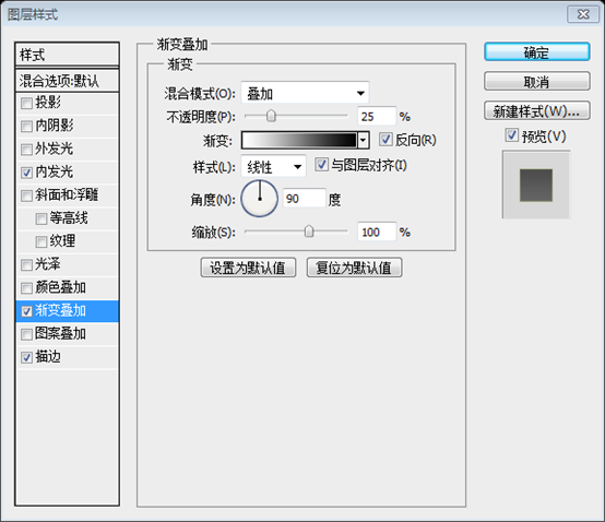
Now we will create a letterpress type treatment using Photoshop's layer styles. Double-click on your text layer to open the Layer Style window and use the settings from the following image forInner Shadow, Inner Glow, and Bevel and Emboss layer styles. By the way, if you want a more detailed tutorial on this technique, check out Jacob's Inset Typography tutorial on Six Revisions (which uses a different technique).
Step 5: Concave processing of the website name
Select the Text Tool (T) to write your website name, color: #93b9bb. Use the font Museo 700 for the creative text and Museo 300 for the folio text.
Now we will create a concave process using Photoshop layer styles. Double-click your text layer to open the Layer Styles window and set the Inner Shadow, Inner Glow, Bevel and Emboss layer styles as shown below. By the way, if you want a more detailed tutorial on this technique, check out Jacob’s Inset Typography tutorial (using a different technique) on Six Revisions.


#Step 6: Creating a small cloud in the header
Create a new group and name it “cloud“.
Then select the Ellipse Tool (U ), hold down the Shift key to maintain the proportions and create a few white circles with different sizes.Then arrange all these circles using the Move Tool (V) to form a cloud. Set the opacity of the “ cloud” group to80%.
Step 6: Create a small cloud in the head area
Create a new group and name it cloud.
(Specifically, this translation tutorial uses 5 circles)
Then use the Move Tool (V) to arrange the circles to form a cloud. Set the cloud group's opacity to 80%.
Step 7: Creating a “hire me” banner
Now we are going to create a small piece of paper and write a call-to-action text over it that will attract possible clients. A strong call to action is very important for a portfolio website because it encourages visitors who might be looking to hire a designer to get in touch with the website's owner.Create a new group and name it “hire me“. Then select the Rectangle Tool (U) and create a small rectangle in the right side of the header using the color #f7efda.
Name this layer “paper“, double-click on it to open the Layer Style window, and use the settings from the following image.
Step 7: Create a "hrie me" bulletin board
Now, we have to create a small A piece of paper with a call-to-action text on it to attract potential customers. An emphasized call-to-action text is very important for a portfolio website because it encourages potential hire designers to click on it and contact the website owner. Create a new group hire me. Then select the Rectangle Tool (U) and create a small rectangle(795, 15, 145, 81) on the right side of the head area with color: #f7efda.
Name this layer paper, double-click to open the layer style window, and set the style as shown below.


Step 8: Bending a corner of the paper
Now I will show you how to create a bent corner effect in Photoshop. First, click on the vector mask of the “paper” layer to make it active.
Then select the Pen Tool (P), make sure that the “Shape layers” button is activated and select the Subtract from shape area button from the Options bar.
Now use the Pen Tool (P) to create a triangle over the upper right corner of the yellow rectangle as you see in the following image.
Step 8: Fold the corner of the paper
Now, I will show you how to create a zigzag corner effect in Photoshop. First, activate the vector mask on the paper layer.
Then select the Pen Tool (P), make sure the mode is "Shape Layer" and select the "Subtract from Shape Area" button in the options bar.
Now use the Pen Tool (P) to create a triangle in the upper right corner of the yellow rectangle you see in the image below.
This step is a very interesting step that has never appeared in previous tutorials, so I will add a detailed process here. Since I am not good at using the pen tool, I used the rectangle tool instead during the explanation process.
First activate the vector mask of paper, click on the vector mask of the paper layer on the layer panel (the right one of the two rectangles on the paper layer).

Then select the rectangle tool, click on the "Shape Layer" and "Subtract from Shape Area" buttons

Draw a small square in the upper right corner of the rectangle on the paper layer (hold down the Shift key)
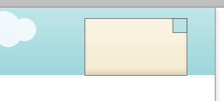
Use the direct selection tool to select the control point in the lower right corner of the small rectangle

Press the delete key on the keyboard to delete the control point in the lower left corner Control the points to form a triangle

Click the mouse on the remaining layers to complete this step

Step 9: Apply a Gradient Overlay on the bended paper
Create a new layer and use the Pen Tool (P) to create a triangle like the one you see in the following image using the color #f1e9d3.
Name this layer “corner“, double-click on it and use the settings from the following image for Gradient Overlay.
Step 9: Apply a gradient overlay to the folded paper
Create a new layer and using the Pen Tool (P) create a triangle with color: #f1e9d3, like the one seen in the image below.
Name this layer "corner", double-click the layer and set the gradient overlay as shown below.
For those who are not good at using the pen tool, you can use the rectangle tool and the direct selection tool to select a control point and then delete it to realize the triangle


#Step 10: Adding shadow to the paper corner
Create a new layer beneath the “corner” layer .Select the Pen Tool (P) and create a black triangle like the one from the following image.Right-click on the new layer and selectConvert to Smart Object.
Then go to Filter > Blur > Gaussian Blur and use a2px radius.
Add a mask to this layer (Layer > Layer Mask > Reveal All), select a small black brush tip (B) and paint with it over the shadow from the right side of the paper corner to erase it.Name this layer “shadow” and set its opacity to 15%.
Step 10: Add shadow
to the folded corner of the paper Below the corner layer, create a new layer. Select the Pen Tool (P) and create a black triangle like the image below.This step is better to copy the conner layer
Right-click the new layer and select "Convert to Smart Object".Perhaps due to the PS version, in the CS5 version, in order to complete the following steps, this step should be to rasterize the layer.
Then click: Filter > Blur > Gaussian Blur and use a 2px radius. Add a mask to this layer (Layer > Layer Mask > Show All), select a small black pen tip (B) and paint the shadow of the paper corner guard on the right side of it, placing its erased. Name this layer shadow and set its opacity to 15%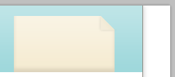
Step 11: Adding noise to the paper
Now we are going to add a little bit of noise to the paper to make it look more realistic. Ctrl/Cmd-click on the vector mask of the “paper” layer to make a selection of the paper. Create a new layer above all the other ones from this group and fill the selection with white (#ffffff) using the Paint Bucket Tool (G).
Convert this layer into a smart object, then go to Filter > Noise > Add Noise and use the settings from the following image.Name this layer “noise” and set its blending mode to Multiply and layer opacity to 15%.
In the following steps, we will add noise to other elements of the layout as well and I will refer to this step , so you might want to keep in mind this method.Step 11: Add Noise to Paper
Now we are going to add a little bit of noise to the paper to make it look more realistic. Press Ctrl/Cmd+Click on the vector mask of the paper layer to make a selection of the paper. Create a new layer above all other layers in this group, select the Paint Bucket Tool (G) and fill the selection with white (#FFFFFF).
Convert this layer to a smart object, then click: Filter > Noise > Add Noise, set as shown below.
Name this layer "noise" and set its blending mode to Multiply and change the layer opacity to 15%.
In the following steps we will add noise to the other elements, I will also repeat this step so you may want to keep this method in mind.


##Step 12: Adding a text over the paper
Now it's time to add your call-to-action text. Select the Horizontal Type Tool (T) and write a text over the paper using the color#514c3f and the font Museo.
Step 12: Add Text to Paper
Now it’s time to add your call-to-action text. Select the Horizontal Type Tool (T) and write the text on the paper using the color: #514c3f and the Museo font.
Step 13: Adding a paper airplane
Download a paper airplane image from the Internet and open it in Photoshop. Then use the Move Tool (V) to move the airplane into your document. The image I used is from GraphicRiver and it costs $3 (or $1 if you have a prepaid deposit).Convert this layer into a smart object. Then go to Edit > Free Transform (Ctrl/Cmd + T), hold down the Shift key to maintain the proportions, change the size of the paper airplane, and rotate it. My airplane is pointing to the call-to-action banner to make it even more noticeable.Go to Filter > Noise > Add Noise and use the settings from the following image. Then name this layer “paper airplane“, double-click on it to open the Layer Style window and use the settings from the image below for a Drop Shadow layer style.
Step 13: Add a Paper Plane
Download a paper airplane image from the internet and open it in Photoshop. Then use the Move Tool (V) to move the plane into your document. The image I used is from GraphicRiver, which costs $3 (or $1 if you have a prepaid deposit). Convert this layer to a smart object. Then click: Edit > Free Transform (Ctrl/Cmd+T), hold down the Shift key to maintain the proportions, change the size of the paper airplane, and rotate it. I pointed the call-to-action text to the bulletin board to make it more visible. Click on: Filter > Noise > to add noise, using the settings from the image below. Then name this layer paper airline, double-click it to open the layer style window, and set the layer style of the projection as shown below.

#Step 14: Creating a dashed line behind the airplane
I used Adobe Illustrator (yeah, I cheated just a tad bit, but you can use Photoshop for this too – it just won’t be as easy) to create a dashed line behind the plane. If you don’t have Illustrator, you can download and use my dashed line PNG image called dashed_line.png (tips for Windows users: right-click on one of the links and select Save As). Open it in Photoshop and position it on your canvas using the Move Tool (V).
Optional: for Adobe Illustrator users
If you do have Adobe Illustrator and know how to use it, you can follow the next steps. Open a new document (Ctrl/Cmd + N) and use the Rectangle Tool (M) to create a big gray rectangle. Then select the Pen Tool (P) and create a path like the one from the following image. Use a 1pt white (#ffffff) stroke and no fill. Then open the Stroke Panel (Window > Stroke) and use the settings from the following image.
Select your dashed line using the Selection Tool (V), copy it (Ctrl/Cmd + C), go back to Photoshop, and paste it as a smart object (Ctrl/Cmd + V).
Name this layer “line” and put it beneath the “paper airplane” layer. Use Free Transform (Ctrl/Cmd + T) to rotate this line the way you want.
步骤14:创建纸飞机后面的虚线
我用了Adobe Illustrator中(是的,我只是一个稍微有点被骗,但可以使用Photoshop解决这件事 - 它是不会那么容易)创建一个飞机后面的虚线。如果你没有Illustrator中,你可以下载和使用我的虚线dashed_line.png(提示Windows用户:右键单击的链接,选择“另存为”)的PNG图像。在Photoshop中打开它,和它放置在你的画布,使用移动工具(V)。
可选:Adobe Illustrator的用户
如果你有Adobe Illustrator和知道如何使用它,你可以按照下面的步骤。打开一个新文件(按Ctrl / Cmd+ N),使用矩形工具(M)创建一个大的灰色矩形。然后选择钢笔工具(P),像一个从下面的图片中创建一个路径。使用1点白色(#FFFFFF)描边和无填充。然后打开“笔触”面板(点击:窗口>描边),从下面的图片中使用的设置。
使用选择工具(V)选择您的虚线,将它复制(按Ctrl / Cmd+ C),返回到Photoshop中,作为一个智能对象(按Ctrl / Cmd+ V),并将其粘贴。
命名此层为line,并把它放在的paper airplane层的下方。使用自由变换(Ctrl / Cmd+ T),把这条虚线的移动到你想要的位置。

Step 15: Creating the navigation bar
Create a new group beneath the “header” group and name it “navigation bar“.
Then select the Rectangle Tool (U) and create a rectangle with the dimensions 940px by 40px and the color #c0e332. Name this layer “navigation bar bg“, double-click on it and use the settings from the following image.
步骤15:创建导航栏
在组header的下方创建一个新组navigation bar。
然后选择矩形工具(U)创建一个矩形(40,96),尺寸:940px*40px,颜色: #c0e332。命名此层为navigation bar bg,双击它按照下图进行设置。


Step 16: Make 1px lines for detail
Select the Line Tool (U), set the weight to 1px and create a horizontal line at the top of the navigation bar using the color #7e961d. Name this layer “1px dark line“.
Hit Ctrl/Cmd + J to duplicate this layer and move the new line at the bottom of the navigation bar.
Step 16: Add a 1px line to the detail section
Select the Line Tool (U) with its Weight set to 1px and create a horizontal line at the top of the navigation bar (40 , 96, 940, 1) , Color: #7e961d. Name this layer "1px dark line".
Press Ctrl/Cmd+J to copy this layer and move the new horizontal line to the bottom of the navigation bar (40, 135, 940, 1) .

Step 17: Give the 1px lines some depth
Create a new line with the weight of 1px using the Line Tool (U) and the color #d8fd42.
Name this layer “1px light line” and put it beneath the first dark line.
Duplicate this layer (Ctrl/Cmd + J) and put the new one above the second dark line.
Step 17: Make the 1px line look like depth
Use the Line Tool (U) with a thickness of 1px and create a new horizontal line with the color: #d8fd42.
Name this layer "1px light line" and move it below the first dark line (40, 97, 940, 1) .
Duplicate this layer (Ctrl/Cmd+J) and move it above the second dark line (40, 134, 940, 1) .

Step 18: Type out the navigation menu items
Select the Type Tool (T) and write the name for your navigation menu items. Use the font Museo 700 and the color #336600.
Step 18: Enter navigation menu items
Select the Type Tool (T) and enter a name for the navigation menu item. Use font museo700, color: #336600.

Step 19: Creating the featured content area
Create a new group above the “navigation bar ” group and name it “featured“.
Then select the Rectangle Tool (U) and create a rectangle with the dimensions 940px by 450px using the color #e6b633.
Name this layer “featured area bg“.
Steps 19: Create a featured content area
Create a new group featured above the navigation bar group.
Then select the Rectangle Tool (U) to create a rectangle (40, 136) , size: 940px*450px, color: #e6b633.
Name this layer as featured area bg

Step 20: Add 1px lines for detail
Web design is all about the details. Use the Line Tool (U) to create two horizontal lines with the weight 1px at the bottom of the yellow rectangle.
For the dark line, use the color #755c18 and name the layer “1px dark line“.
For the light line, use the color #ffdf87 and name its layer “1px light line“.
Step 20: Add 1px line of detail
Web design is all about the details. Use the Line Tool (U) to create two horizontal lines with a thickness of 1px at the bottom of the yellow rectangle.
For the dark line (40, 585, 960, 1) , use color: #755c18 and name the layer 1px dark line.
For the light line (40, 584, 960, 1) , use color: #ffdf87 and name the layer 1px light line.

Step 21: Adding noise to the featured content background
Now we will add some noise to the background of the featured content area just like we did with the paper. Ctrl/Cmd-click on the vector mask of the “featured area bg” layer to select the yellow rectangle. Then create a new layer and fill the selection with white ( #ffffff) using the Paint Bucket Tool (G).
Convert this layer into a smart object.
Then go to Filter > Noise > Add Noise and use the settings from the following image.
Set the blend mode of this layer to Multiply, lower the layer opacity to 25%, and name it “noise“.
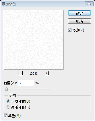
Step 21: Add noise to the featured content background
Now we will add some noise to the featured content area, Just like the background of our previous paper. Press Ctrl/Cmd+click on the vector mask of the featured area bg to outline the yellow rectangular selection. Then create a new layer and use the Paint Bucket Tool (G) to fill the selection with white (#FFFFFF).
Convert this layer to a smart object.
Then click: Filter > Noise > Add Noise, using the settings from the image below.
Set the blending mode of this layer to Multiply, lower the layer's opacity to 25%, and name it noise.

Step 22: Creating a blue bar for the headlines
Create a new group and name it “blue bar“.
Then select the Rectangle Tool (U) and create a rectangle like the one you see in the following image using the color #1e92e4.
Name this layer “blue bar” as well, double-click on it to open the Layer Style window and use the settings from the following image to add a Gradient Overlay and Stroke layer style to it.
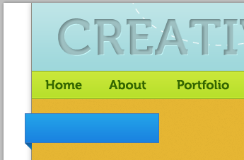
Then select the Move Tool (V) and move your rectangle 10px beyond the left edge of the layout and at a distance of 20px from the navigation bar.
Step 22: Create the title row A blue bar
Create a new group blue bar.
Then select the Rectangle Tool (U) and create a rectangle (30, 156, 190, 42) , color: #1e92e4, like the image below.
Name this layer blue bar, double-click to open the layer style window, and add a gradient overlay and stroke layer style as shown below.
Then select the Move Tool (V) and move the rectangle to 10px beyond the left edge and 20px from the upper navigation bar.

Stroke color: #3a77be


Step 23: Create the 3D effect
Create a new layer, select the Pen Tool (P) and create a small triangle beneath the lower left corner of the rectangle to make the blue bar look like it's 3D.
Name this layer “triangle“, double-click on it and use the settings from the following image for Gradient Overlay.
Step 23: Create a 3D Effect
Create a new layer, select the Pen Tool (P), and create a small triangle underneath the lower left corner of the rectangular blue bar,Color: #166ead, looks like its 3D shade.
This step can also be done by using the rectangle tool to create a new rectangle (30, 198, 10, 10), then directly select the tool to select the control point in the lower left corner of the rectangle, and press delete to delete the control point in the lower left corner. Click to get the triangle
Name this layer triangle, double-click the layer and set the gradient overlay as shown below.

Step 24: Add the text on the blue bar
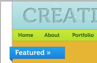
Select the Type Tool (T) and write “Featured »” on the blue bar using the font Museo 700 and the color #ffffff.
Step 24: Add text on the blue bar
Select the Type Tool (T) and write Featured »On the blue bar, use Font: Museo 700, Color: #FFFFFF.
Step 25: Adding images to the featured content area
Create a new group and name it “images“.
Then open three images that you like in Photoshop and crop each one to the dimensions 290px by 260px. I just used some random images and screengrabs from Six Revisions and from my site PSDBURN.
Move each image in your canvas using the Move Tool (V), arranging them like you see below.
Add an Inner Glow and a Stroke to each image using the settings from the following image to create a double stroke effect.
Steps 25: Add images in the featured content area
Create a new group iamges
Then open the images you like in Photoshop, each one is 260px*290px in size. I just used some random images and screengrabs from Six Revisions, and from my website PSDBURN.
Use the Move Tool (V) on your canvas and arrange them as you see in the image below. After calculation, the positions of these 3 pictures are (80, 207), (380, 207), (680, 207)
Add inner glow and outline to each image as shown below Edge settings to create a double stroke effect.

Stroke color: #5d5643


#Step 26: Creating a “read more” button
Create a new group and name it “buttons“.
Then select the Rounded Rectangle Tool (U), set the radius to6px and create a rounded rectangle using the color #f8c539.
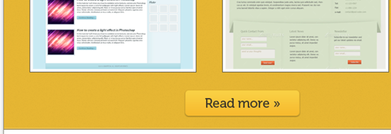
Double-click on this layer to open the Layer Style window and use the settings from the following image.Then select the Type Tool (T) and write “Read more »” on your button using the font Museo 500 and the color #3d382a.
Step 26: Create a read more button
Create a new group of buttons.
Then select the Rounded Rectangle Tool (U), set the radius to 6px, color: #f8c539, and create a rounded rectangle (322, 524, 179, 41) .
Double-click the layer to open the layer style window and set it as shown below.
Then select the Type Tool (T) and write Read more » on the button, using the font Museo 500 and the color: #3d382a.


##Step 27: Creating a “view portfolio” button
Duplicate the rounded rectangle layer which you have created at the previous step (Ctrl/Cmd + J) and move the new rounded rectangle to the right. Then change its color to#dfd7c0, and the stroke color to #ccc5b2.
Use the Type Tool (T), the font Museo 300 and the color#3d382a to write “View Portfolio” on your button.
Step 27: Create a view Portfolio button
Copy the rounded rectangle layer created in the previous step (press Ctrl/Cmd+J), and move it to the right side of the rounded rectangle(522, 524) . Then change its color to: #dfd7c0 and the stroke color to: #ccc5b2.
Use the Type Tool (T), font: Museo 300, color: #3d382a, and write View Portfolio
Step 28: Creating a lamp
Now we will create a lamp that will light the middle image from the featured content area. Create a new group and name it “lamp“. Then select the Rounded Rectangle Tool (U), set the radius to 7px and create a small rounded rectangle using the color #8f631e.
Double-click on this layer to open the Layer Style window and use the settings from the following image to applyInner Shadow, Inner Glow, Gradient Overlay, and Stroke layer styles.
Name this layer “wood“.
Add a little bit of noise to the wood part of the lamp just like you did with the paper at the Step 11. Use an amount of5% uniform and monochromatic noise.
Set the blend mode of this noise layer to Multiply35%.
Step 28: Create a Light
Now we will place a light in the middle of the featured content area Lighted lamp. Create a new group lamp. Then select the Rounded Rectangle Tool (U), set the radius to 7px and create a small rounded rectangle(475, 162, 66, 12) , color: #8f631e.
Double-click to open the layer style window, and use the image below to set the layer styles of inner shadow, inner glow, gradient overlay, and stroke. Name this layer wood. Add a little bit of noise to the wooden part of the lamp just like you did to the paper in step 11. Use an even distribution of 5% and a single color. Set the blending mode of the noise layer to Multiply and the opacity to 35%.


描边的颜色: #634513


Step 29: Creating the lamp shade of our lamp
We’ll create a lamp that sort of illuminates our featured work, which is not only symbolic of what the featured area means, but also to bring more attention to this section of the web layout. Select the Rounded Rectangle Tool (U) and create a rounded rectangle like the one from the following image using the color #9ce340.
Make sure that the vector mask of this layer is selected, click on the Exclude overlapping shape areas button from the Options bar and drag a new rectangle over the bottom half of the first one to erase that area. Take a look at the following image for reference.
Then double-click on this layer and use the settings from the image below to add Inner Glow, Bevel and Emboss, Gradient Overlay and Stroke layer styles.
步骤29:为我们的灯创建灯罩
我们将按顺序创建一盏灯,照亮我们的特色工作,这不仅是在的特色区域的符号,也希望带来更多的关注这部分的网络布局。选择圆角矩形工具(U)创建一个圆角矩形(439,168,141,39),半径设置为15px,像下面的图片,颜色: #9ce340。
单击选择这层的矢量蒙版,在选项栏上选择“从形状区域减去”按钮,并拖动一个新的矩形的在前一个矩形的下半部分,达到删除的目的。就像下面的图片一样。和之前做的纸片折角的做法是一样的。
然后双击这一层,从下面的图像中添加内发光,斜面和浮雕,渐变叠加和描边的图层样式。


Stroke color: #84b93d


#Step 30: Giving our lamp a nice gradient overlay
Duplicate the layer which you have created at the previous step (Ctrl/Cmd + J) and set its fill to0%. Right-click on this layer and select Clear Layer Style.
Then double-click on it and use the settings from the following image forGradient Overlay.
Step 30: Give our lights a nice gradient overlay
Copy the image created in the previous step layer (Ctrl/Cmd+J) and set its fill to %. Right-click the layer and select Clear Layer Style. Then double-click it and set up the gradient overlay as shown below.


Step 31: Add another gradient overlay on the lamp shade
Duplicate the layer from the previous step (Ctrl/Cmd + J) and use the settings from the following image forGradient Overlay.
Step 31: Add another gradient overlay to the lampshade
Duplicate the layer from the previous step (press Ctrl/Cmd+J) and set up the gradient overlay as shown below.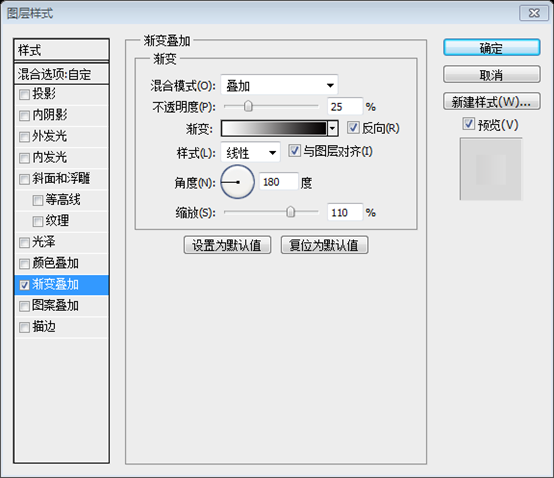

Step 32: Add noise to the lamp shade
Add some noise to the lamp to give it a bit of texture using the same technique which you have used for the paper at the Step 11. Set the blend mode of this noise layer toMultiply and set the layer opacity to 15%.
Step 32: Add noise
to the light Add some noise to give it a bit of texture, just like the technique you used for the paper in step 11. Set the blending mode of this noise layer to Multiply and set the layer opacity to 15%.

Step 33: Giving the lamp shade some depth
Duplicate the layer which you have created at the Step 29 (“Shape 1″) and put it above the “noise” layer.
Clear the layer style and change the color of this shape to #eef8e2.
Go to Edit > Free Transform (Ctrl/Cmd + T) and decrease the width of the shape as you see in the image below.
Add a mask to this layer (Layer > Layer Mask > Reveal All ), select the Gradient Tool (G) and drag a black to transparent gradient from the bottom to the middle of this shape.
Name this layer “highlight” and set its blend mode to Overlay and layer opacity to 20%.
Step 33: Give the lampshade some depth
Duplicate the layer created in step 29 and move it above the noise layer.
Clear the layer style and change the color of this shape: #eef8e2.
Click on: Edit > Free Transform (Ctrl/Cmd + T) and reduce the width of the shape when like you see in the image below.
Add a mask to this layer (click: Layer > Layer Mask > Show All), select the Gradient Tool (G), and select a black to transparent gradient from this shape Drag the gradient from bottom to middle.
Name this layer highlight, and set its blending mode to Overlay and layer opacity to 20%.


Step 34: Creating a light bulb
What would a lamp be without a light bulb? Create a new layer beneath the “Shape 1″ layer, select the Ellipse Tool (U) and create a circle (hold down the Shift key to create a perfect circle) using the color #f6f3a2.
Name this layer “light bulb“, double-click on it and use the settings from the following image for Inner Glow, Gradient Overlay, and Stroke layer styles.
Step 34: Create a light bulb
No How can a light bulb be considered a light? Create a new layer below the shade layer, select the Ellipse Tool (U) and create a circle (hold the Shift key to create a perfect circle) with the color: #f6f3a2.
Name this layer light bulb, double-click it to set the layer styles of inner glow, gradient overlay, and stroke as shown below.



Step 35: Creating the light sourcing from the lamp
Create a new layer above the “light bulb” layer.Then select the Pen Tool (P) and create a white shape like the one you see in the following image.
Convert this layer into a smart object.
Then go to Filter > Blur > Gaussian Blur and set the radius to 7px.
Name this layer “light” and set its opacity to 25%.
Step 35: Create the light emitted from the lamp
Create a new layer above the light bulb layer.
Then select the Pen Tool (P) and create a white shape like the one you see in the picture below.
If you are not used to using the pen tool, you can follow the steps below:
Create a new rectangle (377, 193, 266, 304), color: #f6f3a2

Press Ctrl+T to transform freely, right-click to select perspective, and drag the control point in the upper left corner to the appropriate position, as shown in the figure below :

Convert this layer to a smart object.
Then click: Filter > Blur > Gaussian Blur, set the radius to 7px.
Name this layer light and set its opacity to 25%.

#Step 36: Creating the right arrow of the image carousel
Create a new group and name it “right arrow”. Select the Ellipse Tool (U) and create a circle in the middle of the right edge of the featured content area. Use the color #e6b633. Name this layer “circle “.
Step 36: Create a revolving image of the right arrow
Create a new group right arrow. Select the Ellipse Tool (U) to create a circle centered on the right side of the featured content area. Use color: #e6b633. Name this layer circle.

#Step 37: Add noise to the right arrow
Add some noise over the yellow circle using the same technique which you have use at the Step 11 for the paper.
Step 37: Add noise to the right arrow
Add some noise to the yellow circle, using the same technique as adding noise to the paper in step 11. The layer blending mode is Multiply and the opacity is 25%


##Step 38: Adding a stroke to the circle
Duplicate the “circle” layer (Ctrl/Cmd + J) and put the new one beneath it.Double- click on this layer and use the settings from the following image to add anOuter Glow and a Stroke layer style.
Then add a mask to this layer (Layer > Layer Mask > Reveal All).Select the Gradient Tool (G) and drag a horizontal black to transparent gradient from the left side of the circle to the right side. Take a look at the following image for reference.Name this layer “stroke“.
Step 38: Add a stroke to the circle
Duplicate the circle layer (Ctrl/Cmd+J) and place the new layer below the circle layer.
Double-click the layer and set the outer glow and stroke layer styles as shown below.
Then add a mask layer (click: Layer > Layer Mask > Show All).
Select the Gradient Tool (G) and drag the horizontal black to transparent gradient from the left side of the circle to the right side (actually it should be the middle left side of the circle to the right side ). Take a look at the pictures below for reference.
Name this layer stroke.


#Step 39 : Create the actual arrows
Select the Custom Shape Tool (U) and create two arrows on your circle using the color#fbf2db. The custom shape used below is called Arrow 2 (it comes as a default shape in Photoshop as part of the Arrows custom shape group). I chose this shape because it most resembles the arrows in the “Featured” blue bar text, giving us some repeating design elements in the layout. Create 2 arrows in your garden, color: #fbf2db. The custom shape is called Arrow 2 (as one of the default shapes in Photoshop and part of the Arrow custom shapes group). I chose this shape because it most closely resembles the arrows in the text in the "Featured" blue column, which gives us just a few repeating design elements in the layout.
#Step 40: Creating the left arrow of the image carousel
Duplicate the “right arrow” group (right-click on it and select Duplicate Group).
left arrow“.
Step 40: Create a revolving image of the left arrow
Duplicate the right arrow group (right-click on it and select "Copy Group").
Click: Edit > Transform > Flip Horizontal, and use the Move Tool (V) to move to the left side of the layout. This group is named left arrow
Step 41: Adding the name of the images
Create a new group and name it “ image names
5px and create a white (#ffffff
) rounded rectangle at the bottom of each image from the featured content area.Add a Stroke
layer style to each of these rectangles using the settings from the following image.Then select the Type Tool (T) and write the name of your images inside these rectangles using the font Verdana and the color #38352c
.
Step 41: Add the name of the imageCreate a new group image names.
Select the Rounded Rectangle Tool (U), set the radius to 5px, and create a white rounded rectangle at the bottom of each image in the featured content area,respectively (110, 475, 200, 32) and (410, 475, 200, 32) and (710, 475, 200, 32)
.Set the stroke layer style for each rounded rectangle as shown below.
Then select the Type Tool (T) and write the name of each image, using Font: Verdana, Color: #38352c.
Stroke color: #999382


##Step 42: Creating the “services” area
Create a new group and name it “services“.
Select the Rectangle Tool (U) and create a rectangle with the height340px using the color #e6e2d5.
Name this layer “services bg” and set its opacity to 25%.
Step 42: Create Services Area
Create a new group servicesSelect the Rectangle Tool (U) Create a rectangle(40, 586, 940, 340) , height 340px, color: #e6e2d5.
Name this layer "services bg" and set its opacity to 25%.
Step 43: Add the “Services” blue bar
Duplicate the “blue bar” group from the featured area and move it inside the “services” group.Then use the Type Tool (T) to change the text “Featured” into “Services“.
Step 43: Add the blue bar of the service area
Copy the blue bar group in the featured area and move it from the featured area group to the services group. Then use the Text Tool (T) to change Featured to Services.
Step 44: Adding a list of services
Create a new group and name it “navigation“.
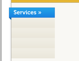
Select the Rectangle Tool (U) and create a rectangle beneath the blue one using the color#edeadf.
Double-click on this layer to open the Layer Style window and use the settings from the following image forGradient Overlay.
Duplicate this rectangle three times and arrange all of them using the Move Tool (V) .Step 44: Add a Service List
Create a new group navigationSelect the Rectangle Tool (U) on Create a rectangle(40, 648, 180, 42) below the blue bar, color: #edeadf.
Double-click to open the layer style window and set the gradient overlay as shown below. Duplicate this rectangle three times and use the Move Tool (V) to move it to the appropriate location.
Step 45: Create separators
Select the Line Tool (U) and create lines with the weight1px to separate the rectangles which you have created at the previous step. Use the color #d9d6c9. Then group all these layers (Ctrl/ Cmd + G) and name the group “separators“.
Step 45: Create separators
Select the 1px thick line created with the Line Tool (U) that separates the rectangle you created in the previous step. Color: #d9d6c9. Then select all these layers and merge them into a group (Ctrl/Cmd+G) and name it separators.
These five straight lines are (40, 689, 180, 1) and (40, 731, 180, 1) and (40, 773, 180, 1) and (40, 815, 180 ,1) and (219,648,1,168)

Step 46: Write out services you offer
Select the Type Tool (T) and write a list of services using the font Museo 300 and the color #3f3d36.
Step 46: List of provided services
Select the Type Tool (T) to write the list of services, font Museo 300, color: #3f3d36.

#Step 47: Adding an image for each service
Now we will add a representative image for each service listed. Create a new group and name it “images“. Then add an image cropped to the dimensions 160px by 210px. Copy the layer style from one of the images from the featured content area and paste it to this image to get the same double stroke effect.
Use the Rounded Rectangle Tool (U) to create a white rounded rectangle at the bottom of this image.
Then add a 1px #999381 stroke to this layer.
Select the Type Tool (T) and write the name of the first service from your list inside this rectangle using the font Verdana and the color #38352c.
Step 47: Add image# to each service
##Now we will add representative images for each service. Create a new group images. Then add an image(240, 606) , with a cropped size of 160px*210px. Copy the layer style of the featured content area image and paste it into that image to get the same double stroke effect.
Use the Rounded Rectangle Tool (U) to create a white rounded rectangle at the bottom of the image. Add a 1px stroke to this layer, color: #999381Use the text tool to write the name of the first service in the service list in the rectangle, font: Verdana, color: #38352c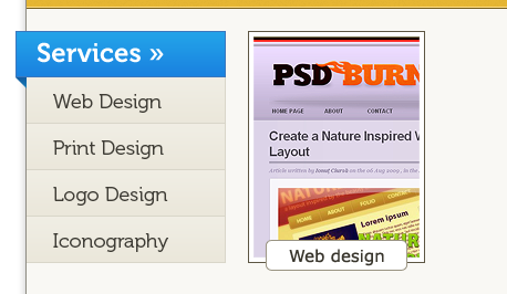
Step 48: Add more images
Add three more images and repeat the previous step for each one.Then move the second and the fourth images20px down (select the images, chose the Move Tool (V), hold down the Shift key and hit the down arrow key twice). This looks a little bit more interesting than having every image aligned the same way.
Step 48: Add more images
Add three more images and repeat the previous steps for each one. Then move the second and fourth down 20 px (select the image of the picture, select the Move Tool (V), hold down the Shift key and press the Down Arrow key twice). This is a bit more interesting to look at than having every image aligned.
Step 49: Adding two call-to-action buttons
Duplicate the two buttons from the featured content area and move them beneath the images from the services area using the Move Tool (V). Then change the text of the yellow button into “Hire me today!” and write a few words before it. Take a look at the following image for reference.
Now the visitors/potential clients who like the works presented in the portfolio site have two options here: to hire the designer or to view more of his work. Through these call-to-action buttons, we want to encourage the potential clients to take action and get in touch with us for a new project. Since “Hire me today!” is our most desired call-to-action, we use a more prominent color for it, as well as position it to the left, which for left-to-right English language readers, would be the first thing they would see.
Step 49: Add two function buttons
Copy the two buttons in the Featured Content area and use the Move Tool (V) to move them under the image in the Services area. Then change the text of the yellow button to Hire me today! and write a sentence in front of it. Take a look at the pictures below for reference.
Potential clients who like the work presented in a portfolio website have two options: hire the designer or view his work. Through these functional buttons, we want to encourage potential customers to contact us proactively and get a new project. Thanks Hire me today! For the action we wanted most, we made it use a more prominent color, and position it to the left so that English readers from left to right would be the first button they see.

Step 50: Adding two separators
Create two lines with the weight of 1px at the bottom of the services area. Use the color #c0bcb1 for the first line and #ffffff for the second one.
Step 50: Add 2 Separators
Create 2 horizontal straight lines with a thickness of 1px at the bottom of the service area. The first straight line (40, 925, 940, 1) color: #c0bcb1, the second straight line (40, 924, 940, 1) color: #ffffff

Step 51: Creating a background for the blog area
Create a new group beneath the “services” group and name it “blog“. This will feature excerpts from blog posts, which many portfolios nowadays have.
Select the Rectangle Tool (U) and create a rectangle with the height 345px using the color #f8f5ec.
Name this layer “blog bg” and set its opacity to 25%.
Step 51: Create the background of the blog area
Under the services group, create a new group blog. This will have a summary of the blog posts, and we have a lot of blog posts now.
Select the Rectangle Tool (U) to create a rectangle (40, 926, 940, 345) , color: #f8f5ec.
Name this layer blog bg and set its opacity to 25%.

Step 52: Adding a blue bar to the blog area
Duplicate the “blue bar” group from the services area and move it down.
Use the Type Tool (T) to change the text “Services” into “Blog“.
Step 52: Add a blue bar to the blog area
Copy the blue bar group of the service area and move it down to the appropriate position
Use the text tool to add the text Services changed to Blog

#Step 53: Writing the blog's categories
Duplicate the “navigation” group from the services area and move it into the “blog” group.
Then use the Move Tool (V) to move the rectangles beneath the blue bar of the blog area. We'll use this list for the blog's categories.
Select the Type Tool (T) and change the text of the list. If necessary, add more rectangles by duplicating one of these layers as many times as you need.
Step 53: Write the blog category
Copy the navigation group of the service area and move it to the blog group.
Then use the Move Tool (V) to move below the blue rectangle of the blog area. We will use this list of categories for writing our blog.
Select the Type Tool (T) and change the list of text. Many times you will need to add more rectangles by duplicating these layers if necessary.
Don’t forget to copy the delimiter and make appropriate modifications

Step 54: Adding two blog posts
Create a new group and name it “posts”. Add two images to your blog area with the dimensions 340px by 140px.
Copy the layer style from one of the images from the services area and paste it to these two images to get the same double stroke effect.
Then select the Type Tool (T) and write some text beneath your images. Use the font Verdana with the color #222222 for headlines and #444444 for the block of text.
Step 54: Add two blog posts
Create a new group posts. Two images to add to your blog area, dimensions: 340px*140px.
Copy the layer style from the service area image and paste it into both images so that it achieves the same double stroke effect.
Then select the Type Tool (T) and write some text below your image. Title color: #222222, Text block color: #444444, Font: Verdana.

Step 55: Call-to-action to read your blog
Use the Type Tool ( T) to write the question “Want more articles and tutorials?” beneath the blog posts. Then add a button next to this question with the text “Read the blog“.
Note: you can duplicate this button from the “services” group.
Step 55: Add function button read your blog
Use the Type Tool (T) to write Want more articles and tutorials? below your blog post. Then add a button and add text that answers the question Read the blog.
Note: You can copy this button from the services group.

Step 56: More separators
Duplicate the two separator layers from the bottom of the services area and use the Move Tool (V) to move them at the bottom of the blog area.
Step 56: More separators
Copy the separator layers at the bottom of the service area and use the move tool to move them to the bottom of the blog area

Step 57: Creating the “ About me” area
Create a new group, name it “about” and move it beneath the “blog” group.
Select the Rectangle Tool ( U) and create a rectangle with the height 200px and the color #e6e2d5. Name this layer “about bg” and set its opacity to 25 %.
Duplicate a blue bar group which you have created at the previous steps, move it in the upper left corner of this area and change the text into “About me”.
Write a couple of sentences beneath the blue bar using the Type Tool (T). Then you can add some social icons beneath this text. The ones which I have used are from Function and you can download them for free.
Finally, add two lines with the weight 1px at the bottom of this area.
Step 57: Create the About Me area
Create a new group about, and move it below the blog group.
Select the Rectangle Tool (U) to create a rectangle (40, 1271, 940, 200) , color: #e6e2d5. Name this layer "about bg" and set its Opacity to 25%.
Copy the blue bar you created in the previous step and move it to the upper left corner of this area and change the text About me.
Use the Type Tool (T) to write a sentence below the blue bar. Then you can add some social media icons. I use it all from Function, you can download it for free.
Finally, add two 1px straight lines at the bottom of this area (You can copy the divider at the bottom of the previous blog area).

#Step 58: Creating the contact area
Create a new group beneath the “about” group and name it “contact“.
Use the Rectangle Tool (U) to create a rectangle with the height 450px and the color #f8f5ec. Name this layer “contact bg” and set its opacity to 25%.
Duplicate a blue bar group which you have previously created.
Move this new blue bar in the upper left corner of the contact area and use the Type Tool (T) to change the text into “Contact“.
Step 58: Create the Contact Us area
Create a new group contact under the about group.
Use the Rectangle Tool (U) to create a rectangle (40, 1271, 940, 449) , color: #f8f5ec. Name this layer contact bg and set its opacity to 25%.
Copy the blue bar you created in the previous step Copy the blue bar you created in the previous step.
Place this new blue bar in the upper left corner of the contact area and use the Type Tool (T) to change the text to Contact.

Step 59: Create the contact form send button
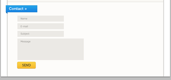
Use the Rectangle Tool (U) to create a contact form. Set the color of each rectangle to #ebe9e5. Then use the Type Tool (T) and the color #8c8a86 to write the name of each field of the contact form inside it.
Add a send button beneath the contact form.
You can duplicate one of the buttons which you have previously created and change the text to “Send “.
Step 59: Create the Contact Form and Send Button
Use the Rectangle Tool (U) to create a contact form. Color setting for each rectangle: #ebe9e5. Then use the Type Tool (T), color: #8c8a86, to write the name of each field in the contact form.
Add a send button below the contact form.
You can copy the button you created previously and change the text to Send button and move it to the appropriate position.
Name form: (100, 1553, 280, 36)
E-mail form: (100, 1599, 280, 36)
Subject form: (100, 1645, 280, 36)
##Message form: (100, 1691, 400, 130)
Step 60: Creating the footer
We're coming to the final step of this tutorial, so keep at it! Create a new group and name it “footer“. Then use the Rectangle Tool (U) to create a rectangle with the height of30px and the color #e6e2d5.
Name this layer “footer bg” and set its opacity to 25%.
Add two lines with the weight1px at the top of the footer.
Then select the Type Tool (T) and write a copyright statement.Use the font Verdana and the color #595753.
Step 60: Create the footer
Our last step in this tutorial, stick with it! Create a new group footer. Then use the Rectangle Tool (U) to create a rectangle (40, 1888, 940, 32) with color: #e6e2d5.
Name this layer "footer bg" and set its Opacity to 25%.
Add two 1px horizontal lines at the top of the footer (You can copy the two separators at the bottom of the blog area).
Then select the Type Tool (T) and write a copyright statement.
Use font: Verdana font, color: #595753.

Final result:

Postscript:
This is also a very detailed tutorial, with a total of 60 steps. The highlight of this tutorial is to achieve some special effects by "subtracting from the shape area", such as the corner effect of paper, the effect of lampshade, etc. Second, a large number of gradient overlay effects are used to achieve beautiful effects. The production of lamps in the tutorial is also a highlight. Even these steps alone are a good tutorial.
For more PS web design tutorials

Hot AI Tools

Undresser.AI Undress
AI-powered app for creating realistic nude photos

AI Clothes Remover
Online AI tool for removing clothes from photos.

Undress AI Tool
Undress images for free

Clothoff.io
AI clothes remover

Video Face Swap
Swap faces in any video effortlessly with our completely free AI face swap tool!

Hot Article

Hot Tools

Notepad++7.3.1
Easy-to-use and free code editor

SublimeText3 Chinese version
Chinese version, very easy to use

Zend Studio 13.0.1
Powerful PHP integrated development environment

Dreamweaver CS6
Visual web development tools

SublimeText3 Mac version
God-level code editing software (SublimeText3)

Hot Topics
 1672
1672
 14
14
 1428
1428
 52
52
 1333
1333
 25
25
 1277
1277
 29
29
 1257
1257
 24
24
 Advanced Photoshop Tutorial: Master Retouching & Compositing
Apr 17, 2025 am 12:10 AM
Photoshop's advanced photo editing and synthesis technologies include: 1. Use layers, masks and adjustment layers for basic operations; 2. Use image pixel values to achieve photo editing effects; 3. Use multiple layers and masks for complex synthesis; 4. Use "liquefaction" tools to adjust facial features; 5. Use "frequency separation" technology to perform delicate photo editing, these technologies can improve image processing level and achieve professional-level effects.
 Photoshop's Key Features: A Deep Dive
Apr 19, 2025 am 12:08 AM
Key features of Photoshop include layers and masks, adjustment tools, filters and effects. 1. Layers and masks allow independent editing of image parts. 2. Adjust tools such as brightness/contrast can modify image tone and brightness. 3. Filters and effects can quickly add visual effects. Mastering these features can help creative professionals achieve their creative vision.
 Using Photoshop: Creative Possibilities and Practical Uses
Apr 22, 2025 am 12:09 AM
Photoshop is very practical and creative in practical applications. 1) It provides basic editing, repairing and synthesis functions, suitable for beginners and professionals. 2) Advanced features such as content recognition fill and layer style can improve image effects. 3) Mastering shortcut keys and optimizing layer structure can improve work efficiency.
 Photoshop and Digital Art: Painting, Illustration, and Compositing
Apr 18, 2025 am 12:01 AM
Photoshop's applications in digital art include painting, illustration and image synthesis. 1) Painting: Using brushes, pencils and mixing tools, the artist can create realistic effects. 2) Illustration: With vector and shape tools, artists can accurately draw complex graphics and add effects. 3) Synthesis: Using mask and layer blending mode, artists can seamlessly blend different image elements.
 Using Photoshop for Graphic Design: Branding and More
Apr 16, 2025 am 12:02 AM
The steps to using Photoshop for brand design include: 1. Use the Pen tool to draw basic shapes, 2. Add shadows and highlights through layer styles, 3. Adjust colors and details, 4. Use smart objects and actions to automatically generate different versions of the design. Photoshop helps designers create and optimize brand elements with the flexibility of layers and masks, ensuring consistency and professionalism of designs, from simple logos to complex branding guides.
 Photoshop for Photographers: Enhancing and Retouching Images
Apr 25, 2025 am 12:01 AM
Enhance and retouching photos in Photoshop can be achieved by adjusting brightness and contrast, using the Repair Brush Tool. 1) Adjust brightness and contrast: Increase brightness and contrast to improve underexposed photos through the Image->Adjustments->Brightness/Contrast menu. 2) Use the Repair Brush Tool: Select HealingBrushTool in the toolbar and apply to remove miscellaneous points or scars in the image.
 What Photoshop Does Best: Common Tasks and Projects
Apr 23, 2025 am 12:06 AM
Photoshop is specialized in image editing, layering and masking, digital painting and a variety of design applications. 1) Image editing and repair: remove defects and adjust color and brightness. 2) Layers and masks: non-destructive editing and creation. 3) Digital paintings and illustrations: create art works. 4) Practical applications: graphic design, web design and digital art creation.
 Photoshop's Subscription Model: What You Get for Your Money
Apr 15, 2025 am 12:17 AM
Photoshop's subscription model is worth buying. 1) Users can access the latest version and use across devices at any time. 2) The subscription fee is low, and continuous updates and technical support are provided. 3) Advanced functions such as neural filters can be used for complex image processing. Despite the high long-term costs, its convenience and feature updates are valuable to professional users.


