PS web design tutorial XXIX - How to design a gallery layout in PS
As a coder, my art foundation is weak. We can refer to some mature web PS tutorials to improve our design capabilities. To paraphrase a sentence, "If you are familiar with three hundred Tang poems, you can recite them even if you don't know how to compose them."
The tutorials in this series come from online PS tutorials, all from abroad, and all in English. I try to translate these excellent tutorials. Due to limited translation capabilities, the details of the translation still need to be worked out. I hope that the majority of netizens will give me some advice.
Agreement:
1. The software used in this article is the Photoshop CS5 version
2. The screenshots of the original tutorial are in English. I re-screened them based on the re-production. Chinese version of Figure
3. Some operations in the original text do not give parameters. I measured some parameters through repeated testing, which are displayed in red text. For some wrong parameters, the correct parameters are displayed directly in red text
For example: (90, 22, 231, 77) , indicating that the coordinates of the upper left corner of the rectangle are (90, 22) , width 231, height 77
For example: (90,22), indicating that the coordinates of the upper left corner of the rectangle are (90,22), the other two parameters of the rectangle have been specified in the tutorial
4. My own experience will be attached at the end of the tutorial. Some are optimizations of some steps in the tutorial, etc.
In this week's tutorial we will create a gallery layout. I will not be using the 960 grid in this tutorial, the purpose is to show beginners out there how important the Ruler Tool is when you are designing in Photoshop. We will also tackle how to create and use patterns and using mask and filters.
In this weekly tutorial, we are going to create a gallery web layout. I will not use the 960 grid system in this tutorial, the purpose is to show beginners how important the ruler tool is when starting to design web pages in Photoshop. We will also demonstrate how to create using patterns, using masks and filters
Step 1: Setting up the Document
Steps 1: Set up the document
Start by creating a 1200px x 1850px document in Photoshop.
Start by creating a new document in PS, size: 1200px*1850px
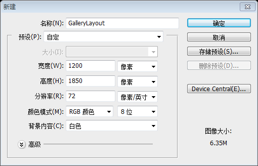
As I mentioned earlier we will be using the Ruler Tool. Make sure that rulers and guides is turned on.
As I mentioned earlier we will be using the Ruler Tool. As said, we are going to use the ruler tool. Make sure rulers and guides are turned on
Rulers: Ctrl + R
Guides: Ctrl + ;
Ruler: Ctrl + R
Reference line: Ctrl + ;
Information Panel
when you are measuring. Make sure this is shown in the panel to your right. If it doesn't display, you can display it by clicking:Window > Information. The total width of your site will be 960px. So, let's create our first guide by going to View – New Guide, set the value to 120px. Repeat the step of create a guide but now change the value to 1080px, this will make a total of 960px in the center of our canvas.The total width of your web page will be 960px. So, let's create our first guide by going to: View > New Guide and setting the value to 120px. Repeat the steps to create a guide, but change the value to 1080px, which will make the middle part of your canvas 960px wide.
Step 2: Creating the Header
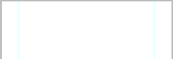
Step 2: Creating the header area
TheHeader section is composed of Logo, Navigation, and Search. First thing you need to do is to create a folder name it Header and inside of it create sub folders and name them Logo, Navigation, and Search. It is important that you group all the things you do properly in order to be organized and easily locate things in the future for coding purposes.
The header area includes the LOGO, navigation bar, and search bar. The first thing you need to do is create a folder called Header, and within it, create subfolders called Logo, Navigation, and Search. It is very important to group items so that they are organized correctly and can be easily located when coding in the future.
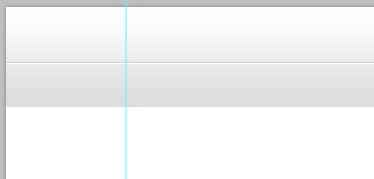
Inside Header folder create a new layer and name it bg. Using Rectangle Tool create a 100% x 100px. By looking at the Info Panel you can view the dimension of the shape that you 're making. Or you can do this by creating a new guide by going to View – New Guide – 100px Horizontal. It's up to you what way you choose.
Create a new bg layer in the Header folder. Use Rectangle Tool to create a 100%*100px rectangle. When viewing the Information Panel, you can see the dimensions of the shape you created. Or you can create a new guide line to accomplish this, click: View > New Guide Line, and set the parameters to: Horizontal 100px. It depends on how you do it.

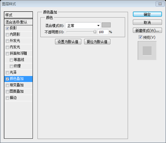
Add this Blending Option
Add the following blending options
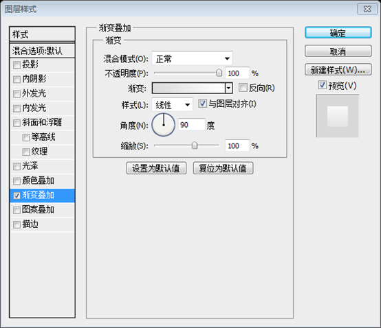
Gradient Overlay : #dcdcdc, #ffffff
Gradient overlay: #dcdcdc, #ffffff

Create two straight lines
((0,55,1200,1),(0,56,1200,1)), 55px from the top. But I suggest you use the Rectangular Marquee Tool to make the line pixel perfectLine 1: #cfcfcf
Line 2: #ffffff
Straight line 1: #cfcfcf
Straight line 2: #ffffff
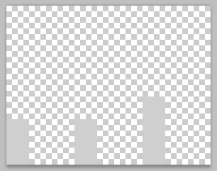
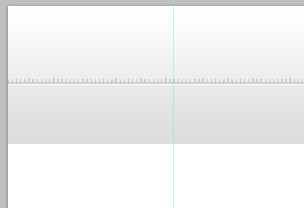
 As you can see in the preview of our header there is a pattern above the lines. Create a new document 9px x 7px, background content Transparent. Using Pencil Tool with a fill color of #cfcfcf create a pattern as shown in the screenshot below. When you are done go to Edit – Define Pattern and name it whatever you wish to call it.
Like you see in our header A preview of the area where there is a pattern above the line. Create a new document, size: 9px*7px, background is transparent. Use the
Pencil Toolto create the pattern as shown in the screenshot below and fill it with the color: #cfcfcf. When you're done, click:
Edit > Define Patternand give it a name you want.
 Using Paint Bucket Tool instead of foreground change it to pattern and select the pattern we made. Apply this pattern by making a selection and fill with pattern using Paint Bucket Tool.
Select
Paint Bucket Tooland replace the fill content with the pattern we created previously. Create a selection and use the
Paint Bucket Toolto fill it with the pattern to complete the work of adding patterns. It is recommended to use the Rectangle Tool
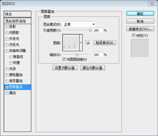
to create a rectangle (0, 48, 1200, 7), fill it with 0, and add the following pattern overlay layer style
Step 3: Create LOGO
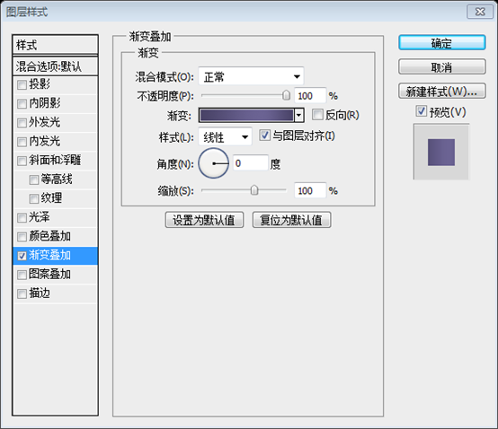
This is just a simple site name logo. Start by using Text Tool and type your desired site name. This is just a simple site name logo. Use Text tool and enter the name of your desired website Font: Helvetica BOLD, font size: 30px, TEMPLATE color: #494367; SHOW color: #A5AB0D Add this Blending Option Add the following blending option Step 4: Creating a navigation menu Again using Text Tool lets place our navigation links. Use again to place our navigation linksFont: Helvetica BOLD, font size: 16px, About color: #252525; color of the rest of the text : #555555 Add this Blending Option Add the following blending option ##Step 5: Creating Search Step 5: Creating a search bar It is recommended to create four new guide lines first: vertical 780, vertical 805, horizontal 65, horizontal 100
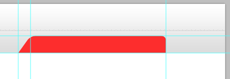
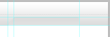
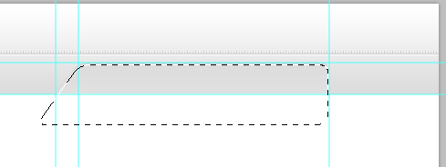
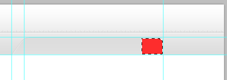
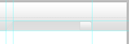
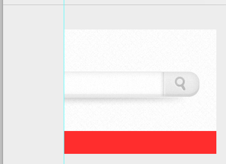
As you can see in the preview above, the left side of our search bar is slanting. So , we need to transform our shape by selecting the layer and press Ctrl + T then Right Click to the work area and select Distort. Distort Deform as shown below. The height setting of 70 is appropriate. As long as the width becomes 325px, the left side will just pass through the intersection. Next we need to mask the bottom part of our shape to be equal in our header. First set the foreground to #000000, then select the layer bg in our header and make a selection of it. While it is selected select the shape of our search the press the Mask Icon in the layers panel area beside the fx icon. Just refer to the screenshot below. Next, we need to mask off the bottom of our shape so that it equals our head area. First set the foreground color to #000000, then make a selection on the bg layer of our head area. When it's selected, select our search bar shape and then the Mask icon next to the fx icon (Add Layer Style icon) in the Layers panel. Refer to the screenshot below. Create a new layer, and then use the fill the color). By clicking: Select> Modify> Shrink, shrink the selectionIt is recommended to do the last step first and then shrink 2px
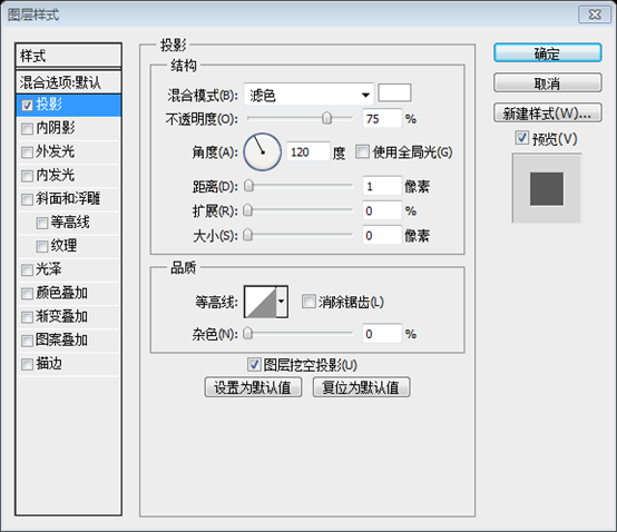
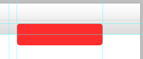
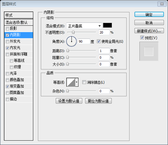
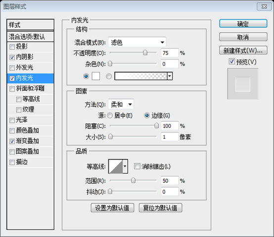
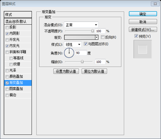
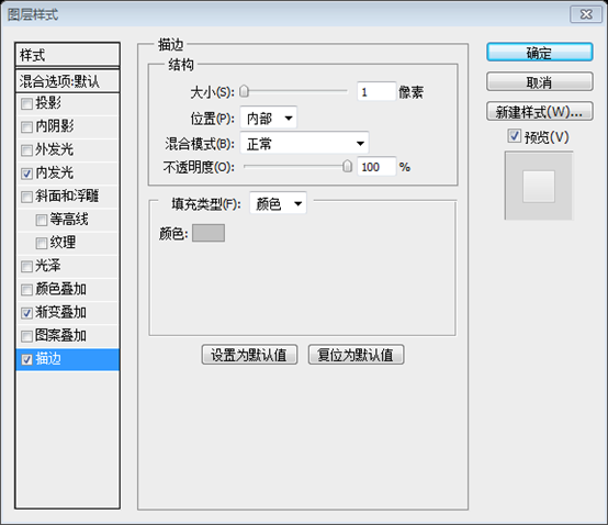
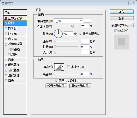
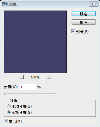
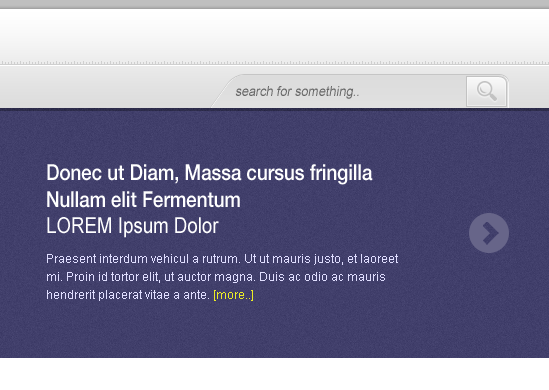
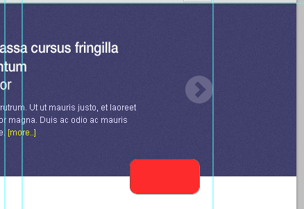
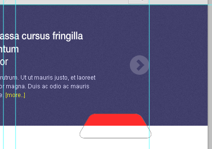
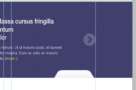
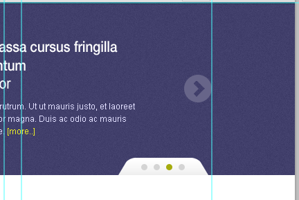
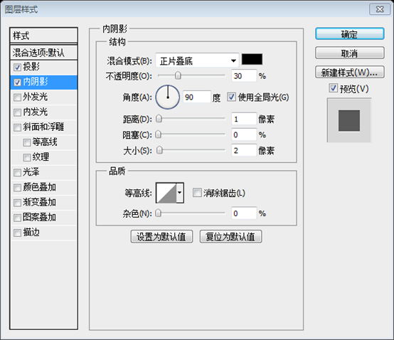
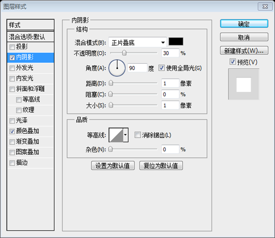
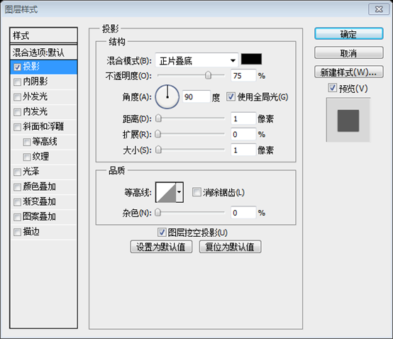
##Select Rectangular Marquee Tool, by pressing Alt key you will notice that there is a - sign beside the selection pointer, this sign means to deselect selection. Now you you can deselect the section you want to deselect. Remove selection. Now you can remove the selection you want to remove Add this Blending Option Inner Glow: #ffffff Gradient Overlay: #dcdcdc, #f9f9f9 Open up the search icon, align it and add a 1px drop shadow #ffffff. Open the search icon, align it and add a 1px white shadow Because the icon has its own color, add a color overlay to the icon: #c2c2c2, To make the style unified Then add text to the search bar: search for something... Font: Arial italic, font size: 14px, color: #666666 ##Step 6: Creating Slider Step 6: Create a picture sliding bar Rectangle Tool to create a rectangle of 100% width and 250px height (0, 99, 1200, 250) , fill color: #413f6b #Convert the shape layer to Smart Filters by going to Filter – Convert for Smart Filters. Now, go to filter again and add noise Convert this shape layer to Smart by clicking: object. Now, click again: Filter> Add Noise ##Controls Control Buttons Ellipse Tool (120,204,40,40) Download the arrow icon provided in the resources and place it on our canvas. Resize and position it as shown in the screenshot below. Download the arrow icon provided in the resources and place it on our canvas. Resize and place as shown in the screenshot below Then hide the arrow layer. (1040, 204, 40, 40). Get some sample images to put on our image slider. And, use the Text Tool to add some text: an example title and some content text following the text format on the screenshot below. Rounded Rectangle Tool, set the radius to 10px, and create a rounded rectangle as shown below. Transform it like you did the search bar before This step is a bit omitted, so I’ll fill it in here Use a rounded rectangle Tool, radius 10px, create a rounded rectangle (960, 324, 100, 50) Distort, hold down the Shift key, and drag the control block in the lower right corner to the right until the width becomes 130; then hold down the Shift key and drag the control block in the lower left corner to the left until the width becomes 130 160. Press Ctrl + Click on the purple background layer to obtain a rectangular selection, then select the red-shaped layer and press the mask button on the layer panel #Using Ellipse Tool create a shape as shown in the screenshot below. , (996,333,9,9), (1014,333,9,9), (1032,333,9,9) Gray color: #D4D4D4, green Color: #A5AB0D ##Add this Blending Option Drop Shadow: #ffffff Inner Shadow: #000000 Projection: #ffffff Inner shadow: #000000 Using Rectangle Tool with a fill color of #000000 create a 100% by 5px shape, then set the layer mode to multiply and opacity to 30% in the layers panel. 344, 1200, 5) Select > Modify> Expand , expand the selection by 5px. Create a new layer, name it Border, fill it with black, change the layer mode to Multiply, and change the opacity to 30% Select the purple background layer, press Ctrl + Click to create a selection, then select the Border layer, click the mask button on the layers panel
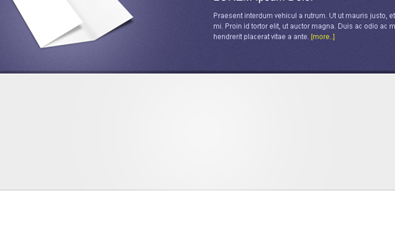
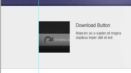
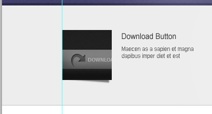
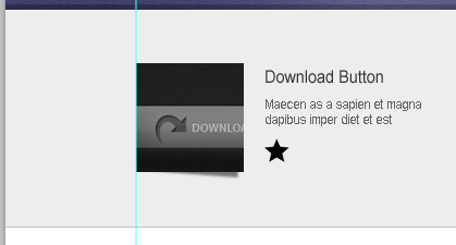
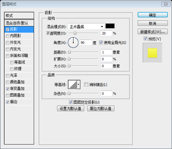
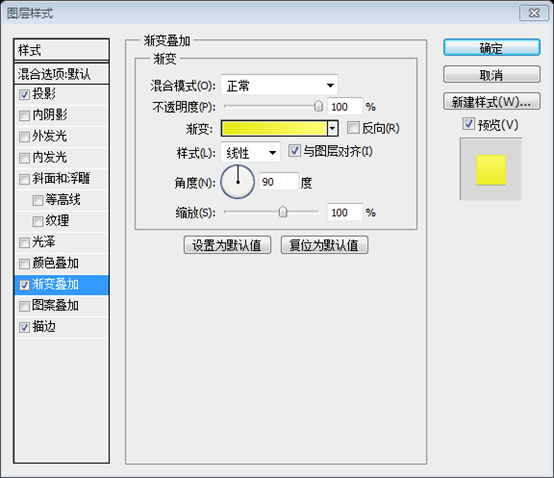
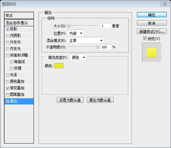
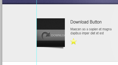
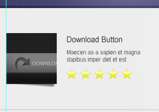
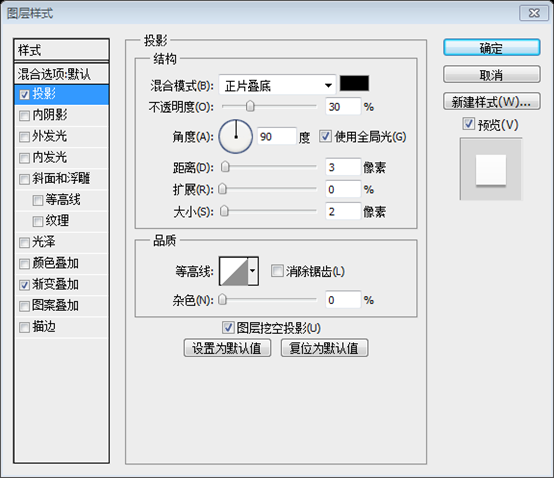
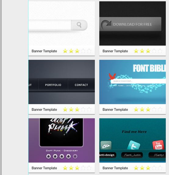
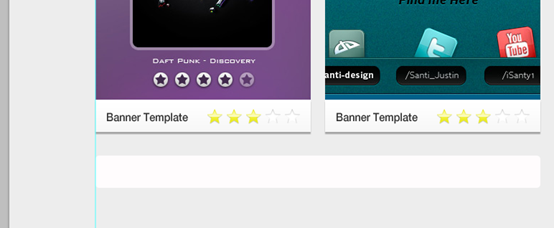
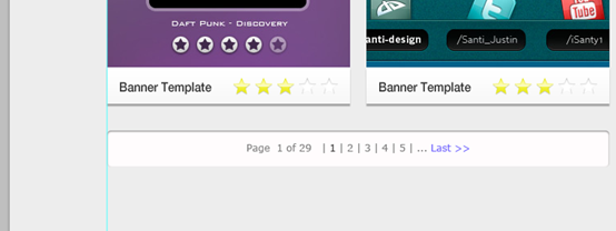
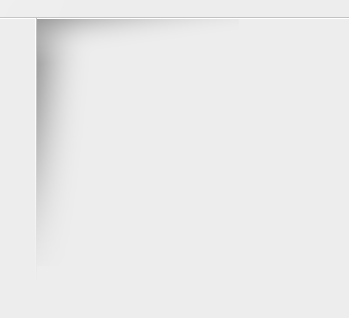
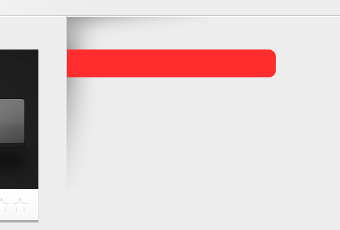
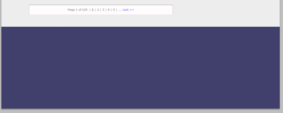
There are two dark color blocks on the left and right, which are disharmonious. Continue to modify. Right-click on the Border layer and select Convert to Smart Object. Press Ctrl + Click on the previous horizontal strip rectangular layer to create a selection, and press Ctrl + Shift + I to invert the selection Then Select the Border layer and click the Mask button on the layers panel Brush Tool, set the hardness to 0% and the size to 400px. Fill a separate layer with color: #ffffff, then set the blending mode to Soft Light in the Layers panel Step 7 : Featured Gallery Step 7: Featured Gallery (0, 349, 1200, 200) , width 100%, height 200px, color: #ededed. And, create two 1px straight lines, the first straight line is placed at the top of the rectangle (0, 349, 1200, 1) , color: #ffffff, the second straight line is placed at the bottom of the rectangle (0, 548, 1200, 1) , color: #c2c2c2. #As you can see, there is a white line at the bottom of the control block of the sliding bar. Press Ctrl + Click on the control block layer to create a selection, and press Ctrl + Shift + I to invert the selection. Select the white straight layer and click the Mask button on the layers panel Brush Tool to fill the center of the selection with white, and set the layer's blending mode to Soft Light Text Tool to add a title and content Create a new layer below the thumbnail and name it shadow, using Pen Tool create a shape as shown in the screenshot below. Then, go to Filter – Blur – Gaussian Blur 1px, and set the Opacity to 50% in the layers panel. Create a new layer shadow below the thumbnail and use the Pen Tool to create the shape according to the screenshot. Then, click: Filter>Blur>Gaussian Blur, unit 1px, and set the opacity to 50% in the Layers panel Create a new folder and name it rate. Now, open up the star icon and place it to our canvas and place it as shown in the screenshot below. Create a new folder rate. . Now, open the star icon and place it on our canvas as shown in the screenshot below Add this Blending Option Add the following Blend Options Drop Shadow: #000000 Gradient Overlay: #e7e918, #fffd76 Stroke: #eaec25 Projection: #000000 Gradient Overlay: #e7e918, #fffd76 Stroke: #eaec25 Step 8: Posts Step 8: List Fill the background layer with color: #ededed. Create a new folder Body Posts and create a subfolder post. Now, create a 300px by 200px thumbnail of our list on our canvas. Use Rectangle Tool to create a 300px*45px rectangle and fill it with any color. See the screenshot below Add this Blending Option Add the following blending option Drop Shadow: #000000 Gradient Overlay: #f7f7f7, #ffffff Gradient Overlay: #000000 Gradient Overlay: #f7f7f7, #ffffff Text Tool to create a sample title, set the also have to remove the drop shadow and stroke and add a white color overlay. #Step 9: Pagination Step 9: Paging button Rounded Rectangle Tool , radius 5px, create a 620px*45px rounded rectangle (120, 1403, 620, 45) Below the list, color : #fffcfd ##Using Text Tool place the number of pages as shown in the screenshot below. Font size: 12px. The color of page number text: #7E7E7E, the color of page number 1: #363636, the color of Last: #7266FE Step 10: Sidebar Step 10: Sidebar Create a #c2c2c2 1px line 40px distance from our post, Mask the line and make the tip faded using Brush Tool with a fill color of #000000. You may have something that looks like the screenshot below. Create a straight line 40px away from our list (780, 549, 1, 300) , color: #c2c2c2, add a mask to the straight line, make a fade out effect, use Brush tool, fill color: #000000. What you make is like the screenshot below to create a fade-out effect. It is recommended to use, click:Layer > Vector Mask > Show All. Then fill it with the Gradient Tool from bottom to top, from black to transparent Duplicate the line and move it to the left and change the color to #ffffff. Create a Horizontal line with the same color place it as shown in the screenshot below. Copy this line and move it to the left and change the color to #ffffff. Create a straight horizontal line using the same color and place it as shown in the screenshot below. Next, create a new layer below those lines we have just created and name it shadow. Using Selection, Gradient Tool, and Eraser Tool perform what you have seen in the screenshot below. The set the shadow layer to Multiply, Opacity to 50%. Next, create a new layer shadow below these straight lines. Use the Selection Tool, Gradient Tool, and Eraser Tool together, just like you see in the screenshot. Set the shadow layer to Multiply and the opacity to 50% Duplicate the layer and place it on the top as shown in the screenshot below. It's up to you to make adjustments, just erase the portion that you don't like. Duplicate this layer and place it on top as shown in the screenshot below. It depends on your adjustments. Erase the parts you don’t like. It is recommended to create a new selection, and then use the Gradient toolto draw horizontally and vertically, and then add and vertical Straight line mask Select Rounded Rectangle Tool then set the radius to 10px. Create a shape as shown in the screenshot below. The width of the shape is the remaining width of our canvas and the height will be 40px. Select theRounded Rectangle Tool and set the radius to 10px. Create a shape (760, 597, 320, 40) as shown below. The width of the shape is the remaining width of our canvas and the height is 40px Use rectangle selection Frame tool, create a selection (780, 500, 350, 200), then select the rectangular layer and click the mask button on the layer panel Add this Blending Option Add the following blending options Gradient Overlay: #494367, #6b6393, #494367 Gradient overlay: #494367, #6b6393, #494367 Text Tool to add a title. Font: Helvetica, font size: 24px, color: #ffffff. And add drop shadow style Next open up the social icons and place them on our canvas, align them as shown in the screenshot below, and also add their corresponding social icon names using Text Tool. Next open the social media icons and place them on our canvas, as shown in the screenshot below, and give Add corresponding description text for each icon. Font: Helvetica, font size: 16px, color: #363636 Type Tool Line Tool, just like the screenshot belowTitle font: Helvetica, font size: 18px, left text color: #363636 , the color of the text on the right: #655DF3 Step 11: Footer Step 11: Footer Rectangle Tool
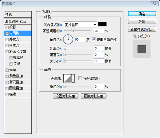
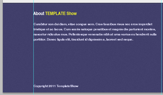
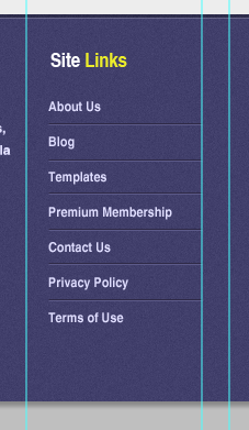
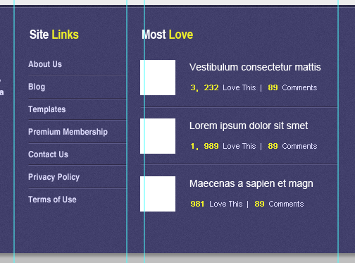
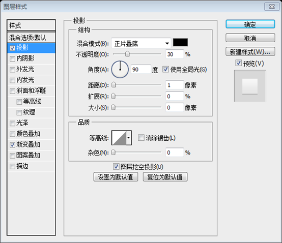
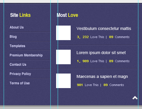
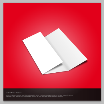
##Inner Shadow: #ffffff ##Convert the shape layer to Smart Filters by going to Filter – Convert for Smart Filters, go to filter again and add noise. Filter> Convert to Smart Filter # and add a white horizontal line (0, 1501, 1200, 1) with Opacity set to 20% We were going to add info text in our about folder. Using Text Tool put in some dummy text and for the formatting of the text just refer to the screenshot below. Text Tool Paragraph and copyright information text: Font: Helvetica, font size: 12px, text color: #E0DEFF Using Text Tool add links on Site Links folder. Use Text ToolAdd text on Site Links folder Title: Font: Helvetica, Font size: 18px, Site color : #FFFFFF; color of the text on the right: #ECED2B List text: font: Helvetica, font size: 12px, text color: #E0DEFF Separating line: color of the upper line: #2F2A47; The color of the line below: #5C5A89 Using Text Tool add a Post Title, Love this, and comments. Create also a 50px x 50px thumbnail and place it as shown in the screenshot below. Use Text tool to add a list title, Love this, comments. Create a 50*50 thumbnail and place it as shown in the screenshot below Title: Font: Helvetica, Font size: 18px, Most color: #FFFFFF; Color of the text on the right: #ECED2B List title: Font: Arial, Font size: 14px, Color: #FFFFFF Small text below: Font: Arial, Font size: 11px, Color: #ECED2B, #E0DEFF Dividing line: above The color of the straight line: #2F2A47; the color of the straight line below: #5C5A89 This is a good tutorial. A lot of masking techniques are used. The overall color scheme is simple and harmonious, which is pleasing to the eye. When I looked up this tutorial on the Internet, there were only text descriptions and invalid dead links. Thanks to this website WayBack Marchine, I found the backup of this tutorial and was able to successfully complete the translation of this tutorial. At the same time, let’s introduce TinEYE, a website that can find similar pictures based on the pictures you upload (new features also include finding related pictures based on the ratio of the colors you specify) The picture below This is the PSD material I found after uploading the origami in the tutorial. It is very good and powerful. 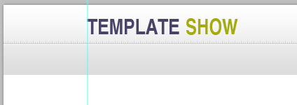

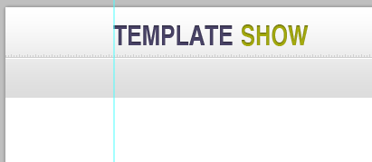

Drop Shadow: #ffffff



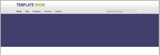

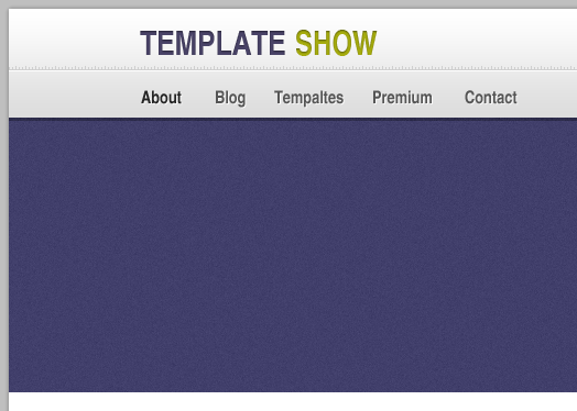
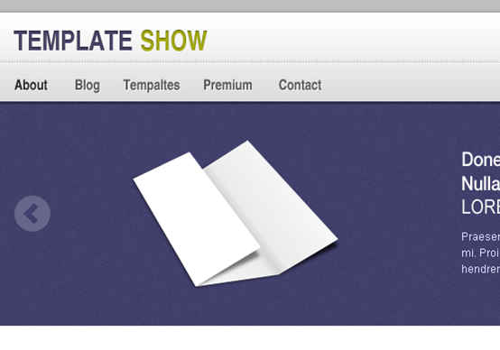
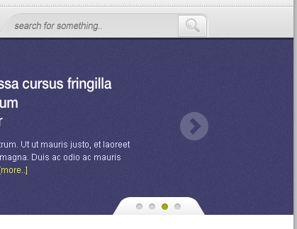
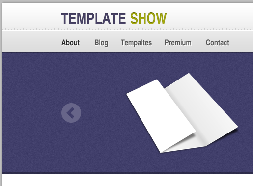
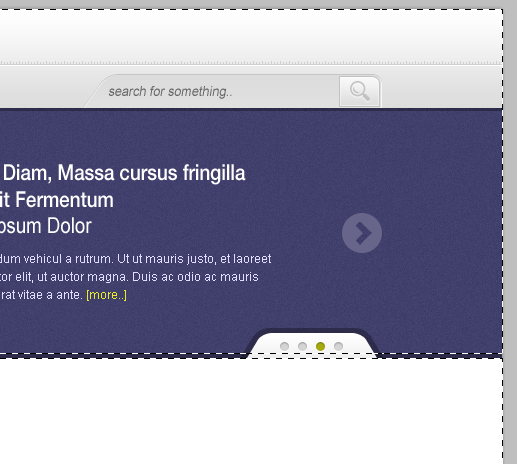
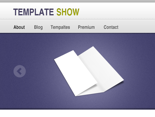
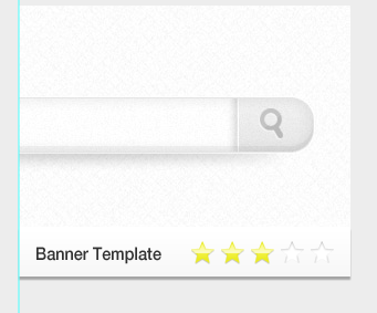
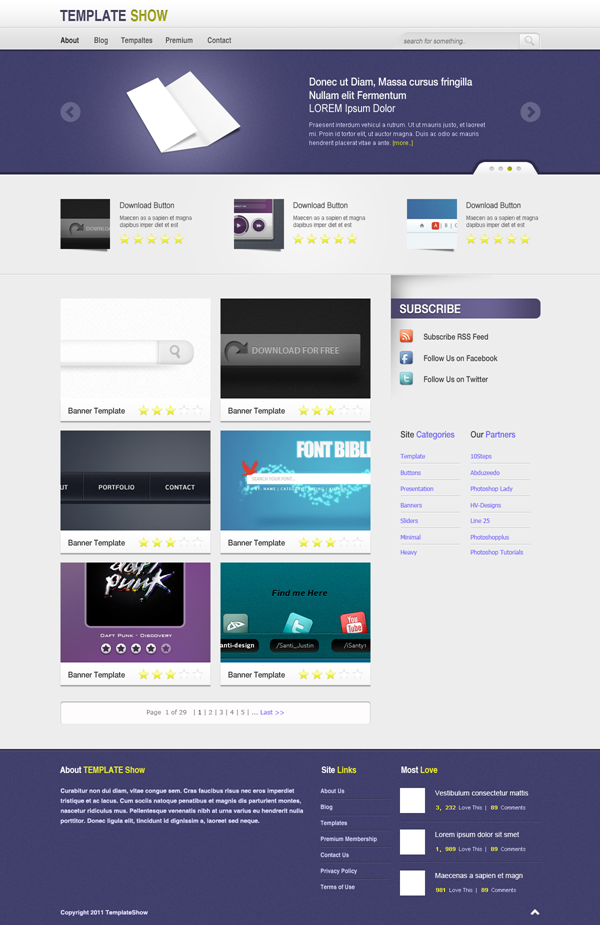
##This will be the result.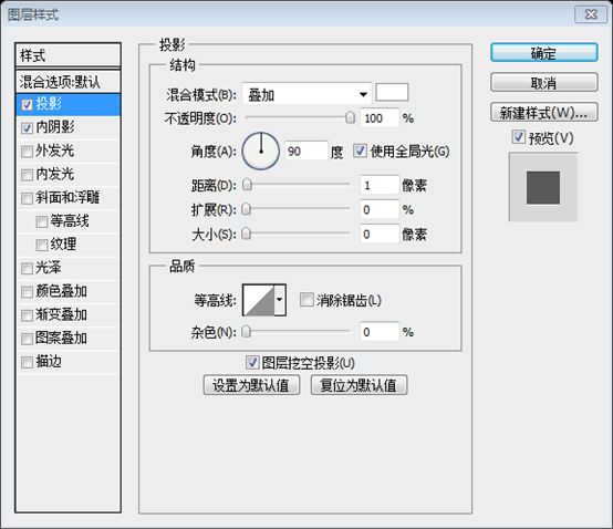 This is the final effect












 ##Postscript:

Hot AI Tools

Undresser.AI Undress
AI-powered app for creating realistic nude photos

AI Clothes Remover
Online AI tool for removing clothes from photos.

Undress AI Tool
Undress images for free

Clothoff.io
AI clothes remover

Video Face Swap
Swap faces in any video effortlessly with our completely free AI face swap tool!

Hot Article

Hot Tools

Notepad++7.3.1
Easy-to-use and free code editor

SublimeText3 Chinese version
Chinese version, very easy to use

Zend Studio 13.0.1
Powerful PHP integrated development environment

Dreamweaver CS6
Visual web development tools

SublimeText3 Mac version
God-level code editing software (SublimeText3)

Hot Topics
 1653
1653
 14
14
 1413
1413
 52
52
 1304
1304
 25
25
 1251
1251
 29
29
 1224
1224
 24
24
 How to set password protection for export PDF on PS
Apr 06, 2025 pm 04:45 PM
Export password-protected PDF in Photoshop: Open the image file. Click "File"> "Export"> "Export as PDF". Set the "Security" option and enter the same password twice. Click "Export" to generate a PDF file.
 What are the common questions about exporting PDF on PS
Apr 06, 2025 pm 04:51 PM
Frequently Asked Questions and Solutions when Exporting PS as PDF: Font Embedding Problems: Check the "Font" option, select "Embed" or convert the font into a curve (path). Color deviation problem: convert the file into CMYK mode and adjust the color; directly exporting it with RGB requires psychological preparation for preview and color deviation. Resolution and file size issues: Choose resolution according to actual conditions, or use the compression option to optimize file size. Special effects issue: Merge (flatten) layers before exporting, or weigh the pros and cons.
 How to use PS Pen Tool
Apr 06, 2025 pm 10:15 PM
The Pen Tool is a tool that creates precise paths and shapes, and is used by: Select the Pen Tool (P). Sets Path, Fill, Stroke, and Shape options. Click Create anchor point, drag the curve to release the Create anchor point. Press Ctrl/Cmd Alt/Opt to delete the anchor point, drag and move the anchor point, and click Adjust curve. Click the first anchor to close the path to create a shape, and double-click the last anchor to create an open path.
 What is the reason why PS keeps showing loading?
Apr 06, 2025 pm 06:39 PM
PS "Loading" problems are caused by resource access or processing problems: hard disk reading speed is slow or bad: Use CrystalDiskInfo to check the hard disk health and replace the problematic hard disk. Insufficient memory: Upgrade memory to meet PS's needs for high-resolution images and complex layer processing. Graphics card drivers are outdated or corrupted: Update the drivers to optimize communication between the PS and the graphics card. File paths are too long or file names have special characters: use short paths and avoid special characters. PS's own problem: Reinstall or repair the PS installer.
 Photoshop's Value: Weighing the Cost Against Its Features
Apr 11, 2025 am 12:02 AM
Photoshop is worth the investment because it provides powerful features and a wide range of application scenarios. 1) Core functions include image editing, layer management, special effects production and color adjustment. 2) Suitable for professional designers and photographers, but amateurs may consider alternatives such as GIMP. 3) Subscribe to AdobeCreativeCloud can be used as needed to avoid high one-time spending.
 Photoshop for Professionals: Advanced Editing & Workflow Techniques
Apr 05, 2025 am 12:15 AM
Photoshop's advanced editing skills include frequency separation and HDR synthesis, and optimized workflows can be automated. 1) Frequency separation technology separates the texture and color details of images. 2) HDR synthesis enhances the dynamic range of images. 3) Automate workflows to improve efficiency and ensure consistency.
 How to solve the problem of loading when PS is always showing that it is loading?
Apr 06, 2025 pm 06:30 PM
PS card is "Loading"? Solutions include: checking the computer configuration (memory, hard disk, processor), cleaning hard disk fragmentation, updating the graphics card driver, adjusting PS settings, reinstalling PS, and developing good programming habits.
 How to speed up the loading speed of PS?
Apr 06, 2025 pm 06:27 PM
Solving the problem of slow Photoshop startup requires a multi-pronged approach, including: upgrading hardware (memory, solid-state drive, CPU); uninstalling outdated or incompatible plug-ins; cleaning up system garbage and excessive background programs regularly; closing irrelevant programs with caution; avoiding opening a large number of files during startup.


