 Web Front-end
 PS Tutorial
 PS web design tutorial XXX - Create a comic book themed web layout in PS
PS web design tutorial XXX - Create a comic book themed web layout in PS
As a coder, my art foundation is weak. We can refer to some mature web PS tutorials to improve our design capabilities. To paraphrase a sentence, "If you are familiar with three hundred Tang poems, you can recite them even if you don't know how to compose them."
The tutorials in this series come from online PS tutorials, all from abroad, and all in English. I try to translate these excellent tutorials. Due to limited translation capabilities, the details of the translation still need to be worked out. I hope that the majority of netizens will give me some advice.
Convention:
1. The software used in this article is Photoshop CS5 version
2. The screenshots of the original tutorial are in English. I took them again based on the re-production. Chinese version of Figure
3. Some operations in the original text do not give parameters. I measured some parameters through repeated testing, which are shown in red text. For some wrong parameters, the correct parameters are displayed directly in red text
For example: (90, 22, 231, 77) , indicating that the coordinates of the upper left corner of the rectangle are (90, 22) , width 231, height 77
For example: (90,22), indicating that the coordinates of the upper left corner of the rectangle are (90,22), the other two parameters of the rectangle have been specified in the tutorial
4. My own experience will be attached at the end of the tutorial. Some are optimizations of some steps in the tutorial, etc.
Before Getting Started
Before Getting Started
Let's get it started! In order to speed up the reading I will avoid some of the most basic explanations (like how to create a layer mask or how to edit the handlers or Beziers of a vector shape). You will need some basic knowledge about Layers, Guides, Vector and Layer Masks, Brushes, the Pen Tool, and working with Typography (Character and Paragraphs).
Let’s get started! To speed up reading, I'll omit some of the most basic explanations (like how to create a layer mask or how to edit a Bezier vector shape). You will need some basic knowledge like layers, guides, vectors and layer masks, brushes, pen tools, and type tools (character and paragraph).
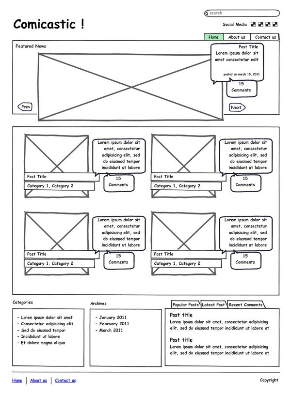
The first step is creating a mock up, doodle, or even just a sketch the layout on a napkin. Having a rough draft of the site's structure makes easy placing the elements on the design . Below you will see a simple sketch showing the following elements:
The first step is to create a mockup, doodle, or even just a sketch of the layout on a napkin. I have a rough draft of the structure of the website, making it easy to place some design elements. Below you will see a simple sketch showing the following elements:
A header, with the logo, search bar and social media links, besides the main navigation bar.
A header area with a LOGO, search bar, and social media links, in addition to the main navigation bar.
A banner, with featured posts, notice how the post text is placed over the image into a talk bubble to depict the "comic" style. Select the article and notice that the text content has been placed in the dialog box to portray a "comic" style.
A content area , a list containing two columns, each list item has an associated image and the text is also displayed nicely in the dialog box.
A footer area, with a list of the blog's categories, archive and popular post and recent comments and the copyright information. Popular posts, recent comments and copyright information
##Step 1: Setting Up the Document
Step 1: Set up the document
Open Photoshop, download the 12 columns Photoshop template from 960 Grid System or create a new document 960px with and make draw some Guides to the left and right borders.Open PS, download the PS template of the 12-column 960 grid system or create a new document, 960px wide, and draw some guide lines on the left and right sides
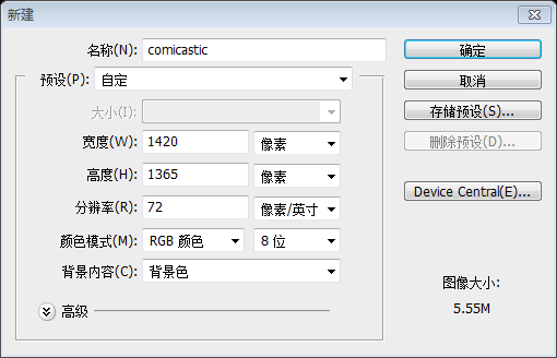
Increase the working area to see how it looks on wider resolutions and increase the height as well. I'm setting the document dimensions to 1420px width and 1200px height. Finally go to Layer > New Fill Layer > Solid Color… and set a Black (#000000) background for the canvas.Adjust the working area to make it look wider, and adjust the height appropriately. I set the document to 1420 width and 1200 height. Finally click:
Layer > New Fill Layer > Solid Color
, and set the background color of the canvas to black.Create a new document, size: 1420*1365, set the background color to black
Step 2: Header Background
Step 2: Header Area Background
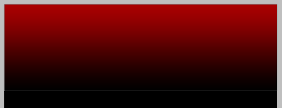
Draw a horizontal Guide around 450px from the top border, we will use it as a reference guide to add a shade on top of the page. Using the Rectangle tool, draw a wide rectangle using this color as foreground (# AA0001). Then apply a Gradient Layer Mask (Black to White) to the rectangle in order to hide the bottom part of it.
Draw a horizontal guide line 450px down from the top edge, which we will use to Add a shadow on top for reference. Use the Rectangle Tool and draw a wide rectangle (0, 0, 1420, 450), with the foreground color: #AA0001. Then add a gradient mask (black to white) over the rectangle to hide the bottom.
Tip: do not ever use a Gradient Layer for backgrounds, because when increasing the height of the canvas (a very common practice in web design) the background gets distorted.
Tip: : Never use a gradient layer on a background because when the height of the canvas is adjusted (a very common practice in web design), the background will be distorted
Note: Also You can directly add the following gradient overlay to the rectangular layer to achieve the same effect. The color of the gradient overlay: #00000, #AA0001

Step 1: Add a Texture to theBackground
Step3: Add a Texture to the Background
Open the "Paper Texture" from the assets Copy and Paste it above the red gradient layer. Scale it in order to make it fit into the bounds of the design and change the layer's Blending Mode to Linear Burn. We will slice this as a large image background, but for wider resolutions we need to subtle merging the edges of the paper with the black background, for this, using the Burn Tool, darken the areas close to the Left and Right edges of our paper texture. You can use a big and soft Brush (0% Hardness).
Open Paper Texture from Materials, copy and paste it above the red gradient layer. Resize it so that it just fits the design of the entire head area and change the layer's blending options to Linear Burn. We are going to slice this into a large image background, but better advice, we need to subtly merge the edges of the paper with a black background, for this, use the Burn Tool, which will be close to the left and right of our texture The edges become darker. You can use a large, soft brush (0% hardness).

Always keep your layers organized, put both layers ("Paper" and "Rectangle") into a folder named "Header Bg".
To keep your layers organized, merge these layers (Paper and Rectangle) into a folder called Header Bg
Step 1: Sunbursts
Step4:Sunbursts
Moving forward with the comic style, let's add some sunburst stripes to create a dramatic background for the logo.
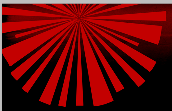
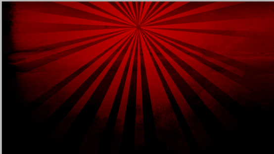
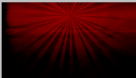
Open the "Sunburst" shapes from the assets. On the Custom Shape tool, choose your favorite sunburst shape an draw it over the red gradient layer. Place the shape to near to the left border of the 960 template ( show the Guides to see the bounds). Apply to the "Sunburst" layer a Radial Gradient Layer Mask (white in the center and black in the outside). Change the Layer Opacity to 50%. Optional: using an irregular Brush, paint with Black over the Layer Mask to create a more grunge merge between the sunburst and the background.
Open the Subburst shape in the material. Open the Custom Shape Tool, select your sunburst shape, and draw it on top of the red gradient layer (Color: #C30000). Place the shape close to the left side of the 960 layout template (turn on the guides to see the boundaries). Give the Subburst layer a radial gradient mask (white in the center, black on the border). Change the layer's opacity to 50%. Optional: Using an irregular brush, paint with black on top of the layer mask to create a more stained union between the sunburst and the background.
Step 1: Halftone
Step5: Halftone
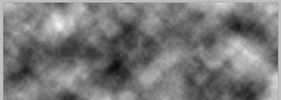
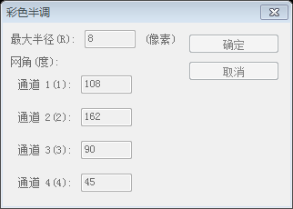
In order to enforce the comic style, we will add some Halftone points over the header background. Create a new layer above the "Sunburst" layer, and render some Black and White Clouds in there (Filter > Render > Clouds). Then go to Filter > Pixelate > Color Halftone. Change the "Halftone" layer's Blending Mode to Multiply and add a Layer Mask > Hide All to it. Then using a big and soft Brush (Color: White and Opacity and Flow to 75%) paint some areas of the layer mask to make visible only a bit of the halftone pattern.
To implement the manga style, on the background of the head area we will add some halftone dots. Create a new layer on top of the Sunburst layer and render some black and white clouds in there (click on: Filter > Render > Clouds ). Then click: Filter > Pixelate > Color Halftone. Change the Halftone layer's blending mode to Multiply and add: Layer Mask > Hide All. Then use a large, soft brush (color: white, opacity and flow at 75%) to paint some areas of the layer mask so that only some of the half is visible Tonal pattern.
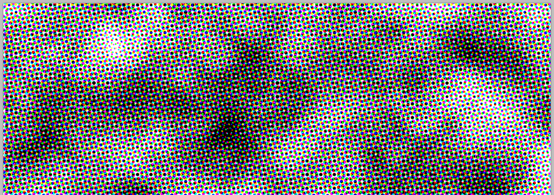
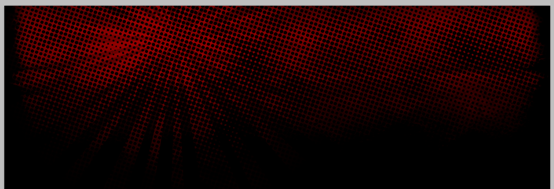


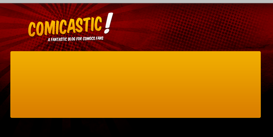
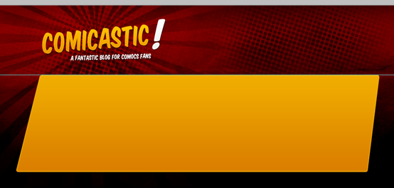
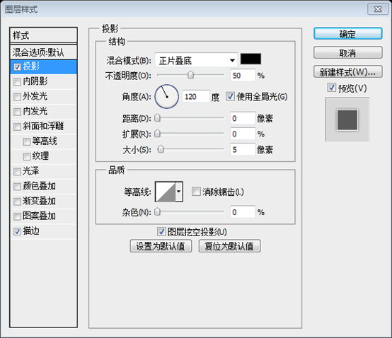
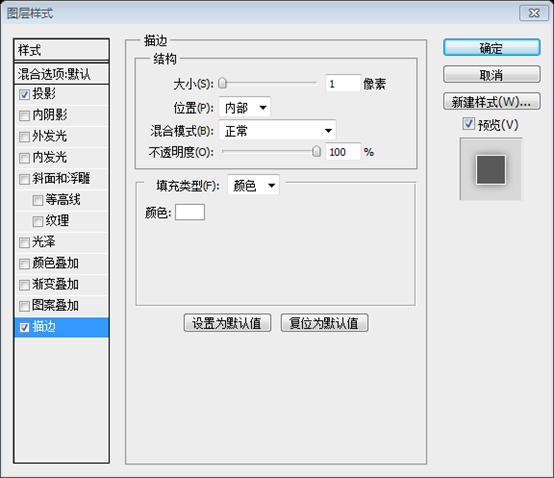
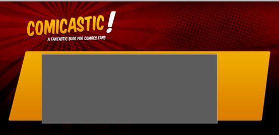
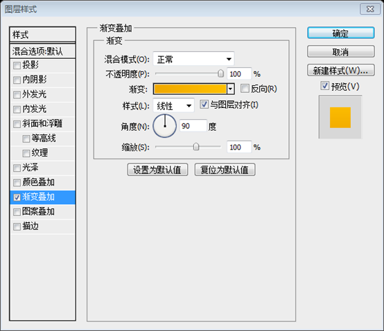
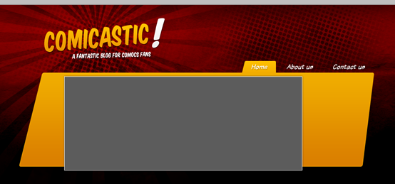
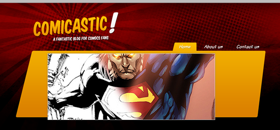
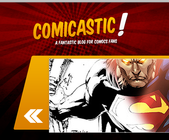
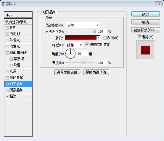
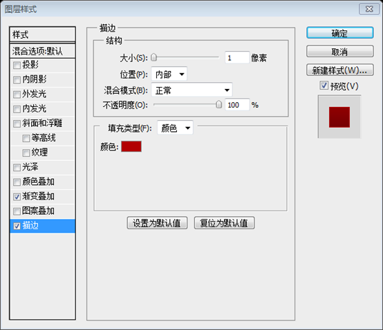
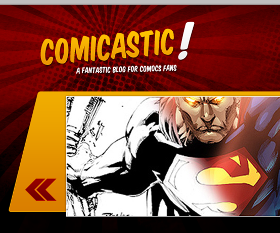
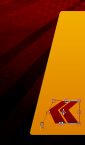
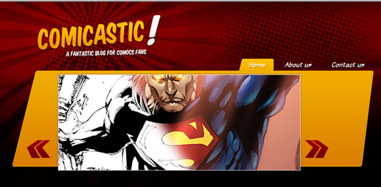
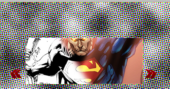
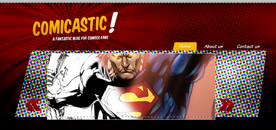
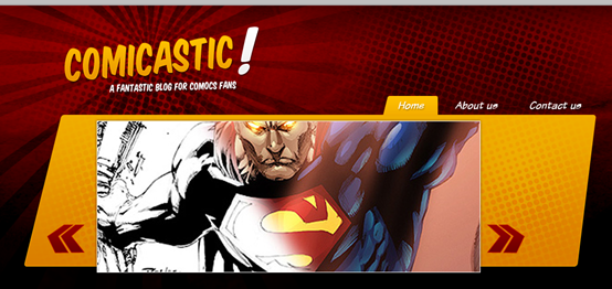
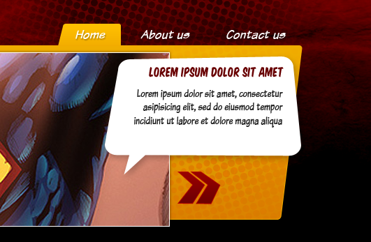
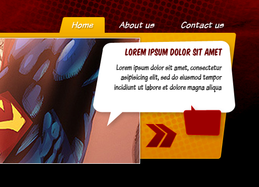
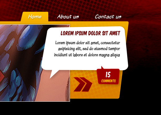
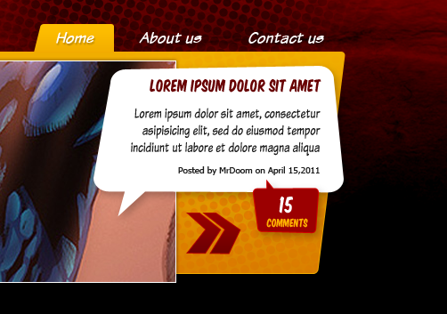
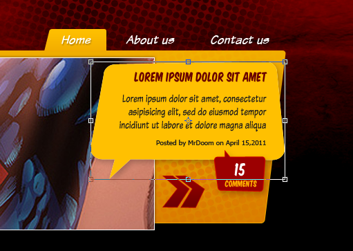
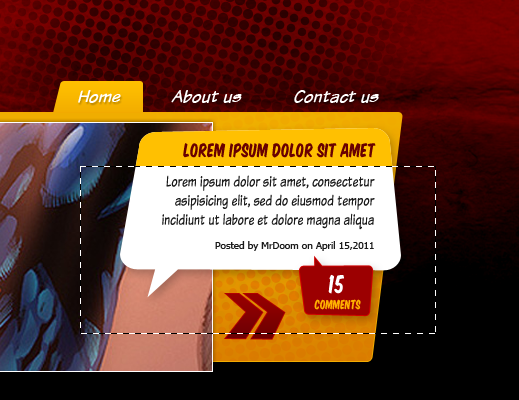
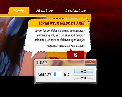
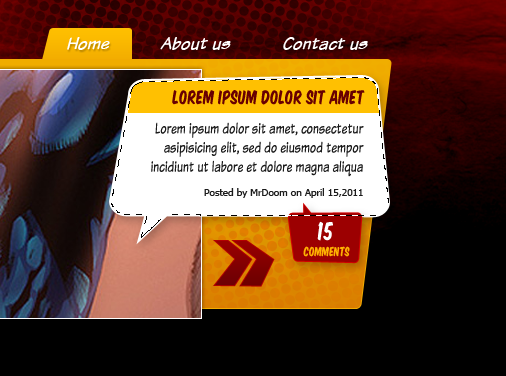
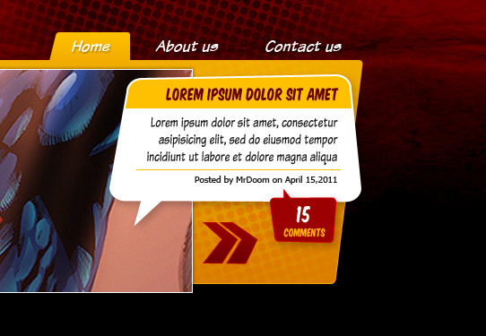
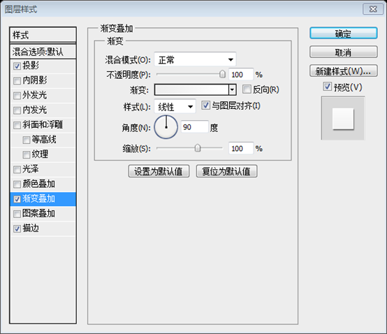
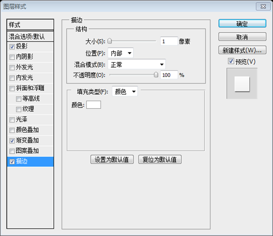
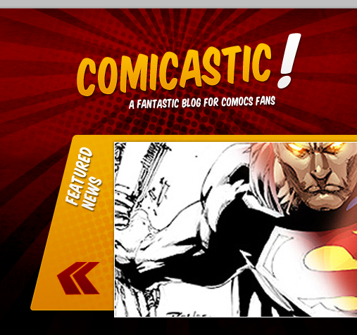
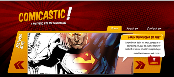
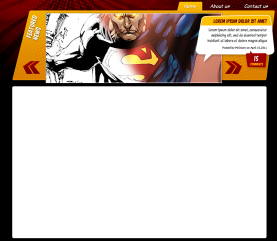
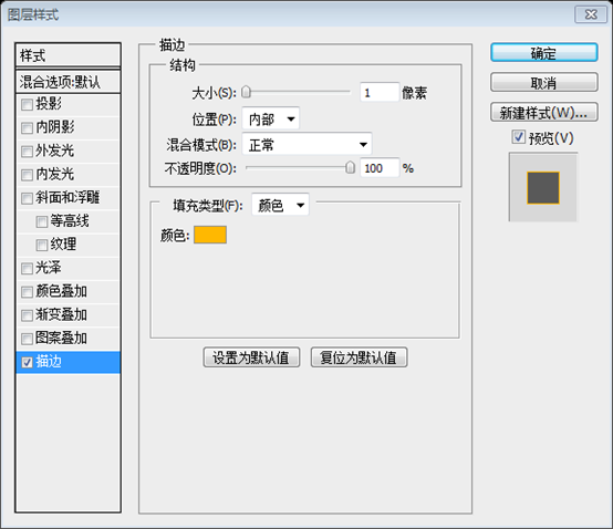
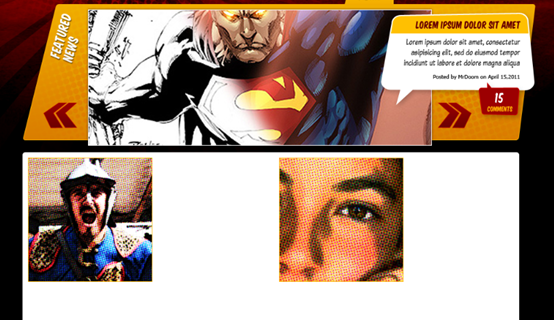
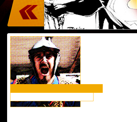
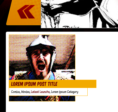
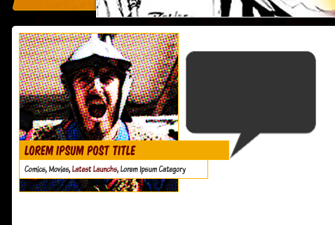
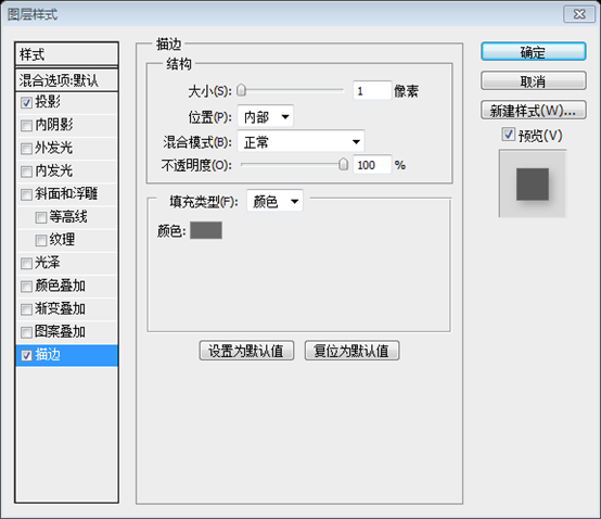
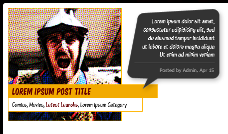
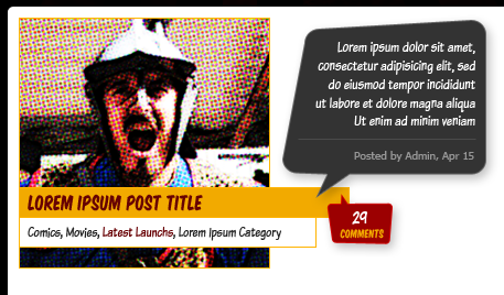
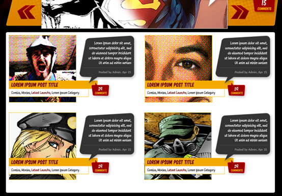
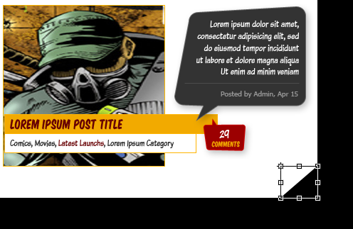
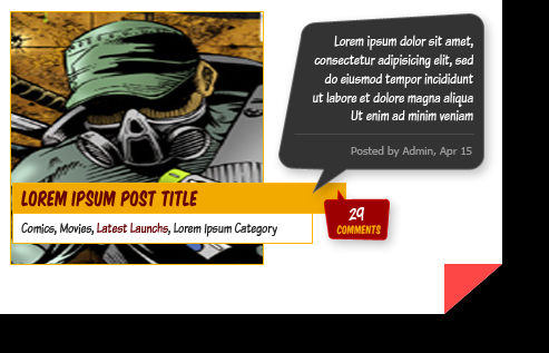
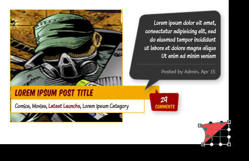
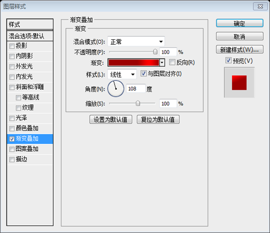
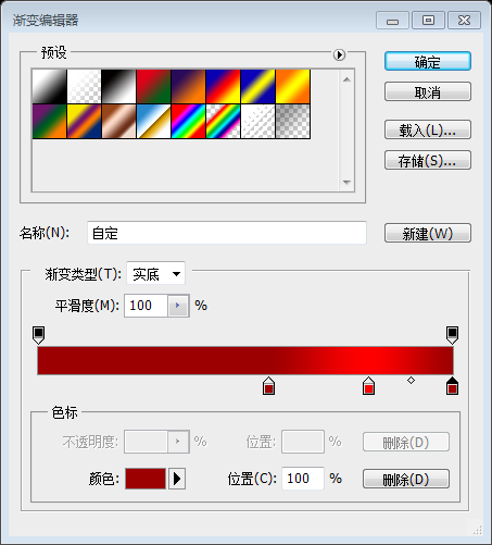
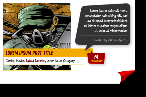
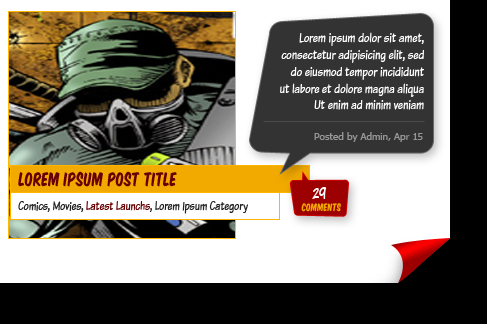
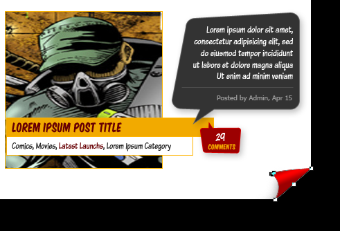
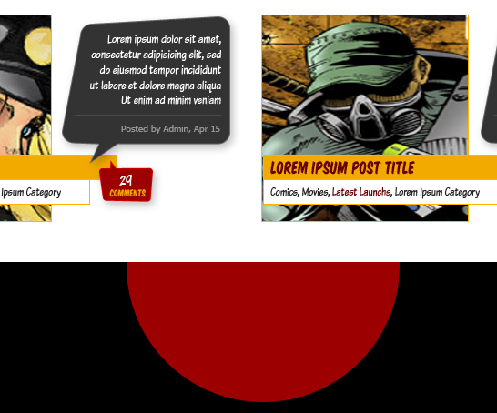
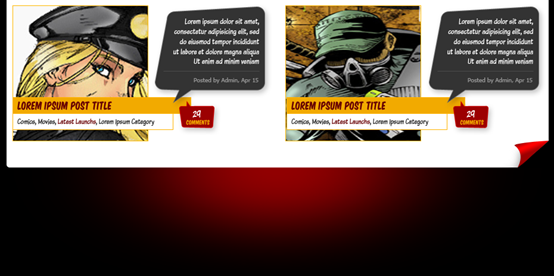
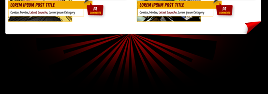
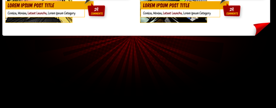
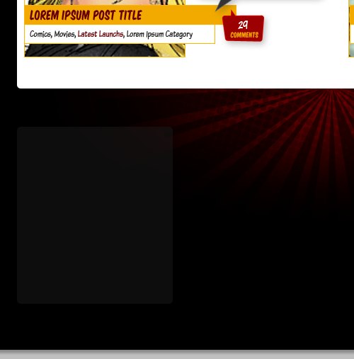
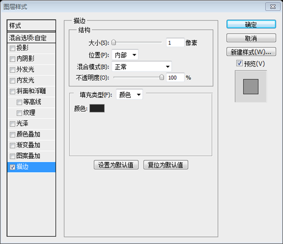
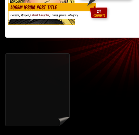
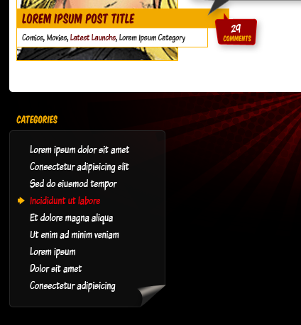
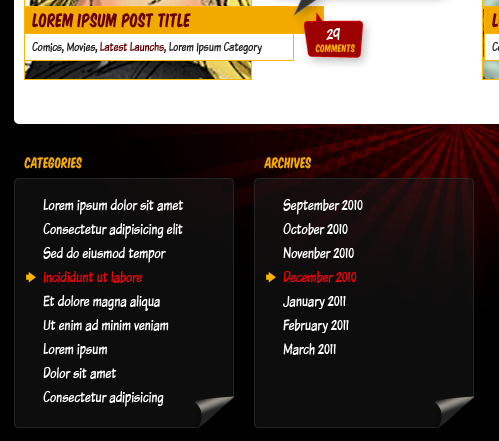
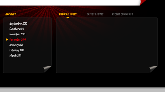
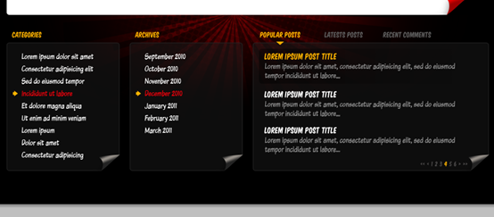
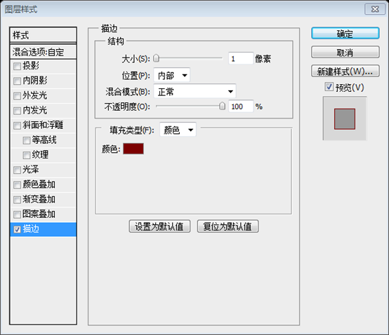
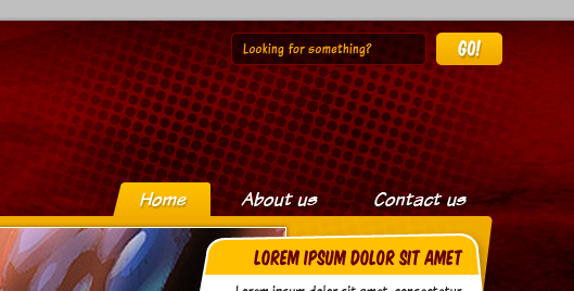
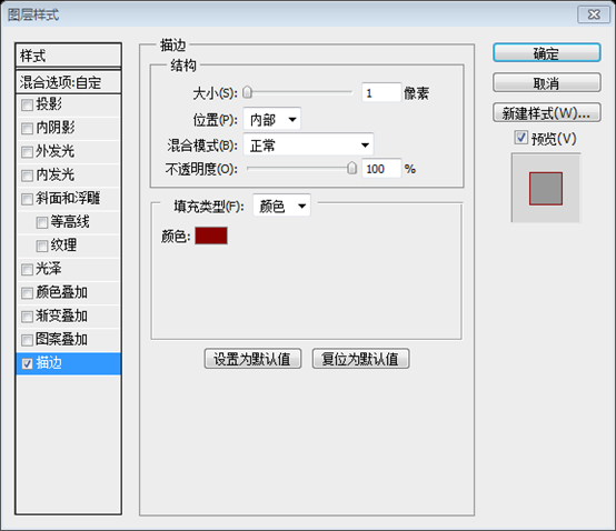
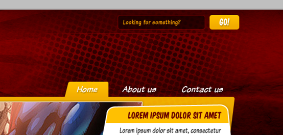
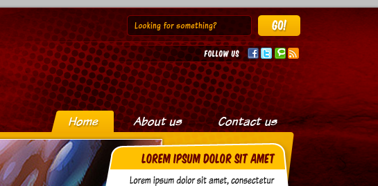
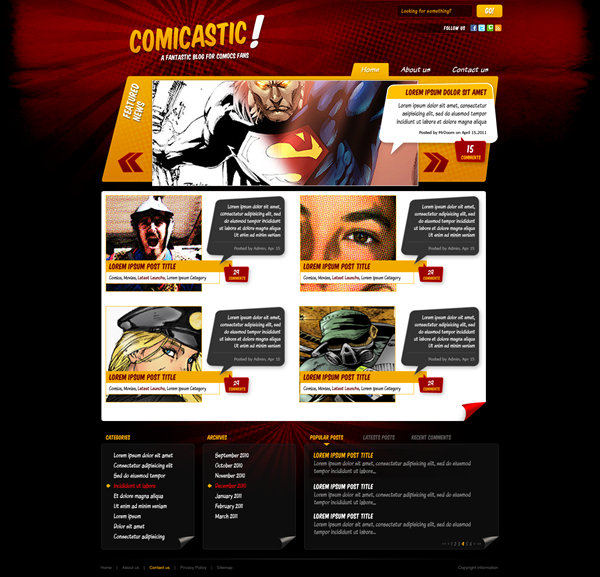
Step6:Title Now you have the header background finished, let's add the Logo. First draw a reference Guide around 180 px below the top border, the logo shouldn't be below that guide. Using the "Komika Title" font face from the assets type the title of the site ("Cicastic") Font Size: 68pt and foreground color: #FFB401. Then Add more text element, like the exclamation sign or the slogan in white (font size 16pt). Now that you have completed the background of the head area, let’s add the logo. First, draw a horizontal guide line 180px down from the top edge. The logo will not be below this guide line. Use the Komika Title font in the resource pack and enter the title of the website (Comicastic), font size: 68px, color: #FFB401. Then add some text elements, like the white exclamation mark (font size: 76px) and the slogan (font size: 16px) Then using the Free Transform Tool rotate the text a few degrees left to make it look less formal. Try to get something like the image below, but remember not to place any element below the guide. Finally put all these layers into a folder labeled " Logo. , and made vertical chamfers) Step 7: LOGO Layer Style Add a Layer Style > Gradient Overlay (#EA9403 – #FFC501) a Stroke (Size:1px, Inside, #FCB600) and a Drop Shadow (Black, 50% Opacity, Distance and Size: 2px) to the "logo" layer. Use a similar Style to the slogan, but change the colors of the Gradient Overlay to #EDEDED - # FFFFFF and the Stroke to White (#FFFFFF). If you place the exclamation sign to the logo, you can try converting it into a shape (Layer > Type > Convert to shape) and distorting it a bit as shows the bottom of the image below. Layer > Text > Convert to Shape This step has been replaced by bevel cutting before, there is no need to do it again Layer style of LOGO Layer style of slogans and exclamation points ##Featured Posts Banner Featured Posted Banner Step 8: Background rounded rectangle Tool (radius: 5px) draws a wide rounded rectangle (240, 180, 940, 250) that passes through the banner below the LOGO, as shown in the picture below. The height of the rectangle depends on For you, mine is 250px. Then add a gradient overlay (color: #DA7E00 - #F0AD00, angle: 90) and stroke (color: #F2AA00, size: 1px, position: inside) style # to the layer Step 9: Change the top of the banner Using the Direct Selection Tool (A) over our brand new rounded rectangle, grab the points of the top left corner and move them to the right (you can use the cursors for an accurate move). Then move the bottom right points a few pixels left. Use In the new rounded rectangle we created, drag the upper left corner to the right corner points (you can drag with your cursor exactly). Then drag the lower right point to the left. (In fact, after pressing Ctrl + T to free transform, right-click and select Distort, drag the upper left corner point to the right, H: 13.97; drag the lower right corner point to the left, H: -7.07. This can also To achieve the same effect) Step 10: Add sliding image content Now, using the Rectangle Tool draw a gray rectangle inside the yellow banner (630px x 250px aprox.), you can leave the bottom part of the gray rectangle a few pixels away to the bottom of the yellow banner to create an out-of-bounds effect. Add a Stroke (Size: 1px, Position: Inside, Color: #FFFFFF) and a Drop Shadow ( Color: #000000, Opacity:50%, Distance: 0px, Spread: 0px, Size: 5px) and try to place the rectangle as shows the image below. Finally, put both layers (Gray and Yellow rectangles) into a folder named " Top Banner". Now, use the Rectangle Tool Draw a gray rectangle inside your yellow banner (360, 190, 630, 250) (630px*250px), you can make the gray The bottom of the rectangle is positioned a few pixels away from the yellow banner to give an out-of-bounds effect. Add Stroke (Size: 1px, Position: Inside, Color: #FFFFFF) and Drop Shadow (Color: #000000, Opacity: 50%, Distance: 0px, Extension: 0px, Size: 5px) and try as shown in the image below Lay out the rectangle. Finally, merge all the layers (gray and yellow rectangles) into one folder Top Banner ##Step 11: Main Navigation Step 11: Main Navigation Rounded Rectangle Tool (radius: 3px, color: #EFA800) to draw a rounded rectangle (828, 149, 92, 40) at the first position of the navigation bar After each option, name the layer Selected Tab. Next, use Direct Selection ToolDrag the lower left corner as shown below (After pressing Ctrl + T to free transform, use Bevel, drag the upper left corner point to the right, H: -14.04). Then add a gradient overlay (color: #F0A900 - #FEBF00, angle: 90 degrees) in the Selected Tab. If you want, you can add a subtle drop shadow to the navbar text (color: #000000, opacity: 25%) Step 12: Add the banner image To show an actual sample, paste any image over the banner. If the image is bigger that the rectangle you can use a Clipping Mask, for this paste the image above the gray rectangle, then Option / Alt – Click between the two layers, this will clip the image inside the rectangle no cropping needed. To show the real image, paste any image on the banner. If the image size exceeds the rectangle, you can use a clipping mask. For this pasted image above the gray rectangle, Alt-Click between the two layers. This will clip the image to fit within the rectangle without clipping. Step 13: Banner Controls Step 13: Banner Control Button Select the Custom Shape Tool and chose one of the arrows, and draw a couple one next to the other, both pointing left. Then Apply to both a Gradient Overlay (#6D0004 – #980000) and a Stroke (Size: 1px , Position: Inside, Color: #B20002). Put both arrows into a folder named "Prev" and using the Free Transform Controls and holding the Command / Ctrl key, distort the arrows a little bit. Then duplicate the folder and rename it to "Next", move it to the right of the banner and go to Edit > Transform > Flip Horizontal to change its direction. Finally put both folders "Next" and "Prev" into a new folder named "Controls". SelectCustom Shape Tooland select one of the arrows and draw a pair, one next to the other, both pointing to the left. Then give them a style, gradient overlay (#6D0004 - #980000) and stroke (size: 1px, position: inside, color: #B20002). Merge these arrows into a folder named Prev, use the Free Transform Tool, hold down the Ctrl key, and twist the arrows a little bit. Then copy the folder and rename it Next, move it to the right side of the banner and click: Edit > Free Transform > Flip Horizontal Change their orientation. Finally, merge the Next and Prev folders into the Controls folder ##Step 14: Controls Hover Step 14: Floating Button This is useful when converting to HTML, skip this step for now) Step 15: Halftone details Step 15: Halftone Details Same process as step 5, create a Halftone layer on top of the yellow banner. With the Halftone layer selected, press Ctrl + Click on the yellow banner layer, then press Ctrl + Shift + I to invert the selection and delete the excess. Change the Halftone layer's Blending Options to Overlay and its Opacity to 25%. Finally click: Layer Mask > Hide All, use a large soft white brush to paint some areas in the layer mask so that part of the pattern can be shown. #Step 16: Featured Article Talking Bubble Step 16: Featured Article Talking Bubble Custom Shape Tool to select the rounded rectangle of the talk box. Draw it above the Featured Image banner and place it on the right as shown below. Before designing any of this functionality you need to do some research to see if it is possible to achieve this effect, even if you don't know how to code for Ajax you can look at what some existing libraries (JQuery/MooTools) have already done What works, then adapt your design to existing libraries. Then, use the Step 17: Featured Post Text Step 17: Featured Post Text Step 18: Comments Box and Post Meta Step 18: Reply box and list information Now, add another bubble, but smaller this time, use this color as foreground: #9C0001 and add a Stroke layer style (Color: #D00000, Size: 1px, Position : Inside), just as shows the image below, then add the comments number with "Komika Title" font face, Color: #FFFFFF and Size: 24pt. And the word "Comments" with "Komika Title", Size: 12pt, Color : #FFB301. Now, add another talk box (It is recommended to directly copy the previous talk box and then adjust it appropriately), but this time it is smaller and the foreground color is # 9C0001, and add the stroke layer style as shown below (color: #D00000, size: 1px, position: inside), then add the number of the reply, the font is Komika Title, color: #FFFFFF, size: 24px; text Comments , font Komika Title, size: 12px, color: #FFB301 Direct Selection toolAdjust the height of the featured column label talk box a little Direct Selection tool to select the points you want to move and move them. Step 19: Featured Post Title's background Step 19: Featured Post Title's background Rectangular Marquee Tool to select the entire yellow talk box below the title line, and then delete the selected content. Next, add a border line and, while the Bubble Title layer is selected, Ctrl + Click on the vector mask of the Bubble Background layer. Then click: Edit > Modify > Shrink, set the value to 1px (recommended 2px, more obvious). Finally, press Ctrl + Shift + I to invert the selection and delete the selection content (You can also add a 2px white stroke directly to the Bubble Title layer to achieve the same effect) (#ffc000) line (927, 302, 288 , 1) Between the publication introduction and meta information On the left side of the banner, add the caption FEATURED NEWS. Color: #FFFFFF; Font: Komika Title; Font size: 24px; Line spacing: 24px. And add the following layer style. Finally press Ctrl + T to free transform, angle: -74. Colors for gradient overlay: #EEEEEE, #FFFFFF Stroke color: #FFFFFF Main content area Step 20: Content Background Now let's move forward with the main content background, create a Folder named "Page Content" and draw a white (#FFFFFF ) Rounded Corner Rectangle (5 px radius) several pixels height (If the original canvas size becomes too small at this time you can increase its size, just ensure to keep the top border as is). Now let’s Focus on the background of the main content area, create a folder named Page Content and draw a white ( #FFFFFF ) rounded rectangle a few pixels high (Radius: 5px ) (If the size of the canvas feels too small at this point, you can increase its size, just make sure the top banner you created earlier doesn't move) Step 21: Post Image Step 21: Post the image of the article It's time to start adding content to the page, as default on blogs we will design a list of the latest posts. It's time to start adding content to the page, as default on blogs we will design a list of the latest posts. A list of the latest releases Draw two squares (3 columns width aprox.) and place them as shows the image below. Doing the same process than step 12 add some images over the squares using them as Clipping Masks. Finally select the square and add a Stroke Layer Style to it (Color: #FFB801, Size: 1px, Position: Inside). draw two squares(250,462, 228,228), (710,462,228,228) (about 3 columns wide) and place them as shown below. As in step 12, add some images to the square, like using a clipping mask. Finally, select the square and add a stroke (color: #FFB801, size: 1px; position: inside) Step 22: Add posts' Titles and Categories. Step 22: Add the title and category of the list ( #FFB401 ) (250, 616, 300, 28) and the other below White with yellow edge (#FFB401) (250, 643, 270, 28) . On the yellow rectangle, enter the title of the list, font: Komika Title, color: #670003, size: 18px. On the white rectangle, enter the name of the category, font: Komika Text Tight, size: 13px, link color: #212121, mouse hover color: #670003 Step 23: Post brief and Meta Step 23: Post brief and meta information #Step 24: Finishing the main content Step 24: Complete the main content area (you can copy the talk box in step 18 and adjust the size appropriately, the font size of the reply number: 18px, the font size of COMMENTS: 10px) . Then merge them into a folder, I named the folder A Post. Then copy (Ctrl + Drag) and place it to the right. Repeat this process as shown below to make the list two to three rows. Adjust the height of the white background to include all posts. Step 25: Corner of the content area To increase the "comic book" style, we will add a simple page curl at the bottom right of the white background. In order to add a Comic book style, we need to add a page curl effect to the bottom right corner of the white background. First draw a Black Triangle at the bottom right corner (you can use the Pen Tool), then duplicate it and move the triangle making it a "reflex" of the black one, you can fill this copy with any other color. Next warp the second triangle making it a little curve. Then, apply to the warped triangle a Gradient Overlay using a nice mix of colors: (#9C0001 – #FE0000 – #9C0001) and change the Angle to anything that looks good according to the angle of the curl, in this case 108 degrees. Next using a Soft Brush (Black, Opacity and Flow 50%) paint some shadows in a new layer behind the warped triangle. If you want to, add some points to the warped triangle in order to add a rounded corner to the tip just as shows the bottom of the image below. Finally, put all the curl related layers into a folder named "Page Curl". Keep it handy because we are using it later. First draw a black triangle in the lower right corner (you can use the Pen Tool ) ( It is recommended to use the Rectangle Tool to create a rectangle (1098, 951, 52, 45), Then use Direct Selection Tool to select the upper left point, delete it to get the triangle ), then copy it and move the triangle to make it a black "reflection", you can fill this copied triangle Any color. Next bend the second triangle so that it becomes a little bit curved. Then, give the curved triangle a gradient overlay using a nice blend of colors ( #9C0001 - #FE0000 - #9C0001 ), adjusting the angle of the gradient according to the angle of the bend to make it look more comfortable, in this case 108 degrees. Next use a soft brush (black, opacity and flow 50%) to add a shadow to the curved triangle in a new layer. If you want, add some points on the curved triangle to give it a rounded corner, like in the image below. Finally, merge all the curved layers into the Page Curl folder. Put it in a prominent place because we will need it later. Step 26: Footer Background Step 26: Footer Background (560, 850, 300, 300) inside, and then add a Gaussian blur with a radius of at least 65px. Then transform the resulting blurred aperture (240, 787, 910, 420) so that it fits the border's guide line. Step 27: Background sunburst Now, with the Custom Shape Tool, select one of the Sunburst shapes and draw a black one in the middle, then down its Opacity to 50%. Then add the Halftone Pattern over the red glowing circle, hide it using a layer mask and show only some parts of it. Finally down the opacity of the red circle to 50%.. Now, use the Custom Shape Tool, select a sunburst pattern in the middle Draw a black sunburst pattern and lower the Opacity to 50%. Then add a halftone on top of the red circle glow and hide it with a layer mask, showing only a small part of it. Finally, change the opacity of the red circle to 50% (It is recommended that 70% is better). Step 28: Footer content background Step 28: Footer content background We will add common elements of a blog such Categories and Archive on the footer. We will add a common category of blog in the footer. and archive elements Now, let's add a background for the footer elements, draw a Rounded Rectangle (5px radius) Color:#1A1A1A and set its Fill value to 50%, making it around 3 columns wide. you can create copies of it to make fit 4 boxes at the footer. Now, let’s add a background to the footer element and draw a rounded rectangle(240,1050 , 220, 250) (radius: 5px), color: #1A1A1A, and set the padding to 50% so that it is 3 columns wide. You can create a copy of it so that it fits exactly 4 times into the entire footer Step 29: Footer content background – Curl Step 29: Footer content background - angled corner Select the first rectangle, (you can delete the others at this point). Then duplicate the "Page Curl" folder and place it inside the "Footer" folder, transform it to make it match with the bottom right corner of the rectangle, then change the colors of the gradient to different tones of gray. Finally add to the rectangle layer a Stroke style (1px, Inside, #242424). Select the first rectangle, (you can delete the other rectangles). Then copy the Page Curl folder and put it into the Footer folder, transform it so that it fits the lower right corner of the rectangle (Recommended zoom 70%), and then change the gradient overlay color to a different stone gray (respectively: #232323, #97918a, #252525) . Finally add a stroke to the rectangle (1px, inside, #242424) Step 30 : Categories Step 30: Categories Now, add the title of the section, in this case "Categories" using "Komika Title", Size: 14px Color: #F2AA00. Use guides to delimit the title baseline, keep it at least 20 px below the end of the page content background. Then add some rows as sample categories, using "Komika Text Tight", Size: 16px, Color: #FFFFFF, and Red (#EC000A) as hover effect. As an additional detail for the hover effect, add a little yellow (#FFB301) arrow using the Custom Shape Tool. Put all the layers into a folder named "Footer Element". Now, add a title to this section, in this case Categories, using font: Komika Title, font size: 14px, color: #F2AA00. Use guides to define the basic line of the title, keeping it at least 20px below the background of the main content area. Then add some categories, using font: Komika Text Title, font size: 16px, color: #FFFFFF, red (#EC000A) is a floating effect. As an extra detail to the floating effect, add a small yellow ( #FFB301 ) arrow using the Custom Shape Tool. Merge these layers into a folder named Footer Element Step 31: Duplicate the footer section Step 31: Duplicate the footer section Duplicate the "Footer element" folder and move it to the right, change the words to depict "Archives" this time. Copy the Footer element folder and move it to the right, this time describing it with the text Archives. Then duplicate the folder again but this time expand the translucent background to make it twice wider, on top, type the titles for "Popular Posts" , "Latest Posts" and "Recent Comments", use yellow for the first one and gray for the other two. As you guess, this will have a similar functionality than a tabbed pane. Then add a little yellow triangle to mark the selected tab . Then copy the folder again but this time expand the translucent background to 2 times wider (parameters of the rectangle (720, 1050, 460, 250)) and at the top, enter a title For Popular Posts, Latest Posts, and Recent Comments, use yellow (#F2AA00) for the first one and gray (#5A5A5A) for the other two. As you guessed, this will have a tabbed pane-like functionality. Then add a little yellow triangle marker on the selected tab. Step 32: Tabbed pane content Step 32: Tabbed window Grid content Since this part will have mostly lists of posts, lets add them, basically is a combination of "Komika Title" and "Komika Text Tight" with different colors (See the screenshot below). The first row will be a sample of the selected (hover) item, on this, add a black (#000000) rounded rectangle behind the text and add a Horizontal Gradient (Black to White) Layer Mask. Because This section will have a large list of releases, let's add them, basically using a font combination of Komika Title and Komika Text Tight, in different colors (see screenshot below). The first row is a selected row (floating). Here, add a black (#000000) rounded rectangle behind the text and add a horizontal gradient (black to white) layer mask Finally, add a little Pager at the bottom of this section. Finally, add a page number at the bottom of this section Yellow title Color: #F2AA00; color of paragraph text: #909090; color of yellow page numbers: #F2AA00; color of gray page numbers: #484848 ##Step 33: Search Bar Step 33: Search Bar It's time to add some details to finish up our graphic. Let's start with the search bar. Create a folder named "Search Bar" on top of everything, create a Rounded Rectangle (3px Radius, Color: #000000 with a Stroke Effect Size: 1px, Position: Inside, Color: #7C0000) as the search input, and a small rectangle for the search button; Copy the Layer Style of the selected item on the main navigation and paste it to the search button. For the actual button, type the word "Go!" over it with White, and apply the same Drop Shadow than the main navigation text (recycling layer styles is a great time saver). On the Search input, type the Word "Looking for something" using "Komika Text Tight" Color: #F9A600. Now it's time to add some details to complete our piece. Let's start with the search bar. Create the Search Bar folder on all layers and create a rounded rectangle (939, 11, 180, 30) (Radius: 3px, Color: #000000; Fill: 50%; Stroke: 1px, Position: Inside, Color: #7C0000) as the search input box, and a small rectangle (1128, 11, 61, 30) as the search button; copy the main navigation bar layer style of the selected item and paste it to the search button. For the actual button, enter the white text GO! , then add the same drop shadow as the main navigation bar (recycling layer styles is a great way to save time). In the search input box, add the text Looking for something, font: Komika Text Tight, color: #F9A600 (720, 0, 560, 50) , fill it with dark red (#380001, Fill: 50%) and add a Stroke style, color: #890101. Convert it to a Smart Object and click: Layer Mask> Hide All and use a symmetrical black-white (i.e. black-white-black gradient) The gradient fill mask creates the effect as shown below Step 34: Social Media Icons Repeat the process of the search bar background but this time using a less height bar and with a sightly different Stroke color (#860001). Then type the word "Follow us" using "Komika title" and paste all the icons you want to add, you can use the mini icons from the assets. Don't forget to keep your layers organized under folders . Repeat the process of making the search bar background, but this time have a smaller height , and another pleasing stroke color ( #860001). Then enter the text Follow us, use Komika title as the font, and then paste all the icons you want to add. You can use the mini icons in the material pack. Don’t forget to organize your layers in a folder Finishing today's work, let's add the Footer navigation. Delimit the section with a white Line, masked with a reflected black – white gradient. Type the navigation links using Arial, Size 10px, Color: #515151 and highlight a hover effect with yellow: #F2AA00. Then add the copyright text Right aligned. To finish today’s work, let’s add footer navigation. Separate it with a white line (230, 1322, 960, 1) and mask it with a symmetrical black-to-white gradient. Enter the navigation bar link, font: Arial, font size: 10px, color: #515151, and highlight the color of the floating effect: #F2AA00. Then add copyright information on the right Step 36: This is it! Step 36: Done! ! Finally double check all the layers are on its respective folder. Finally double check all the layers are on its respective folder. Final rendering Postscript: This tutorial uses and Other tutorials have different techniques (using a lot of direct selection tools to create special shapes, and using masks to achieve many effects), and the overall style is slightly different from other tutorials. A lot of cartoon book styles are unique. For more PS web design tutorials 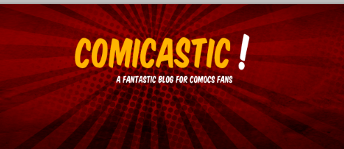
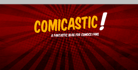 Step 7: Logo Layer Styles
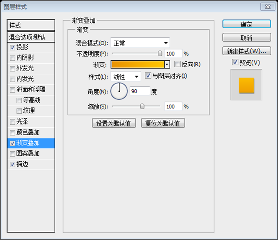
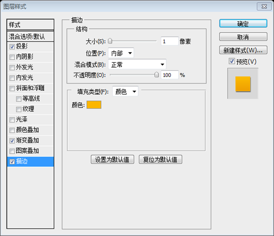
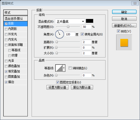

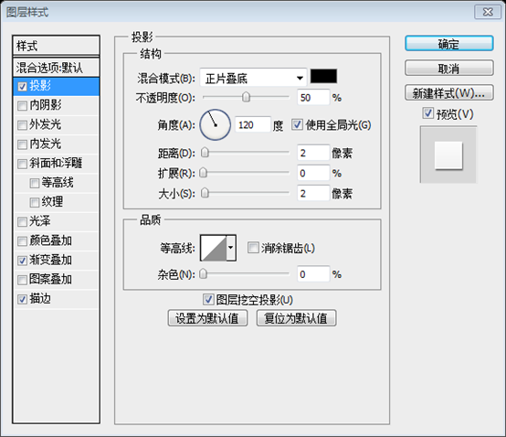
Step 8: Background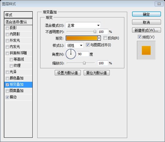

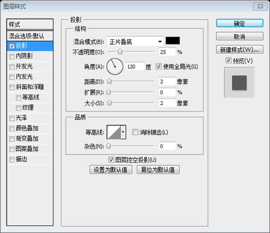

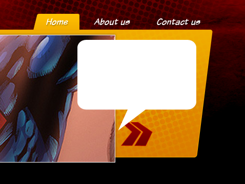
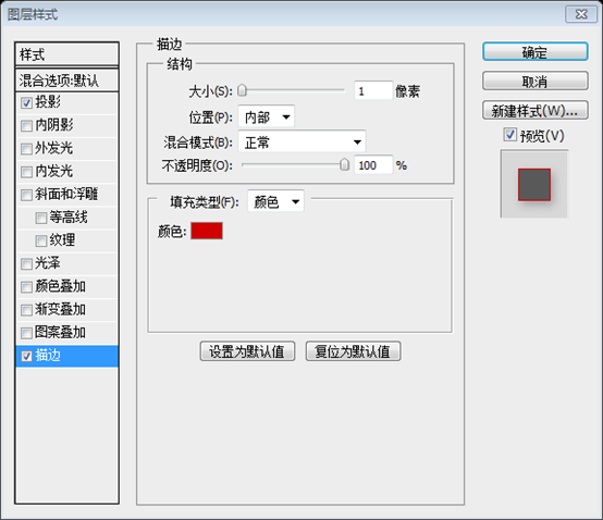
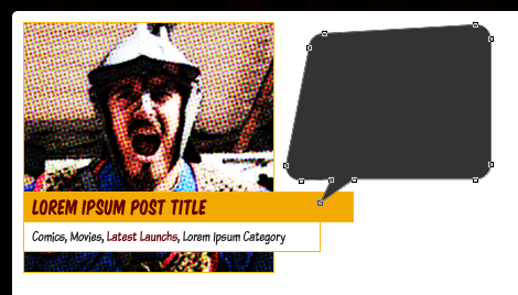
Direct Selection Toolto distort the shape of the talk box a little bit. Finally add drop shadow (Color: #000000, Opacity: 25%, Distance: 5px, Expand: 0px, Size: 10px) 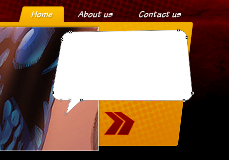






Hot AI Tools

Undresser.AI Undress
AI-powered app for creating realistic nude photos

AI Clothes Remover
Online AI tool for removing clothes from photos.

Undress AI Tool
Undress images for free

Clothoff.io
AI clothes remover

Video Face Swap
Swap faces in any video effortlessly with our completely free AI face swap tool!

Hot Article

Hot Tools

Notepad++7.3.1
Easy-to-use and free code editor

SublimeText3 Chinese version
Chinese version, very easy to use

Zend Studio 13.0.1
Powerful PHP integrated development environment

Dreamweaver CS6
Visual web development tools

SublimeText3 Mac version
God-level code editing software (SublimeText3)

Hot Topics
 1653
1653
 14
14
 1413
1413
 52
52
 1304
1304
 25
25
 1251
1251
 29
29
 1224
1224
 24
24
 How to set password protection for export PDF on PS
Apr 06, 2025 pm 04:45 PM
Export password-protected PDF in Photoshop: Open the image file. Click "File"> "Export"> "Export as PDF". Set the "Security" option and enter the same password twice. Click "Export" to generate a PDF file.
 What are the common questions about exporting PDF on PS
Apr 06, 2025 pm 04:51 PM
Frequently Asked Questions and Solutions when Exporting PS as PDF: Font Embedding Problems: Check the "Font" option, select "Embed" or convert the font into a curve (path). Color deviation problem: convert the file into CMYK mode and adjust the color; directly exporting it with RGB requires psychological preparation for preview and color deviation. Resolution and file size issues: Choose resolution according to actual conditions, or use the compression option to optimize file size. Special effects issue: Merge (flatten) layers before exporting, or weigh the pros and cons.
 How to use PS Pen Tool
Apr 06, 2025 pm 10:15 PM
The Pen Tool is a tool that creates precise paths and shapes, and is used by: Select the Pen Tool (P). Sets Path, Fill, Stroke, and Shape options. Click Create anchor point, drag the curve to release the Create anchor point. Press Ctrl/Cmd Alt/Opt to delete the anchor point, drag and move the anchor point, and click Adjust curve. Click the first anchor to close the path to create a shape, and double-click the last anchor to create an open path.
 What is the reason why PS keeps showing loading?
Apr 06, 2025 pm 06:39 PM
PS "Loading" problems are caused by resource access or processing problems: hard disk reading speed is slow or bad: Use CrystalDiskInfo to check the hard disk health and replace the problematic hard disk. Insufficient memory: Upgrade memory to meet PS's needs for high-resolution images and complex layer processing. Graphics card drivers are outdated or corrupted: Update the drivers to optimize communication between the PS and the graphics card. File paths are too long or file names have special characters: use short paths and avoid special characters. PS's own problem: Reinstall or repair the PS installer.
 Photoshop's Value: Weighing the Cost Against Its Features
Apr 11, 2025 am 12:02 AM
Photoshop is worth the investment because it provides powerful features and a wide range of application scenarios. 1) Core functions include image editing, layer management, special effects production and color adjustment. 2) Suitable for professional designers and photographers, but amateurs may consider alternatives such as GIMP. 3) Subscribe to AdobeCreativeCloud can be used as needed to avoid high one-time spending.
 Photoshop for Professionals: Advanced Editing & Workflow Techniques
Apr 05, 2025 am 12:15 AM
Photoshop's advanced editing skills include frequency separation and HDR synthesis, and optimized workflows can be automated. 1) Frequency separation technology separates the texture and color details of images. 2) HDR synthesis enhances the dynamic range of images. 3) Automate workflows to improve efficiency and ensure consistency.
 How to solve the problem of loading when PS is always showing that it is loading?
Apr 06, 2025 pm 06:30 PM
PS card is "Loading"? Solutions include: checking the computer configuration (memory, hard disk, processor), cleaning hard disk fragmentation, updating the graphics card driver, adjusting PS settings, reinstalling PS, and developing good programming habits.
 How to speed up the loading speed of PS?
Apr 06, 2025 pm 06:27 PM
Solving the problem of slow Photoshop startup requires a multi-pronged approach, including: upgrading hardware (memory, solid-state drive, CPU); uninstalling outdated or incompatible plug-ins; cleaning up system garbage and excessive background programs regularly; closing irrelevant programs with caution; avoiding opening a large number of files during startup.


