

Matplotlib is a Python 2D plotting library that can generate publication-quality graphics in a variety of hardcopy formats and interactive environments on a variety of platforms.

In the last Matplotlib data visualization tutorial, we will introducehow to createbar charts, histograms and scatter plots. Today we bring you two other types of charts, stacked charts and pie charts. Because these two diagrams are very similar, they are introduced together.
Stacked Chart
Stacked chart is used to show the relationship of "part to whole" over time. A stacked chart is basically like a pie chart, only it changes over time.
Let's consider a situation where we have 24 hours in a day and we want to see how we spend our time. We divide our activities into: sleeping, eating, working and playing.
We assume we want to track it over a period of 5 days, so our initial data will look like this:
import matplotlib.pyplot as plt
days = [1,2,3,4,5]
sleeping = [7,8,6,11,7]
eating =   [2,3,4,3,2]
working =  [7,8,7,2,2]
playing =  [8,5,7,8,13]
Therefore, our x-axis will include the day variable, which is 1, 2, 3, 4 and 5. The individual components of the date are then kept in their respective activities. Draw them like this:
plt.stackplot(days, sleeping,eating,working,playing, colors=['m','c','r','k'])
plt.xlabel('x')
plt.ylabel('y')
plt.title('Interesting Graph\nCheck it out')
plt.show()
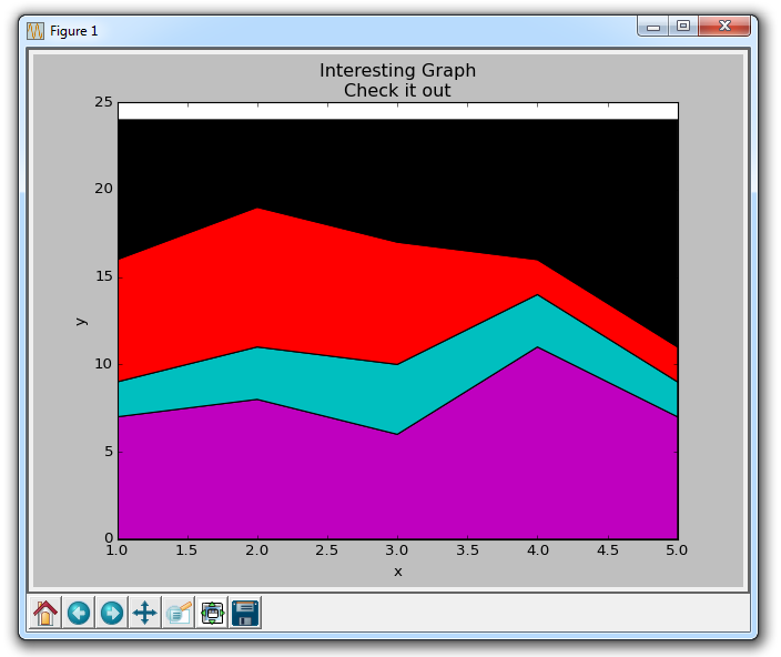
Here we can see, at least in color, how we spend our time. The problem is, without looking back at the code, we don't know what color is what. The next problem is that with polygons we can't actually add "labels" to the data. So anywhere that's more than just lines, with a fill or a stacked diagram like this, we can't inherently mark out specific parts. This shouldn't stop programmers. We can fix this:
import matplotlib.pyplot as plt
days = [1,2,3,4,5]
sleeping = [7,8,6,11,7]
eating =   [2,3,4,3,2]
working =  [7,8,7,2,2]
playing =  [8,5,7,8,13]
plt.plot([],[],color='m', label='Sleeping', linewidth=5)
plt.plot([],[],color='c', label='Eating', linewidth=5)
plt.plot([],[],color='r', label='Working', linewidth=5)
plt.plot([],[],color='k', label='Playing', linewidth=5)
plt.stackplot(days, sleeping,eating,working,playing, colors=['m','c','r','k'])
plt.xlabel('x')
plt.ylabel('y')
plt.title('Interesting Graph\nCheck it out')
plt.legend()
plt.show()
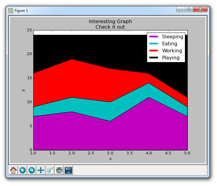
What we do here is draw some empty rows, give them the same color as our stacked plot, and the correct labels. We also give them a line width of 5 to make the lines appear wider in the legend. Now we can easily see how we spend our time.
Pie Chart
Pie charts are much like stacked charts, except they are located at a certain point in time. Typically, pie charts are used to show how a part contributes to a whole, usually in %. Fortunately, Matplotlib takes care of the slice size and everything, we just need to provide the numerical value.
import matplotlib.pyplot as plt
slices = [7,2,2,13]
activities = ['sleeping','eating','working','playing']
cols = ['c','m','r','b']
plt.pie(slices,
        labels=activities,
        colors=cols,
        startangle=90,
        shadow= True,
        explode=(0,0.1,0,0),
        autopct='%1.1f%%')
plt.title('Interesting Graph\nCheck it out')
plt.show()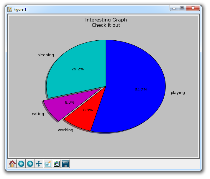
In plt.pie, we need to specify the "slice", which is the relative size of each part. We then specify a list of colors for the corresponding slices. Next, we can choose to specify the "start angle" of the graphic. This allows you to start drawing anywhere. In our example, we chose a 90-degree angle for the pie chart, which means the first segment is a vertical line. Next, we have the option to add a character-sized shadow to the drawing, and then we can even use explode to pull out a slice.
We have a total of four slices, so for explode, if we don't want to pull out any slices, we pass in 0,0,0,0. If we want to pull the first slice, we pass in 0.1,0,0,0.
Finally, we use autopct to choose to place the percentage on the chart.
The above is the detailed content of How to draw stacked charts and pie charts using Matplotlib. For more information, please follow other related articles on the PHP Chinese website!


![[Web front-end] Node.js quick start](https://img.php.cn/upload/course/000/000/067/662b5d34ba7c0227.png)


