目前在弄公司移动端改版问题中,本人css菜鸟,对移动端更是不熟悉,遇到这种PC上无问题,移动端出问题时真心无力。
测试连接: body滚动问题地址
测试浏览器: android手机 上 QQ浏览器 UC 浏览器 或者微信扫描打开
二维码地址:
问题起因:
想要实现点击按钮,右侧进入菜单,菜单整体宽度是和body宽度一致,从而遮住整个屏幕。
目前实现方案是 菜单绝对定位 宽度100% left:100% 从而整个菜单超出屏幕,并设置body overflow-x 为hidden ,从而实现默认情况下菜单不可见, 点击按钮 激活菜单,添加active之类的class 变更left 从而实现右侧动画进入效果。
PS:默认情况下没有让菜单display none 是考虑 使用display 从none到block 导致没有渐变过程。
问题描述如下:
现在出现的问题是,在手机上 左右可以滚动,从而可以把屏幕最右边的菜单给滚进来, PC 上没有此问题。尝试各种方法没有解决,求大神帮忙。
问题截图: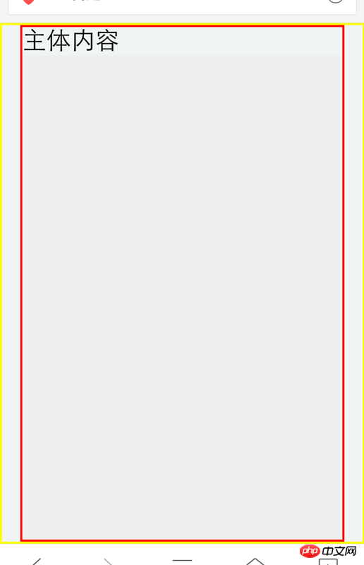
打开页面后看到的是上面的效果
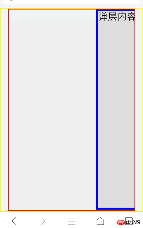
左右触摸滚动 可以把右边的菜单栏位给滚动进来,但是我设置了overlfow-x hidden的,还是可见,求教如何隐藏。


![[Web front-end] Node.js quick start](https://img.php.cn/upload/course/000/000/067/662b5d34ba7c0227.png)


Because I have canceled the default behavior of the browser before, this problem has never occurred, so I did a test all afternoon. Let’s complain about the fact that the browsers on vivo and Huawei really have a lot of compatibility issues.
Find a sentence portal from another forum
But the direct parent of the menu block in the code, that is,
body, has relative positioning turned on, andbodyhas setoverflow-x:hidden, so logically it will be hidden. But due to the problems I encountered before, I wonder if the browsing area handlesviewportdifferently, causing the body to also belong to the root-level containing block? (No verification) So I hope it can be solved by wrapping it with another layer ofp.The html structure is as follows
No other changes will be made to the style part
Others: There seem to be duplicate styles in your style sheet, which need to be optimized.
So many answers first. We will add the general processing of other mobile terminals later.
Thank you for the invitation. Well, sorry for my limited understanding. What is the problem after you have said so much? I linked to your question page...still confused.
There is no problem when using QQ Browser for iOS and Cheetah Browser on Xiaomi
The body is not used as a root element on some browsers, which means that the root element does not have attributes such as width and height, view box, etc. Only non-root browsers that handle the body can support the ofh of the body; but on some browsers It is processed as root, which means that the body cannot hide child elements or have a fixed width; you can try supporting the :root selector, which basically does not have this problem;
So: The solution for you [knock on the blackboard]:
1. The animation structure of Dom should be separated from the performance structure as much as possible; for example: nest an independent layer as the animation layer; reduce the amount of calculations in the middle process of animation ;(Based on your case: just add a layer of #slideLeft below the body to set the width);
2, on the mobile side; if possible, please use transform:translate(100%,0); to complete the flat animation; don't Use posa+left||right animation; combined with the following case, it is #slideLeft{transform:translate(100%,0)}
@golden_freeman_china Sorry, I can only accept one person's answer. Thank you for your reply.
The current solution is to add an additional layer of containers to wrap the overall content, and the internal absolutely positioned elements are positioned using the wrapping container. Problem solved, posted.