 Backend Development
 XML/RSS Tutorial
 Detailed explanation of the sample code used in Android XML files
Detailed explanation of the sample code used in Android XML files
Detailed explanation of the sample code used in Android XML files
1. Layout file: In the layout directory, it is widely used;
We can define two sets for the application Or multiple sets of layouts, for example: you can create new directories layout_land (representing the horizontal screen layout of mobile phones), layout_port (representing the vertical screen layout of mobile phones). The system will automatically find the most appropriate layout file according to different situations, but two different sets of layouts on the same interface The filenames of the files should be the same, just placed in two different directories.
2. Picture files: In the drawable directory, it is divided into three directories from version 2.1 onwards.
drawable-hdpi stores high-resolution pictures, such as WVGA (480×800) ,FWVGA (480×854)
drawable-mdpi stores medium-resolution pictures, such as HVGA (320×480)
drawable-ldpi stores low-resolution pictures, such as QVGA (240×320)
The system will go to these folders to find the corresponding pictures according to the resolution of the machine.
When developing a program, in order to be compatible with different platforms and different screens, it is recommended that different versions of images be stored in each folder according to needs.
We can put the prepared pictures in this directory, or realize the desired pictures through custom XML files. For example, we can define shape_1.xml and put it in the drawable directory, the content is as follows:
<shape xmlns:android="http://schemas.android.com/apk/res/android"   android:shape="oval">
<!--android:shape="oval"表示所要绘制的图形是一个椭圆,默认是rectangle,长方形-->
<gradient
    android:startColor="#0055ff88"
    android:centerColor="#0055ff00"
    android:centerY="0.75"
    android:endColor="#00320077"
    android:angle="270"
/>
<!--gradient 产生颜色渐变 android:angle 从哪个角度开始变 只有90的整数倍可以 -->
<solid android:color="#ff4100ff"/>
<!--solid表示图形是实心的,填充里面,#ff4100ff为填充颜色-->
<stroke
    android:width="2dp"
    android:color="#ee31ff5e"
    android:dashWidth="3dp"
    android:dashGap="2dp" />
<!-- 描边 采用那样的方式将外形轮廓线画出来,width表示笔的粗细,dashWidth表示小横线的宽度,dashGap表示小横线之间的距离-->
<padding
    android:left="7dp"
    android:top="7dp"
    android:right="7dp"
    android:bottom="7dp" />
<!--和CSS中的padding应该是一个道理-->
<corners android:radius="6dp" />
<!--corners表示是有半径为5像素的圆角-->
</shape>When we want a control to display different pictures according to different states, we can control it directly in the program, or we can create an XML file in the drawable directory to achieve the same effect. For example: we can create a new file button_back in the drawable directory. .xml
<?xml version="1.0" encoding="UTF-8"?>
<selector xmlns:android="http://schemas.android.com/apk/res/android">
    <item  android:state_pressed="false"android:drawable="@drawable/xxx1" />
    <item  android:state_pressed="true"  android:drawable="@drawable/xxx2" />
    <item  android:state_focused="true"  android:drawable="@drawable/xxx3" />
    <-- 这里还可以加N多效果和动作 只要你用的到 -->
    <item  android:drawable="@drawable/xxx4" />
</selector>The above XML file can implement a control (assumed to be a button), get the focus, press the button, and display the effects of different pictures under normal conditions. You only need to reference the file name when defining the control. , for example:
<Button
     android:id="@+id/Button"
     android:layout_width="wrap_content"
     android:layout_height="wrap_content"
     android:background="@drawable/button_add_x">
</Button>
<!--android:background="@drawable/button_back"指向button_back.xml文件-->But what should we do when our condition is not an existing event type in the system, for example, ImageView displays different pictures based on the value of a variable var? You can write the following code in the program
if (条件1)
{
image.setBackground(R.id.xxx1);
}
else if (条件2)
{
image.setBackground(R.id.xxx2);
} ...Or you can use another simple method to achieve the same function. Create an xml file under res/drawable with the following content
<level-list xmlns:android="http://schemas.android.com/apk/res/android">
    <item android:maxLevel="9" android:drawable="@drawable/battery_0" />
    <item android:maxLevel="39" android:drawable="@drawable/battery_1" />
    <item android:maxLevel="69" android:drawable="@drawable/battery_2" />
    <item android:maxLevel="89" android:drawable="@drawable/battery_3" />
    <item android:maxLevel="100" android:drawable="@drawable/battery_4" />
</level-list> and then in the layout Set the src of imageview to the created xml file. When changing the image in the program, you only need to use imageview.getDrawable().setLevel(50);
Android will automatically select the corresponding image according to the value of level. The mobile phone uses this method to display different pictures when displaying the remaining battery power.
3. Menu file: In the menu directory, when writing code, you only need to load it with MenuInflater in the onCreateOptionsMenu method. The format is as follows,
<menu xmlns:android="http://schemas.android.com/apk/res/android">
    <item android:id="@+id/enabled_item"
        android:title="Enabled"
        android:icon="@drawable/stat_happy" />

    <item android:id="@+id/disabled_item"
        android:title="Disabled"
        android:enabled="false"
        android:icon="@drawable/stat_sad" />

    <item android:id="@+id/enabled_item_2"
        android:title="Enabled"
        android:icon="@drawable/stat_happy" />

    <item android:id="@+id/disabled_item_2"
        android:title="Disabled"
        android:enabled="false"
        android:icon="@drawable/stat_sad" />
</menu>4. The resource file is in the values directory. It is called a resource file because the xml files in the values directory all have resource as the root node.
1 .strings.xml The file that defines strings, the format is as follows:
<resources>
    <string name="hello">Hello World!</string>
    <string name="app_name">我的应用程序</string>
</resources>2.colors.xml The file that defines colors, the format is as follows:
<resources>
    <!--定义图片颜色-->
    <drawable name="screen_background_black">#ff000000</drawable>
    <drawable name="translucent_background">#e0000000</drawable>
    <drawable name="transparent_background">#00000000</drawable>
    <!--定义文字颜色-->
    <color name="solid_red">#f00</color>
    <color name="solid_blue">#0000ff</color>
    <color name="solid_green">#f0f0</color>
    <color name="solid_yellow">#ffffff00</color>
</resources>3.arrays.xml The file that defines arrays, The format is as follows:
<resources>
    <string-array name="planets">
        <item>Mercury</item>
        <item>Venus</item>
        <item>Earth</item>
        <item>Mars</item>
        <item>Jupiter</item>
        <item>Saturn</item>
        <item>Uranus</item>
        <item>Neptune</item>
        <item>Pluto</item>
    </string-array>

    <integer-array name="numbers">
        <item>100</item>
        <item>500</item>
        <item>800</item>
    </integer-array>
</resources>4.styles.xml The file that defines the style is divided into two purposes:
Style: used in the layout of a single XML element (control) in a unit manner. For example: we can define a style for TextView, including the font size and color of the text, and then use it on a specific instance of TextView.
Theme: used as a unit in all activities in the application or in a certain activity in the application. For example, we can define a Theme, which defines a set of colors for the foreground and background of the window frame and panel, and defines the textable size and color attributes for the menu. This Theme can be applied to all activities in your program.
<resources>
   <!--Theme,可以用来定义activity的主题-->
   <style name="Theme.Transparent">
        <item name="android:windowIsTranslucent">true</item>
        <item name="android:windowAnimationStyle">@android:style/Animation.Translucent</item>
        <item name="android:windowBackground">@drawable/transparent_background</item>
        <item name="android:windowNoTitle">true</item>
        <item name="android:colorForeground">#fff</item>
    </style>
    <!--Style,可以用来定义某个View元素,这里是ImageView的样式-->
    <style name="ImageView120dpi">
        <item name="android:src">@drawable/stylogo120dpi</item>
        <item name="android:layout_width">wrap_content</item>
        <item name="android:layout_height">wrap_content</item>
    </style>
</resources>Personally, I think that whether it is Theme or Style, it is just the scope of application that is different. The distinction should be based on the xxxx of android:name="xxxx". It is obviously different.
5.dimen.xml File that defines units. There are the following measurement units in Android:
px (pixel): the actual pixels of the screen, the commonly used resolution is 1024* 768pixels means 1024px horizontally and 768px vertically. The display effect is the same on different devices.
in (inch): The physical size of the screen, each inch is equal to 2.54 centimeters.
mm(millimeters): The physical size of the screen.
pt (point): The physical size of the screen. 1/72 inch.
dp/dip: Density-independent pixel, an abstract unit based on screen density. On a 160 dots per inch monitor, 1dp = 1px. However, the ratio of dp to px will change with the change of screen density, and different devices have different display effects.
sp: pixels that have nothing to do with scale, mainly used for font display best for textsize, as a size unit related to text.
<resources>
    <dimen name="one_pixel">1px</dimen>
    <dimen name="double_density">2dp</dimen>
    <dimen name="sixteen_sp">16sp</dimen>
</resources>6.attrs.xml The file that defines attributes is mainly used in custom components. The specific usage will be introduced in detail in the subsequent How to use custom components. Its format is as follows:
<resources>
    <declare-styleable name="MyView">
        <attr name="textColor" format="color" />
        <attr name="textSize" format="dimension" />
    </declare-styleable>
</resources>五、动画文件 在anim目录下,动画资源分为两种,
1.实现图片的translate、scale、rotate、alpha四种变化,还可以设置动画的播放特性,称为Tween动画。
<set xmlns:android="http://schemas.android.com/apk/res/android">
    <translate android:interpolator="@android:anim/accelerate_interpolator"
         android:fromXDelta="0" android:toXDelta="200" android:fromYDelta="0"
         android:toYDelta="180" android:duration="2000" />
    <scale android:interpolator="@android:anim/accelerate_interpolator"
         android:fromXScale="1.0" android:toXScale="2.0" android:fromYScale="1.0"
         android:toYScale="2.0" android:pivotX="150%" android:pivotY="150%"
         android:duration="2000" />
    <alpha android:fromAlpha="1.0" android:toAlpha="1.0"
         android:duration="@android:integer/config_mediumAnimTime" />
    <rotate ....各个属性></rotate>
    <Interpolator >可以使用其子类和属性定义动画的运行方式,先快后慢,先慢后快等</Interpolator>
</set>
2.帧动画,逐帧播放设置的资源,称为Frame动画。
<animation-list xmlns:android=”http://schemas.android.com/apk/res/android”
android:oneshot=”true”>
    <item android:drawable=”@drawable/rocket_thrust1″ android:duration=”200″ />
    <item android:drawable=”@drawable/rocket_thrust2″ android:duration=”200″ />
    <item android:drawable=”@drawable/rocket_thrust3″ android:duration=”200″ />
</animation-list>六、raw目录下的文件,是直接复制到设备中的任意文件。它们无需编译,添加到你的应用程序编译产生的压缩文件中。一般为应用要用到的音频或视频文件等等
要使用这些资源,可以调用Resources.openRawResource(),参数是资源的ID,即R.raw.somefilename。
七、xml目录下的文件,是程序中需要使用的普通xml文件。在运行时可以通过调用Resources.getXML()读取。
八、assets目录下的文件都是保持原始的文件格式,需要用AssetManager以字节流的形式读取文件。
1. 先在Activity里面调用getAssets()来获取AssetManager引用。
2. 再用AssetManager的open(String fileName, int accessMode)方法则指定读取的文件以及访问模式就能得到输入流InputStream。
3. 然后就是用已经open file 的inputStream读取文件,读取完成后记得inputStream.close()。
4.调用AssetManager.close()关闭AssetManager。
总结:其实android中定义如此多的XML配置文件,在我看来就是为了达到显示层和数据层的分离,提高了可维护性,也是我们的程序代码变得简洁。
The above is the detailed content of Detailed explanation of the sample code used in Android XML files. For more information, please follow other related articles on the PHP Chinese website!

Hot AI Tools

Undresser.AI Undress
AI-powered app for creating realistic nude photos

AI Clothes Remover
Online AI tool for removing clothes from photos.

Undress AI Tool
Undress images for free

Clothoff.io
AI clothes remover

AI Hentai Generator
Generate AI Hentai for free.

Hot Article

Hot Tools

Notepad++7.3.1
Easy-to-use and free code editor

SublimeText3 Chinese version
Chinese version, very easy to use

Zend Studio 13.0.1
Powerful PHP integrated development environment

Dreamweaver CS6
Visual web development tools

SublimeText3 Mac version
God-level code editing software (SublimeText3)

Hot Topics
 1377
1377
 52
52
 New report delivers damning assessment of rumoured Samsung Galaxy S25, Galaxy S25 Plus and Galaxy S25 Ultra camera upgrades
Sep 12, 2024 pm 12:23 PM
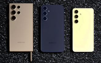
In recent days, Ice Universe has been steadily revealing details about the Galaxy S25 Ultra, which is widely believed to be Samsung's next flagship smartphone. Among other things, the leaker claimed that Samsung only plans to bring one camera upgrade
 Samsung Galaxy S25 Ultra leaks in first render images with rumoured design changes revealed
Sep 11, 2024 am 06:37 AM
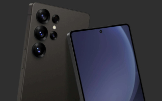
OnLeaks has now partnered with Android Headlines to provide a first look at the Galaxy S25 Ultra, a few days after a failed attempt to generate upwards of $4,000 from his X (formerly Twitter) followers. For context, the render images embedded below h
 IFA 2024 | TCL\'s NXTPAPER 14 won\'t match the Galaxy Tab S10 Ultra in performance, but it nearly matches it in size
Sep 07, 2024 am 06:35 AM
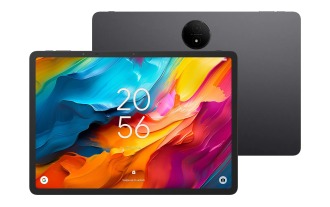
Alongside announcing two new smartphones, TCL has also announced a new Android tablet called the NXTPAPER 14, and its massive screen size is one of its selling points. The NXTPAPER 14 features version 3.0 of TCL's signature brand of matte LCD panels
 New report delivers damning assessment of rumoured Samsung Galaxy S25, Galaxy S25 Plus and Galaxy S25 Ultra camera upgrades
Sep 12, 2024 pm 12:22 PM
In recent days, Ice Universe has been steadily revealing details about the Galaxy S25 Ultra, which is widely believed to be Samsung's next flagship smartphone. Among other things, the leaker claimed that Samsung only plans to bring one camera upgrade
 Vivo Y300 Pro packs 6,500 mAh battery in a slim 7.69 mm body
Sep 07, 2024 am 06:39 AM
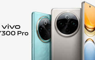
The Vivo Y300 Pro just got fully revealed, and it's one of the slimmest mid-range Android phones with a large battery. To be exact, the smartphone is only 7.69 mm thick but features a 6,500 mAh battery. This is the same capacity as the recently launc
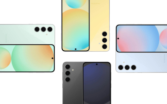 Samsung Galaxy S24 FE billed to launch for less than expected in four colours and two memory options
Sep 12, 2024 pm 09:21 PM
Samsung has not offered any hints yet about when it will update its Fan Edition (FE) smartphone series. As it stands, the Galaxy S23 FE remains the company's most recent edition, having been presented at the start of October 2023. However, plenty of
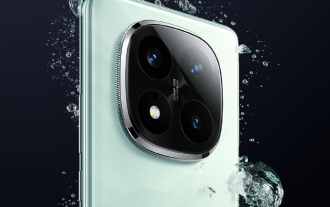 Xiaomi Redmi Note 14 Pro Plus arrives as first Qualcomm Snapdragon 7s Gen 3 smartphone with Light Hunter 800 camera
Sep 27, 2024 am 06:23 AM
The Redmi Note 14 Pro Plus is now official as a direct successor to last year'sRedmi Note 13 Pro Plus(curr. $375 on Amazon). As expected, the Redmi Note 14 Pro Plus heads up the Redmi Note 14 series alongside theRedmi Note 14and Redmi Note 14 Pro. Li
 iQOO Z9 Turbo Plus: Reservations begin for the potentially beefed-up series flagship
Sep 10, 2024 am 06:45 AM
OnePlus'sister brand iQOO has a 2023-4 product cycle that might be nearlyover; nevertheless, the brand has declared that it is not done with itsZ9series just yet. Its final, and possibly highest-end,Turbo+variant has just beenannouncedas predicted. T


