


![[Web front-end] Node.js quick start](https://img.php.cn/upload/course/000/000/067/662b5d34ba7c0227.png)


 PHPz
PHPzCorrection status:qualified
Teacher's comments:很好,没什么问题,继续坚持态度认真,加油


 Collection
 Collection

权重:ID=100 class=10 tag=1
<!DOCTYPE html><html lang="zh-CN"><head><meta charset="UTF-8"><meta http-equiv="X-UA-Compatible" content="IE=edge"><meta name="viewport" content="width=device-width, initial-scale=1.0"><title>CSS选择器权重计算方式</title></head><style>/* 当使用标签作为选择器的时候权重是001 */p {color: blue;}/* 当使用class作为选择器的时候权重是010 */.title {color: red;}/* 当使用ID作为选择器的时候权重是100 */#pid {color: yellow;}/*解释:示例2 p标签+class 选择器权重将会增加到011*/p.title {color:cornsilk;}/* id权重过于高不推荐使用,推荐使用class */</style><body><p>示例1:标签</p><p class="title">示例2:class</p><p id="pid">示例3:ID</p></body></html>
<!DOCTYPE html><html lang="zh-CN"><head><meta charset="UTF-8"><meta http-equiv="X-UA-Compatible" content="IE=edge"><meta name="viewport" content="width=device-width, initial-scale=1.0"><title>盒模型五大属性与计算方式</title></head><style>.box {/* 宽 */width: 200px;/* 高 */height: 150px;/* 内边距 */padding: 10px;/* 边框 */border:solid;/* 外边距 */margin: auto;/* 浏览器默认计算方式 */box-sizing: content-box;}</style><body><div class="box">盒子</div></body></html>
页面显示大小 不等于 源码中的大小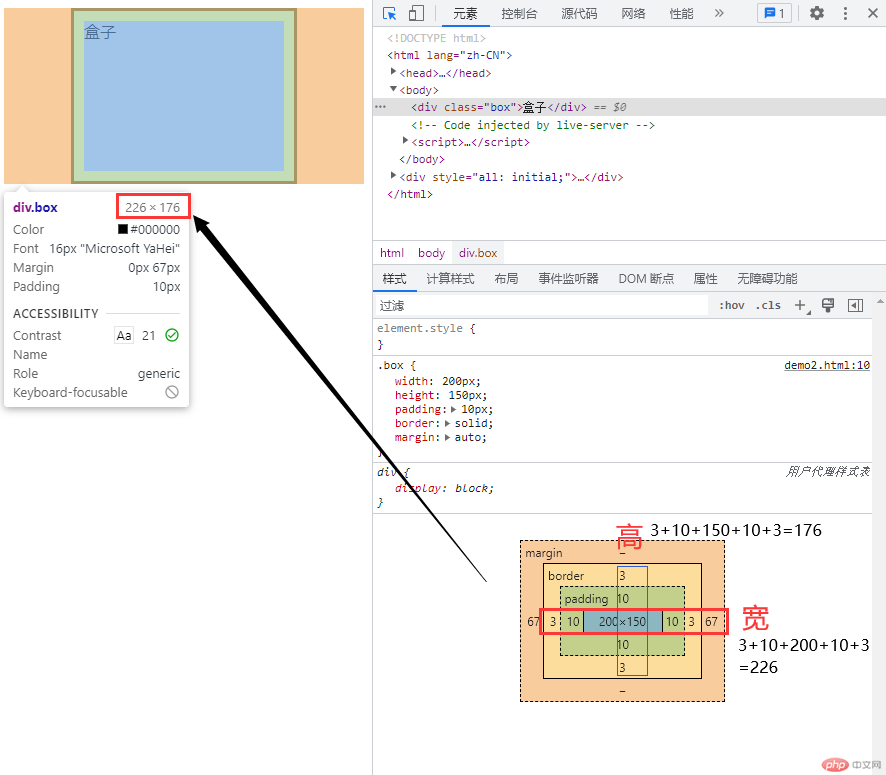
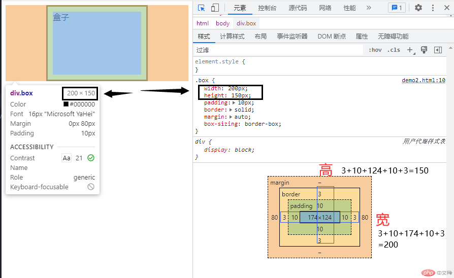
页面显示大小 等于 源码中大小
.box {/* 如果需要页面中的大小 == 源码中的大小增,使用box-sizing:border-box */box-sizing: border-box;}
<!DOCTYPE html><html lang="zh-CN"><head><meta charset="UTF-8" /><meta http-equiv="X-UA-Compatible" content="IE=edge" /><meta name="viewport" content="width=device-width, initial-scale=1.0" /><title>CSS常用单位em、rem</title></head><style>div.em {font-size: 2em;}/* 1em = 16px 可继承属性 *//* ---------------------- *//* 1rem = 1em = 16px */.rem {font-size: 1.15rem;}.rem p {font-size: 1.55rem;}/* 解决了em的问题,使用rem可以单独使用 */</style><body><!-- 1.em --><div class="em"><p>你好</p><p>世界</p></div><!-- 2.rem --><div class="rem"><p>rem</p></div></body></html>
<!DOCTYPE html><html lang="zh-CN"><head><meta charset="UTF-8" /><meta http-equiv="X-UA-Compatible" content="IE=edge" /><meta name="viewport" content="width=device-width, initial-scale=1.0" /><title>vw、vh</title></head><style>.box {width: 100vw;height: 100vh;/* 背景颜色宽高将会占据窗口的100% */width: 20vw;height: 50vh;/* 背景颜色宽占据窗口的20% *//* 背景颜色高占据窗口的50% *//* 背景颜色 */background-color: red;}</style><body><div class="box"></div></body></html>
1.本次学习,让我了解到了CSS选择器的权重知识,以及在不知道CSS的样式写在哪的情况下该如何覆盖它上一个
2.了解到了盒模型的 宽高内外边距属性调整位置
3.CSS常用单位em、rem、自适应的知识。与手机端布局使用vw、vh其中之一