![[Web front-end] Node.js quick start](https://img.php.cn/upload/course/000/000/067/662b5d34ba7c0227.png)


 天蓬老师
天蓬老师Correction status:qualified
Teacher's comments:其实下面的图文列表用grid就可以了, 不必整体用的


 Collection
 Collection

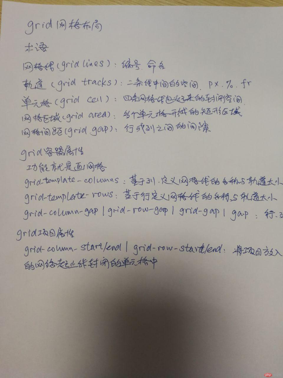
html代码
<!DOCTYPE html><html lang="en"><head><meta charset="UTF-8"><!--引入阿里字体图标库的css--><link rel="stylesheet" href="../iconfont/iconfont.css"><link rel="stylesheet" href="second-hand.css"><title>二手商品交易</title></head><body><!-- 页眉 --><header><a href="">抢好货</a><span>0低价,便捷,安全,快速</span></header><!-- 导航 --><nav><span>热门分类</span><a href="">家用电器</a><a href="">日常百货</a><a href="">运动器械</a><a href="">户外装备</a></nav><!-- 主要内容 --><main><!-- 左边区域,这里采用grid布局 --><div class="left"><div class="detail"><img src="img/shop6.jpg" alt=""><span>grid-template-colums:基于列定义网络线的名与与轨道大小</span><div class="summary"><span>$ 333</span><span>电器</span></div></div><div class="detail"><img src="img/shop6.jpg" alt=""><span>grid-template-rows:基于行定义网络线的名与与轨道大小</span><div class="summary"><span>$ 333</span><span>电器</span></div></div><div class="detail"><img src="img/shop6.jpg" alt=""><span>grid-template-colums:基于列定义网络线的名与与轨道大小</span><div class="summary"><span>$ 333</span><span>电器</span></div></div><div class="detail"><img src="img/shop6.jpg" alt=""><span>grid-template-rows:基于行定义网络线的名与与轨道大小</span><div class="summary"><span>$ 333</span><span>电器</span></div></div><div class="detail"><img src="img/shop6.jpg" alt=""><span>grid-template-colums:基于列定义网络线的名与与轨道大小</span><div class="summary"><span>$ 333</span><span>电器</span></div></div><div class="detail"><img src="img/shop6.jpg" alt=""><span>grid-template-rows:基于行定义网络线的名与与轨道大小</span><div class="summary"><span>$ 333</span><span>电器</span></div></div><div class="detail"><img src="img/shop6.jpg" alt=""><span>grid-template-colums:基于列定义网络线的名与与轨道大小</span><div class="summary"><span>$ 333</span><span>电器</span></div></div><div class="detail"><img src="img/shop6.jpg" alt=""><span>grid-template-rows:基于行定义网络线的名与与轨道大小</span><div class="summary"><span>$ 333</span><span>电器</span></div></div></div><!-- 右边区域,6张图片,grid布局 --><div class="right"><img src="img/1.png" alt=""><img src="img/2.png" alt=""><img src="img/3.png" alt=""><img src="img/4.png" alt=""><img src="img/image.png" alt=""><img src="img/ad2.jpg" alt=""></div></main></body></html>
css代码
* {margin: 0;padding: 0;/* outline: 1px solid green; */font-size: 13px;}a {text-decoration: none;}/* 图片宽度设定占用父容的宽度 */img {width: 100%;}body {width: 1200px;margin: 0 auto;}header {padding: 10px;border-bottom: 1px solid grey;}header > a {font-size: 23px;}header > span {margin: 15px;color: red;}nav {padding: 10px;margin-bottom: 10px;}nav > span {font-size: 23px;color: red;}nav > a {margin-left: 10px;}/* 主体区域,网格,左宽2fr,右宽1fr */main {display: grid;grid-template-columns: 2fr 1fr;grid-gap: 10px;}/* 左:4列2行等分 */main > .left {/* width: 800px; */display: grid;grid-template-columns: repeat(4,1fr);grid-template-rows: repeat(2, 1fr);grid-gap: 10px;}/* 单元格采用grid布局,1列3行,行高自动 */main > .left > .detail {display: grid;/* grid-template-rows: repeat(3, auto); */grid-gap: 10px;}/* 图片宽设定100%比像素更好 */main > .left > .detail > img {/* width: 100%; */border-radius: 5px;}/* 价格所在行设定为FLEX,便于设置样式:两端对齐 */main > .left > .detail > .summary {display: flex;justify-content: space-between;}main > .left > .detail > .summary > span:first-of-type {color: red;}main > .left > .detail > .summary > span:last-of-type {padding: 0 5px;background-color: green;border-radius: 3px;}main > .left > .detail > .summary > span:last-of-type:hover {background-color: blue;cursor: pointer;color: white;}/* 右:2列4行,行高自动,第3、4行各独占一行 */main > .right {display: grid;grid-template-columns: repeat(2, 1fr);grid-template-rows: repeat(4, auto);/* grid-template-areas: "ad1 ad2" "ad3 ad4" "ad5 ad5" "ad6 ad6"; */grid-gap: 10px;}main > .right > img:nth-child(5) {grid-column: 1 / -1;}main > .right > img:nth-child(6) {grid-column: 1 / -1;}
抄写: