


![[Web front-end] Node.js quick start](https://img.php.cn/upload/course/000/000/067/662b5d34ba7c0227.png)


 天蓬老师
天蓬老师Correction status:qualified
Teacher's comments:看得出, 你是多么的热爱你的家乡, 不得不说, 写得真好


 Collection
 Collection
以下所有例子均基于或扩展于下面的HTML结构:
<body><div class="container"><div class="itme"><span>中国.四川</span></div><div class="itme"><span>中国.四川</span></div><div class="itme"><span>中国.四川</span></div><div class="itme"><span>中国.四川</span></div><div class="itme"><span>中国.四川</span></div><div class="itme"><span>中国.四川</span></div><div class="itme"><span>中国.四川</span></div><div class="itme"><span>中国.四川</span></div><div class="itme"><span>中国.四川</span></div></div></body>
grid-template-colums: 基于列,定义网络线的名称与与轨道大小grid-template-rows: 基于行,定义网络线的名称与与轨道大小grid-template-area: 命名网格区域(配合gird项目的grid-area属性)
grid-template: 可快速命名网格区域并设定网格大小(配合gird项目的grid-area属性)
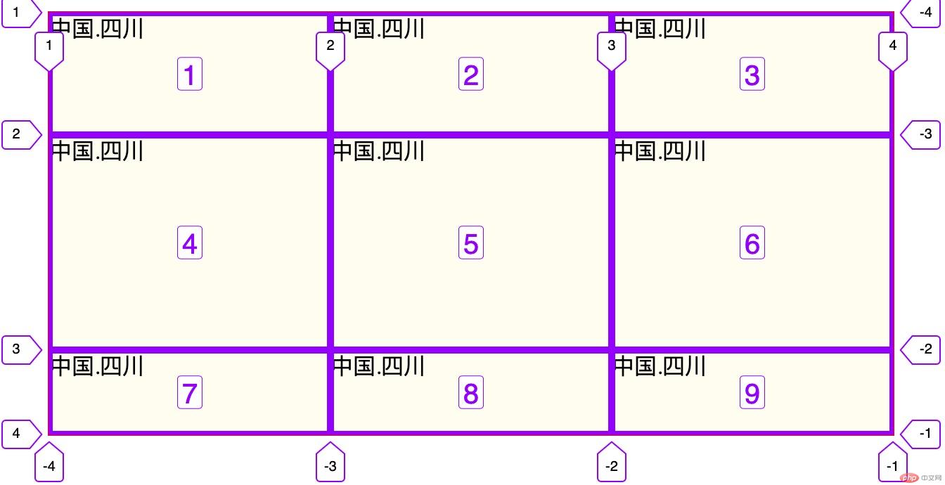
<style>.container{margin: auto;border: 1px solid red;width: 600px;height: 300px;background: #fffdef;display: grid;/*1,直接有px像素定义行列的宽窄和数量*//*grid-template-columns: 200px 200px 200px;*//*grid-template-rows: 100px 100px 100px;*//*2,用repeat函数快速定义行列的宽窄和数量*//*grid-template-columns: repeat(3,140px);*//*grid-template-rows: repeat(3,60px);*//*3,使用命名的方式定义行列的宽窄和数量*/grid-template: '1 2 3' 29%'4 5 6' auto'7 8 9' 20%/1fr 1fr 1fr;}</style>
grid-column-gap | grid-row-gap | grid-gap | gap: 行/列间距:
<style>.container{margin: auto;border: 1px solid red;width: 600px;height: 300px;background: #fffdef;display: grid;grid-template-columns: repeat(3,200px);grid-template-rows: repeat(3,100px);grid-gap:10px;/*place-content: space-between;*/place-items: center;}</style>

grid-auto-flow: 项目在网格中项目的排列方向(默认先行后列)grid-auto-flow:column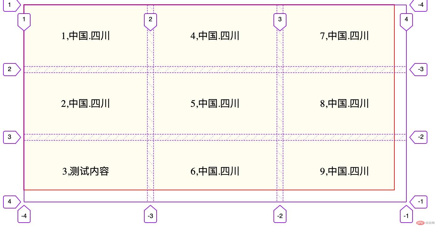
grid-auto-flow:row
justify-contens: 设置所有项目在网格容器中的水平对齐方式align-content: 设置所有项目在网格容器中的垂直对齐方式place-content: justify-content和align-content的简写place-content:start: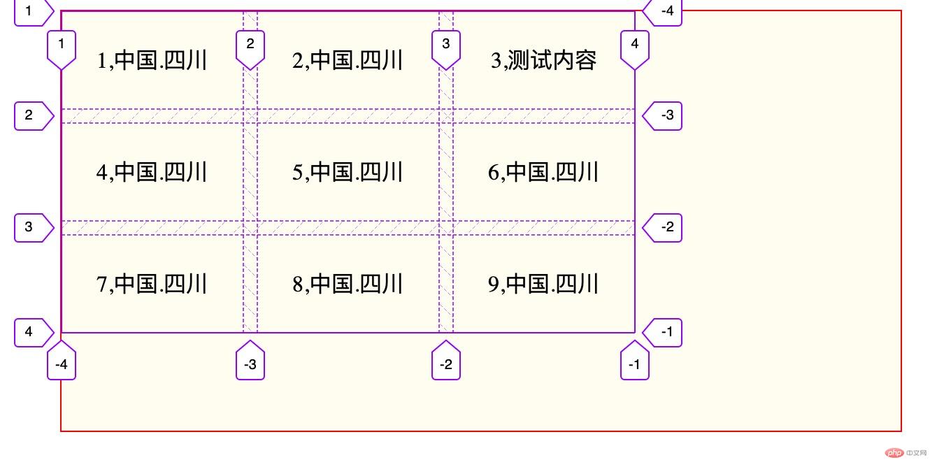
place-content:center: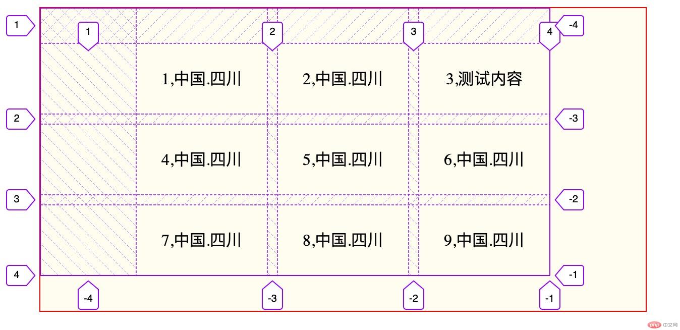
place-content:end: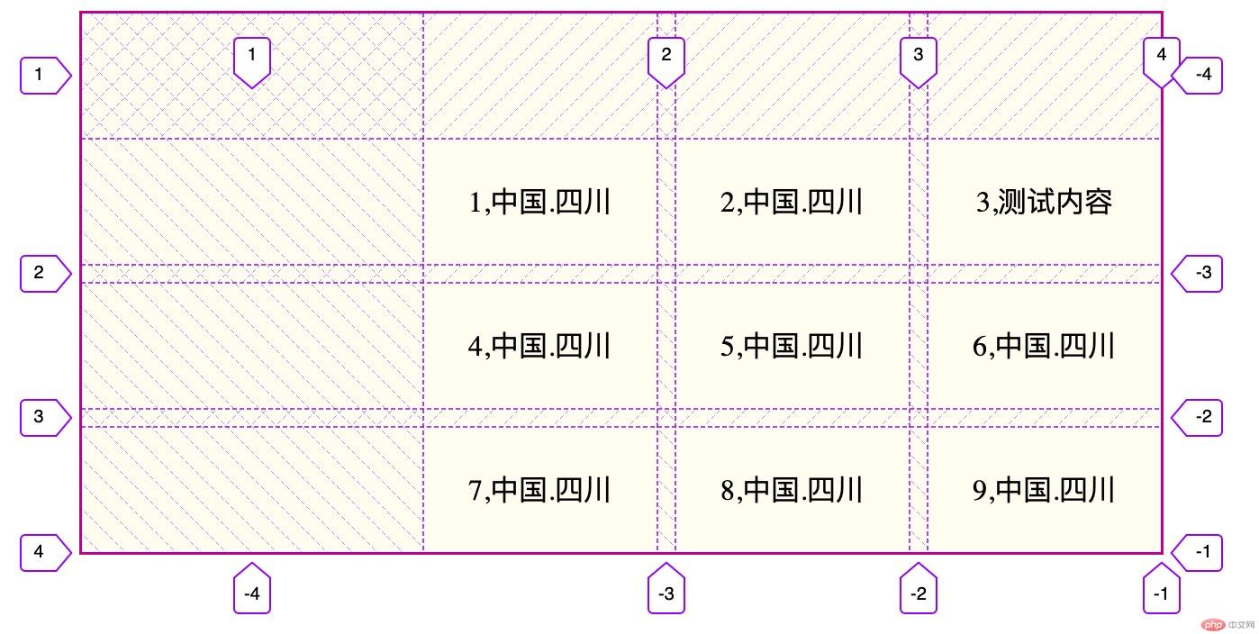
place-content:space-between: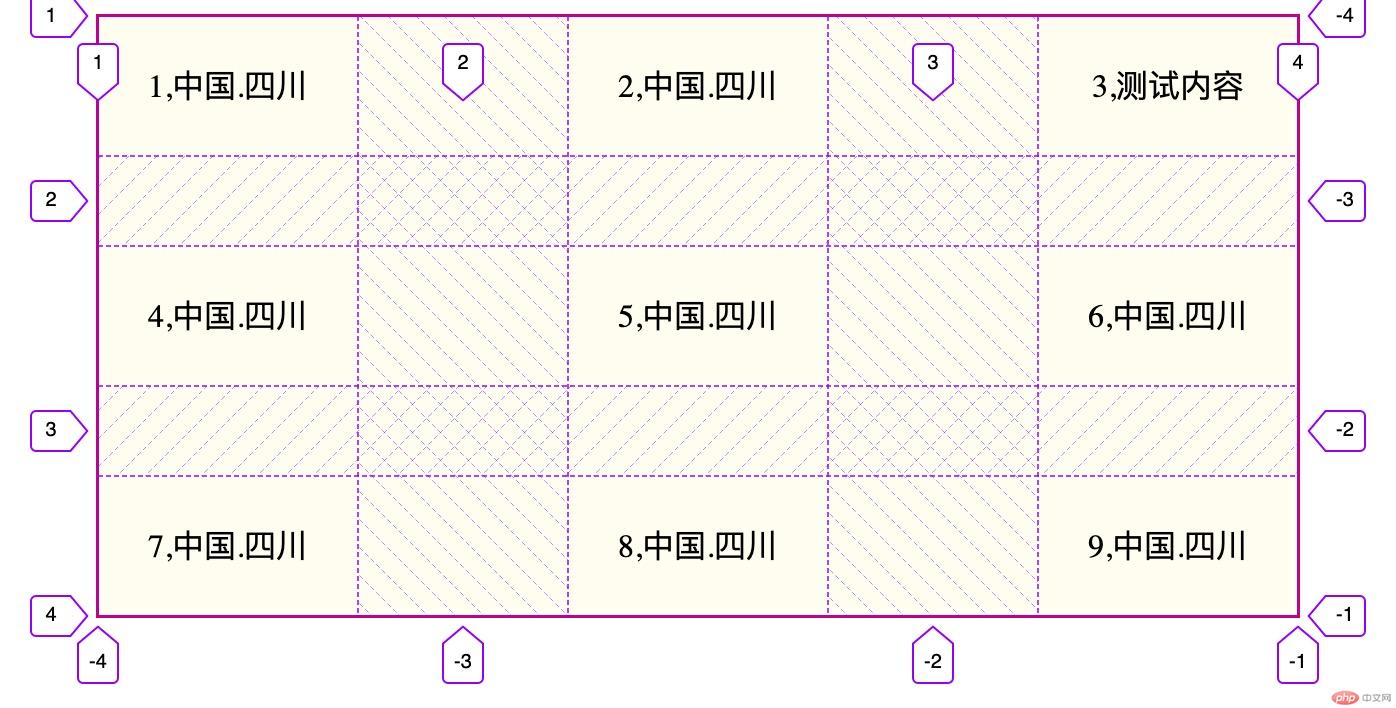
place-content:space-evenly: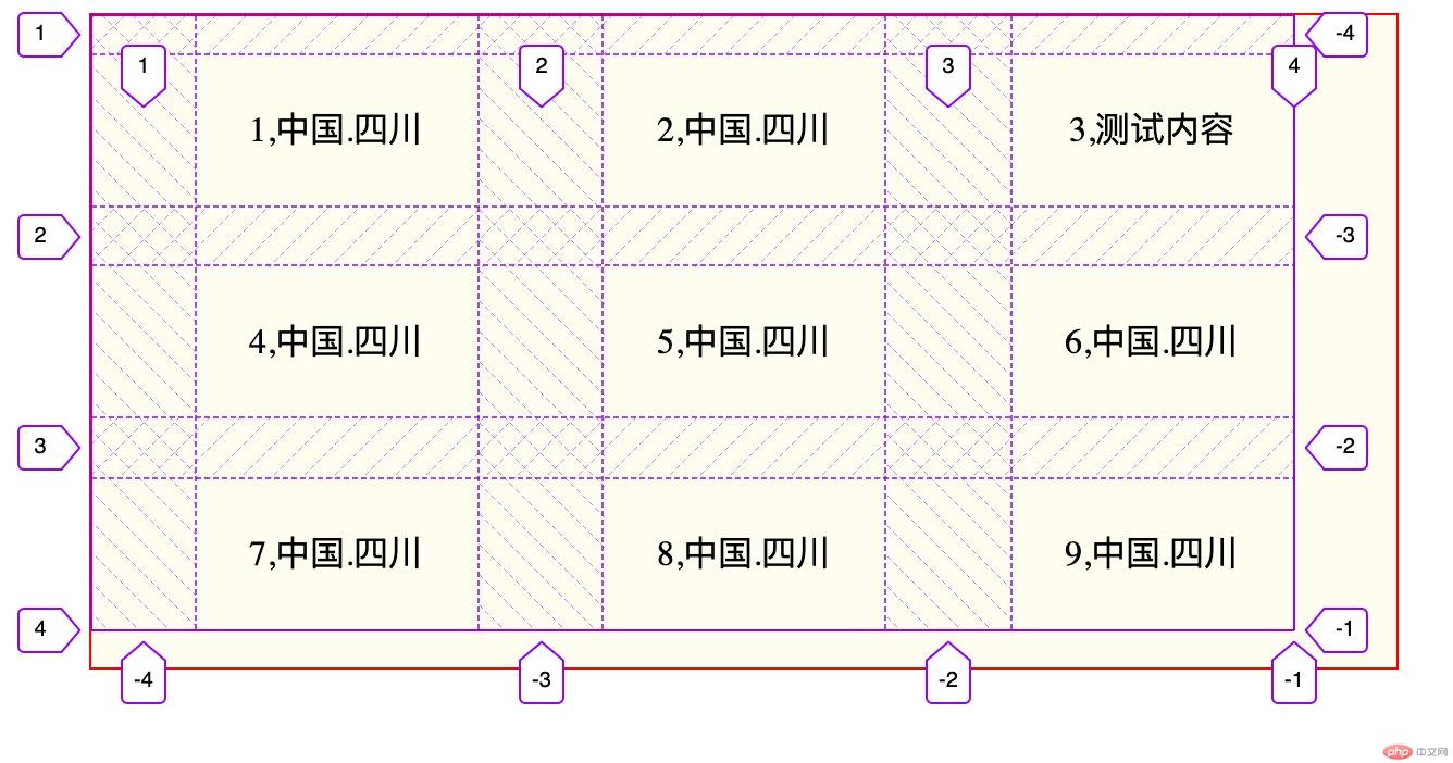
place-content:space-around:
justify-items: 设置所有项目在单元格内的水平对齐方式align-items: 设置所有项目在单元格内的垂直对齐方式place-items: justify-items和align-items的简写place-items:start:
place-items:center:
place-items:end: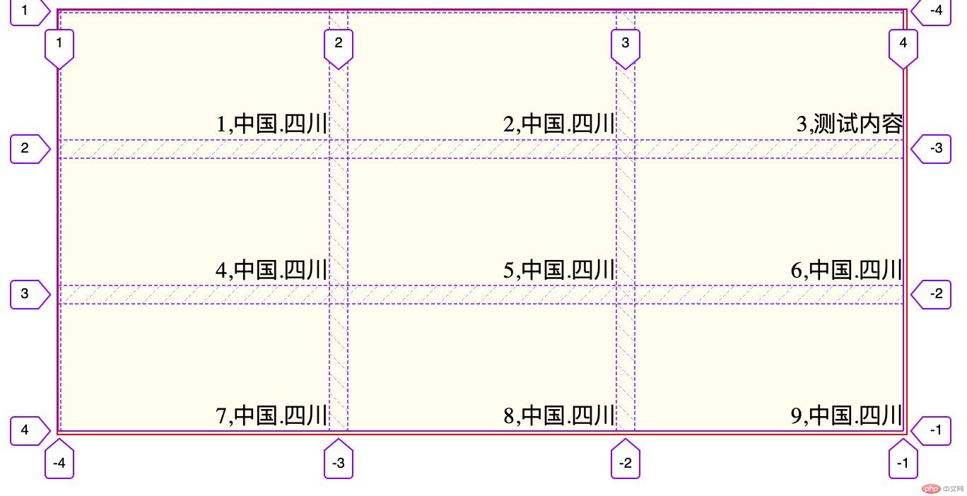
grid-column-start: 起始列编号grid-column-end: 终止列编号grid-column: 上面二属性缩写
grid-row-start: 起始行编号
grid-row-end: 终止行编号grid-row: 上面二属性编写grid-area: top/left/bottom/right: 将项目按逆时针顺序放置
<style>.container{margin: auto;border: 1px solid red;width: 600px;height: 300px;background: #fffdef;display: grid;grid-template-columns: repeat(3,190px);grid-template-rows: repeat(3,90px);grid-gap:10px;place-content: space-around;place-items: center;/*grid-auto-flow: row;*/}.container>.itme:nth-of-type(3) span{background: red;}.container>.itme:nth-of-type(3){grid-area: 2/2/4/4;}</style>
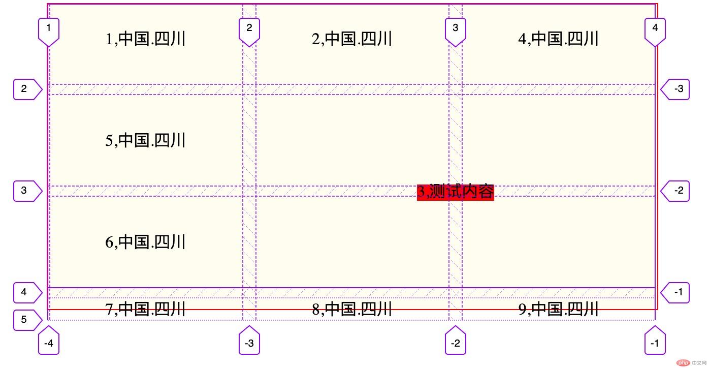
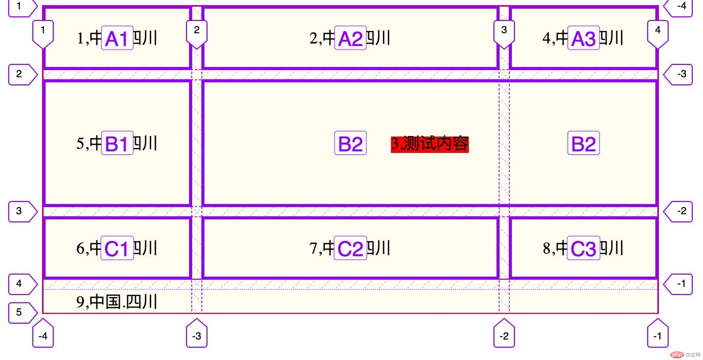
<style>.container{margin: auto;border: 1px solid red;width: 600px;height: 300px;background: #fffdef;display: grid;/*grid-template-columns: repeat(3,190px);*//*grid-template-rows: repeat(3,90px);*/grid-template: 'A1 A2 A3' 1fr'B1 B2 B2' 2fr'C1 C2 C3' 1fr/1fr 2fr 1fr;grid-gap:10px;place-content: space-around;place-items: center;/*grid-auto-flow: row;*/}.container>.itme:nth-of-type(3) span{background: red;}.container>.itme:nth-of-type(3){/*grid-area: 2/2/4/4;*/grid-area:B2;}</style>