


![[Web front-end] Node.js quick start](https://img.php.cn/upload/course/000/000/067/662b5d34ba7c0227.png)


 天蓬老师
天蓬老师Correction status:qualified
Teacher's comments:不是99%, 是100%, 任何页面在grid面前都是浮云


 Collection
 Collection
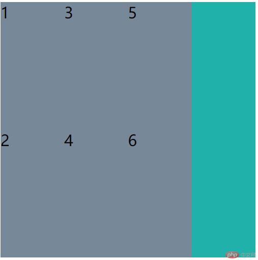
简单的说,就是在flex布局的基础上加了一个轴,flex同时只能设置一个方向,grid布局却能同时设置两个方向,就好比我们现实生活中的坐标轴,flex布局一次只能走一条线,要么x,要么y,非常的单一,在布局一些单行或单列的布局时,非常的占优势,而grid布局,能够两条线一起走,同时进行,在对页面的整体布局时,优势就体现出来了,一个好的页面,一定是将两者合二为一,互相取长补短,才能算是一个好的前端。下面来用案例来介绍一下grid的属性。
/* 设置显示为grad */display: grid;/* 默认显示为行 */grid-auto-flow: row;/* 修改为列显示 */grid-auto-flow: column;/* 显示为三行三列 */grid-template-columns: 100px 100px 100px;grid-template-rows: 200px 200px;/* 对于放不下的项目,会掩式生成单元格 */grid-auto-rows: auto;/* grid-auto-rows: auto; */
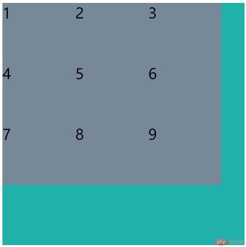
/* 显示为三行三列 */grid-template-columns: 100px 100px 100px;grid-template-rows: 100px 100px 100px;/* 用百分比来设置 */grid-template-columns: 20% 30% auto;grid-template-rows: 100px auto 100px;/* 用比例来设置 */grid-template-columns: 1fr 1fr 1fr;grid-template-rows: 2fr 1fr 1fr;/* 重复设置 */grid-template-columns: repeat(3, 100px);grid-template-rows: repeat(3, 100px);/* 按分组来设置 */grid-template-columns: repeat(2, 50px 100px);/* 弹性设置大小 */grid-template-columns: repeat(3, minmax(20px,200px));grid-template-rows: repeat(3, minmax(20,200px));/* 自动填充 */grid-template-columns: repeat(auto-fill, 120px);grid-template-rows: repeat(auto-fill, 100px);
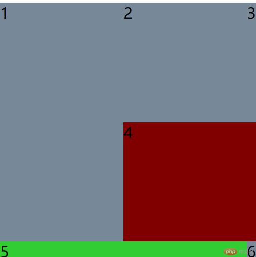
.item.item1 {grid-row-start: 1;grid-row-end: 3;grid-column-start:1;grid-column-end: 3;grid-row-start: -1;grid-row-end: -4;grid-column-start: -1;grid-column-end: -3;grid-row-start: 2;grid-row-end: 4;grid-column-start:2;grid-column-end:4;/* 简写 */grid-row: 1 / 3;grid-column: 1 / 2;}.item.item4{background-color:maroon;grid-column: 2 / span 3;}.item.item5 {background-color:limegreen;grid-row-start: span 1;grid-column-end: span 2;}
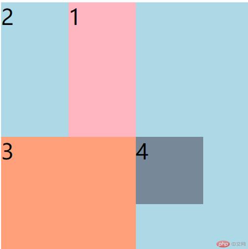
.container {width: 400px;height: 400px;background-color: lightblue;display: grid;grid-template-columns: [c1-start] 100px [c1-end c2-start] 100px [c3-start c3-end] 100px;grid-template-rows: [r1-start] 100px [r1-end r2-start] 100px [r2-end r3-start] 100px;}.item {/* 设置字体是默认字体的两倍 */font-size: 2rem;}.item.item1 {background-color: lightpink;grid-column-start: c2-start;grid-column-end: c3-start;grid-row-start: r1-start;grid-row-end: r2-end;}.item.item3 {background-color: lightsalmon;grid-row-end: span 2;grid-column-end: span 2;}.item.item4 {background-color: lightslategray;}}
.container {/* 容器大小 */width: 400px;height: 400px;background-color: wheat;/* 创建grid容器 */display: grid;grid-template-columns: repeat(4, 1fr);grid-template-rows: repeat(4, 1fr);}.item {font-size: 2rem;}.item.item1 {background-color: lightgreen;/* grid-area: 1 / 1 / 2 / 5; *//* 用偏移量进行简化 *//* grid-area: 1 / 1 / span 1 / span 4; *//* 是从当前位置开始的填充 */grid-area: span 1 / span 4;}/* 简写 */.item.item2 {background-color: lightpink;/* grid-area: 2 / 1 / 4 / 2; *//* grid-area: span 2 / span 1; *//* 默认就是偏移一行/一列 */grid-area: span 2;}/* 使用偏移量来简化, 将第三个移动到左下角 */.item.item3 {background-color: yellow;}.item.item4 {background-color: lightgrey;/* grid-area: row-start / col-start / row-end / col-end; */}.item.item5 {background-color: violet;}

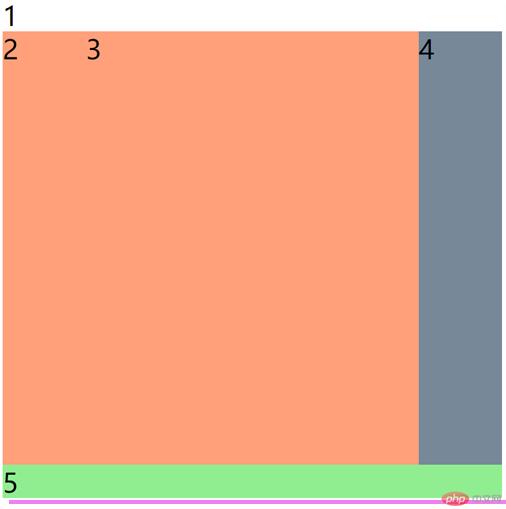
.container {/* 设置容器大小 */width: 600px;height: 600px;background-color: lightslategray;/* 创建grid容器 */display: grid;grid-template-columns: 100px 1fr 100px;grid-template-rows: 40px 1fr 40px;grid-template-areas:"header header header""left main right""footer footer footer";}
.container {/* 设置容器大小 */width: 800px;height: 800px;background-color: lightslategray;/* 创建grid容器 */display: grid;grid-template-columns: repeat( 3 , 200px);grid-template-rows: repeat( 3 , 200px);/* 设置对齐方式 */justify-content: end;align-content:end;justify-content: center;align-content: center;justify-content: space-between;justify-content: space-around;justify-content: space-evenly;align-content: space-between;align-content: space-around;align-content: space-evenly;/* 垂直对齐 水平对齐 */place-content: center start;place-content: center center;place-content: center;}

.container {/* 设置容器大小 */width: 600px;height: 600px;background-color: lightslategray;/* 创建grid容器 */display: grid;grid-template-columns: repeat(3,1fr);grid-template-rows: repeat(3,1fr);justify-items: stretch;align-items: stretch;justify-items: end;align-items: center;justify-items: center;align-items: center;/* 垂直 水平 */place-items: start end;place-items: center center;place-items: center;}
.item {/* 设置字体是默认字体的两倍 */font-size: 2rem;}.item.item5{justify-self: end;align-self: end;place-self: center end;}
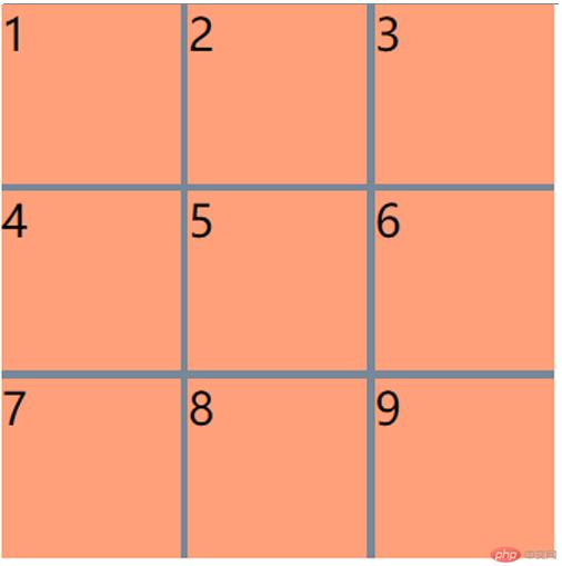
.container {/* 设置容器大小 */width: 400px;height: 400px;background-color: lightslategray;/* 创建grid容器 */display: grid;grid-template-columns: repeat(3,1fr);grid-template-rows: repeat(3,1fr);/* 调整间距 */column-gap: 5px;row-gap: 15px;/* gap: 列间距 行间距 */gap: 15px 5px;gap: 5px;}
总的来说用grid来搭建框架,非常的方便快捷,像一些市面上的网站,基本上都可以用grid布局来实现,配合着flex,两个可以说是无敌了,可以把99%的网站页面做出来,虽然只讲了grid的基本属性,但配合着案例,让我见识到了它的强大,学习了grid框架,也只是万里长征的第一步,还有更多的知识等着我去学习。去向更好出发。
天蓬老师