


![[Web front-end] Node.js quick start](https://img.php.cn/upload/course/000/000/067/662b5d34ba7c0227.png)


 天蓬老师
天蓬老师Correction status:qualified
Teacher's comments:是的, 一定要整理总结, 才能进步


 Collection
 Collection
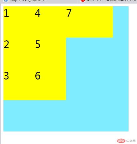
<!DOCTYPE html><html lang="en"><head><meta charset="UTF-8" /><meta name="viewport" content="width=device-width, initial-scale=1.0" /><title>创建grid容器</title><style>.container {width: 400px;height: 400px;background-color: rgb(127, 236, 255);/* 创建grid容器 */display: grid;/* 三行三列 */grid-template-rows: 100px 100px 100px;grid-template-columns: 100px 100px;/*填充方式,默认行优先 */grid-auto-flow: row;grid-auto-flow: column;/* 放不下的项目,会隐式生成单元格 */grid-auto-columns: auto;grid-auto-columns: 150px;}.item {background-color: yellow;font-size: 2em;}</style></head><body><div class="container"><div class="item item1">1</div><div class="item item2">2</div><div class="item item3">3</div><div class="item item4">4</div><div class="item item5">5</div><div class="item item6">6</div><div class="item item7">7</div></div></body></html>
设置单元格的数量与大小](https://img.php.cn/upload/image/906/489/668/1586946316624843.jpg)](https://img.php.cn/upload/image/562/544/680/1586946310693502.jpg)](https://img.php.cn/upload/image/273/810/889/1586946303396363.jpg)](https://img.php.cn/upload/image/647/238/467/1586946296956403.jpg)
<!DOCTYPE html><html lang="en"><head><meta charset="UTF-8" /><meta name="viewport" content="width=device-width, initial-scale=1.0" /><title>设置单元格的数量与大小</title><style>.container {width: 400px;height: 400px;background-color: lightgray;/* 创建grid容器 */display: grid;/* 固定值 */grid-template-rows: 100px 100px 100px;grid-template-columns: 100px 100px 100px;/* 百分比*/grid-template-rows: 10% 40% auto;grid-template-columns: auto 100px 100px;/* 比例 */grid-template-columns: 1fr 3fr 2fr;grid-template-rows: 1fr 1fr 2fr;/* 重复值 */grid-template-rows: repeat(3, 100px);grid-template-columns: repeat(3, 80px);/* 分组 */grid-template-columns: repeat(2, 50px 100px);grid-template-rows: repeat(2, 50px);/* 弹性 */grid-template-columns: repeat(2, minmax(50px,80px));grid-template-rows: repeat2, minmax(50px,1fr));/* 自动填充 */grid-template-columns: repeat(auto-fill,80px);grid-template-rows: repeat(auto-fill,50px);}.item {background-color: yellow;font-size: 2em;}</style></head><body><div class="container"><div class="item item1">1</div><div class="item item2">2</div><div class="item item3">3</div><div class="item item4">4</div><div class="item item5">5</div><div class="item item6">6</div><div class="item item7">7</div></div></body></html>
使用默认的网格线来划分单元格
<!DOCTYPE html><html lang="en"><head><meta charset="UTF-8" /><meta name="viewport" content="width=device-width, initial-scale=1.0" /><title>使用默认的网格线来划分单元格</title><style>.container {width: 400px;height: 400px;background-color: lightgray;/* 创建grid容器 */display: grid;grid-template-columns: repeat(4, 1fr);grid-template-rows: repeat(4, 1fr);}.item {font-size: 2em;}.item.item1 {background-color: lightpink;grid-row-start: 1;grid-row-end: 3;grid-column-start: 1;grid-column-end: 3;}.item.item2 {background-color: lightgreen;grid-row: 1/3;grid-column: 3/5;}.item.item3 {background-color: lightblue;/* grid-row-start: 3;grid-row-end: span 2;grid-column-start: 1;grid-column-end: span 1; */grid-row: 3 / span 2;grid-column: 1 / span 2;}/* 从原地方扩展 */.item.item4 {background-color: lightsalmon;/* grid-row-start: 3; */grid-row-end: span 2;/* grid-column-start: 3; */grid-column-end: span 2;}</style></head><body><div class="container"><div class="item item1">1</div><div class="item item2">2</div><div class="item item3">3</div><div class="item item4">4</div></div></body></html>
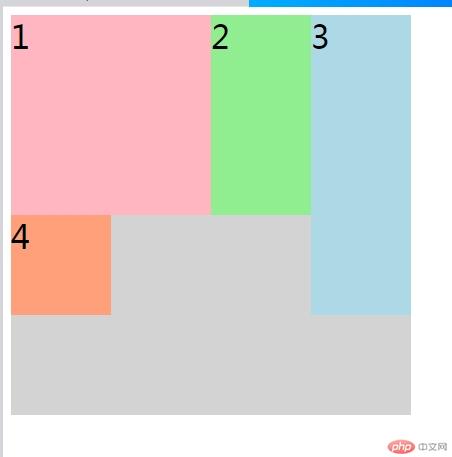
使用命名网格线来划分单元格<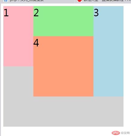
<!DOCTYPE html><html lang="en"><head><meta charset="UTF-8" /><meta name="viewport" content="width=device-width, initial-scale=1.0" /><title>使用命名网格线来划分单元格</title><style>.container {width: 400px;height: 400px;background-color: lightgray;/* 创建grid容器 */display: grid;grid-template-columns: [c1-start] 100px[c1-end c2-start] 100px[c2-end c3-start] 100px[c3-end c4-start] 100px[c4-end];grid-template-rows: [r1-start] 100px[r1-end r2-start] 100px[r2-end r3-start] 100px[r3-end r4-start] 100px[r4-end];}.item {font-size: 2em;}.item.item1 {background-color: lightpink;grid-column-start:c1-start;grid-row-start:r1-start;grid-row-end:r2-end;}.item.item2 {background-color: lightgreen;grid-column:c2-start/ c3-end;}.item.item3 {background-color: lightblue;grid-row: span 3;}.item.item4 {background-color: lightsalmon;grid-row:span 2;grid-column:span 2;}</style></head><body><div class="container"><div class="item item1">1</div><div class="item item2">2</div><div class="item item3">3</div><div class="item item4">4</div></div></body></html>
<!DOCTYPE html>
<html lang="en">
<head>
<meta charset="UTF-8" />
<meta name="viewport" content="width=device-width, initial-scale=1.0" />
<title>默认网格区域</title>
<style>
.container {
width: 400px;
height: 400px;
background-color: lightgray;
/ 创建grid容器 /
display: grid;
grid-template-columns: repeat(4, 1fr);
grid-template-rows: repeat(4, 1fr);
}
.item {
font-size: 2em;
}
.item.item1 {
background-color: lightpink;
/ grid-area:row-start/col-start/row-end/col-end; /
grid-area: 1/1/3/3;
}
.item.item2 {
background-color: lightgreen;
/ grid-area: 1/3/3/4; /
/ 从当前位置填充 /
/ grid-area: span 2 / span 1; /
/ 默认跨一行或一列 /
grid-area: span 2;
}
.item.item3 {
background-color: lightblue;
grid-area: span 3;
}.item.item4 {background-color: lightsalmon;}</style>
</head>
<body>
<div class="container">
<div class="item item1">1</div>
<div class="item item2">2</div>
<div class="item item3">3</div>
<div class="item item4">4</div>
</div>
</body>
</html>
命名网格区域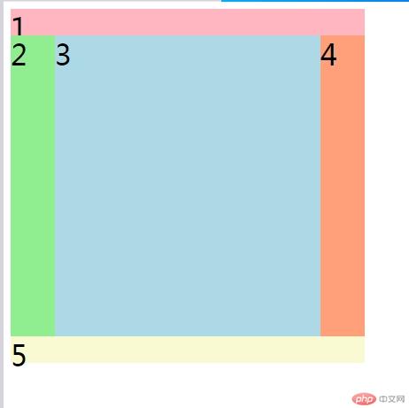
<!DOCTYPE html>
<html lang="en">
<head>
<meta charset="UTF-8" />
<meta name="viewport" content="width=device-width, initial-scale=1.0" />
<title>命名网格区域</title>
<style>
.container {
width: 400px;
height: 400px;
background-color: lightgray;
/ 创建grid容器 /
display: grid;
grid-template-columns: 50px 1fr 1fr 50px;
grid-template-rows: 30px 1fr 30px;
grid-template-areas:
“header header header header”
“left main main right”
“footer footer footer footer”;
}
.item {
font-size: 2em;
}
.item.item1 {
background-color: lightpink;
grid-area: header;
}
.item.item2 {
background-color: lightgreen;
grid-area: left;
}
.item.item3 {
background-color: lightblue;
grid-area: main;
}
.item.item4 {
background-color: lightsalmon;
grid-area: right;
}
.item.item5 {
background-color: lightgoldenrodyellow;
grid-area: footer;
}
</style>
</head>
<body>
<div class="container">
<div class="item item1">1</div>
<div class="item item2">2</div>
<div class="item item3">3</div>
<div class="item item4">4</div>
<div class="item item5">5</div>
</div>
</body>
</html>
命名网格区域占位符$网格区域线的默认名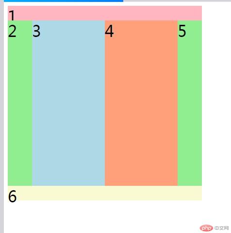
<!DOCTYPE html>
<html lang="en">
<head>
<meta charset="UTF-8" />
<meta name="viewport" content="width=device-width, initial-scale=1.0" />
<title>命名网格区域占位符$网格区域线的默认名称</title>
<style>
.container {
width: 400px;
height: 400px;
background-color: lightgray;
/ 创建grid容器 /
display: grid;
grid-template-columns: 50px 1fr 1fr 50px;
grid-template-rows: 30px 1fr 30px;
grid-template-areas:
“header header header header”
“. . . . “
“footer footer footer footer”;
}
.item {
font-size: 2em;
}
.item.item1 {
background-color: lightpink;
grid-area: header;
}
.item.item2 {
background-color: lightgreen;
/ grid-area: left; /
}
.item.item3 {
background-color: lightblue;
/ grid-area: main1; /
}
.item.item4 {
background-color: lightsalmon;
/ grid-area: main2; /
}
.item.item5 {
background-color: lightgreen;
/ grid-area: right; /
}
.item.item6 {
background-color: lightgoldenrodyellow;
/ grid-area: footer; /
grid-area:footer-start/footer-start/footer-end/footer-end;
}
</style>
</head>
<body>
<div class="container">
<div class="item item1">1</div>
<div class="item item2">2</div>
<div class="item item3">3</div>
<div class="item item4">4</div>
<div class="item item5">5</div>
<div class="item item6">6</div>
</div>
</body>
</html>
设置单元格在容器中的对齐方式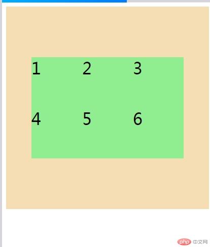
<!DOCTYPE html>
<html lang="en">
<head>
<meta charset="UTF-8">
<meta name="viewport" content="width=device-width, initial-scale=1.0">
<title>设置单元格在容器中的对齐方式</title>
<style>
.container{
width: 400px;
height: 400px;
background-color: wheat;
display: grid;
grid-template-columns: repeat(3,100px);
grid-template-rows: repeat(2,100px);
justify-content: center;justify-content: start;justify-content: end;justify-content: space-between;justify-content: space-around;justify-content: space-evenly;justify-content: stretch;align-content: start;align-content: end;align-content: center;align-content: space-between;align-content: space-around;align-content: space-evenly;align-content: stretch;/* place-content: 垂直对齐 水平对齐 */place-content: start space-evenly;place-content:center ;}.item{font-size: 2em;background-color: lightgreen;}</style>
</head>
<body>
<div class="container">
<div class="item item1">1</div>
<div class="item item2">2</div>
<div class="item item3">3</div>
<div class="item item4">4</div>
<div class="item item5">5</div>
<div class="item item6">6</div>
</div>
</body>
</html>
设置项目在单元格中的对齐方式$设置某个项目在单元格中的对齐方式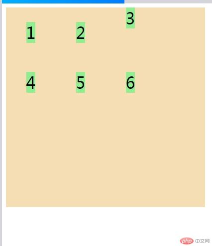
<!DOCTYPE html>
<html lang="en">
<head>
<meta charset="UTF-8" />
<meta name="viewport" content="width=device-width, initial-scale=1.0" />
<title>设置项目在单元格中的对齐方式$设置某个项目在单元格中的对齐方式</title>
<style>
.container {
width: 400px;
height: 400px;
background-color: wheat;
display: grid;
grid-template-columns: repeat(3, 100px);
grid-template-rows: repeat(2, 100px);
/* place-content: 垂直对齐 水平对齐 */place-items: start end;place-items: center;}.item {font-size: 2em;background-color: lightgreen;}.item.item3 {place-self: start center;}</style>
</head>
<body>
<div class="container">
<div class="item item1">1</div>
<div class="item item2">2</div>
<div class="item item3">3</div>
<div class="item item4">4</div>
<div class="item item5">5</div>
<div class="item item6">6</div>
</div>
</body>
</html>
行、列间距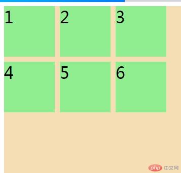
<!DOCTYPE html>
<html lang="en">
<head>
<meta charset="UTF-8" />
<meta name="viewport" content="width=device-width, initial-scale=1.0" />
<title>行、列间距</title>
<style>
.container {
width: 400px;
height: 400px;
background-color: wheat;
display: grid;
grid-template-columns: repeat(3, 100px);
grid-template-rows: repeat(2, 100px);
row-gap: 5px;column-gap: 10px;/* row-gap: 10px;column-gap: 10px; */gap: 10px;}.item {font-size: 2em;background-color: lightgreen;}</style>
</head>
<body>
<div class="container">
<div class="item item1">1</div>
<div class="item item2">2</div>
<div class="item item3">3</div>
<div class="item item4">4</div>
<div class="item item5">5</div>
<div class="item item6">6</div>
</div>
</body>
</html>
```
作业总结:通过练习,对知识进行了梳理,对justify-content、align-content、justify-items和align-items有了豁然开朗的感觉。