


![[Web front-end] Node.js quick start](https://img.php.cn/upload/course/000/000/067/662b5d34ba7c0227.png)


 WJ
WJCorrection status:qualified
Teacher's comments:写的非常仔细认真!继续加油!


 Collection
 Collection

天下难事,必作于易;天下大事,必作于细
CSS选择器可用于实现对HTML网页上的元素样式的一对一,一对多或者多对一的控制。
通过元素的通用属性class、ID和标签本身选择
借助元素之间的关系父子、同胞选择
根据文档结构
选择那些不能够被普通选择器选择的文档之外的元素,
例如a标签的hover、actice和visited等
同伪类一样选择那些不能够被普通选择器选择的文档之外的元素
更像是创建一个不存在在文档结构的元素
伪类前使用:
伪元素使用::
| 选择器 | 用法 | 含义 |
|---|---|---|
| 通用选择器 | *{} | 选择所有的元素 |
| 标签选择器 | [p/i/em/b/strong·····]{} | 选择同标签名的元素 |
| 类选择器 | .className{} | 选择类名为className的元素 |
| ID选择器 | #idName{} | 选择ID名为idName的元素 |
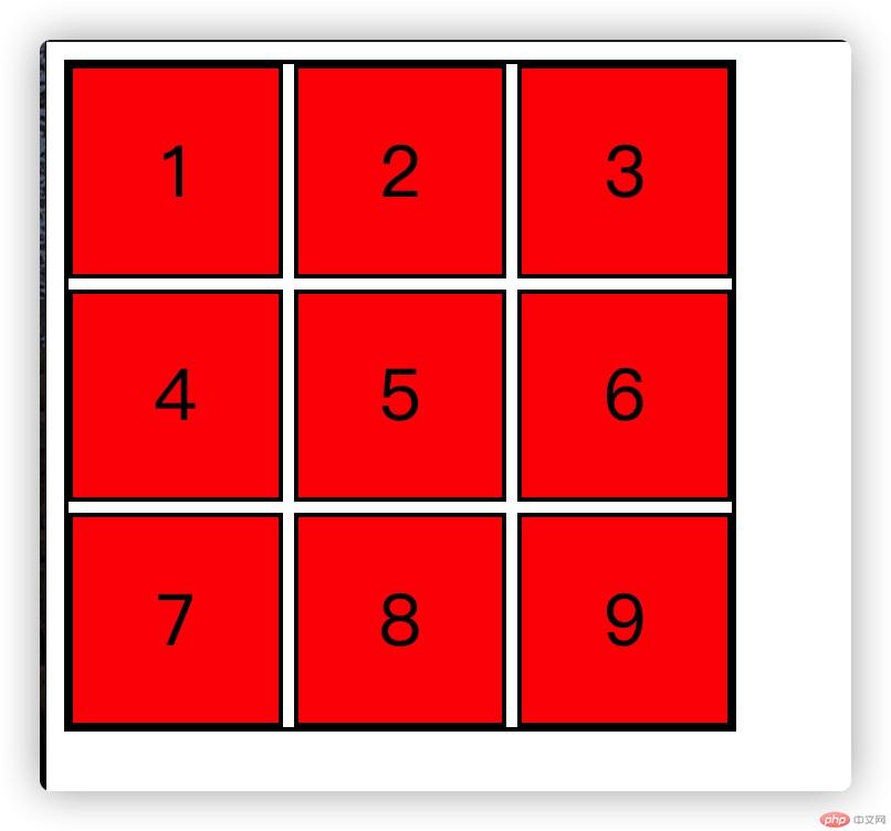
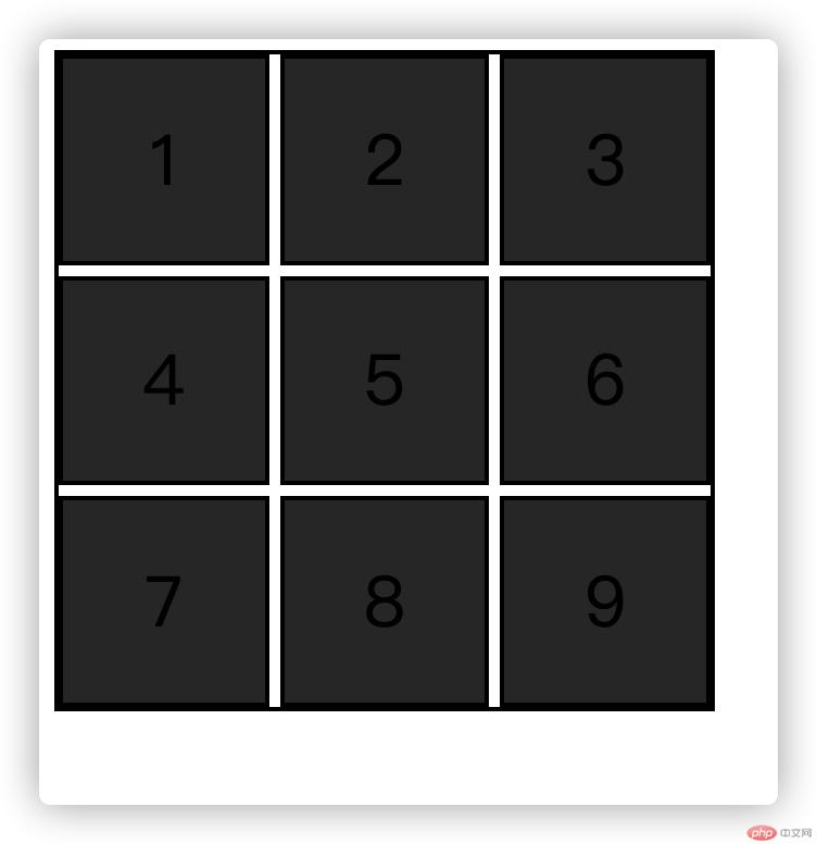
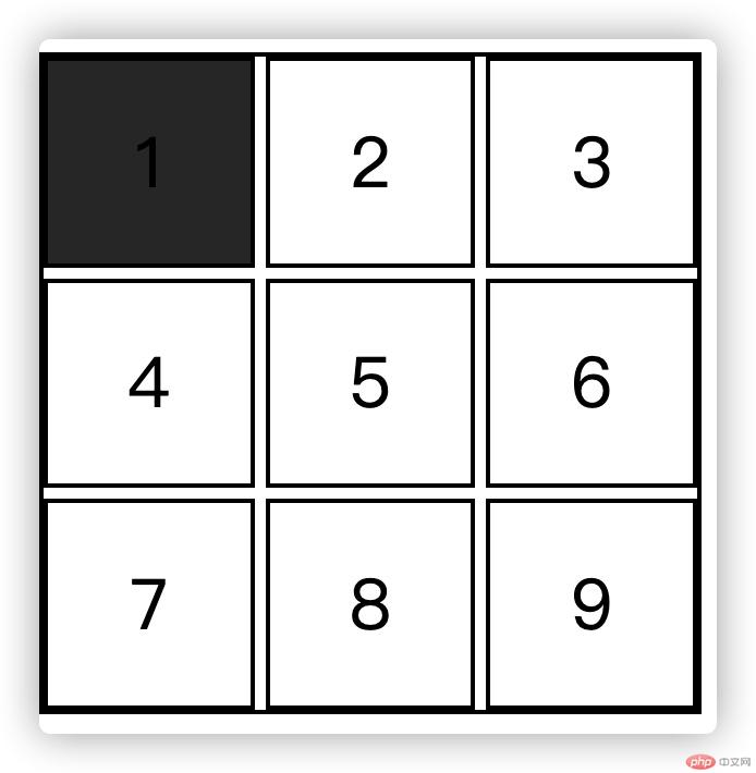
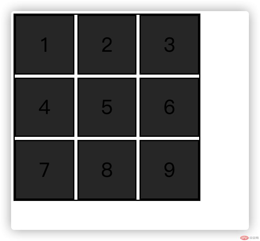
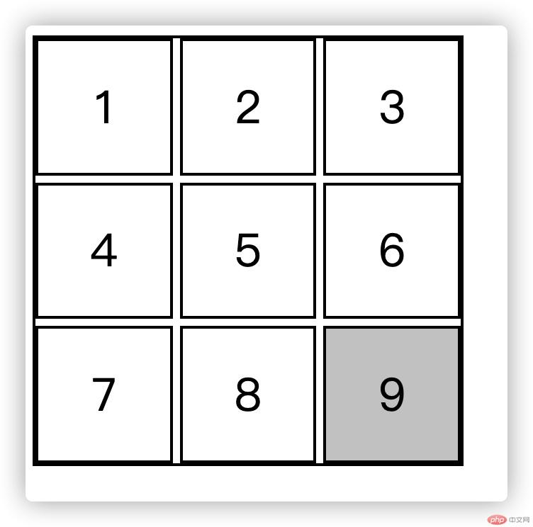
就用grid布局实现的的九宫格可以更容易理解选择器的用法
<!DOCTYPE html><html lang="en"><head><meta charset="UTF-8" /><meta name="viewport" content="width=device-width, initial-scale=1.0" /><title>Document</title><style>/* 使用九宫格来演示: grid布局实现 */.box1 {margin:0;padding:0;width: 300px;height: 300px;display: grid;grid-template-columns: repeat(3, 1fr);gap: 5px;border: 2px solid #000;}.sbox {font-size: 2rem;/* background-color: lightskyblue; */display: flex;justify-content: center;align-items: center;border: 2px solid black;}</style></head><body><ul class="box1"><li class="sbox">1</li><li class="sbox">2</li><li class="sbox">3</li><li class="sbox">4</li><li class="sbox">5</li><li class="sbox">6</li><li class="sbox">7</li><li class="sbox">8</li><li class="sbox">9</li></ul></body></html>

<style>/* 使用九宫格来演示: grid布局实现 */.box1 {margin: 0;padding: 0;width: 300px;height: 300px;display: grid;grid-template-columns: repeat(3, 1fr);gap: 5px;border: 2px solid #000;}.sbox {font-size: 2rem;/* background-color: lightskyblue; */display: flex;justify-content: center;align-items: center;border: 2px solid black;}* {background-color: #ccc;}</style></head><body><ul class="box1"><li class="sbox">1</li><li class="sbox">2</li><li class="sbox">3</li><li class="sbox">4</li><li class="sbox">5</li><li class="sbox">6</li><li class="sbox">7</li><li class="sbox">8</li><li class="sbox">9</li></ul></body>
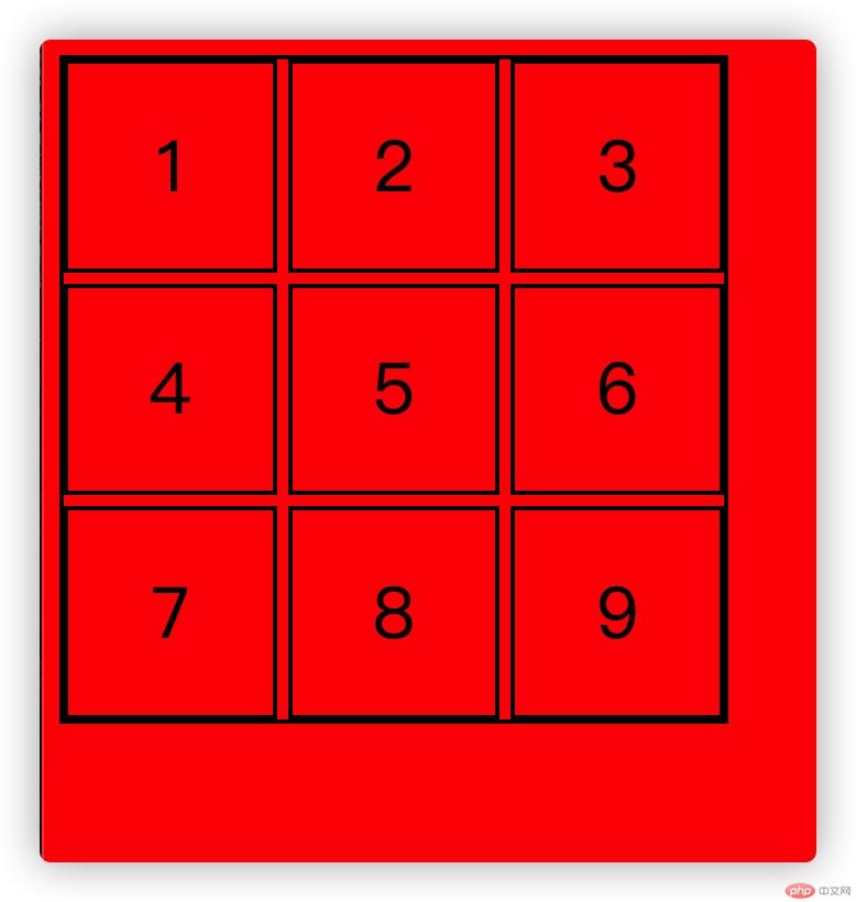
<style>/* 使用九宫格来演示: grid布局实现 */.box1 {margin: 0;padding: 0;width: 300px;height: 300px;display: grid;grid-template-columns: repeat(3, 1fr);gap: 5px;border: 2px solid #000;}.sbox {font-size: 2rem;/* background-color: lightskyblue; */display: flex;justify-content: center;align-items: center;border: 2px solid black;}li {background-color: red;}</style></head><body><ul class="box1"><li class="sbox">1</li><li class="sbox">2</li><li class="sbox">3</li><li class="sbox">4</li><li class="sbox">5</li><li class="sbox">6</li><li class="sbox">7</li><li class="sbox">8</li><li class="sbox">9</li></ul></body>
<style>/* 使用九宫格来演示: grid布局实现 */.box1 {margin: 0;padding: 0;width: 300px;height: 300px;display: grid;grid-template-columns: repeat(3, 1fr);gap: 5px;border: 2px solid #000;}.sbox {font-size: 2rem;/* background-color: lightskyblue; */display: flex;justify-content: center;align-items: center;border: 2px solid black;}/* 类选择器 */.sbox {background-color: #333;}</style></head><body><ul class="box1"><li class="sbox">1</li><li class="sbox">2</li><li class="sbox">3</li><li class="sbox">4</li><li class="sbox">5</li><li class="sbox">6</li><li class="sbox">7</li><li class="sbox">8</li><li class="sbox">9</li></ul></body>
<style>/* 使用九宫格来演示: grid布局实现 */.box1 {margin: 0;padding: 0;width: 300px;height: 300px;display: grid;grid-template-columns: repeat(3, 1fr);gap: 5px;border: 2px solid #000;}.sbox {font-size: 2rem;/* background-color: lightskyblue; */display: flex;justify-content: center;align-items: center;border: 2px solid black;}/* id 选择器*/#sbox {background-color: #333;}</style></head><body><ul class="box1"><li class="sbox" id="sbox">1</li><li class="sbox">2</li><li class="sbox">3</li><li class="sbox">4</li><li class="sbox">5</li><li class="sbox">6</li><li class="sbox">7</li><li class="sbox">8</li><li class="sbox">9</li></ul></body></html>
| 选择器 | 用法 | 含义 |
|---|---|---|
| 父代选择器 | body ul{} | 选择body元素中的所有ul元素(父代选择器选择范围下级链表) |
| 父子选择器 | body > ul{} | 选择body元素中的ul元素(只针对子元素) |
| 兄弟选择器 | .box + .box{} | 选择同级元素的下一个 |
<style>/* 使用九宫格来演示: grid布局实现 */.box1 {margin: 0;padding: 0;width: 300px;height: 300px;display: grid;grid-template-columns: repeat(3, 1fr);gap: 5px;border: 2px solid #000;}.sbox {font-size: 2rem;/* background-color: lightskyblue; */display: flex;justify-content: center;align-items: center;border: 2px solid black;}/* 父代选择器 */body ul li {background-color: #333;}</style></head><body><ul class="box1"><li class="sbox" id="sbox">1</li><li class="sbox">2</li><li class="sbox">3</li><li class="sbox">4</li><li class="sbox">5</li><li class="sbox">6</li><li class="sbox">7</li><li class="sbox">8</li><li class="sbox">9</li></ul></body>
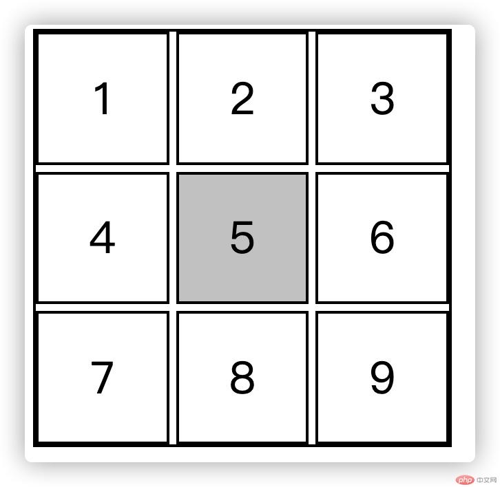
<style>/* 使用九宫格来演示: grid布局实现 */.box1 {margin: 0;padding: 0;width: 300px;height: 300px;display: grid;grid-template-columns: repeat(3, 1fr);gap: 5px;border: 2px solid #000;}.sbox {font-size: 2rem;/* background-color: lightskyblue; */display: flex;justify-content: center;align-items: center;border: 2px solid black;}/* 父子选择器 */ul > li.center {background-color: #ccc;}</style></head><body><ul class="box1"><li class="sbox" id="sbox">1</li><li class="sbox">2</li><li class="sbox">3</li><li class="sbox">4</li><li class="sbox center">5</li><li class="sbox">6</li><li class="sbox">7</li><li class="sbox">8</li><li class="sbox">9</li></ul></body>
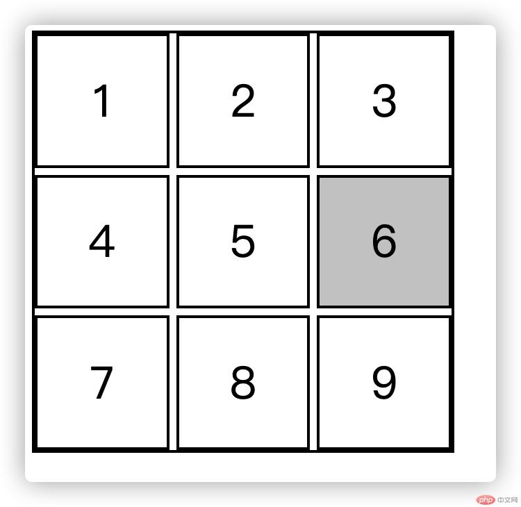
<style>/* 使用九宫格来演示: grid布局实现 */.box1 {margin: 0;padding: 0;width: 300px;height: 300px;display: grid;grid-template-columns: repeat(3, 1fr);gap: 5px;border: 2px solid #000;}.sbox {font-size: 2rem;/* background-color: lightskyblue; */display: flex;justify-content: center;align-items: center;border: 2px solid black;}/* 兄弟选择器 */.center + .sbox {background-color: #ccc;}</style></head><body><ul class="box1"><li class="sbox" id="sbox">1</li><li class="sbox">2</li><li class="sbox">3</li><li class="sbox">4</li><li class="sbox center">5</li><li class="sbox">6</li><li class="sbox">7</li><li class="sbox">8</li><li class="sbox">9</li></ul></body></html>
不分组:first-child:last-child:nth-child(n):nth-last-child(n)分组:first-of-type:last-of-type
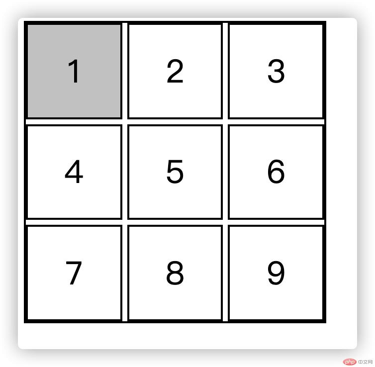
<style>/* 使用九宫格来演示: grid布局实现 */.box1 {margin: 0;padding: 0;width: 300px;height: 300px;display: grid;grid-template-columns: repeat(3, 1fr);gap: 5px;border: 2px solid #000;}.sbox {font-size: 2rem;/* background-color: lightskyblue; */display: flex;justify-content: center;align-items: center;border: 2px solid black;}/* 结构伪类选择器 */ul :first-child {background-color: #ccc;}</style></head><body><ul class="box1"><li class="sbox" id="sbox">1</li><li class="sbox">2</li><li class="sbox">3</li><li class="sbox">4</li><li class="sbox center">5</li><li class="sbox">6</li><li class="sbox">7</li><li class="sbox">8</li><li class="sbox">9</li></ul></body></html>
<!DOCTYPE html><html lang="en"><head><meta charset="UTF-8" /><meta name="viewport" content="width=device-width, initial-scale=1.0" /><title>Document</title><style>/* 使用九宫格来演示: grid布局实现 */.box1 {margin: 0;padding: 0;width: 300px;height: 300px;display: grid;grid-template-columns: repeat(3, 1fr);gap: 5px;border: 2px solid #000;}.sbox {font-size: 2rem;/* background-color: lightskyblue; */display: flex;justify-content: center;align-items: center;border: 2px solid black;}ul :last-child {background-color: #ccc;}</style></head><body><ul class="box1"><li class="sbox" id="sbox">1</li><li class="sbox">2</li><li class="sbox">3</li><li class="sbox">4</li><li class="sbox center">5</li><li class="sbox">6</li><li class="sbox">7</li><li class="sbox">8</li><li class="sbox">9</li></ul></body></html>
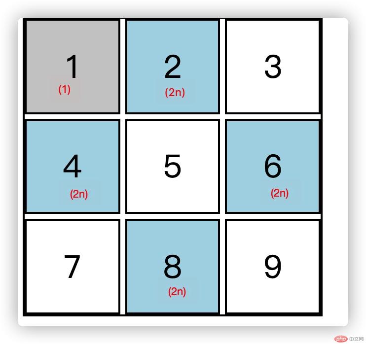
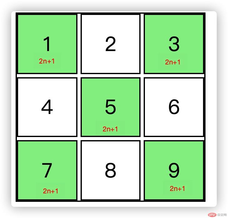
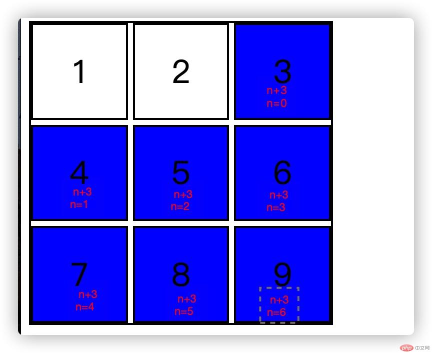
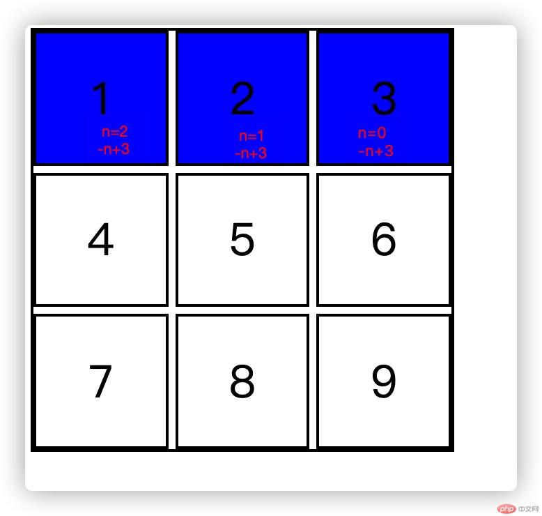
选择第m个元素
选择偶数:m=2n/even
<style>/* 使用九宫格来演示: grid布局实现 */.box1 {margin: 0;padding: 0;width: 300px;height: 300px;display: grid;grid-template-columns: repeat(3, 1fr);gap: 5px;border: 2px solid #000;}.sbox {font-size: 2rem;/* background-color: lightskyblue; */display: flex;justify-content: center;align-items: center;border: 2px solid black;}ul :nth-child(1) {background-color: #ccc;}ul :nth-child(2n) {background-color: lightblue;}ul :nth-child(2n+1){background-color: lightgreen;}ul :nth-child(n+3){background-color: blue;}ul :nth-child(-n+3){background-color: blue;}</style></head><body><ul class="box1"><li class="sbox" id="sbox">1</li><li class="sbox">2</li><li class="sbox">3</li><li class="sbox">4</li><li class="sbox center">5</li><li class="sbox">6</li><li class="sbox">7</li><li class="sbox">8</li><li class="sbox">9</li></ul></body></html>
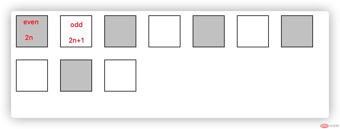
选择倒数第m个子元素
选择反序偶数:m=2n/even
<style>.box {width: 50px;height: 50px;border: 1px solid black;margin: 10px 10px;float: left;}div :nth-last-child(even) {background-color: #ccc;}div :nth-last-child(odd) {background-color: white;}</style><body><div class="bbox"><div class="box"></div><div class="box"></div><div class="box"></div><div class="box"></div><div class="box"></div><div class="box"></div><div class="box"></div><div class="box"></div><div class="box"></div><div class="box"></div></div></body></html>
因为整体个数为偶数个,所以反序的偶数为正序的奇数,反序的奇数为正序的偶数。
计算规律以nth-child相似
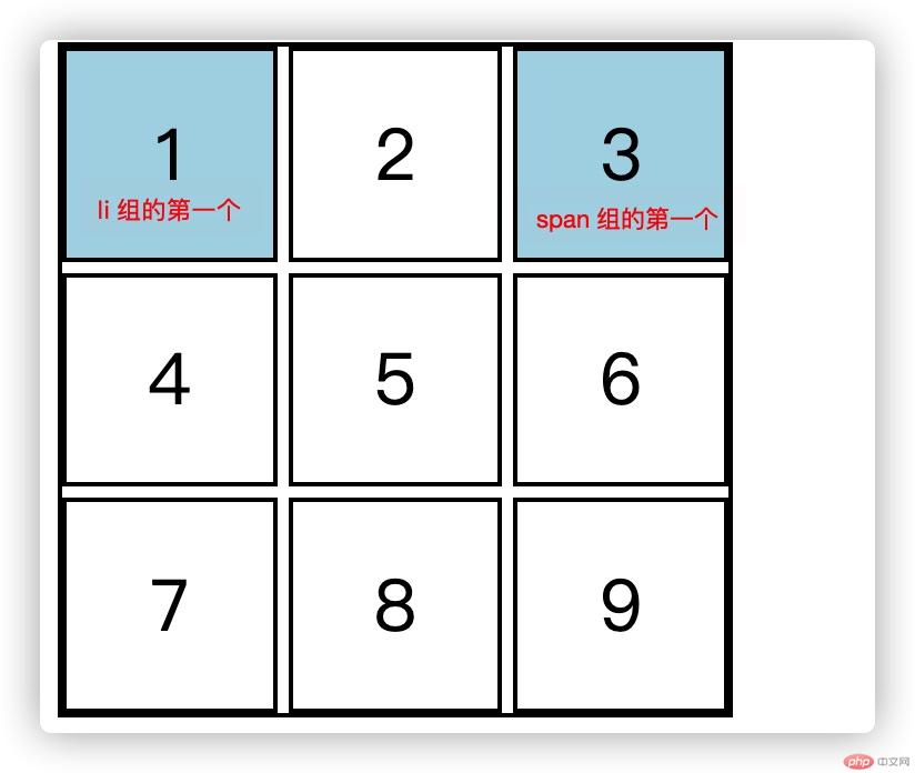
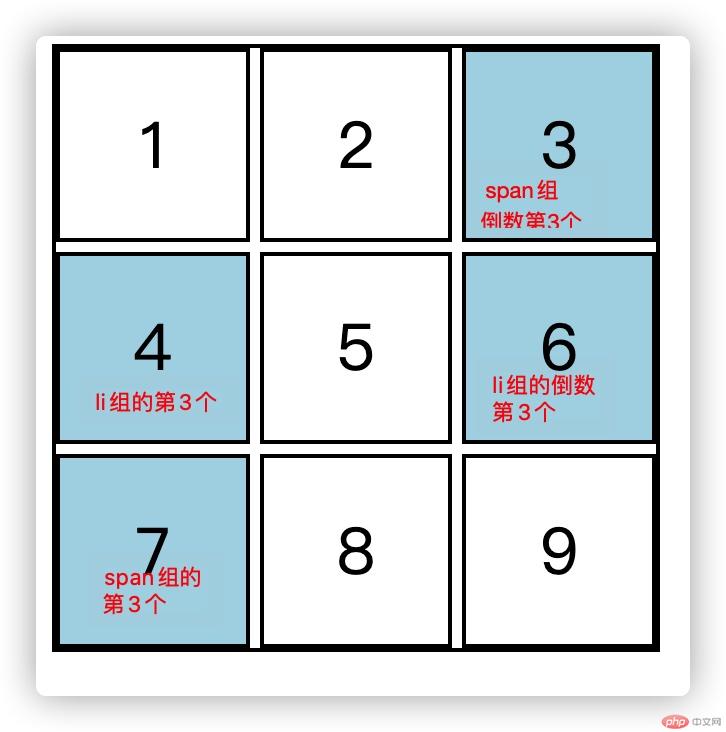
<style>/* 使用九宫格来演示: grid布局实现 */.box1 {margin: 0;padding: 0;width: 300px;height: 300px;display: grid;grid-template-columns: repeat(3, 1fr);gap: 5px;border: 2px solid #000;}.sbox {font-size: 2rem;/* background-color: lightskyblue; */display: flex;justify-content: center;align-items: center;border: 2px solid black;}ul :first-of-type {background-color: lightblue;}</style></head><body><ul class="box1"><li class="sbox" id="sbox">1</li><li class="sbox">2</li><span class="sbox">3</span><li class="sbox">4</li><span class="sbox center">5</span><li class="sbox">6</li><span class="sbox">7</span><li class="sbox">8</li><li class="sbox">9</li></ul></body>
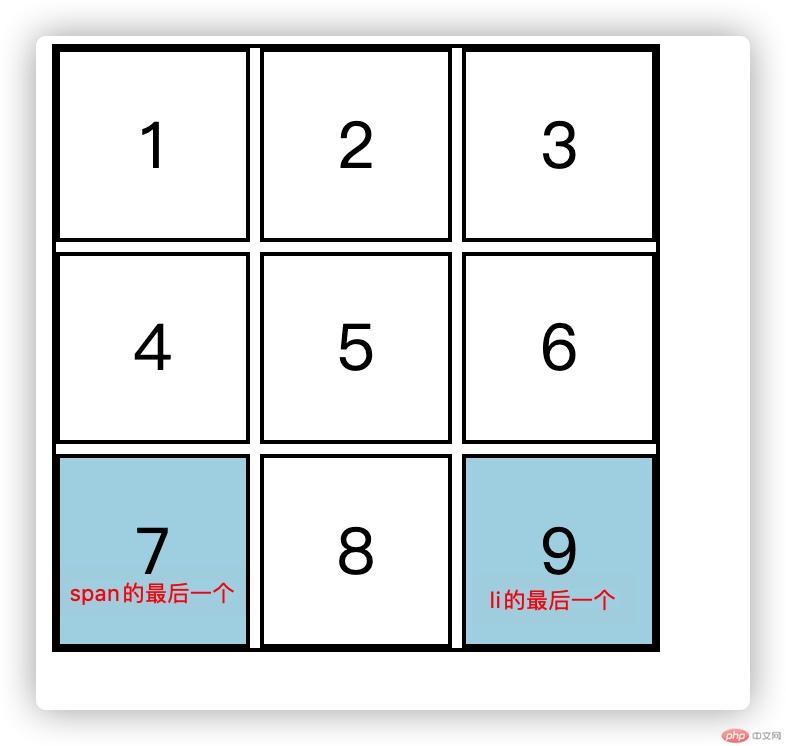
m可以代入同上公式
<style>/* 使用九宫格来演示: grid布局实现 */.box1 {margin: 0;padding: 0;width: 300px;height: 300px;display: grid;grid-template-columns: repeat(3, 1fr);gap: 5px;border: 2px solid #000;}.sbox {font-size: 2rem;/* background-color: lightskyblue; */display: flex;justify-content: center;align-items: center;border: 2px solid black;}ul :nth-of-type(3) {background-color: lightblue;}ul :nth-last-of-type(3) {background-color: lightblue;}</style></head><body><ul class="box1"><li class="sbox" id="sbox">1</li><li class="sbox">2</li><span class="sbox">3</span><li class="sbox">4</li><span class="sbox center">5</span><li class="sbox">6</li><span class="sbox">7</span><li class="sbox">8</li><li class="sbox">9</li></ul></body>
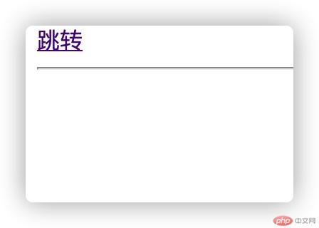
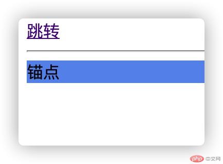
<style>#mcdm {display: none;}#mcdm:target {display: block;background-color: cornflowerblue;}</style><body><div><a href="#mcdm"> 跳转</a><hr /><span id="mcdm">锚点</span></div></body>
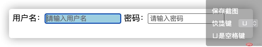
<style>input:focus {background-color: lightblue;}</style><body>用户名:<input type="text" placeholder="请输入用户名" /> 密码:<inputtype="password"placeholder="请输入密码"/></body>
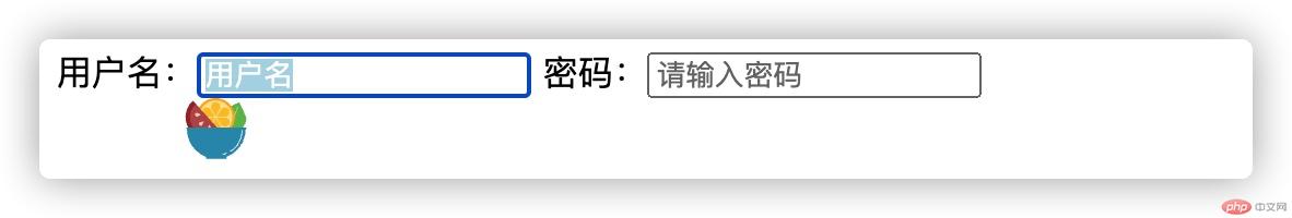
<style>input::selection {background-color: lightblue;color: white;}</style><body>用户名:<input type="text" placeholder="请输入用户名" /> 密码:<inputtype="password"placeholder="请输入密码"/></body>
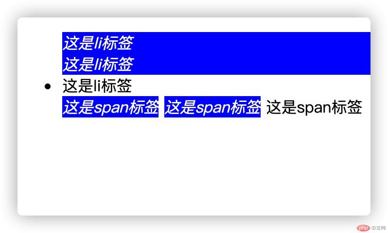
<style>ul :not(:last-of-type) {font-style: italic;background-color: blue;color: white;}</style><body><ul><li>这是li标签</li><li>这是li标签</li><li>这是li标签</li><span>这是span标签</span><span>这是span标签</span><span>这是span标签</span></ul></body>
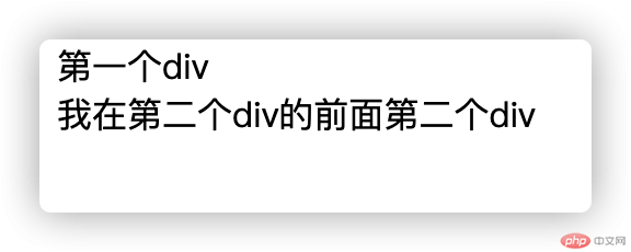
<style>.box2::before {content: "我在第二个div的前面";}</style><body><div>第一个div</div><div class="box2">第二个div</div></body>
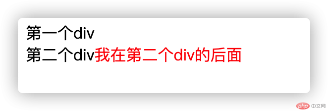
在元素内容后生成
<style>.box2::after {content: "我在第二个div的后面";color: red;}</style><body><div>第一个div</div><div class="box2">第二个div</div></body>