


![[Web front-end] Node.js quick start](https://img.php.cn/upload/course/000/000/067/662b5d34ba7c0227.png)


 天蓬老师
天蓬老师Correction status:qualified
Teacher's comments:如果记不住主轴和交叉轴, 那就这样想, 现在这几个东西, 我打算怎么排列对齐 ,如果水平,就是主轴水平, 如果垂直, 就是主轴垂直, 主轴是为元素排列服务的....


 Collection
 Collection
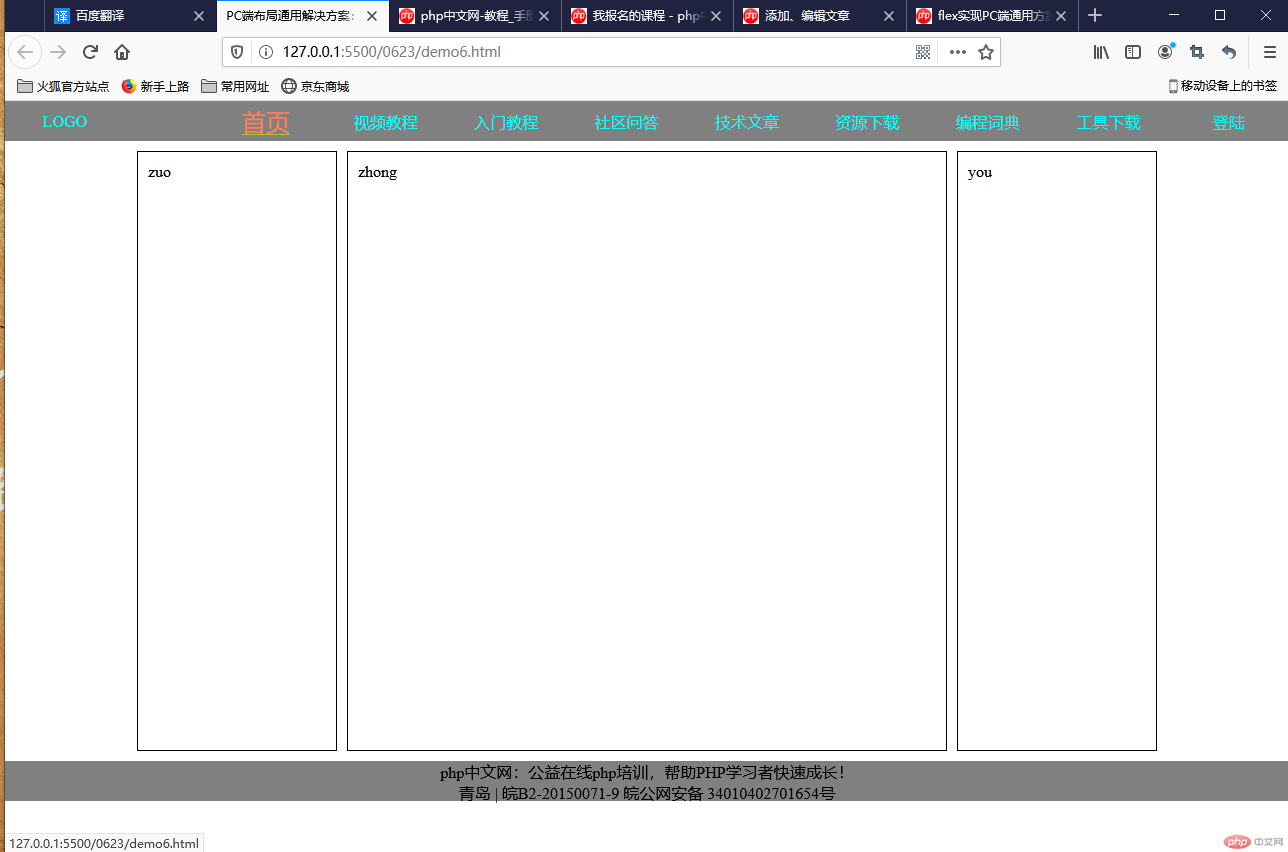
<body><header><nav><a href="">LOGO</a><a href="">首页</a><a href="">视频教程</a><a href="">入门教程</a><a href="">社区问答</a><a href="">技术文章</a><a href="">资源下载</a><a href="">编程词典</a><a href="">工具下载</a><a href="">登陆</a></nav></header><div class="container"><div class="side">zuo</div><div class="main">zhong</div><div class="side">you</div></div><footer><p>php中文网:公益在线php培训,帮助PHP学习者快速成长!</p><p>青岛 | 皖B2-20150071-9 皖公网安备 34010402701654号</p></footer></body>
<style>* {margin: 0;padding: 0;box-sizing: border-box;}a {text-decoration: none;color: aqua;}/* body转为flex 主轴方向垂直 不换行*/body {min-width: 960px;display: flex;flex-flow: column nowrap;}/* 设置页眉页脚公共样式 */header nav,footer {background-color: grey;height: 40px;}/* 把nav转为flex 主轴水平不换行 这行代码可以不写 */header nav {display: flex;/* 所有项目在交叉轴上垂直居中 */align-items: center;}/* 当nav转为flex时,他的子元素a标签 就成为一个个项目让他不放大可收缩 宽度150*/header nav > a {flex: 0 1 150px;text-align: center;}/* 设置第一个A标签右外边距 */header nav > a:first-of-type {margin-right: 80px;}/* 最后一个A标签靠最左边 */header nav > a:last-of-type {margin-left: auto;}/* 排除第一个A标签鼠标悬停效果 */header nav > a:hover:not(:first-of-type) {color: coral;font-size: 1.5rem;text-decoration: underline;text-decoration-color: yellowgreen;}/* 主体去转为flex 主轴为水平 */.container {min-height: 600px;/* 设置主体上下边距10 左右居中 */margin: 10px auto;display: flex;/* container下面的项目 水平方向居中显示 */justify-content: center;}/* 设置.container下面所有div */.container > * {border: 1px solid #000;padding: 10px;}/* 设置左右两侧 禁止缩放,宽度为200*/.container > .side {flex: 0 0 200px;}/* 设置中间禁止缩放宽度为600,左右外边距为10px */.container > .main {flex: 0 0 600px;margin: 0 10px;}/* 设置页脚样式:转为flex 主轴垂直不换行,文本居中显示 */footer {display: flex;flex-flow: column nowrap;text-align: center;}</style>
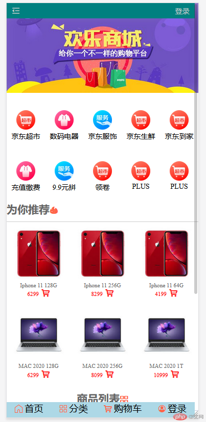
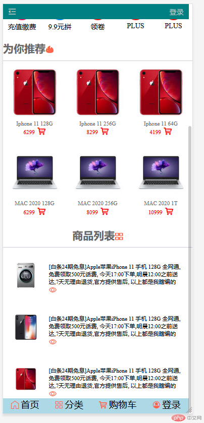
<!DOCTYPE html><html lang="en"><head><meta charset="UTF-8" /><meta name="viewport" content="width=device-width, initial-scale=1.0" /><!-- 引入字体图标 --><link rel="stylesheet" href="static/css/font-icon.css" /><title>手机端</title><style>/* 初始化 */* {margin: 0;padding: 0;box-sizing: border-box;}a {text-decoration: none;color: #ccc;}/* html=:root */html {/* vw: 可视区宽度,100指100份 *//* vh:可视区的高度,100指100分 */width: 100vw;height: 100vh;font-size: 14px;color: #666;}/* 手机端页面总是一列显示,先转FLEx */body {min-width: 360px;background-color: white;display: flex;flex-flow: column nowrap;}body > header {color: white;background-color: teal;height: 30px;display: flex;/* 项目在交叉轴位置 */align-items: center;/* 项目在主轴上两端对齐 */justify-content: space-between;/* 固定在浏览器得上方 */position: fixed;width: 98vw;padding: 0 10px;}/* 此处选择器问题 body下面就一个.slider得div而.slider下面就一个img标签所以我用了后代选择器,用子选择器(>)得效果时一样得 */body .slider {height: 180px;}body .slider img {width: 100%;}/* 导航区转为flex主轴水平,换行,分散对齐 */.nav {height: 200px;margin-top: 10px;display: flex;flex-flow: row wrap;align-content: space-around;}/* .nav1转为flex 主轴垂直不换行.项目在交叉轴居中显示 */.nav > .nav1 {width: 20vw;display: flex;flex-flow: column nowrap;align-content: center;}.nav > .nav1 > a {text-align: center;color: #000000;}.nav > .nav1 img {width: 50%;}.goods {border-top: 1px solid #cdcdcd;margin-top: 10px;font-size: 0.8rem;display: flex;/* 水平行容器 */flex-flow: row wrap;}.goods > .goods-hot img {width: 100%;}.goods > .goods-hot {padding: 10px;/* 允许放大不允许缩小,否则项目不会换行,多行容器失效 */flex: 1 0 30vw;/* 再将每个商品描述转为flex */display: flex;flex-flow: column nowrap;align-items: center;}.goods-hot > .goods-prc > a span {color: red;}/* 商品列表 */.list {padding: 10px;border-top: 1px solid #ccccdd;margin-top: 10px;display: flex;/* 主轴垂直 */flex-flow: column nowrap;}.list > .list1 {/* 每个项目添加上下边距 转为flex*/margin: 10px 0;display: flex;}.list > .list1 > a {padding: 10px;color: #000000;font-size: 0.8rem;}.list img {width: 100%;}body footer {height: 30px;background-color: lightblue;/* 做绝对定位 */position: fixed;bottom: 0;width: 98vw;display: flex;justify-content: space-around;}/* 修改字体大小颜色 */footer a > span:last-of-type {font-size: 1.3rem;color: #000000;}</style></head><body><!-- 页眉 --><header><a href=""><span class="iconfont"></span></a><a href="">登录</a></header><!-- 轮播图 --><div class="slider"><a href=""><img src="static/images/banner.jpg" alt="" /></a></div><!-- 主导航区 --><div class="nav"><div class="nav1"><a href=""><img src="static/images/link1.webp" alt="" /></a><a href="">京东超市</a></div><div class="nav1"><a href=""><img src="static/images/link2.webp" alt="" /></a><a href="">数码电器</a></div><div class="nav1"><a href=""><img src="static/images/link3.webp" alt="" /></a><a href="">京东服饰</a></div><div class="nav1"><a href=""><img src="static/images/link1.webp" alt="" /></a><a href="">京东生鲜</a></div><div class="nav1"><a href=""><img src="static/images/link1.webp" alt="" /></a><a href="">京东到家</a></div><div class="nav1"><a href=""><img src="static/images/link2.webp" alt="" /></a><a href="">充值缴费</a></div><div class="nav1"><a href=""><img src="static/images/link3.webp" alt="" /></a><a href="">9.9元拼</a></div><div class="nav1"><a href=""><img src="static/images/link1.webp" alt="" /></a><a href="">领卷</a></div><div class="nav1"><a href=""><img src="static/images/link1.webp" alt="" /></a><a href="">PLUS</a></div><div class="nav1"><a href=""><img src="static/images/link1.webp" alt="" /></a><a href="">PLUS</a></div></div><h2>为你推荐<span class="iconfont" style="color: tomato;"></span></h2><div class="goods"><div class="goods-hot"><a href=""><img src="static/images/goods1.jpg" alt="" /></a><p>Iphone 11 128G</p><div class="goods-prc"><a href=""><span>6299 </span></a><a href=""><span class="iconfont"></span></a></div></div><div class="goods-hot"><a href=""><img src="static/images/goods1.jpg" alt="" /></a><p>Iphone 11 256G</p><div class="goods-prc"><a href=""><span>8299 </span></a><a href=""><span class="iconfont"></span></a></div></div><div class="goods-hot"><a href=""><img src="static/images/goods1.jpg" alt="" /></a><p>Iphone 11 64G</p><div class="goods-prc"><a href=""><span>4199 </span></a><a href=""><span class="iconfont"></span></a></div></div><div class="goods-hot"><a href=""><img src="static/images/goods2.jpg" alt="" /></a><p>MAC 2020 128G</p><div class="goods-prc"><a href=""><span>6299 </span></a><a href=""><span class="iconfont"></span></a></div></div><div class="goods-hot"><a href=""><img src="static/images/goods2.jpg" alt="" /></a><p>MAC 2020 256G</p><div class="goods-prc"><a href=""><span>8099 </span></a><a href=""><span class="iconfont"></span></a></div></div><div class="goods-hot"><a href=""><img src="static/images/goods2.jpg" alt="" /></a><p>MAC 2020 1T</p><div class="goods-prc"><a href=""><span>10999 </span></a><a href=""><span class="iconfont"></span></a></div></div></div><!-- 商品列表 --><h2 style="text-align: center; margin-top: 15px;">商品列表<span class="iconfont" style="color: tomato;"></span></h2><div class="list"><div class="list1"><a href=""><img src="static/images/goods3.jpg" alt="" /></a><a href="">[白条24期免息]Apple苹果iPhone 11 手机 128G 全网通, 免费领取500元话费,今天17:00下单,明晨12:00之前送达,7天无理由退货,官方提供售后,以上都是我瞎编的<span class="iconfont" style="color: tomato;"></span></a></div><div class="list1"><a href=""><img src="static/images/goods4.jpg" alt="" /></a><a href="">[白条24期免息]Apple苹果iPhone 11 手机 128G 全网通, 免费领取500元话费,今天17:00下单,明晨12:00之前送达,7天无理由退货,官方提供售后,以上都是我瞎编的<span class="iconfont" style="color: tomato;"></span></a></div><div class="list1"><a href=""><img src="static/images/goods1.jpg" alt="" /></a><a href="">[白条24期免息]Apple苹果iPhone 11 手机 128G 全网通, 免费领取500元话费,今天17:00下单,明晨12:00之前送达,7天无理由退货,官方提供售后,以上都是我瞎编的<span class="iconfont" style="color: tomato;"></span></a></div></div><!-- 页脚 --><footer><a href=""><span class="iconfont" style="color: tomato;"></span><span>首页</span></a><a href=""><span class="iconfont" style="color: tomato;"></span><span>分类</span></a><a href=""><span class="iconfont" style="color: tomato;"></span><span>购物车</span></a><a href=""><span class="iconfont" style="color: tomato;"></span><span>登录</span></a></footer></body></html>
天蓬老师