


![[Web front-end] Node.js quick start](https://img.php.cn/upload/course/000/000/067/662b5d34ba7c0227.png)


 天蓬老师
天蓬老师Correction status:qualified
Teacher's comments:你把你的页面乱箭射死了.... 写得不错, 继续


 Collection
 Collection
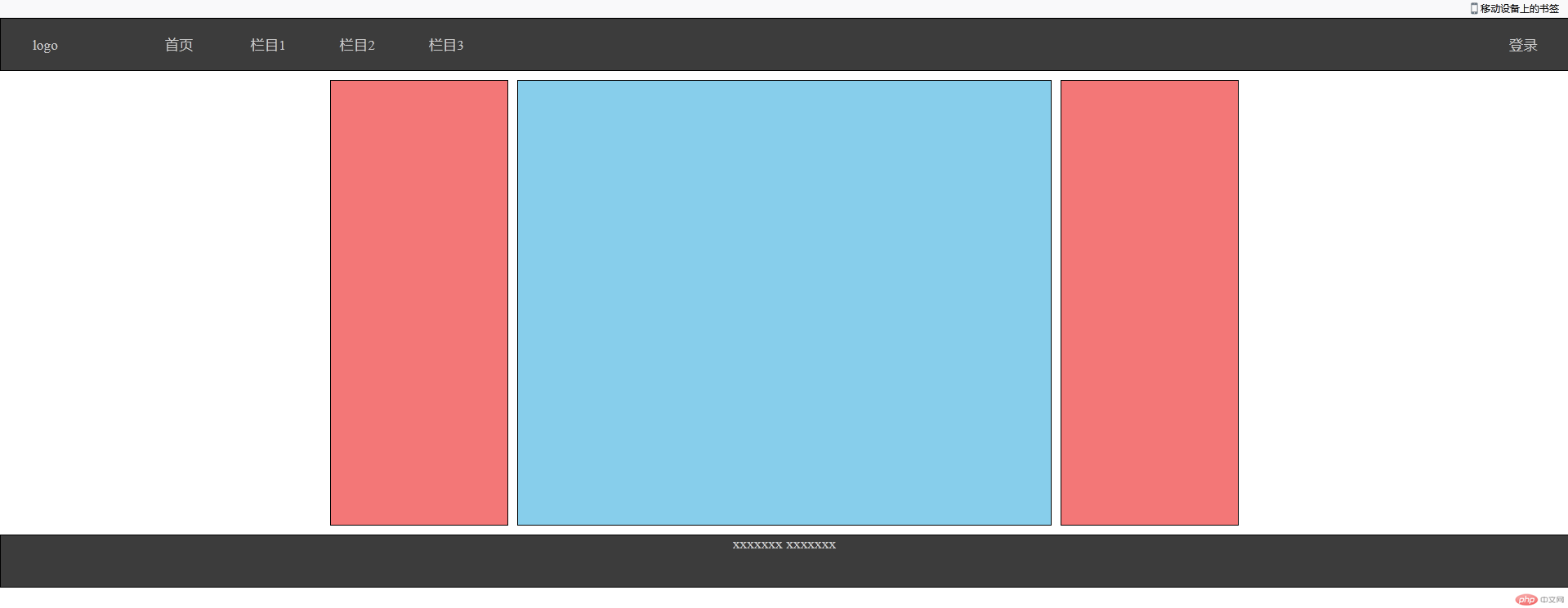
< !DOCTYPE html><html lang="en"><head><meta charset="UTF-8" /><meta name="viewport" content="width=device-width, initial-scale=1.0" /><!-- 加载字体 --><title>pc布局的通用解决方案</title></head><style>/* 初始化 */* {margin: 0;padding: 0;box-sizing: border-box;}/* 去除下划线和设置颜色 */a {color: #ccc;text-decoration: none;}body {min-width: 600px;/* 设置弹性盒子 */display: flex;/* 主轴为垂直且不换行显示 */flex-flow: column nowrap;}header,footer {height: 60px;border: 1px solid #000;}/* 页眉区 */header {/* 设置弹性盒子 */display: flex;/* 项目在交叉轴居中显示 */align-items: center;background-color: #3c3c3c;}header > a {/* 不放大 可以收缩 宽度为100px */flex: 0 1 100px;text-align: center;}/* logo区 *//* 给第一个A标签设置一个向右的50px外边距 */header > a:first-of-type {margin-right: 50px;}/* 设置最后一个A标签靠右居中 */header > a:last-of-type {margin-left: auto;}/* 设置除了第一个a标签以外其他a标签鼠标悬停后颜色改变 */header > a:hover:not(:first-of-type) {color: white;}/* 主体区 */.container {/* 设置弹性容器 */display: flex;/* 居中 上下10px的外边距 */margin: 10px auto;/* 在没有内容的时候设置最小高度撑开盒子 */min-height: 500px;/* 可视区居中 */justify-content: center;}.container > aside,.container > main {border: 1px solid #000;/* 给子元素设置10px的内边距 */padding: 10px;}.container > aside {/* 设置不放大、不收缩、宽度为200px */flex: 0 0 200px;background-color: rgb(243, 119, 119);}.container > main {/* 设置不放大、不收缩、宽度为600px */flex: 0 0 600px;/* 上下外边距为0 左右为10px */margin: 0 10px;background-color: skyblue;}/* 页脚区 */footer {/* 设置弹性盒子 */display: flex;/* 设置主轴为垂直 不换行 */flex-flow: column nowrap;/* 文本内容居中显示 */text-align: center;background-color: #3c3c3c;}</style><body><!-- 页眉 --><header><a href="">logo</a><a href="">首页</a><a href="">栏目1</a><a href="">栏目2</a><a href="">栏目3</a><a href="">登录</a></header><!-- 主体 --><div class="container"><!-- 左边栏 --><aside></aside><!-- 主体区域 --><main></main><!-- 右边栏 --><aside></aside></div><!-- 页脚 --><footer><p><a href="#">xxxxxxx</a><a href="#">xxxxxxx</a></p></footer></body></html>
思路:
1.先写出HTML的结构 页眉、主体(内容区)、页脚
2.然后初始化样式通常用margin: 0; padding: 0;box-sizing: border-box;
3.然后考虑去除一些公共样式 去除<li>的序列号 和 <a>标签的下划线
4.将页眉、内容区、页脚设置弹性容器,并为主轴垂直排列。将内容区三部分设置为主轴为水平排列的弹性容器
5.页眉部分 :将页眉部分的子元素也设置为弹性容器 ,然后再交叉轴上居中排列 。然后让里面的a标签以及内容设置 字体大小、颜色以及文本效果 (文本居中,一般通过text-align: center实现)还可以设置margin值来调整靠左或者靠右距离。设置flex的放大缩小和宽度控制a标签之间的间距。
6.最后还可以通过hover来设置鼠标悬停后的样式
7.主体部分:设置弹性容器后,可以先设置最小高度撑开内容区。然后设置调整上与页眉和页脚的外边距。然后让内容区子元素水平方向居中排列。然后通过flex值来设置内容区三部分的宽度、放大和收缩。
8页脚部分:设置弹性容器后,设置主轴垂直排列 ,然后实现文本居中。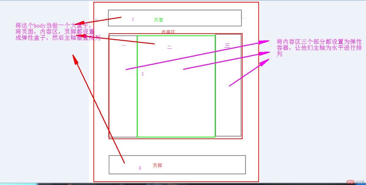
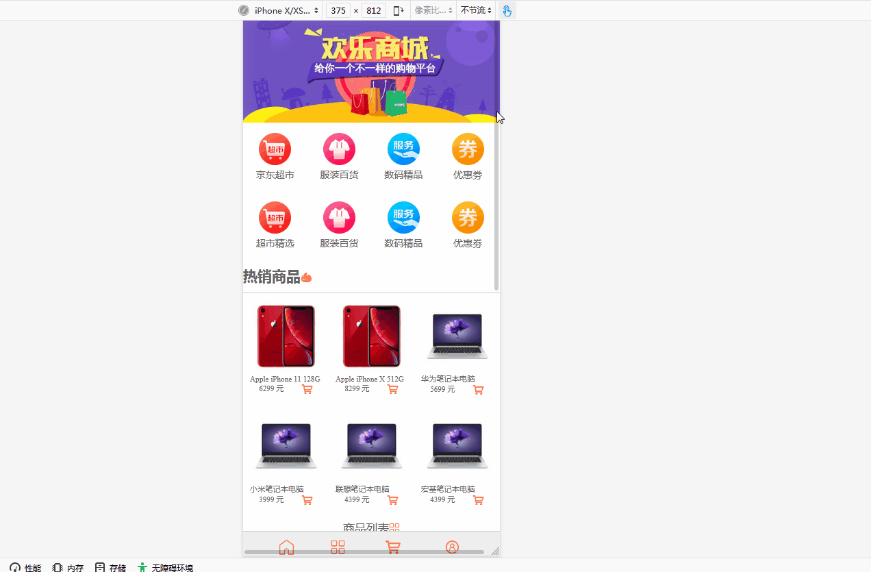
< !DOCTYPE html><html lang="en"><head><meta charset="UTF-8" /><meta name="viewport" content="width=device-width, initial-scale=1.0" /><!-- 加载字体图标 --><link rel="stylesheet" href="static/css/font-icon.css" /><title>移动端的解决方案</title><style>* {/* 样式初始化 */margin: 0;padding: 0;box-sizing: border-box;}a {/* 去除下划线 */text-decoration: none;color: #666;}html {/* vw: 可视区宽度*//* vh:可视区的高度*/width: 100vw;height: 100vh;font-size: 14px;color: #666;}body {min-width: 360px;background-color: #fff;/* 设置弹性容器 */display: flex;/* 主轴为垂直 不换行 */flex-flow: column nowrap;}/* 头部区域 */body > header {color: white;background-color: #333;height: 30px;/* 设置弹性容器 */display: flex;/* 辅轴居中排列 */align-items: center;/* 紧靠父盒子两端,中间留空且均等排列 */justify-content: space-between;/* 相对于浏览器窗口固定定位 */position: fixed;width: 100vw;/* 设置上下0 ,左右15px内边距 */padding: 0 15px;}body > .slider {height: 180px;}body > .slider > img {/* width: 100%; 让图片充满盒子*/height: 100%;}/* 主导航区 */nav {height: 200px;/* 下外边距10px */margin-bottom: 10px;display: flex;/* 转为多行容器 */flex-flow: row wrap;/* 辅轴方向紧靠父盒子两端中间留空均等 */align-content: space-around;}nav > div {width: 25vw;/* 设置弹性容器 */display: flex;/* 设置主轴为垂直方向 不换行 */flex-flow: column nowrap;/* 辅轴居中排列 */align-items: center;}nav > div > a:first-of-type {/* 文本内容居中对齐 */text-align: center;}nav > div img {width: 50%;}/* 每个区域的标题样式 */.title {/* 上外边距10Px */margin-top: 10px;/* 1.2倍的正常字体大小 */font-size: 1.2rem;/* 正常粗细 */font-weight: normal;/* 文本居中对齐 */text-align: center;}/* 热销商品区 */.hot-goods {border-top: 1px solid #cdcdcd;margin-top: 10px;font-size: 0.8rem;/* 设置弹性盒子 */display: flex;/* 主轴为水平方向 换行 */flex-flow: row wrap;}.hot-goods img {width: 100%;}.hot-goods > .goods-img {/* 内边距并重置大小 */padding: 10px;box-sizing: border-box;/* 允许放大不允许缩小,否则项目不会换行,多行容器失效 */flex: 1 0 30vw;/* 再将每个商品描述转为flex */display: flex;/* 主轴方向垂直且不允许换行 */flex-flow: column nowrap;/* 居中排列 */justify-content: center;}/* 商品描述的最后一个区域转flex,并设置项目在主轴上排列对齐方式 */.hot-goods > .goods-img > div {/* 设置弹性盒子 */display: flex;/* 分散对齐 */justify-content: space-around;}/* 热销样式 */.hot {color: coral;}/* 商品列表区 */.list-goods {/* 设置10px内边距 */padding: 10px;border-top: 1px solid #cdcdcd;margin-top: 10px;/* 设置弹性容器 */display: flex;/* 主轴为水平 换行 */flex-flow: row wrap;/* 居中排列 */justify-content: center;}/* 每个项目也转为flex */.list-goods > .goods-desc {display: flex;/* 主轴为垂直 换行 */flex-flow: column wrap;/* 居中排列 */align-items: center;/* 文本居中 */text-align: center;padding: 10px;font-size: 0.8rem;color: lightseagreen;}/* 设置文字区域的宽度 */.list-goods > .goods-desc > a:last-of-type {width: 30vw;}/* 图片缩放为空间的80%*/.list-goods img {width: 80%;}body > footer {color: #666;background-color: #efefef;border-top: 1px solid #ccc;height: 55px;/* 相对于浏览器窗口固定 */position: fixed;bottom: 0;/* 100%视口宽度 */width: 100vw;/* 设置弹性容器 */display: flex;/* 间隙均等排列 */justify-content: space-evenly;}body > footer a {/* 上外边距10px */margin-top: 10px;/* 0.8倍字体大小 */font-size: 0.8rem;/* 设置弹性容器 */display: flex;/* 垂直排列不换行 */flex-flow: column nowrap;/* 交叉轴项目居中显示 */align-items: center;}/* 选择第一个span */body > footer a > span:first-of-type {/* 图标字体应该大一些 */font-size: 1.6rem;}</style></head><body><!-- 页眉 --><header><a href="">LOGO</a><!-- 图标引用 --><span class="iconfont"></span></header><!-- 轮播图 --><div class="slider"><img src="static/images/banner.jpg" alt="" /></div><!-- 主导航区 --><nav><div><a href=""><img src="static/images/link1.webp" alt="" /></a><a href="">京东超市</a></div><div><a href=""><img src="static/images/link2.webp" alt="" /></a><a href="">服装百货</a></div><div><a href=""><img src="static/images/link3.webp" alt="" /></a><a href="">数码精品</a></div><div><a href=""><img src="static/images/link4.webp" alt="" /></a><a href="">优惠劵</a></div><div><a href=""><img src="static/images/link1.webp" alt="" /></a><a href="">超市精选</a></div><div><a href=""><img src="static/images/link2.webp" alt="" /></a><a href="">服装百货</a></div><div><a href=""><img src="static/images/link3.webp" alt="" /></a><a href="">数码精品</a></div><div><a href=""><img src="static/images/link4.webp" alt="" /></a><a href="">优惠劵</a></div></nav><!-- 热销商品 --><h2><!-- 图标引用 -->热销商品<span class="iconfont hot" style="color: coral;"></span></h2><div class="hot-goods"><div class="goods-img"><a href=""><img src="static/images/goods1.jpg" alt="" /></a><p>Apple iPhone 11 128G</p><div><span>6299 元</span><!-- 图标引用 --><span class="iconfont hot"></span></div></div><div class="goods-img"><a href=""><img src="static/images/goods1.jpg" alt="" /></a><p>Apple iPhone X 512G</p><div><span>8299 元</span><!-- 图标引用 --><span class="iconfont hot"></span></div></div><div class="goods-img"><a href=""><img src="static/images/goods2.jpg" alt="" /></a><p>华为笔记本电脑</p><div><span>5699 元</span><!-- 图标引用 --><span class="iconfont hot"></span></div></div><div class="goods-img"><a href=""><img src="static/images/goods2.jpg" alt="" /></a><p>小米笔记本电脑</p><div><span>3999 元</span><!-- 图标引用 --><span class="iconfont hot"></span></div></div><div class="goods-img"><a href=""><img src="static/images/goods2.jpg" alt="" /></a><p>联想笔记本电脑</p><div><span>4399 元</span><!-- 图标引用 --><span class="iconfont hot"></span></div></div><div class="goods-img"><a href=""><img src="static/images/goods2.jpg" alt="" /></a><p>宏基笔记本电脑</p><div><span>4399 元</span><!-- 图标引用 --><span class="iconfont hot"></span></div></div></div><!-- 商品列表区 --><h2 class="title"><!-- 图标引用 -->商品列表<span class="iconfont hot" style="color: coral;"></span></h2><div class="list-goods"><div class="goods-desc"><a href=""><img src="static/images/goods3.jpg" alt="" /></a><!-- 图像对齐 --><a href="">西门子(SIEMENS) 10公斤 变频滚筒洗衣机 防过敏程序 高温筒清洁 快洗15'羽绒服专业洗涤<spanclass="iconfont hot"style="vertical-align: middle;"></span></a></div><div class="goods-desc"><a href=""><img src="static/images/goods3.jpg" alt="" /></a><!-- 图像对齐 --><a href="">西门子(SIEMENS) 10公斤 变频滚筒洗衣机 防过敏程序 高温筒清洁 快洗15'羽绒服专业洗涤<spanclass="iconfont hot"style="vertical-align: middle;"></span></a></div><div class="goods-desc"><a href=""><img src="static/images/goods3.jpg" alt="" /></a><!-- 图像对齐 --><a href="">西门子(SIEMENS) 10公斤 变频滚筒洗衣机 防过敏程序 高温筒清洁 快洗15'羽绒服专业洗涤<spanclass="iconfont hot"style="vertical-align: middle;"></span></a></div><div class="goods-desc"><a href=""><img src="static/images/goods3.jpg" alt="" /></a><!-- 图像对齐 --><a href="">西门子(SIEMENS) 10公斤 变频滚筒洗衣机 防过敏程序 高温筒清洁 快洗15'羽绒服专业洗涤<spanclass="iconfont hot"style="vertical-align: middle;"></span></a></div><div class="goods-desc"><a href=""><img src="static/images/goods3.jpg" alt="" /></a><!-- 图像对齐 --><a href="">西门子(SIEMENS) 10公斤 变频滚筒洗衣机 防过敏程序 高温筒清洁 快洗15'羽绒服专业洗涤<spanclass="iconfont hot"style="vertical-align: middle;"></span></a></div><div class="goods-desc"><a href=""><img src="static/images/goods3.jpg" alt="" /></a><!-- 图像对齐 --><a href="">西门子(SIEMENS) 10公斤 变频滚筒洗衣机 防过敏程序 高温筒清洁 快洗15'羽绒服专业洗涤<spanclass="iconfont hot"style="vertical-align: middle;"></span></a></div></div><footer><a href=""><!-- 图标引用 --><span class="iconfont hot"></span><span>首页</span></a><a href=""><!-- 图标引用 --><span class="iconfont hot"></span><span>分类</span></a><a href=""><!-- 图标引用 --><span class="iconfont hot"></span><span>购物车</span></a><a href=""><!-- 图标引用 --><span class="iconfont hot"></span><span>未登录</span></a></footer></body></html>
总结: flex移动端布局,当调整手机型号时,需要重新调整设置。垂直和水平容易搞混淆。还需要多练多写熟悉flex的详细属性。