


![[Web front-end] Node.js quick start](https://img.php.cn/upload/course/000/000/067/662b5d34ba7c0227.png)


 天蓬老师
天蓬老师Correction status:qualified
Teacher's comments:圣杯有套路,记住步骤就简单了


 Collection
 Collection

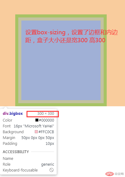
运行代码:
<style>.bigbox{width: 300px;height: 300px;background-color: #ffc0cb;/* 设置边框 */border: 10px solid green;/* 设置内边距 */padding: 10px;/* 设置margin使位置偏移 */margin-left: 50px;margin-top: 50px;/* overflow: hidden */overflow: hidden;/* 修改盒子大小计算方式 */box-sizing: border-box;}.box{width: 200px;height: 200px;background-color: blue;/* 设置边框 */border: 10px solid green;/* 设置内边距 */padding: 10px;/* 设置margin偏移 */margin-left: 20px;margin-top: 20px;}</style><body><div class="bigbox"><div class="box">1</div></div></body>
运行结果图:
下图没设置box-sizing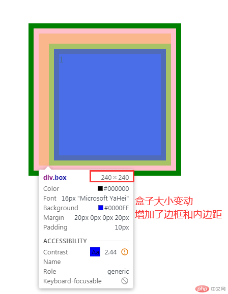
运行代码:
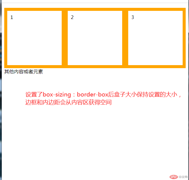
<style>.box{height: 200px;width: 200px;border: 10px solid orange;padding: 10px;/* 浮动排版 */float: left;box-sizing: border-box;}</style><body><div class="box">1</div><div class="box">2</div><div class="box">3</div><p>其他内容或者元素</p></body>
运行结果图: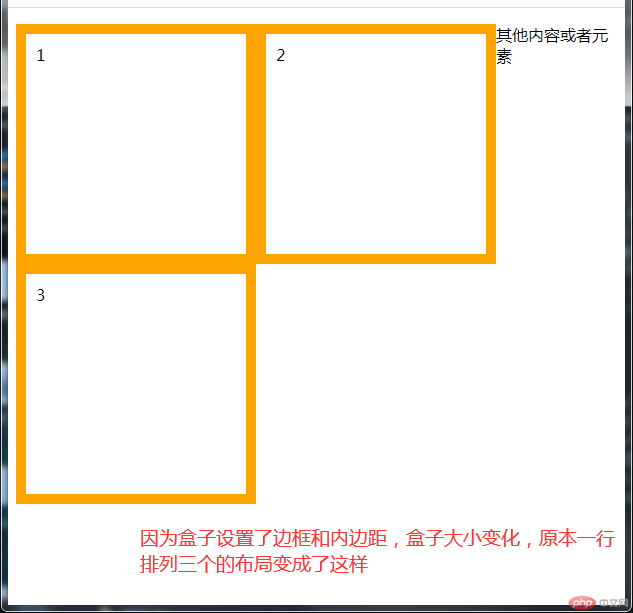
运行代码:
<style>span{background-color: cyan;}.box1{width: 200px;height: 200px;background-color: pink;/* 相对定位 */position: relative;left: 500px;top: 5px;}.bigbox{/* 绝对定位需要有已定位的父元素 */position: relative;}.box2{width: 200px;height: 200px;background-color: green;/* 绝对定位 */position: absolute;left: 10px;top: 20px;}</style><body><hr><div class="box1">相对定位盒子</div><span>测试内容会不会往上占位置</span><hr><div class="bigbox"><div class="box2">绝对定位盒子</div></div><span>测试内容会不会往上占位置</span></body>
运行结果图: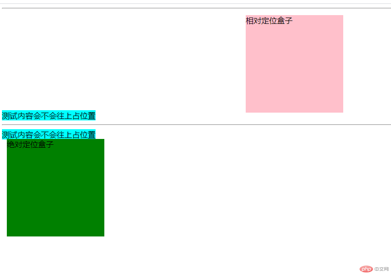
运行代码:
<style>.box1{width: 100px;height: 100px;background-color:pink;/* 固定定位 页面滚动,元素也保持固定在窗口位置,拉动窗口宽度,保持在右下角 */position: fixed;bottom: 10px;left: 20px;}.box2{width: 200px;height: 200px;background-color: green;/* 绝对定位 以最顶层父元素body进行定位 */position: absolute;left: 50px;top: 200px;}</style><body><hr><div class="box1">固定定位的盒子</div><div class="box2">绝对定位的盒子</div></body>
运行结果图: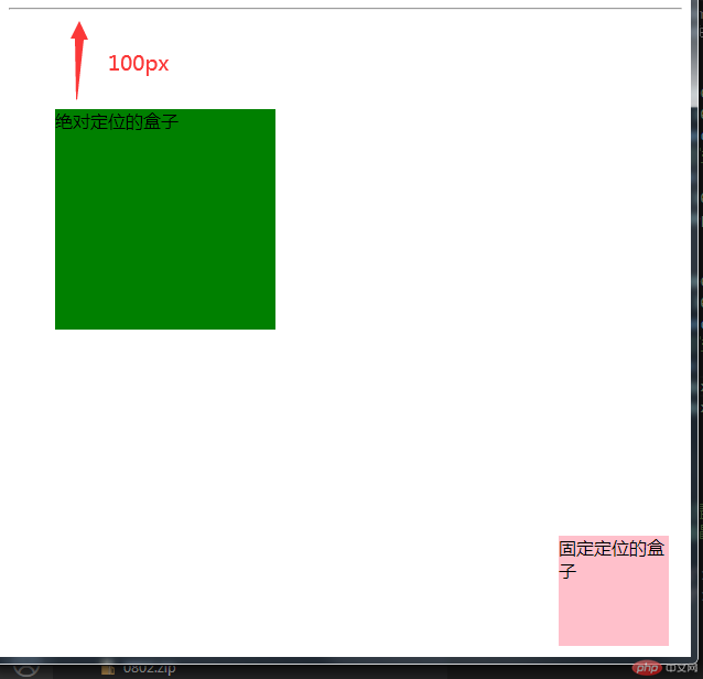
运行代码:
<style>.content{width: 400px;height: 400px;background-color:orange;position: relative;}.content > .main{background-color: pink;width: 200px;height: 20px;/* 左右宽度设置auto 浏览器会自动计算平分空间 使左右两边的margin相等 达到水平居中效果 */margin-left: auto;margin-right: auto;/* 上下设置auto 并不会垂直居中,视图窗口的宽度,页面打开的时候确定了,高度是无法固定的,高度随着你的内容不断增加 ,元素无法确定高度,所以无法计算 */margin-top: auto;margin-bottom: auto;/* 使用绝对定位后起效,绝对定位相当于定位了元素的四个点 确认出宽高,就能计算出高度平分*/position: absolute;top: 0;right: 0;bottom: 0;left: 0;margin: auto;}</style><body><div class="content"><div class="main">绝对定位实现垂直居中</div></div></body>
运行结果图: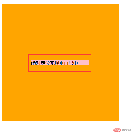
运行代码:
<!DOCTYPE html><html lang="en"><head><meta charset="UTF-8"><meta name="viewport" content="width=device-width, initial-scale=1.0"><title> 使用绝对定位实现二列布局</title><style>/* 页眉和页脚的共同设置 */.header,.footer{height: 50px;background-color:#333;}/* 页脚设置 */.footer{text-align: center;line-height: 50px;}.footer > p{color: white;}/* 导航栏设置 */.nav{width: 1000px;margin: auto;}.nav:first-of-type li{float: left;list-style: none;padding: 0 15px;line-height: 50px;}a{display: block;padding: 0 16px;text-decoration: none;color: white;}a:hover{background-color: #111;color: cyan;}/* 主体内容 *//* 内容区大DIV */.main{width: 1100px;/* background-color: orange; */margin: 15px auto;/* 设置相对定位 给下面的left,right进行绝对定位 */position: relative;min-height: 600px;}/* 左边内容区 */.left{width: 800px;min-height: 600px;/* 绝对定位 left和top都是0 可以不写 */position: absolute;background-color: coral;}/* 右边相关推荐区 */.right{width: 250px;min-height: 600px;background-color: cyan;/* 绝对定位 top为0可以不写 right要写 默认是top:0与left:0 */position: absolute;right: 0;}</style></head><body><!-- 页眉 --><div class="header"><div class="nav"><ul ><li><a href="">导航1</a></li><li><a href="">导航2</a></li><li><a href="">导航3</a></li></ul></div></div><!-- 主体 --><div class="main"><div class="left">左边内容主体区</div><div class="right">右边相关推荐区</div></div><div class="footer"><p>Copyright 2014-2020 https://www.php.cn/ All Rights Reserved | 页脚内容,备案号</p></div></body></html>
运行结果: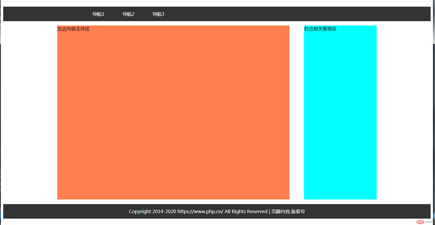
运行代码:
<!DOCTYPE html><html lang="en"><head><meta charset="UTF-8"><meta name="viewport" content="width=device-width, initial-scale=1.0"><title>浮动布局</title><style>*{/* 清楚margin和padding 设置盒子计算方式 */margin: 0;padding: 0;box-sizing: border-box;}/* 页眉,页脚,导航设置 */.header,.footer{height: 50px;margin: 0 auto;background-color: #333;}.header > .nav{width: 1000px;margin: 0 auto;}.header>.nav>ul>li {list-style: none;float: left;line-height: 50px;}a{display: block;padding: 0 16px;text-decoration: none;color: white;}a:hover{background: greenyellow;color: black;}.footer>p{text-align: center;line-height: 50px;color: white;}/* 主体区 */.main{width: 1000px;/* background-color: orange; */min-height: 600px;margin: 5px auto;/*子元素全部浮动会出现高度塌陷 解决容器高度塌陷问题 */overflow: hidden;}/* 设置左右区域 */.left,.right{/* 宽度 */width: 200px;/* 最小高度 */min-height: 600px;background-color: cyan;}/* 内容区 */.content{width: 550px;min-height: 600px;background-color: coral;/* 内容区设置左浮动 */float: left;}.left{/* 左推广区设置左浮动 */float: left;}.right{/* 右推荐区设置右浮动 */float: right;}</style></head><body><div class="header"><div class="nav"><ul><li><a href="#">首页</a></li><li><a href="#">秒杀</a></li><li><a href="#">团购</a></li><li><a href="#">更多</a></li></ul></div></div><div class="main"><div class="left">左边推广区 左浮动</div><div class="content">中间内容区 左浮动</div><div class="right">右边推荐区 右浮动</div></div><div class="footer"><p>Copyright 2014-2020 https://www.****.cn/ All Rights Reserved | 页脚内容,备案号</p></div></body></html>
运行结果图: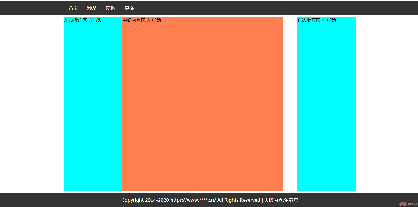
运行代码:
<!DOCTYPE html><html lang="en"><head><meta charset="UTF-8"><meta name="viewport" content="width=device-width, initial-scale=1.0"><title>圣杯布局</title><style>* {margin: 0;padding: 0;box-sizing: border-box;}/* 设置 页眉 页脚 导航 */.header,.footer{background-color: #333;height: 40px;}.center{width: 1000px;margin: 0 auto;}.footer p {line-height: 40px;text-align: center;color: cornsilk;}.header li{list-style: none;float: left;}a{text-decoration: none;color: cornsilk;display: block;line-height: 40px;padding: 0 15px;}a:hover{color: black;background-color: lightgreen;}/* 圣杯布局主体设置 */.container > *{/* 没内容使用最小高度支撑 */min-height: 400px;/* 给主体区域内的元素都给上浮动 */float: left;}.container{/* 解决高度塌陷问题 */overflow: hidden;/* 主体区使用 padding 设置出左右200PX的空间 让左右区块定位到这个padding空间上 */padding: 0 200px;}.container > .content{/* 内容区要设置成百分百 */width: 100%;/* 设置padding 使内容与左右区 间隔开会更美观,不是圣杯布局的必要元素 */padding: 10px 50px ;background-color: orange;}.container > .left,.right{/* 左右区块设置固定的宽度 与上方主体区提供的宽度相同 */width: 200px;background-color: cyan;}.left{/* 1.使用margin-left:-100% 定位到内容区的最左边 */margin-left: -100%;/* 2.再使用定位,进行移动到主体区的padding左空间 */position: relative;right: 200px;}.right{/* 1.使用margin-left:-200px 定位到内容区的最右边 */margin-left: -200px;/* 2.再使用定位,进行移动到主体区的padding右空间 */position: relative;left: 200px;}</style></head><body><div class="header"><div class="center"><ul><li><a href="#">导航1</a></li><li><a href="#">导航2</a></li><li><a href="#">导航3</a></li><li><a href="#">导航3</a></li><li><a href="#">导航3</a></li></ul></div></div><div class="container"><div class="content">央广网北京8月3日消息(记者张棉棉)据中央广播电视总台中国之声《全国新闻联播》报道,国新办8月3日举行发布会,北斗卫星导航系统新闻发言人、中国卫星导航系统管理办公室主任冉承其表示,目前已攻克星间链路、高精度原子钟等160多项关键核心技术,突破500多种器部件国产化研制,实现北斗三号卫星核心器部件国产化率100%,2035年前将建成更加泛在、更加融合、更加智能的国家综合定位导航授时体系,为未来智能化、无人化发展提供核心支撑。北斗三号全球卫星导航系统正式开通,标志着北斗“三步走”发展战略圆满完成,北斗迈进全球服务新时代。冉承其表示,北斗三号工程提前半年完成,开通全系统服务,实现了建成即开通、开通即服务,彰显了中国速度。冉承其介绍:“突破500余种器部件国产化研制,实现北斗三号卫星核心器部件国产化率100%。”北斗三号支持导航定位、通信数传两大功能,性能指标方面,北斗三号全球范围定位精度优于10米、测速精度优于0.2米/秒、授时精度优于20纳秒、服务可用性优于99%,亚太地区性能更优。冉承其介绍:“北斗系统已全面服务交通运输、公共安全、救灾减灾、农林牧渔、城市治理等行业,融入电力、金融、通信等国家核心基础设施建设。28nm工艺芯片已经量产,22nm工艺芯片即将量产。大部分智能手机均支持北斗功能。”北斗已是联合国认可的四大全球卫星导航系统之一。与美国、俄罗斯、欧盟卫星导航的兼容与互操作及系统间合作持续深化。目前,北斗相关产品已出口120余个国家和地区,向亿级以上用户提供服务。冉承其说:“2035年前将建成更加泛在、更加融合、更加智能的国家综合定位导航授时体系,持续推进系统升级换代,构建覆盖天空地海、基准统一、高精度、高智能、高安全、高效益的时空信息服务基础设施。”</div><div class="left">左边</div><div class="right">右边</div></div><div class="footer"><div class="center"><p>****************页脚内容*****************</p></div></div></body></html>
运行结果图: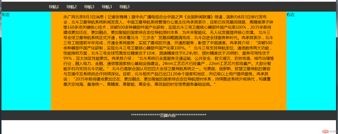