


![[Web front-end] Node.js quick start](https://img.php.cn/upload/course/000/000/067/662b5d34ba7c0227.png)


 天蓬老师
天蓬老师Correction status:qualified
Teacher's comments:非常棒, 下次可以放截图就可以了, 不必放站外地址了


 Collection
 Collection

现在多端需要响应式设计,页面能适应手机、平板、电脑和大屏设备进行自适应。在我的作业https://www.php.cn/blog/detail/24434.html已经详细分析了em和rem联系与区别,在作业https://www.php.cn/blog/detail/24548.html演示了em和rem的应用。今天又接触了新的知识。
- 相对单位vw、vh、vmin和vmax 它们都是相对于视口view(浏览器窗口中用来显示文档的可视区域, 不包括地址栏,菜单,工具条,状态栏,控制台)相对单位。决定了响应式设计中整体布局。
- 媒体查询@media 通过它识别不同尺寸设备,从而调整尺寸适应。
- 自定义变量 以2个短横线为前缀即’—‘,如—textcolor:red;
与字号相关的单位有绝对值px,也有相对单位em和rem。rem(root em的缩写)是根元素的字号大小,而em是元素的字号大小(其中若是用于font-size时则继承父元素)。一般应用建议是:
- rem: 用在font-size,设置字号,尽可能不要用在:root
- em: 用在依赖字号的属性的上,padding,margin,width, height,border-radius,line-height,text-indent….。应该说者都可以用,不过建议需要响应式的地方使用em更好。
- px: border,边框一般不随屏幕而变化宽度。
- em应用在设置font-size时要注意多层子元素的递归问题,所以不要随意使用em设置font-size,要少用或不用,除非你是可以预测的,如组件中还是建议使用em,使用rem则导致不灵活,这点以后会再说明。
.panel {border: 1px solid lightgray;padding: 0.5em 1em;background-color: lightgray;border-radius: 0.5em;}.panel > h3 {font-size: 1.3rem;margin: 0.2em auto;}.panel > p {font-size: 1.1rem;line-height: 2em; /* 行高 */text-indent: 2em; /* 缩进2个字符 */}/* 小屏,宽度大于400px */@media screen and (min-width: 400px) {:root {font-size: 0.75em;}}/* 平板,宽度大于800px */@media screen and (min-width: 800px) {:root {font-size: 0.875em;}}/* PC,宽度大于1200px */@media screen and (min-width: 1200px) {:root {font-size: 1em;}}
- 视口: 浏览器窗口中用来显示文档的可视区域, 不包括地址栏,菜单,工具条,状态栏,控制台
- vw: 视口”初始包含块”宽度的 1 / 100
- vh: 视口”初始包含块”高度的 1 / 100
- vw: 选择视口宽或高中较小的一个值,如80vmin就是80vw和80vh中最小值。
- vw: 选择视口宽或高中较大的一个值,如80vmax就是80vw和80vh中最大值。
<style>.box{ width: 100vw; height: 30vh; margin: 5px auto; }.red{ background-color: red; }.green{ background-color: green; }.blue{ background-color: blue; }</style><div class="container"><div class="box red"></div><div class="box green"></div><div class="box blue"></div></div>
通过这几天相对单位的学习,可以说是让我又重新认识了响应式布局,解决了uniapp的UI框架只适应竖屏,对于横屏则显示很不友好。无论是uni-ui还是uview-ui首先都适配了竖屏,对于横屏考虑很少,再一个就是字号相对单位和视口相对单位选择不是很正确,导致组件在具体环境中适应性差。
常见的相对单位和建议应用场景:
- 字号的相对单位em和rem: rem用于页面内字号 ,em用于组件内字号,这样组件就能根据容器自适应调整,正是根据这个我对uniapp的UI组件进行了修改,较好适应了横屏和竖屏。
- 视口的相对单位vw、vh、vmin和vmax: 多用于整体布局,划分几行几列。不建议用于组件内或局部布局。
- 小程序端的相对单位rpx:我觉得rpx是视口宽度单位更进一步细化,vw分为100份,而rpx则将视口分为750份,更精细了。不过rpx只能用于移动端,而且只是针对横向。经测试在PC端直接使用无效。
- 百分比%: 相比于vw和vh等,它更适合组件内或局部布局,不建议它进行整体布局。对于横向百分比和竖向百分比的计算规则可见我的作业https://www.php.cn/blog/detail/24548.html的第一节第5小点的分析,由于是个人测试总结,对于百分比认识难免有失误,还望老师和同学们批评
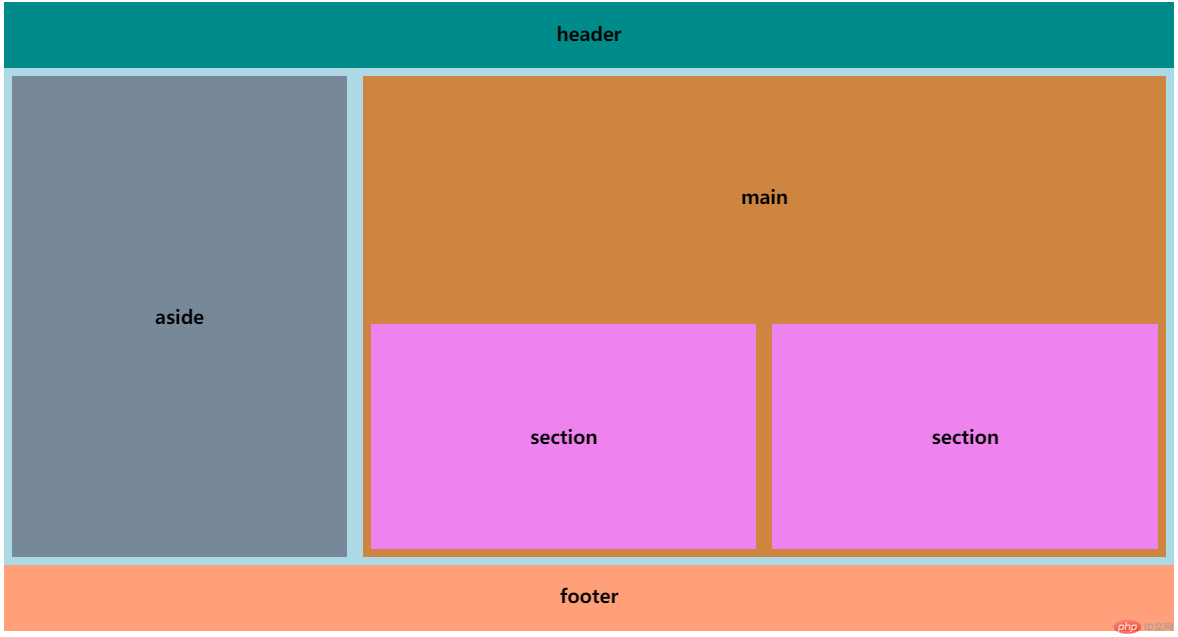
下面源码通过相对单位综合使用实现了类似于Grid布局
<style>* { box-sizing: border-box; text-align: center; }body { display: flex; flex-direction: column; justify-content: space-between; }/* 整体布局:建议使用vw和vh */.page-head { height: 10vh; background-color: darkcyan; }.container { height: 75vh; background-color: lightblue; display: flex; }.page-foot { height: 10vh; background-color: lightsalmon; }/* 局部布局:建议使用百分比,盒模型相关属性使用em */.aside {/* 局部使用vw效果不好 *//* width: 30vw; */width: 30%;height: 100%;background-color: lightslategray;background-clip: content-box;padding: 0.5em;display: flex;justify-content: center;align-items: center;}.main {/* 局部使用vw效果不好 *//* width: 68vw; */width: 70%;height: 100%;background-color: peru;background-clip: content-box;padding: 0.5em;display: flex;flex-direction: column;justify-content: space-between;}.content {height: 50%;display: flex;justify-content: center;align-items: center;}.section-box {display: flex;height: 50%;}.section {width: 50%;height: 100%;background-color: violet;background-clip: content-box;padding: 0.5em;display: flex;justify-content: center;align-items: center;}</style><body><header class="page-head"><h3>header</h3></header><div class="container"><aside class="aside"><h3>aside</h3></aside><main class="main"><div class="content"><h3>main</h3></div><div class="section-box"><section class="section"><h3>section</h3></section><section class="section"><h3>section</h3></section></div></main></div><footer class="page-foot"><h3>footer</h3></footer></body>
到这里,相对单位基本学习完了,通过老师讲解演示和自己测试,终于较为系统的认识了相对单位应用场景。可以归纳如下:
- 字号相对单位多用于盒模型,em用于组件内,rem用于页面或组件外,根据尺寸使用px或rpx来调整,em和rem定义的属性自动相应调整。
- 视口相对单位vw和vh等,主要用于整体布局。
- 百分比用于组件内或局部布局,组件或局部灵活适应开发者的布局。
更多源码见我的Github https://github.com/woxiaoyao81/phpcn13和Gitee https://gitee.com/freegroup81/phpcn13