一、盒模型中百分比和auto
盒模型中属性值可以是数值、关键字、函数、百分比和auto等,本文重点探讨下常用的、非常相似的、都需要浏览器计算的的百分比和auto 。二者最大区别据某博文中总结是:auto与子元素有关,100%与父元素有关。 总体来说是正确的,但要修正一点就是margin的auto是与父元素有关 。下面是盒模型(只考虑 块级元素 )中各属性对百分比和auto处理情况。
几点重要说明:
- 所有margin、padding默认清除 即*{margin:0;padding:0}
- 块级元素的指明高度 就是CSS中用height指明的,可以是固定值、相对值或根据父父元素的百分比计算到。记 height-d (d表示定义或设置之意)。
- 块级元素的内容高度 顾名思义就是内容撑开的高度,记 height-c(c表示内容之意)
- 块级元素的真实高度 就是在chrome开发者工具中盒模型的高度或用户在浏览器中所看到的高度。记 height 。
- height、height-d和height-c的关系:
- 不指定height时,height-d=0,而height-c是随内容增加而增加的,此时height=height-c。
- 指定了height时,height-d=指定高度,而height-c仍然是随内容增加而增加的,此时height=height-d。
下面在使用高度概念时要区分这三个标记,一定要看清上面的说明。
| 盒模型相关属性 |
百分比(chrome测试过结论) |
auto(chrome测试过结论) |
| width |
父元素宽度的百分比 |
width+margin+border+padding等于父元素宽度 |
| height |
父元素指明高度height-d的百分比 |
计算结果为0,元素高度由内容撑开 |
| margin |
父元素宽度的百分比 |
左右时 是父元素宽度减去元素的宽度后左侧或最侧最大化分配。 上下时 则为0。 |
| padding |
父元素宽度的百分比 |
不支持 |
| border |
不支持 |
不支持 |
| left |
父元素宽度的百分比 |
left=0 |
| right |
父元素宽度的百分比 |
right=父元素宽-元素宽 |
| top |
父元素真实高度height的百分比 |
top=父元素内容高度height-c |
| bottom |
父元素真实高度height的百分比 |
bottom=父元素真实高度height-元素真实高度height-top |
从上面可以看出只有盒模型中width、height和margin完全支持百分比和auto,所以本文主要探讨宽度、高度和外边距。
二、宽度和高度中百分比和auto
用户阅读习惯决定了CSS对待宽度和高度不同处理方式,即宽度受限有最大宽度,而高度是可以滚动的没有最大高度。一般来说最大宽度不大于设备横向最大尺寸。
宽度和高度的默认值: 都是auto,具体表现见上面表中说明的。
1、宽度width中的百分比和auto
经典对比
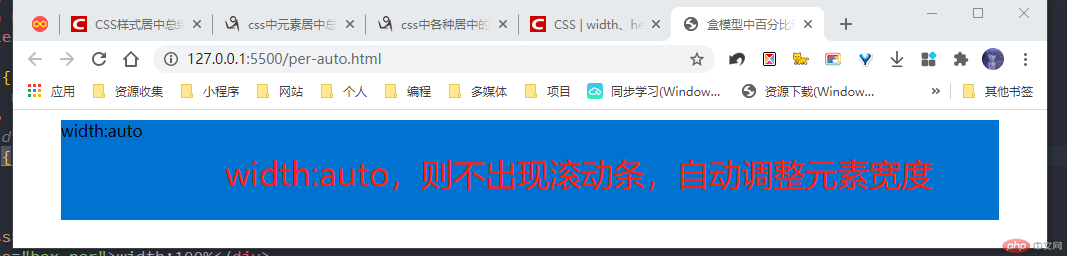
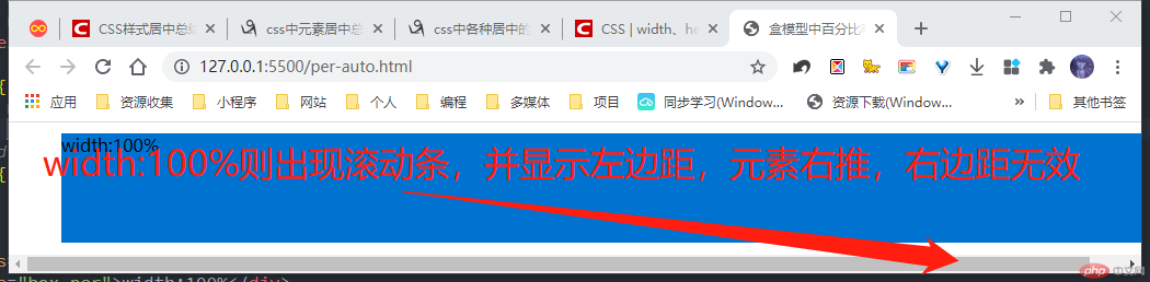
- width:auto,此时div的高度为100px,左右margin为40px,上下margin为10px;
- width:100%,此时div的高度和左右margin同上
<style> .box { height: 100px; margin: 10px 40px; background-color: #0072d0; } /* 1. width:auto */ .auto { width: auto; } /* width:100% */ .per { width: 100%; }</style><body> <div class="box auto">width:auto</div> <div class="box per">width:100%</div></body>
两个效果
结论:
- width为auto时,width+左右两边的margin为其父元素的width ,与其内容无关,会占据一整行但是不会出现滚动条**。
- width为 100% 时,width的值为其父元素的width,与margin无关,margin-left显示,margin-right没有显示。100%时使用margin,出现滚动条。
2、高度height中的百分比和auto
结论:
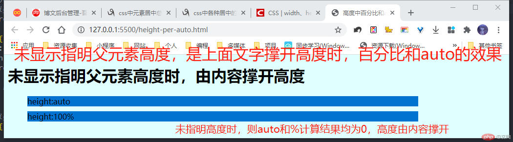
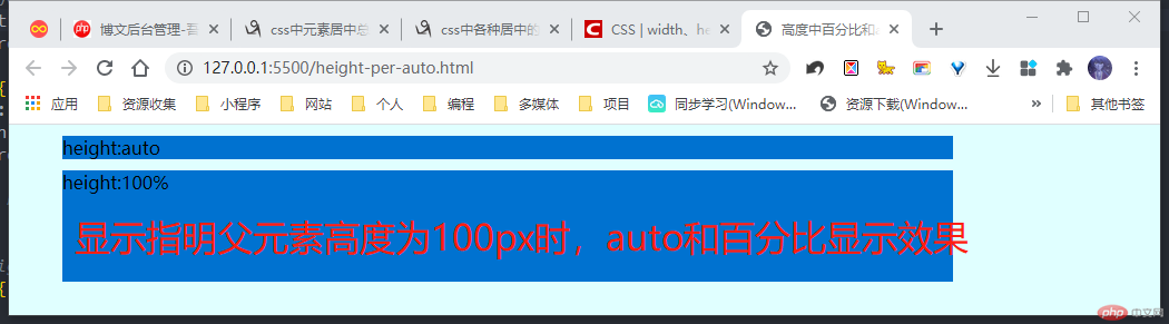
- 高度为auto 高度计算为0,内容撑开元素高度,与其父元素高度无关。
- 高度为百分比% 可根据本文开头测试过数据表中得出:指明高度时有效,结果为指明高度height-d的百分比;而内容高度时无效,此时为0。。
<style> body { /*指明高度 */ /* height: 100px; */ background-color: lightcyan; } .box { width: 800px; margin: 10px 40px; background-color: #0072d0; } /* 1. height:auto */ .auto { height: auto; } /* height:100% */ .per { height: 100%; }</style><body><h1>未显示指明父元素高度时,由内容撑开高度</h1><div class="box auto">height:auto</div><div class="box per">height:100%</div></body>
两个效果
三、外边距margin中百分比和auto
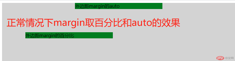
正如本文开头所说,外边距margin的百分比和auto是和父元素密切相关的 ,也是布局中常用的技巧,如常见的水平居中和垂直居中均可以借助margin来实现。
1、 正常情况下外边距的百分比和auto。
- 1、左右外边距
- 取值百分比时,是按父元素宽度计算。
- 取值auto时,若margin-left:auto则父宽度减去元素宽度全部分配给左边距,若margin-right为auto则同样全部分配给右边距,若左右为auto则平均分即水平居中。
- 2、上下外边距
- 取值百分比时,仍然是按父元素宽度计算。
- 取值auto时,不论父元素是否指明高度,计算结果均为0。
<style> .container { width: 800px; height: 600px; background-color: lightgray; } .box { width: 300px; background-color: #007d20; } .auto{ margin:auto; } .per{ margin:10%; }</style><div class="container"> <div class="box auto">外边距margin的auto</div> <div class="box per">外边距margin的百分比</div></div>
2、 定位情况下外边距的百分比和auto
经典定位方案是:父元素或容器相对定位,元素是绝对定位。它们总是满足如下规律:
- 父宽度=left+margin-left+元素宽度+margin-right+right
- 父真实高度height=top+margin-top+元素真实高度height+margin-bottom+bottom
需要说明的是:
- left、right、top和bottom取值百分比或auto时,计算结果见本文开头的表说明。
- 在日常使用中left/right/top/bottom一般不用auto,可百分比、固定值或相对单位值。
* { margin: 0; padding: 0;}.wrapper { display: flex; justify-content: space-around; margin-top: 50px; margin-bottom: 100px;}/* 一、父元素未指定高度 */.container { background-color: lightgray; position: relative;}/* 二、父元素指定高度 */.con-fixed{ width:40vw; height: 30vh;}/* 1.元素未指明宽和高,即都是width:auto;height:auto; */.box { position: absolute; left: 0; top: 0; right: 0; bottom: 0;}/* 2.元素指明宽度 */.box-fixed { width:20vw; height: 10vh;}/* margin百分比和auto */.auto { background-color: #007d20; opacity: 0.9; margin: auto;}.per { background-color: lightsalmon; opacity: 0.9; margin: 5%;}</style><div class="wrapper"> <div class="container"> <h1>未指明父元素宽度和高度</h1> <h1>未指明父元素宽度和高度</h1> <div class="box auto">未指明元素宽高,即都为auto,margin也是auto</div> <div class="box per">未指明元素宽高,即都为auto,margin是百分比</div> </div> <div class="container"> <h1>未指明父元素宽度和高度</h1> <h1>未指明父元素宽度和高度</h1> <div class="box box-fixed auto">元素宽度为20vw,高度为10vh,margin是auto</div> <div class="box box-fixed per">元素宽度为20vw,高度为10vh,margin是百分比</div> </div></div><div class="wrapper"> <div class="container con-fixed"> <h1>父元素宽度为40vw,高度为30vh</h1> <h1>父元素宽度为40vw,高度为30vh</h1> <div class="box auto">未指明元素宽高,即都为auto,margin也是auto</div> <div class="box per">未指明元素宽高,即都为auto,margin是百分比</div> </div> <div class="container con-fixed"> <h1>父元素宽度为40vw,高度为30vh</h1> <h1>父元素宽度为40vw,高度为30vh</h1> <div class="box box-fixed auto">元素宽度为20vw,高度为10vh,margin是auto</div> <div class="box box-fixed per">元素宽度为20vw,高度为10vh,margin是百分比</div> </div></div>
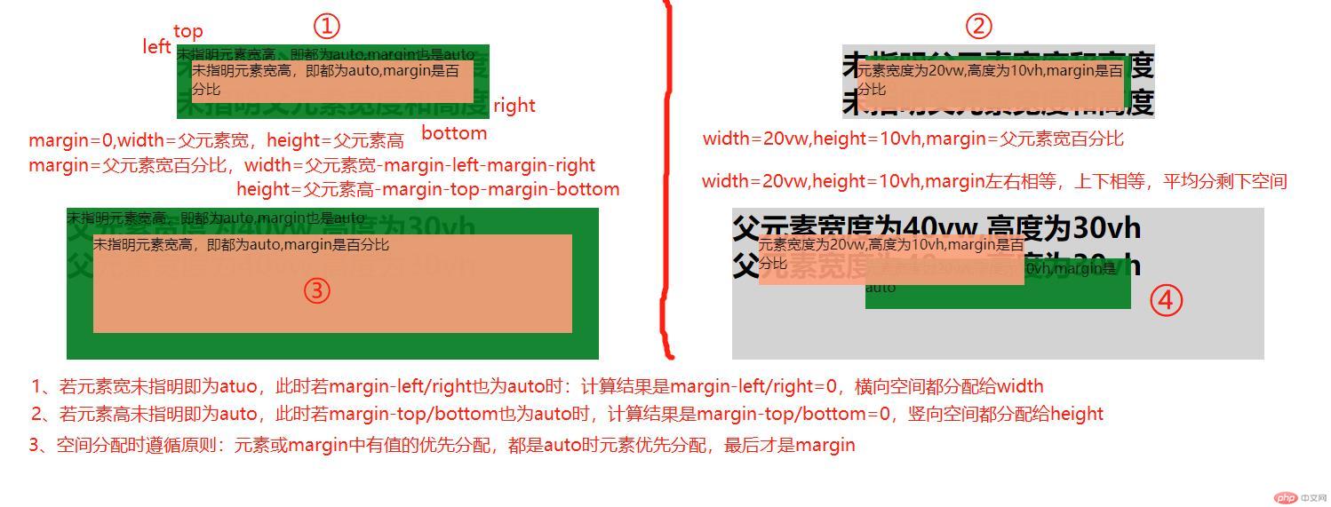
空间分配原则: 元素或margin中有值的优先分配给定值的空间,然后值都是auto时,元素优先分配空间,此时对应的横向或竖向的margin为0。若只有margin是auto时,则平均分配父元素减去元素的空间,就产生居中效果。
四、百分比和auto在块级元素的水平居中和垂直居中应用
1、 父元素或容器指明宽高
- 元素也指明宽高时,left=right,top=bottom,margin=auto即可实现水平和垂直居中
- 元素未指明宽高时,left=right,top=bottom,margin=auto或百分比都可实现水平和垂直居中,此时内容区域自适应。
2、 父元素或容器未指明宽高
- 元素也指明宽高时,left=right,top=bottom,margin=auto即可实现水平和垂直居中
- 元素未指明宽高时,left=right,top=bottom,margin=auto或百分比都可实现水平和垂直居中,此时内容区域自适应。
更多的居中技巧演示见参考文章中。
参考文章
- CSS | width、height中auto与100%与固定值有什么不同 https://blog.csdn.net/R_banyan0820/article/details/80956848
- css中元素居中总结 https://www.cnblogs.com/libin-1/p/5918477.html


 Collection


![[Web front-end] Node.js quick start](https://img.php.cn/upload/course/000/000/067/662b5d34ba7c0227.png)


