


![[Web front-end] Node.js quick start](https://img.php.cn/upload/course/000/000/067/662b5d34ba7c0227.png)


 天蓬老师
天蓬老师Correction status:qualified
Teacher's comments:


 Collection
 Collection
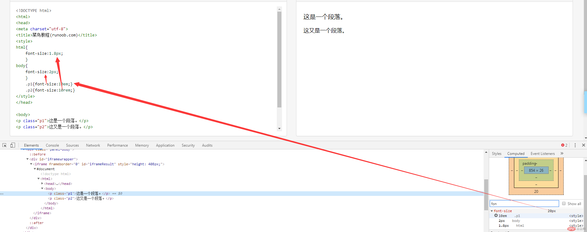
<!DOCTYPE html><html><head><meta charset="utf-8"><title>菜鸟教程(runoob.com)</title><style>html{font-size:1.8px;}body{font-size:2px;}.p1{font-size:10em;}.p2{font-size:10rem;}</style></head><body><p class="p1">这是一个段落。</p><p class="p2">这又是一个段落。</p></body></html>
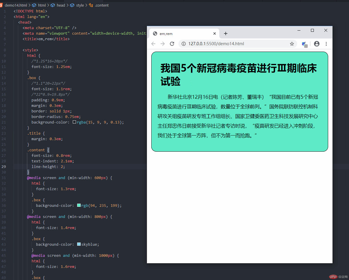
<!DOCTYPE html><html lang="en"><head><meta charset="UTF-8" /><meta name="viewport" content="width=device-width, initial-scale=1.0" /><title>em,rem</title><style>html {/*1.25*16=20px*/font-size: 1.25em;}.box {/*1.1*20=22px*/font-size: 1.1rem;/*22*0.9=19.8px*/padding: 0.9em;margin: 0.3em;border: solid 1px;border-radius: 0.75em;background-color: rgba(15, 9, 9, 0.13);}.title {margin: 0.3em;}.content {font-size: 0.8rem;text-indent: 2.1em;line-height: 2;}@media screen and (min-width: 600px) {html {font-size: 1.3rem;}.box {background-color: rgb(94, 235, 199);}@media screen and (min-width: 800px) {html {font-size: 1.4rem;}.box {background-color: skyblue;}@media screen and (min-width: 1000px) {html {font-size: 1.6rem;}.box {background-color: rgb(230, 204, 89);}}@media screen and (min-width: 1200px) {html {font-size: 1.8rem;}.box {background-color: rgb(243, 164, 61);}@media screen and (min-width: 1400px) {html {font-size: 2rem;}.box {background-color: rgb(77, 206, 238);}/*@media screen and (min-width: 800px) {/* 14/16 = 0.875em *//*html {font-size: 0.875em;}.box {background-color: wheat;}}*/</style></head><body><div class="box"><h2 class="title">我国5个新冠病毒疫苗进行Ⅲ期临床试验</h2><p class="content">新华社北京12月16日电(记者陈芳、董瑞丰)“我国目前已有5个新冠病毒疫苗进行Ⅲ期临床试验,数量位于全球前列。”国务院联防联控机制科研攻关组疫苗研发专班工作组组长、国家卫健委医药卫生科技发展研究中心主任郑忠伟日前接受新华社记者专访时说,“疫苗研发已经进入冲刺阶段,我们处于全球第一方阵,但不为第一而抢跑。”</p></div></body></html>
<!DOCTYPE html><html><head><meta charset="utf-8"><title>vh和vw</title><style>.box{height:50vh;width:50vw;background-color:red;}</style></head><body><div class="box">我是一个盒子</div></body></html>
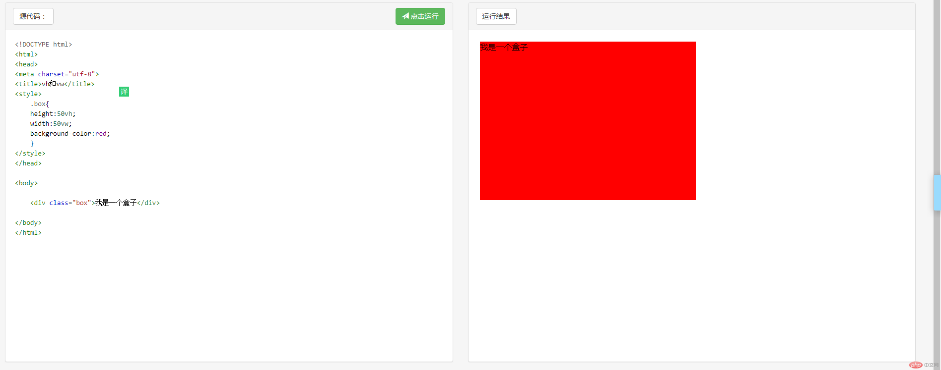
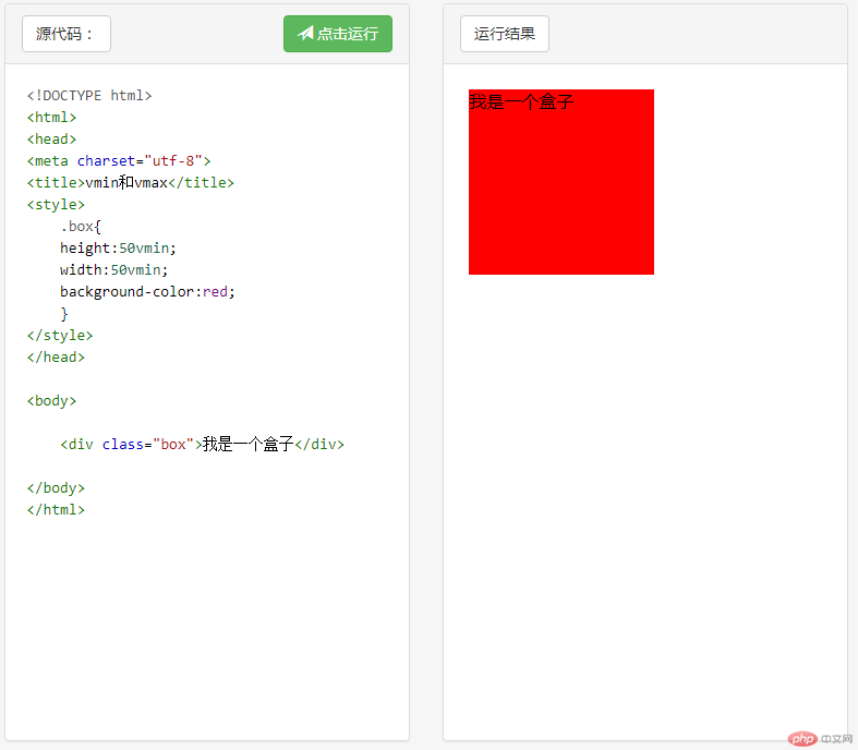
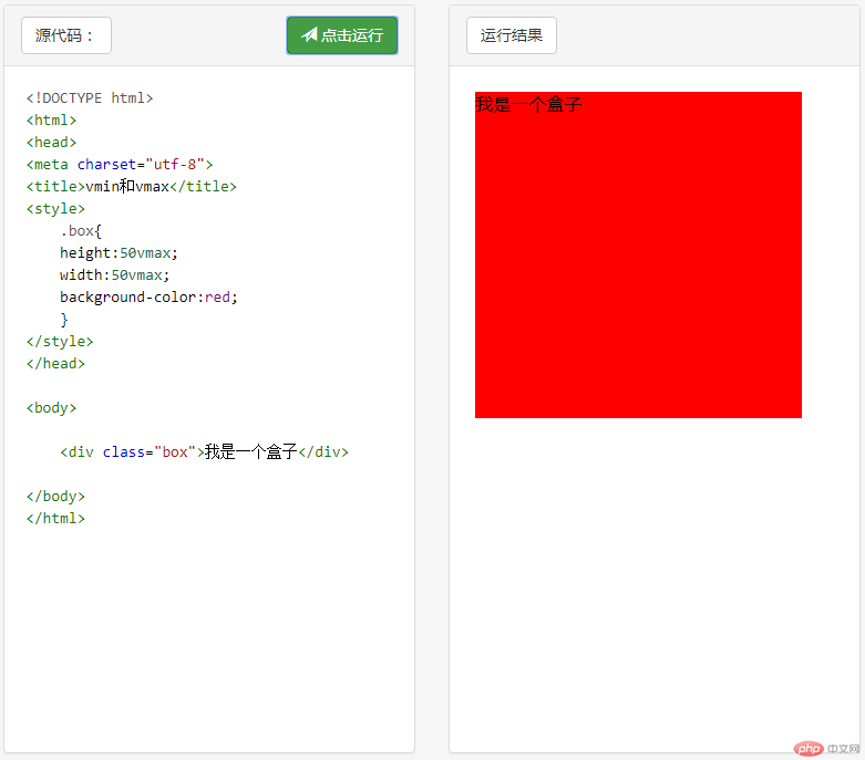
此时上面的盒子都显示为正方形