


![[Web front-end] Node.js quick start](https://img.php.cn/upload/course/000/000/067/662b5d34ba7c0227.png)


 天蓬老师
天蓬老师Correction status:qualified
Teacher's comments:


 Collection
 Collection
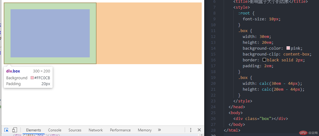
为什么会出现box-sizing这个属性?
当我们设置了box的width和height值之后,希望这个盒子大小是一个固定不变的值,但是padding(内边距)和border(边框)的大小会影响到盒子实际大小,所以程序员会使用width: calc(XXem - XXpx);height: calc(XXem - XXpx);设置来让盒子设置的大小就是盒子的实际大小
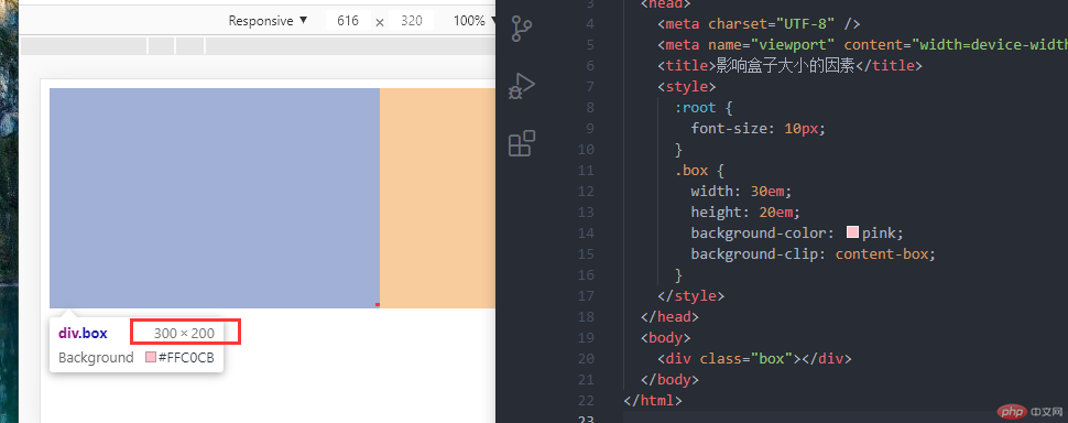
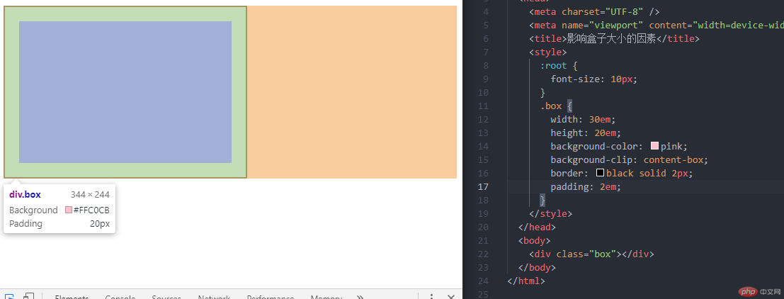
<!DOCTYPE html><html lang="en"><head><meta charset="UTF-8" /><meta name="viewport" content="width=device-width, initial-scale=1.0" /><title>影响盒子大小的因素</title><style>:root {font-size: 10px;}.box {width: 30em;height: 20em;background-color: pink;background-clip: content-box;border: black solid 2px;padding: 2em;}.box {/* 把被border和paddging影响多出的高宽减掉 */width: calc(30em - 44px);height: calc(20em - 44px);}</style></head><body><div class="box"></div></body></html>
可以看到盒子大小已经是实际设置的大小
后面w3c自己出的一个属性->IE盒子
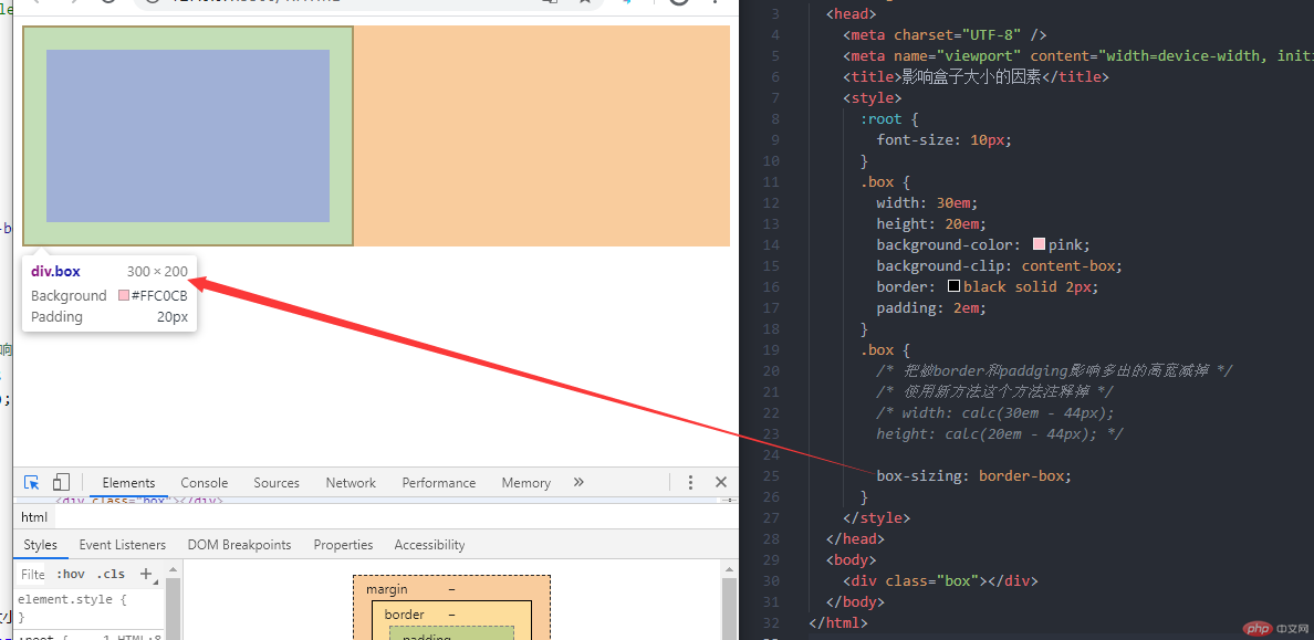
<!DOCTYPE html><html lang="en"><head><meta charset="UTF-8" /><meta name="viewport" content="width=device-width, initial-scale=1.0" /><title>影响盒子大小的因素</title><style>:root {font-size: 10px;}.box {width: 30em;height: 20em;background-color: pink;background-clip: content-box;border: black solid 2px;padding: 2em;}.box {/* 把被border和paddging影响多出的高宽减掉 *//* 使用新方法这个方法注释掉 *//* width: calc(30em - 44px);height: calc(20em - 44px); */box-sizing: border-box;}</style></head><body><div class="box"></div></body></html>
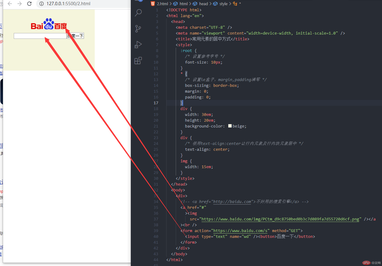
<!DOCTYPE html><html lang="en"><head><meta charset="UTF-8" /><meta name="viewport" content="width=device-width, initial-scale=1.0" /><title>常用元素的居中方式</title><style>:root {/* 设置参考字号 */font-size: 10px;}* {/* 设置ie盒子,margin,padding清零 */box-sizing: border-box;margin: 0;padding: 0;}div {width: 30em;height: 20em;background-color: beige;}div {/* 使用text-align:center让行内元素及行内块元素居中 */text-align: center;}img {width: 15em;}</style></head><body><div><!-- <a href="http://baidu.com">不好用的搜索引擎</a> --><a href="#"><imgsrc="https://www.baidu.com/img/PCtm_d9c8750bed0b3c7d089fa7d55720d6cf.png" /></a><br /><form action="https://www.baidu.com/s" method="GET"><input type="text" name="wd" /><button>百度一下</button></form></div></body></html>
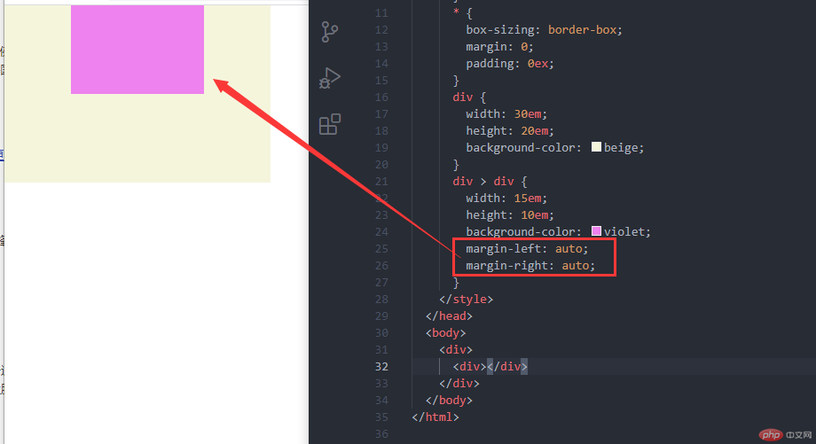
margin: 0 auto;
<!DOCTYPE html><html lang="en"><head><meta charset="UTF-8" /><meta name="viewport" content="width=device-width, initial-scale=1.0" /><title>块元素水平居中</title><style>:root {font-size: 10px;}* {box-sizing: border-box;margin: 0;padding: 0;}div {width: 30em;height: 20em;background-color: beige;}div > div {width: 15em;height: 10em;background-color: violet;/* margin-left: auto;margin-right: auto; *//* 浏览器根据上下文水平居中一般这些写`margin: 0 auto;` */margin: 0 auto;}</style></head><body><div><div></div></div></body></html>
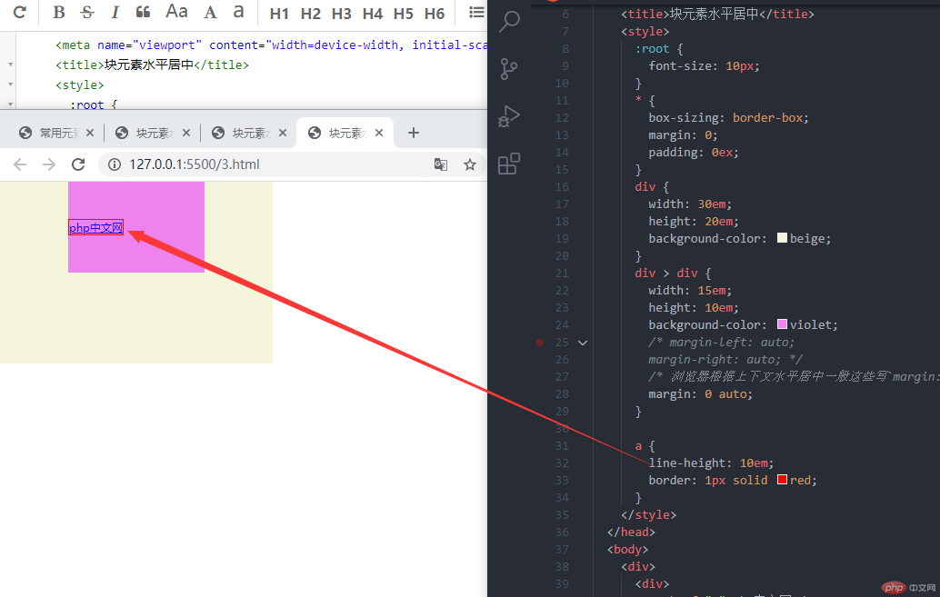
<!DOCTYPE html><html lang="en"><head><meta charset="UTF-8" /><meta name="viewport" content="width=device-width, initial-scale=1.0" /><title>块元素水平居中</title><style>:root {font-size: 10px;}* {box-sizing: border-box;margin: 0;padding: 0;}div {width: 30em;height: 20em;background-color: beige;}div > div {width: 15em;height: 10em;background-color: violet;/* margin-left: auto;margin-right: auto; *//* 浏览器根据上下文水平居中一般这些写`margin: 0 auto;` */margin: 0 auto;}a {line-height: 10em;border: 1px solid red;}</style></head><body><div><div><a href="#">php中文网</a></div></div></body></html>
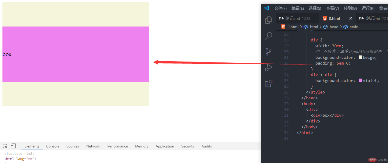
<!DOCTYPE html><html lang="en"><head><meta charset="UTF-8" /><meta name="viewport" content="width=device-width, initial-scale=1.0" /><title>块元素垂直居中</title><style>div {width: 30em;/* 不给盒子高度让padding挤出来 */background-color: beige;padding: 5em 0;}div > div {background-color: violet;}</style></head><body><div><div>box</div></div></body></html>
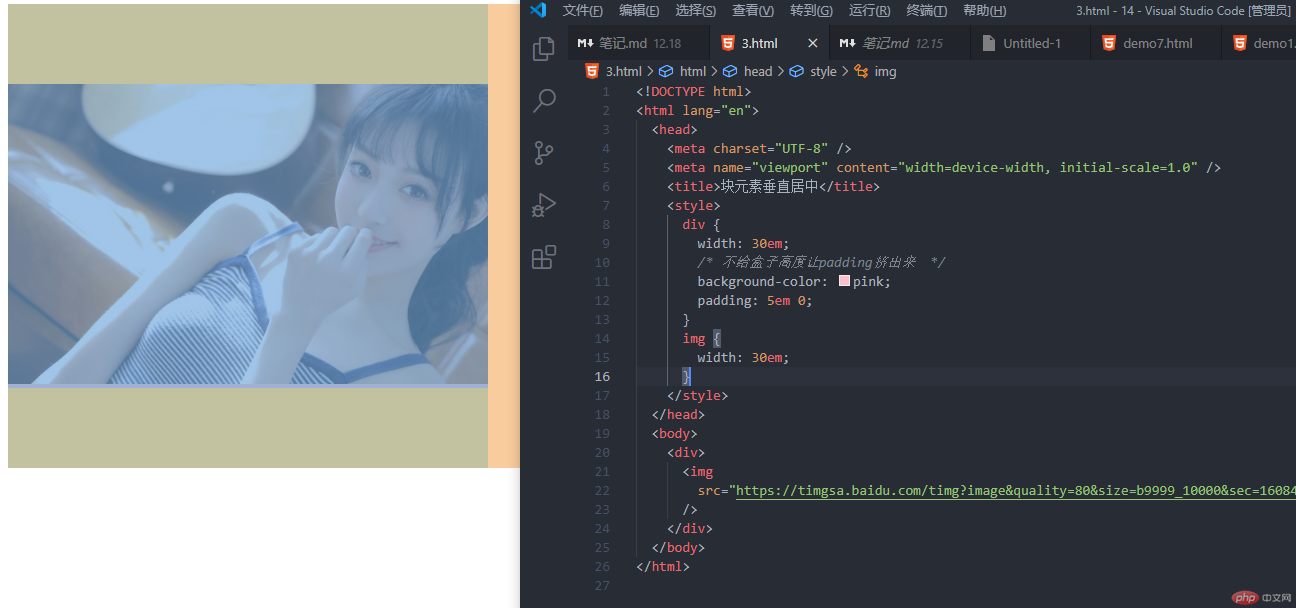
<!DOCTYPE html><html lang="en"><head><meta charset="UTF-8" /><meta name="viewport" content="width=device-width, initial-scale=1.0" /><title>块元素垂直居中</title><style>div {width: 30em;/* 不给盒子高度让padding挤出来 */background-color: pink;padding: 5em 0;}img {width: 30em;}</style></head><body><div><imgsrc="https://timgsa.baidu.com/timg?image&quality=80&size=b9999_10000&sec=1608456663872&di=932bc4d7d0c546647f0320b084d34847&imgtype=0&src=http%3A%2F%2Fpic.jj20.com%2Fup%2Fallimg%2F1113%2F041620103S8%2F200416103S8-4-1200.jpg"/></div></body></html>
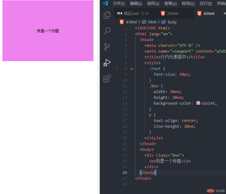
<!DOCTYPE html><html lang="en"><head><meta charset="UTF-8" /><meta name="viewport" content="width=device-width, initial-scale=1.0" /><title>行内元素居中</title><style>:root {font-size: 10px;}.box {width: 30em;height: 20em;background-color: violet;}p {text-align: center;line-height: 20em;}</style></head><body><div class="box"><p>我是一个标题</p></div></body></html>
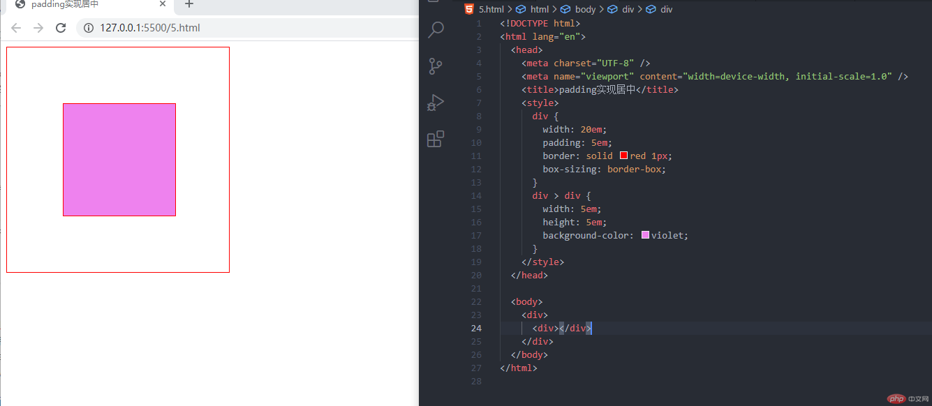
<!DOCTYPE html><html lang="en"><head><meta charset="UTF-8" /><meta name="viewport" content="width=device-width, initial-scale=1.0" /><title>padding实现居中</title><style>div {width: 20em;padding: 5em;border: solid red 1px;box-sizing: border-box;}div > div {width: 5em;height: 5em;background-color: violet;}</style></head><body><div><div></div></div></body></html>
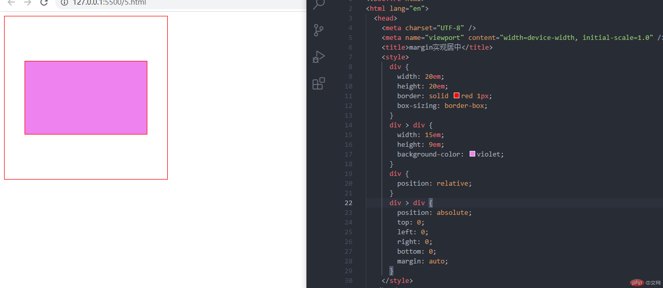
<!DOCTYPE html><html lang="en"><head><meta charset="UTF-8" /><meta name="viewport" content="width=device-width, initial-scale=1.0" /><title>margin实现居中</title><style>div {width: 20em;height: 20em;border: solid red 1px;box-sizing: border-box;}div > div {width: 15em;height: 9em;background-color: violet;}div {position: relative;}div > div {position: absolute;top: 0;left: 0;right: 0;bottom: 0;margin: auto;}</style></head><body><div><div></div></div></body></html>