


![[Web front-end] Node.js quick start](https://img.php.cn/upload/course/000/000/067/662b5d34ba7c0227.png)


 天蓬老师
天蓬老师Correction status:qualified
Teacher's comments:


 Collection
 Collection
1.实例演示 box-sizing 属性; 2. 实例演示常用的元素居中方式
影响盒子大小的因素 width 与 heigth 和 padding、border
一个盒子的实际大小是由 content、padding、border、margin 组成
在 css 中可以通过设置 width 或 heigth 属性来控制 content 部分的大小
还可以设置盒子的 padding、border 的大小
测试代码
<!DOCTYPE html><html lang="en"><head><meta charset="UTF-8" /><meta name="viewport" content="width=device-width, initial-scale=1.0" /><title>关于盒子padding和border</title><style>:root {font-size: 10px;}.box {width: 10em;height: 10em;background-color: skyblue;}/* 设置padding和border属性 */.box {padding: 1em;border: 1px solid #000;background-clip: content-box;}</style></head><body><div class="box"></div></body></html>
效果演示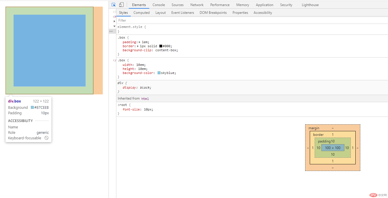
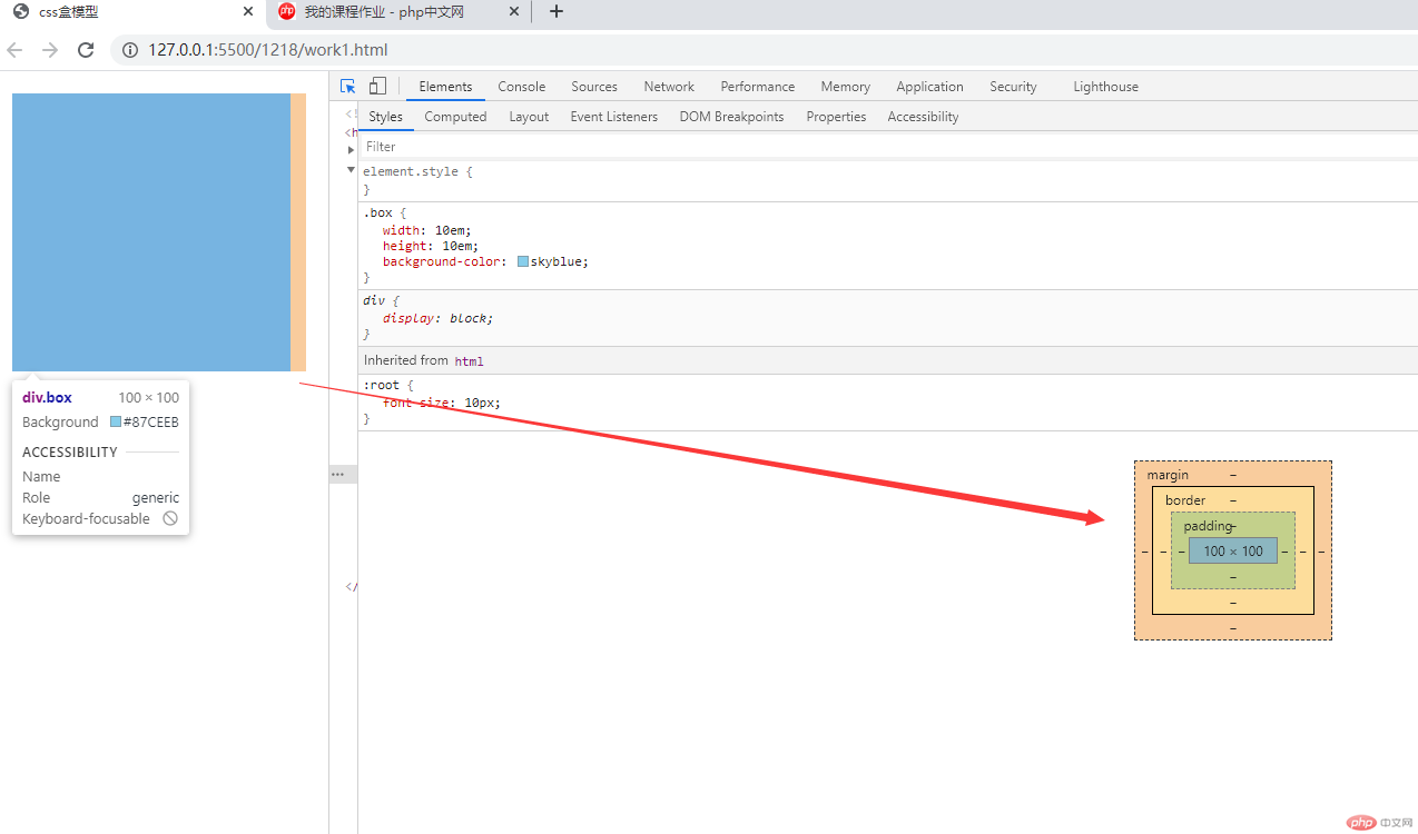
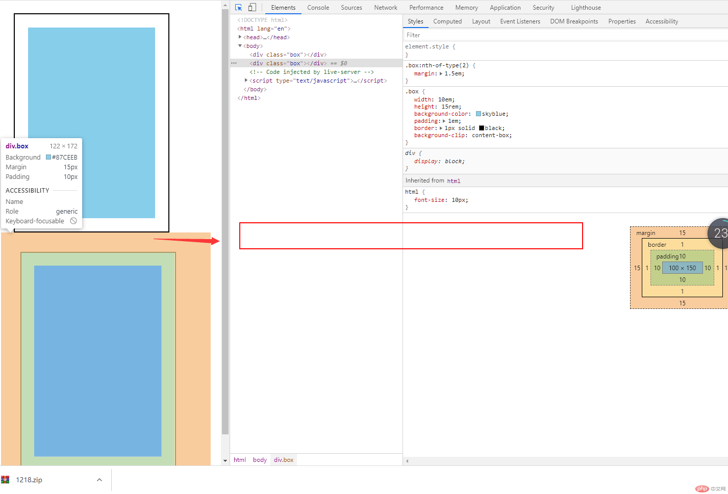
通过 box 的 width 和 heigth 属性,设置了盒子的宽为 100px,高为 100px;
设置盒子的 padding:10px 和 borderpx
此时盒子的宽和高为 122(100+10 2+1 2) * 122 的正方形
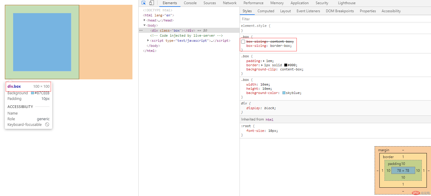
关于 box-sizing 控制盒子计算方式
这种盒子模型,最早是由微软的 IE 浏览器实现的,称之为 IE 盒子模型
css 代码
.box {/* content-box: w3c标准盒子模型,width/height不含padding/border */box-sizing: content-box;/* border-box:padding,border计算在盒子大小内 */box-sizing: border-box;}
演示效果
效果演示
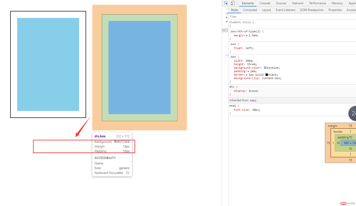
<!DOCTYPE html><html lang="en"><head><meta charset="UTF-8" /><meta name="viewport" content="width=device-width, initial-scale=1.0" /><title>margin对盒子位置的影响</title><style>html {font-size: 10px;}.box {width: 10em;height: 15rem;background-color: skyblue;padding: 1em;border: 1px solid black;background-clip: content-box;}/* 垂直排列 */.box:first-of-type {margin: 1em;}.box:nth-of-type(2) {margin: 1.5em;}/* 水平排列 */.box {float: left;}</style></head><body><div class="box"></div><div class="box"></div></body></html>
<style>* {margin: 0;padding: 0;/* 全局使用IE盒子模型 */box-sizing: border-box;}body {border: 1px solid red;height: 100vh;}</style>
效果演示
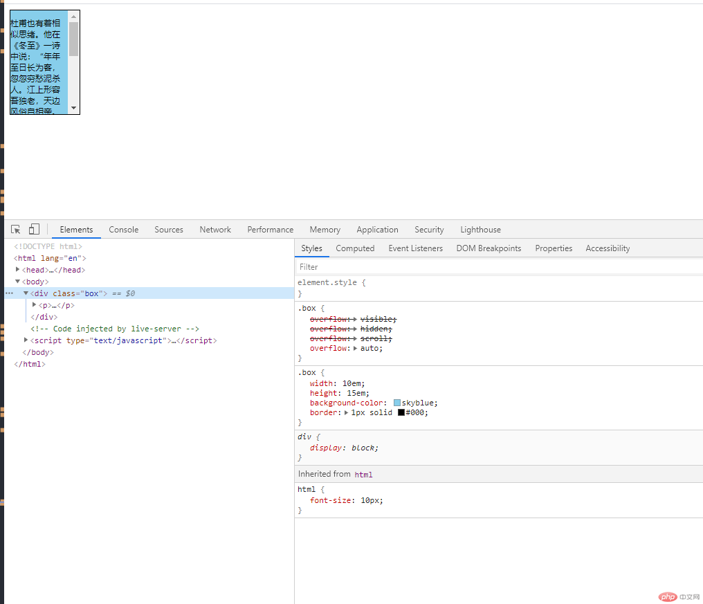
<style>html {font-size: 10px;}.box {width: 10em;/* 应该使用内容将元素的高度撑开,而不是直接设置它的高度 */height: 15em;background-color: skyblue;border: 1px solid #000;}.box {/* 默认属性 */overflow: visible;/* 超出盒子大小的元素部分会被隐藏 */overflow: hidden;/* 使用滚动条 */overflow: scroll;/* 根据盒子内元素大小是否超过盒子高度来决自动使用滚动条功能 */overflow: auto;}</style>
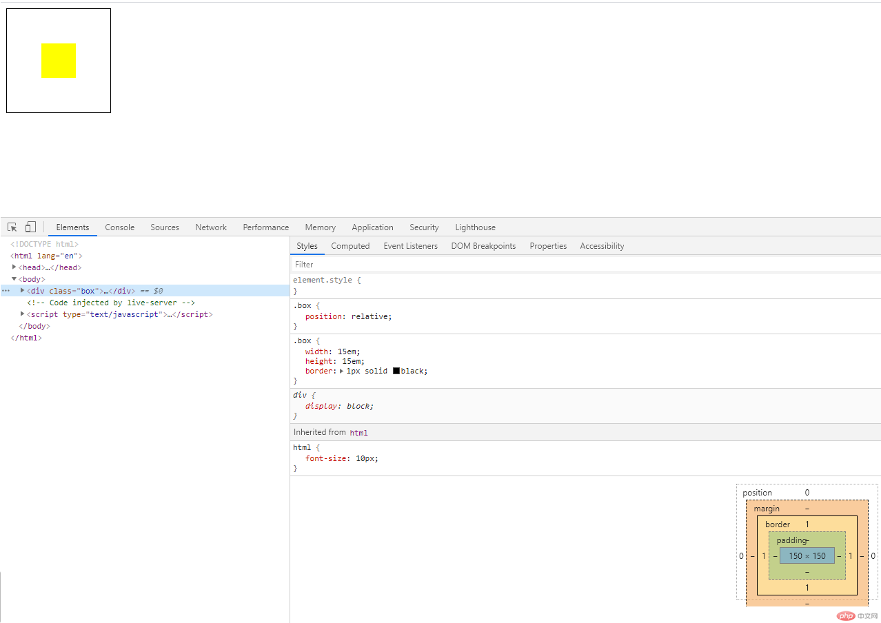
<style>.box {width: 15em;height: 15em;border: 1px solid #000;}/* 1. 行内或行内块水平居中 */.box {text-align: center;}/* 2. 块元素的水平居中 */.box > div {width: 5em;height: 5em;background-color: yellow;}/* 使用margin来实现块的水平居中,挤压式的居中 */.box > div {/* auto:这个值由浏览根据上下文自动计算 *//* margin-left: auto;margin-right: auto; */margin: 0 auto;}</style></head><body><div class="box"><!-- <a href="">php.cn</a> --><!-- <img src="https://img.php.cn/upload/course/000/000/001/5fae261f9c169870.png" width="150" alt=""> --><div></div></div></body>
效果演示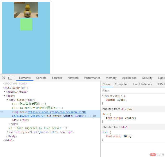
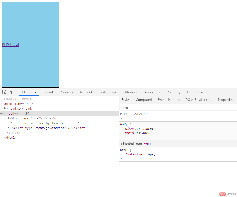
<style>html {font-size: 10px;}.box {width: 20em;height: 30em;background-color: skyblue;border: 1px solid black;}/* 行元素垂直居中 */.box a {line-height: 30em;}</style></head><body><div class="box"><a href="">PHP中文网</a></div></body>
因为行内块元素有他自己的宽高,在页面布局的元素垂直居中时;这里可以吧行内块元素看成一个“特殊”的块元素
块元素和行内块元素的垂直居中问题
代码
<title>块元素和行内块元素的垂直居中</title><style>html {font-size: 10px;}.box {width: 30em;/* 不要给高度,这个高度应该由padding挤出来 *//* height: 40em; */background-color: skyblue;border: 1px solid black;}.box div {width: 10em;height: 10em;background-color: blue;}.box {padding: 5em 0;}</style></head><body><div class="box"><!-- <imgsrc="https://inews.gtimg.com/newsapp_ls/0/12931162834_295195/0"alt=""style="width: 100px"/> --><div></div></div></body>
效果演示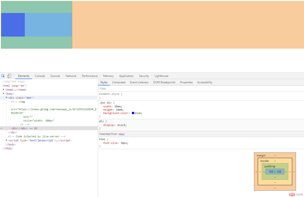
效果演示
<style>html {font-size: 10px;}.box {width: 15em;height: 15em;border: 1px solid black;}.box {position: relative;}.box > div {width: 5em;height: 5em;background-color: yellow;}.box div {position: absolute;top: 0;left: 0;right: 0;bottom: 0;margin: auto;}</style></head><body><div class="box"><div></div></div></body>