


![[Web front-end] Node.js quick start](https://img.php.cn/upload/course/000/000/067/662b5d34ba7c0227.png)


 天蓬老师
天蓬老师Correction status:qualified
Teacher's comments:


 Collection
 Collection
将flex容器与项目的常用属性全部进行实例演示,并理解属性的常用值的显示效果
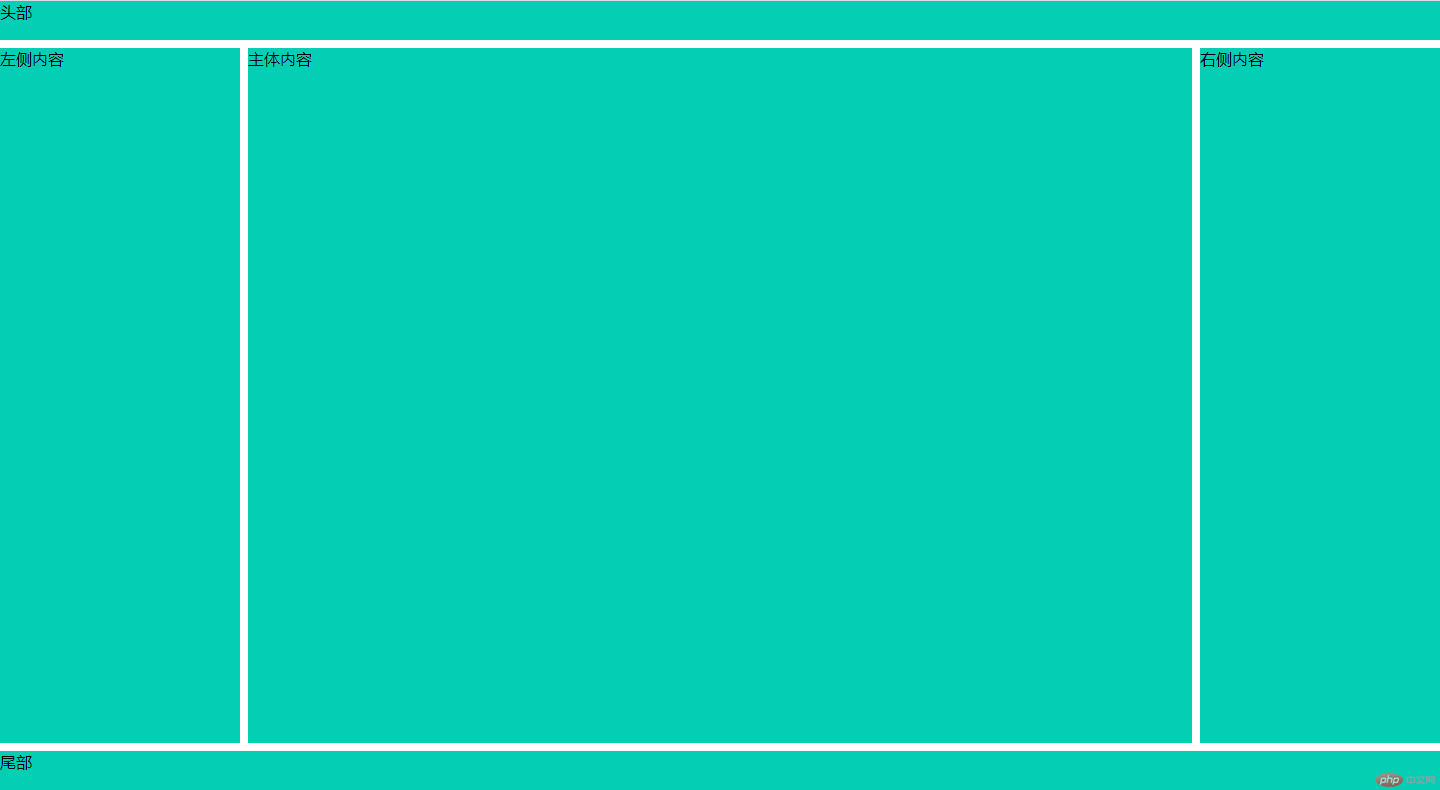
<style>*{margin: 0;padding: 0;box-sizing: border-box;}body *:not(.content) {background: rgb(4, 207, 180);}header,footer{height: 5vh;}.content{display: flex;height: 90vh;}.content aside{min-width: 15em;}.content main {min-width: calc(100% - 30em);margin: 0 0.5em;}.content{margin: 0.5em 0;height: calc(90vh - 1em);}.content main {min-width: calc(100% - 30em - 1em);}</style></head><body><header>头部</header><div class="content"><aside>左侧内容</aside><main>主体内容</main><aside>右侧内容</aside></div><footer>尾部</footer></body>
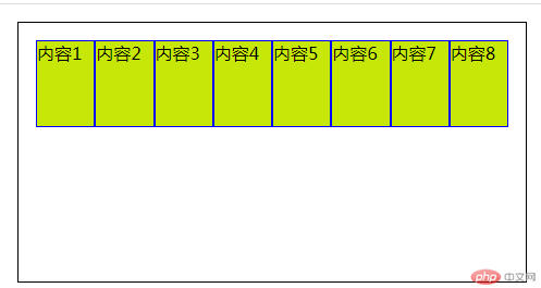
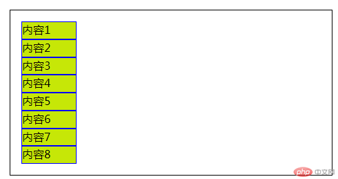
1.运用display: flex;的元素被称为flex容器,它的所有子元素称为flex项目。并且容器中的项目自动转为”行内块元素”。
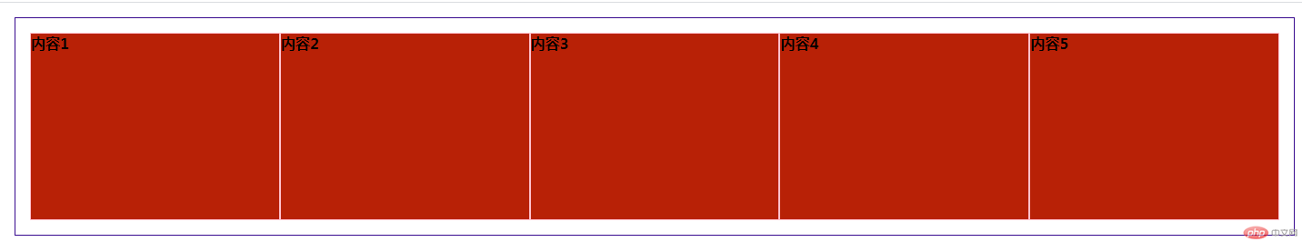
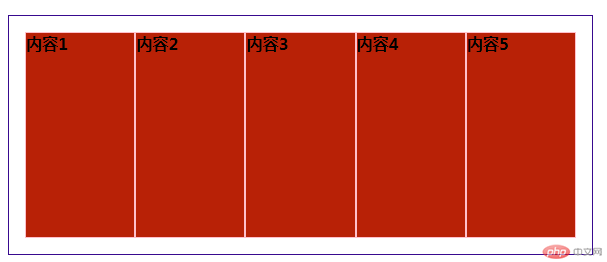
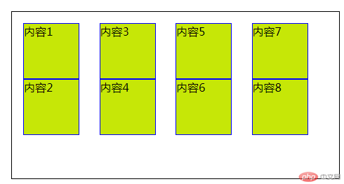
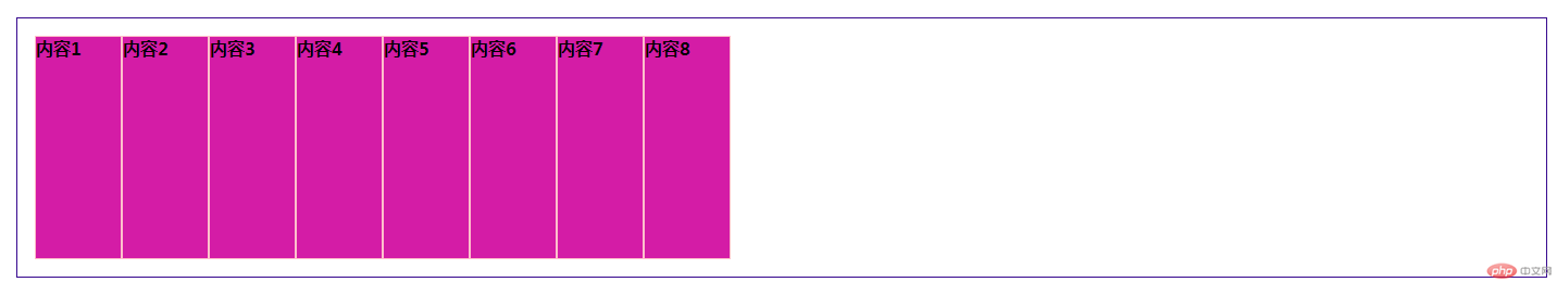
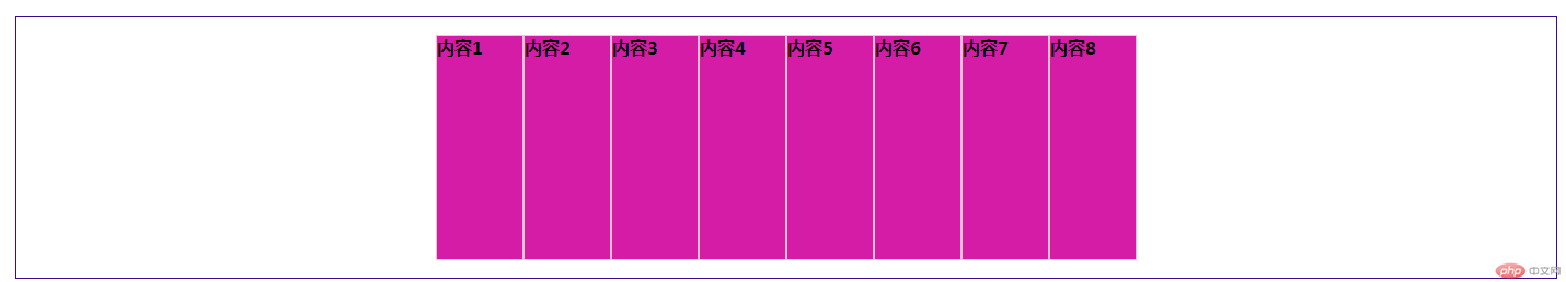
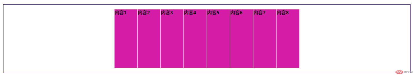
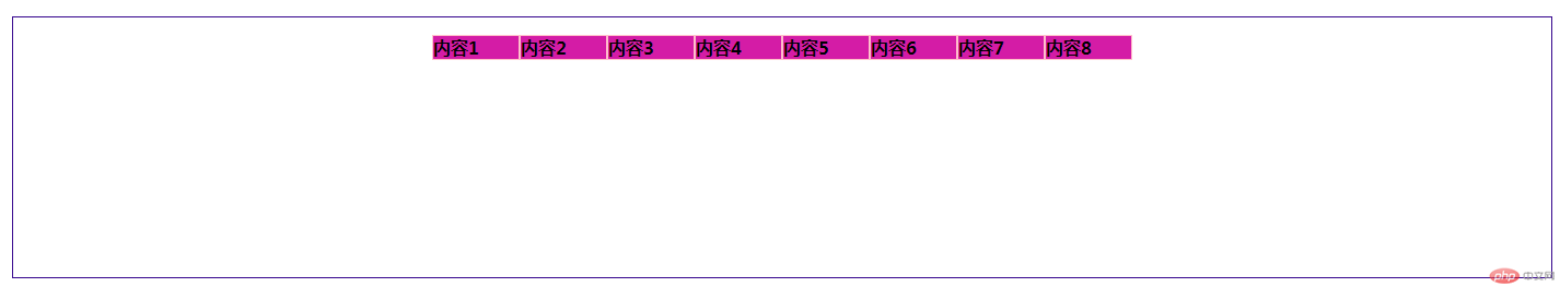
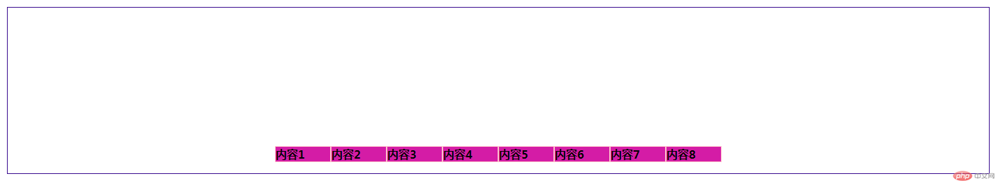
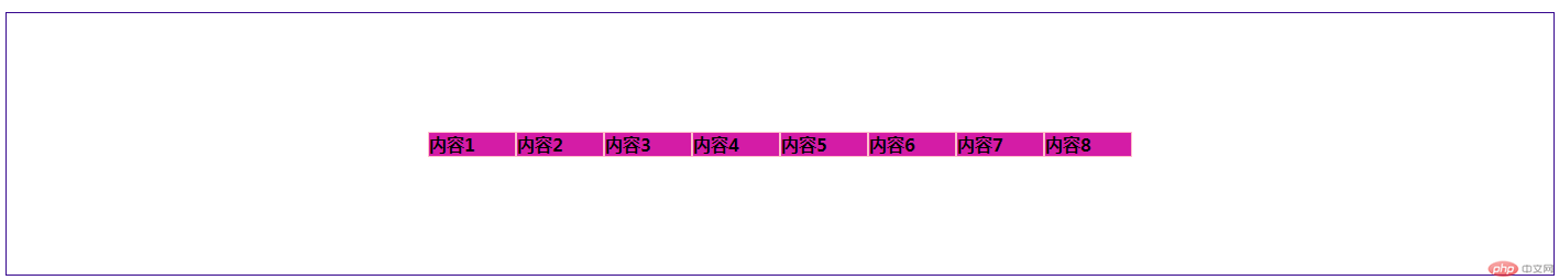
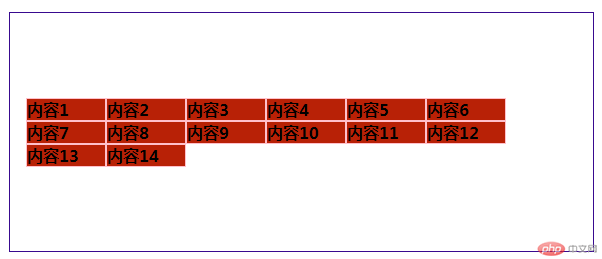
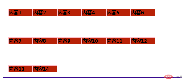
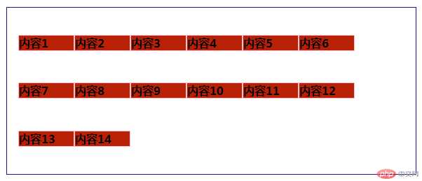
<style>*{margin: 0;padding: 0;box-sizing: border-box;}.content{display: flex;height: 15em;border: 1px solid black;padding: 1em;margin: 1em;}.content>.one{width: 5em;height: 5em;background:rgb(198, 231, 7);border: 1px solid blue;}.content{flex-flow: row nowrap;/*单行容器,主轴为水平方向 不换行*/}.content{flex-flow:column nowrap;/*单行容器,主轴为垂直方向 不换行*/}.content{flex-flow:column wrap;/*单行容器,主轴为垂直方向 可换行*/}</style></head><body><div class="content"><div class="one">内容1</div><div class="one">内容2</div><div class="one">内容3</div><div class="one">内容4</div><div class="one">内容5</div><div class="one">内容6</div><div class="one">内容7</div><div class="one">内容8</div></div>
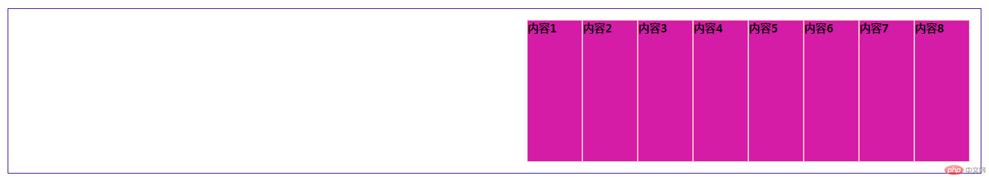
.content{justify-content: flex-start;/*默认左对齐*/justify-content: flex-end;/*右对齐*/justify-content: center;/*居中对齐*/}.content{align-items: stretch;/* 默认交叉轴(垂直方向)对齐方式 */align-items: flex-start;/* 上 */align-items: flex-end;/* 下 */align-items: center;/* 中间 */}
.content{flex-flow: row wrap;/*项目在多行容器中的交叉轴上的对齐方式 */align-content: stretch;align-content: flex-start;align-content: flex-end;align-content: center;align-content: space-between;align-content: space-around;align-content: space-evenly;}
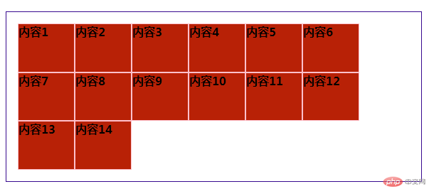
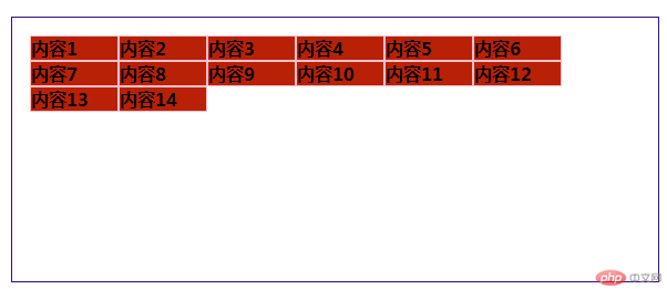
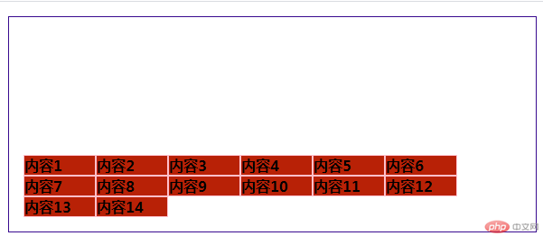
.content .one {/* 允许放大和收缩 */flex: 1 1 auto;flex: auto;}