


![[Web front-end] Node.js quick start](https://img.php.cn/upload/course/000/000/067/662b5d34ba7c0227.png)


 天蓬老师
天蓬老师Correction status:qualified
Teacher's comments:棒,很棒, 非常棒...


 Collection
 Collection
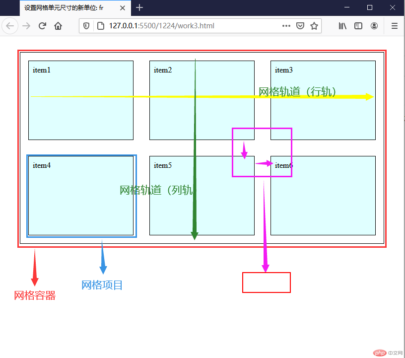
在HTML页面中生成若干个区域模块,通过grid网格布局可以划分HTML页面元素的位置、大小、层次关系
| 序号 | 名词 | 描述 |
|---|---|---|
| 1 | 网格容器 | 由若干个矩形网格单元构成 |
| 2 | 网格项目 | 网格容器的子元素,必须放在网络单元中 |
| 3 | 网格轨道 | 由多个网格单元组成,根据排列方向有”行轨”和”列轨”之分 |
| 4 | 轨道间距 | 容器中轨道之间的间距,有”行轨间距”,”列轨间距” |
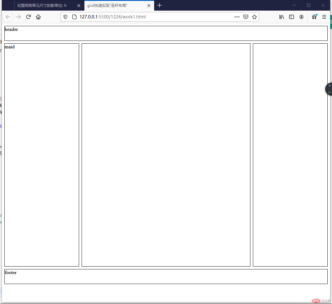
通过display: grid:;语法声明一个网格容器;通过grid-template-columns:和grid-template-rows:语法声明布局控件。并使用grid其他的属性,可以快速生成html的页面布局,例如圣杯布局。
css代码
body * {border: 1px solid #000;}body {display: grid;grid-template-columns: 15em minmax(50vw, auto) 15em;grid-template-rows: 3em minmax(80vh, auto) 3em;gap: 0.5em;}header,footer {grid-area: span 1 / span 3;}</style>
效果演示
| 序号 | 属性 | 属性值 | 描述 |
|---|---|---|---|
| 1 | grid-template-columns: | px、em、%、fr、auto | 设置轨道的列宽 |
| 2 | grid-template-rows: | px、em、%、fr、auto | 设置轨道的行高 |
| 3 | gap: | px、em | 设置轨道的间距 |
| 4 | grid-auto-flow | row、column | 设置隐式轨道的排列方式 |
| 5 | grid-area | 编号、span(num) | 自定义项目在容器的显示位置 |
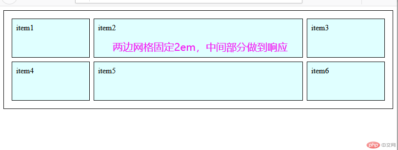
设置轨道宽度时可以使用一个新的单位: fr (fraction),类似flex中的伸缩因子
fr是一个相对单位,与aoto、%类似,还可以与固定单位px、em混合使用(除非布局需要,尽量不要混合使用)
通过fr和固定单位入em可以做到页面的局部响应式
css代码grid-template-columns: 10em 1fr 10em;
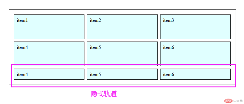
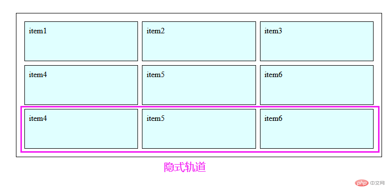
关于隐式轨道及grid-auto-flow: row;
原来声明的网格单元叫: 显式轨道
新项目显示的轨道称为: 隐式轨道
水平优先:在容器中,根据先后顺序,项目默认按照水平方向排列
通过grid-auto-flow: row;可以自动生成隐式轨道,属性值:row表示水平生成
因为自动身长的隐式轨道的行高是默认的,还需要通过grid-auto-rows: 5em;来生成轨道的行高。同理属性值:column表示垂直方向。在实际项目中更多的是使用row属性值
css代码
/* 初始网格容器的轨道布局 */.box {grid-template-columns: 1fr 1fr 1fr;grid-template-rows: 5em 5em;}
.box {grid-template-columns: 1fr 1fr 1fr;grid-template-rows: 5em 5em;/* 设置隐式轨道属性 */grid-auto-flow: row;grid-auto-rows: 5em;}
通过grid-area声明可以自定义项目在容器的显示位置
关于行号:通过grid属性声明的容器里面的容器轨道都有一个行号,可以理解为坐标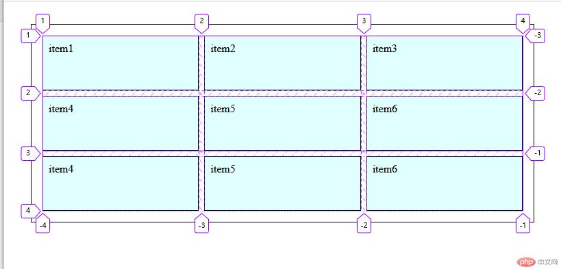
grid-area: 设置任何一个项目所在的网格单元的区域。当我们选中某个项目是,通过修改项目的容器轨道行号,可以改变该项目的位置,及排列方式。
语法grid-area: 行起始编号 / 列起始编号 / 行结束编号 / 列结束编号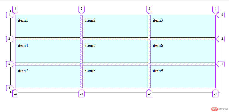
测试1:将item5的项目放到第一个位置
css代码
.box span:nth-of-type(5) {background-color: violet;grid-area: 1/1/2/2;}
测试2:将item5项目,跨第一行排列
.box span:nth-of-type(5) {background-color: violet;grid-area: 1/1/2/2;grid-area: 1/1/2/4;}
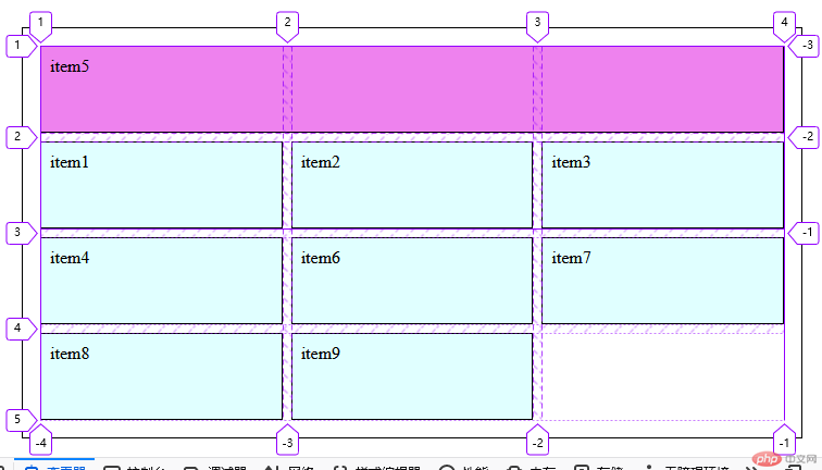
跨几行排列,通常不关心结束编号,给出其实行号坐标,以及跨越的行列数也能实现grid-area: 1 / 1 / span 2 / span 3;
当省略起始位置行号坐标时grid-area: span 2 / span 2;时一改元素的起始行号作为起始位置,向右、向下跨列行号;如果操作将自动生成隐式轨道。
grid-area: 参数数量不同,意义不同
- 值中只有span
1.1 单值: 跨的行数
1.2 双值: 跨的行与列数,如果只想设置列数,就必须设置行数(auto)2.值中有span和编号
2.1 双值: 没有span,默认跨1行1列, grid-area: 2 / 3 ;
2.2 三值: 省了列结束编号或跨的数量,此时前面的值可使用auto
2.3 四值: 最完整的语法 */
grid-template-columns: repeat(3, 1fr);生成若干个相同款对的轨道grid-template-columns: 1fr minmax(20em, 2fr) 1fr;设置最小和最大宽度修改项目的位置
.box {/* 声明一个网格容器 */display: grid;/* 设置轨道列宽 */grid-template-columns: repeat(3.1fr);/* 设置轨道行高和 */grid-template-rows: 5em 5em;/* 设置隐式轨道排列方式(行优先) */grid-auto-flow: row;/* 设置隐式轨道高度 */grid-auto-rows: 5em;/* 设置轨道间距 */gap: 0.5em;}
/* 将item5的项目放到第一个位置 */.box span:nth-of-type(5) {background-color: violet;/* grid-area: 1/1/2/2;grid-area: 1/1/2/4; *//* 设置元素跨2行3列排列 */grid-area: 1/1 / span 2 / span 3;}