


![[Web front-end] Node.js quick start](https://img.php.cn/upload/course/000/000/067/662b5d34ba7c0227.png)


 天蓬老师
天蓬老师Correction status:qualified
Teacher's comments:


 Collection
 Collection
<!DOCTYPE html><html lang="en"><head><meta charset="UTF-8"><meta name="viewport" content="width=device-width, initial-scale=1.0"><title>grid属性</title><style>/* 网格容器 *//* 网格容器中的每个项目默认都是块级元素 */.container{/* 什么支持网格布局元素 */display: grid;border: 1px solid #000;padding: 0.5em;/* 设置轨道的列宽 *//* 设置3列2行的布局空间 *//* 设置列方向的宽度默认auto; */grid-template-columns: 10em 10em 10em;/* 设置轨道的行高默认值auto */grid-template-rows: 5em 5em;/* 设置轨道的间隙 水平方向间隙 垂直方向间隙*/gap: 1em 1em;}/* 网格项目:网格容器中的子元素 */.container .item{background-color: lightcyan;border: 1px solid #000;padding: 0.5em;}</style></head><body><div class="container"><span class="item">item1</span><span class="item">item2</span><span class="item">item3</span><span class="item">item4</span><span class="item">item5</span><span class="item">item6</span></div></body></html>
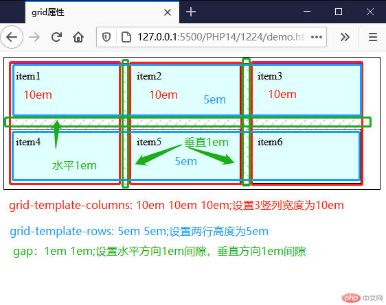
总结:
display: grid;设置网格布局容器,网格容器中的每个项目默认都是块级元素grid-template-columns: 10em 10em 10em;设置三列布局,宽度为10emgrid-template-rows: 5em 5em;设置为2行高度为5emgap: 1em 1em;水平方向间隙 垂直方向间隙 间隙为1em
<!DOCTYPE html><html lang="en"><head><meta charset="UTF-8"><meta name="viewport" content="width=device-width, initial-scale=1.0"><title>网格单元尺寸单位</title><style>.container{display: grid;border: 1px solid #000;padding: 0.5em;grid-template-columns: 10em 10em 10em;/* 设置轨道宽度时可以使用一个新的单位:fr,类似于flex的伸缩银子 *//* grid-template-columns: auto auto auto; *//* fr与auto区别 *//* 百分比由于列间距的存在会超出范围 *//* 百分比与fr共存时计算方式:总宽度减去百分比剩余的全部分给fr */grid-template-columns: 1fr 2fr 1fr;grid-template-rows: 5em 5em;/* 设置轨道的间隙 水平方向间隙 垂直方向间隙*/gap: 1em 1em;}.container .item{background-color: lightcyan;border: 1px solid #000;padding: 0.5em;}</style></head><body><div class="container"><span class="item">item1</span><span class="item">item2</span><span class="item">item3</span><span class="item">item4</span><span class="item">item5</span><span class="item">item6</span></div></body></html>
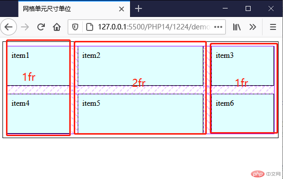
代码总结:
- fr类似于百分比、auto的计算方式,更加灵活的缩放比例
- 存在间隙时使用百分比项目会超出范围,fr则不会
- 百分比与fr共存时计算方式:总宽度减去百分比剩余的全部分给fr
- fr尽量不要与auto,px,em等混合使用
<!DOCTYPE html><html lang="en"><head><meta charset="UTF-8"><meta name="viewport" content="width=device-width, initial-scale=1.0"><title>网格单元尺寸的常用函数</title><style>.container{display: grid;border: 1px solid #000;padding: 0.5em;grid-template-columns: 10em 10em 10em;/* repeat()第二个参数可以是多个值 */grid-template-columns: repeat(3,10em);grid-template-rows: 3em 3em;/* 设置轨道的间隙 水平方向间隙 垂直方向间隙*/gap: 1em 1em;}.container .item{background-color: lightcyan;border: 1px solid #000;padding: 0.5em;}.container1{display: grid;border: 1px solid #000;padding: 0.5em;grid-template-columns: repeat(3,10em 2em);grid-template-rows: 3em 3em;gap: 1em 1em;}.container1 .item{background-color: lightcyan;border: 1px solid #000;padding: 0.5em;}.container2{display: grid;border: 1px solid #000;padding: 0.5em;grid-template-columns: repeat(3,10em 2em 1em);grid-template-rows: 3em 3em;gap: 1em 1em;}.container2 .item{background-color: lightcyan;border: 1px solid #000;padding: 0.5em;}.container3{display: grid;border: 1px solid #000;padding: 0.5em;grid-template-columns: repeat(3,10em) 2em;grid-template-rows: 3em 3em;gap: 1em 1em;}.container3 .item{background-color: lightcyan;border: 1px solid #000;padding: 0.5em;}</style></head><body><div class="container"><span class="item">item1</span><span class="item">item2</span><span class="item">item3</span><span class="item">item4</span><span class="item">item5</span><span class="item">item6</span></div><br><div class="container1"><span class="item">item1</span><span class="item">item2</span><span class="item">item3</span><span class="item">item4</span><span class="item">item5</span><span class="item">item6</span></div><br><div class="container2"><span class="item">item1</span><span class="item">item2</span><span class="item">item3</span><span class="item">item4</span><span class="item">item5</span><span class="item">item6</span></div><br><div class="container3"><span class="item">item1</span><span class="item">item2</span><span class="item">item3</span><span class="item">item4</span><span class="item">item5</span><span class="item">item6</span></div></body></html>
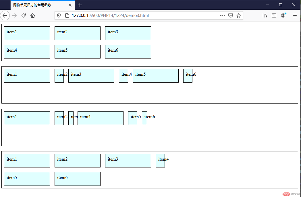
代码总结:repeat()有多种写法
grid-template-columns: repeat(3,10em);与grid-template-columns: 10em 10em 10em;效果一样grid-template-columns: repeat(3,10em 2em);与grid-template-columns: 10em 2em 10em 2em 10em 2em;效果一样grid-template-columns: repeat(3,10em 2em 1em);与grid-template-columns: 10em 2em 1em 10em 2em 1em;效果一样grid-template-columns: repeat(3,10em) 2em;与grid-template-columns: 10em 10em 10em 2em 10em 10em;效果一样- repeat()可以理解为是简写或者组合写法的函数
<!DOCTYPE html><html lang="en"><head><meta charset="UTF-8"><meta name="viewport" content="width=device-width, initial-scale=1.0"><title>网格单元尺寸的常用函数</title><style>.container{display: grid;border: 1px solid #000;padding: 0.5em;grid-template-columns: 1fr minmax(10em,2fr) 1fr;grid-template-rows: 3em 3em;/* 设置轨道的间隙 水平方向间隙 垂直方向间隙*/gap: 1em 1em;}.container .item{background-color: lightcyan;border: 1px solid #000;padding: 0.5em;}</style></head><body><div class="container"><span class="item">item1</span><span class="item">item2</span><span class="item">item3</span><span class="item">item4</span><span class="item">item5</span><span class="item">item6</span></div></body></html>
代码总结:
grid-template-columns: 1fr minmax(10em,2fr) 1fr;设置和中间区块最小值10em,其他值是两边区块的两倍- 通过minmax()的应用,可以用它作为媒体查询来使用
<!DOCTYPE html><html lang="en"><head><meta charset="UTF-8"><meta name="viewport" content="width=device-width, initial-scale=1.0"><title>自定义项目在容器的显示位置</title><style>.container{display: grid;border: 1px solid #000;padding: 0.5em;grid-template-columns: repeat(3,1fr);grid-template-rows: 5em 5em;/* 设置轨道的间隙 水平方向间隙 垂直方向间隙*/gap: 1em 1em;grid-auto-rows: 5em;}.container .item{background-color: lightcyan;border: 1px solid #000;padding: 0.5em;}.container>.item:nth-of-type(5){background-color: red;/* grid-area设置任何一个项目所在的网格单元的区域 *//* grid-area:行起始编号/列起始编号/行结束编码/列结束编号 */grid-area: 1/1/2/2;/* 简写 如果跨越超过1行以上或者1列以上就不能简写 */grid-area: 1/1;}</style></head><body><div class="container"><span class="item">item1</span><span class="item">item2</span><span class="item">item3</span><span class="item">item4</span><span class="item">item5</span><span class="item">item6</span><span class="item">item7</span><span class="item">item8</span><span class="item">item9</span></div></body></html>

display: grid: 网格容器默认都是”块级元素”display: inline-grid: 可以设置为”行内元素”grid-template-columns: 定义每一列的列宽grid-template-rows:: 定义每一行的行高grid-auto-flow:row;: 行优先排列,设置隐式轨道行高grid-auto-rowsgrid-auto-flow:column;: 列优先排列,设置隐式轨道列宽grid-auto-columnsgrid-columns-gap: 定义每一列的列宽grid-row-gap:: 定义每一行的行高grid-area: 定义每一列的列宽,设置任何一个项目所在的网格单元的区域,grid-area:行起始编号/列起始编号/行结束编码/列结束编号