


![[Web front-end] Node.js quick start](https://img.php.cn/upload/course/000/000/067/662b5d34ba7c0227.png)


 天蓬老师
天蓬老师Correction status:qualified
Teacher's comments:


 Collection
 Collection
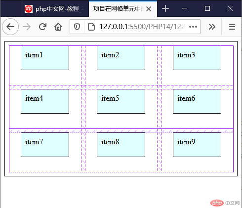
<!DOCTYPE html><html lang="en"><head><meta charset="UTF-8"><meta name="viewport" content="width=device-width, initial-scale=1.0"><title>项目在网格单元中的对齐方式</title><style>.container{border: 1px solid #000;padding: 0.5em;/* grid布局 */display: grid;/* 轨道宽度 */grid-template-columns: repeat(3,1fr);/* 轨道高度 */grid-template-rows: repeat(2,5em);/* 隐式轨道高度 */grid-auto-rows: 5em;/* 轨道间隙 */gap: 0.5em;}.container> .item{background-color: lightcyan;border: 1px solid#000;padding: 0.5em;}/* 项目在网格单元中存在剩余空间,对齐才有必要且有意义 */.container> .item{width: 5em;height: 2em;}/* 所有项目在网格单元中的对齐方式 */.container{/* place-items: 垂直方向 水平方向; *//* 垂直居上 水平居中 *//* place-items: normal center; */place-items: start center;}</style></head><body><div class="container"><div class="item">item1</div><div class="item">item2</div><div class="item">item3</div><div class="item">item4</div><div class="item">item5</div><div class="item">item6</div><div class="item">item7</div><div class="item">item8</div><div class="item">item9</div></div></body></html>
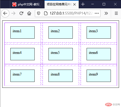
.container{/* place-items: 垂直方向 水平方向; *//* 垂直水平居中 *//*place-items: center center;*/place-items: center;}
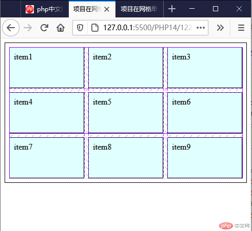
<!DOCTYPE html><html lang="en"><head><meta charset="UTF-8"><meta name="viewport" content="width=device-width, initial-scale=1.0"><title>项目在网格单元中的对齐方式</title><style>.container{border: 1px solid #000;padding: 0.5em;/* grid布局 */display: grid;/* 轨道宽度 */grid-template-columns: repeat(3,1fr);/* 轨道高度 */grid-template-rows: repeat(2,5em);/* 隐式轨道高度 */grid-auto-rows: 5em;/* 轨道间隙 */gap: 0.5em;}.container> .item{background-color: lightcyan;border: 1px solid#000;padding: 0.5em;}/* 项目在网格单元中存在剩余空间,对齐才有必要且有意义 */.container> .item{/* width: 5em;height: 2em; */}/* 所有项目在网格单元中的对齐方式 */.container {/* place-items: 垂直方向 水平方向; */place-items: normal center;place-items: auto center;/* 拉伸,取消固定尺寸可以看到拉升效果 */place-items:stretch;}</style></head><body><div class="container"><div class="item">item1</div><div class="item">item2</div><div class="item">item3</div><div class="item">item4</div><div class="item">item5</div><div class="item">item6</div><div class="item">item7</div><div class="item">item8</div><div class="item">item9</div></div></body></html>
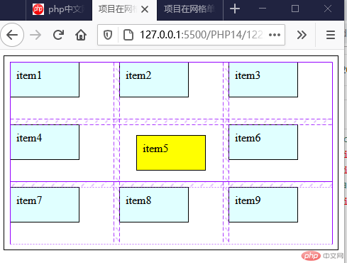
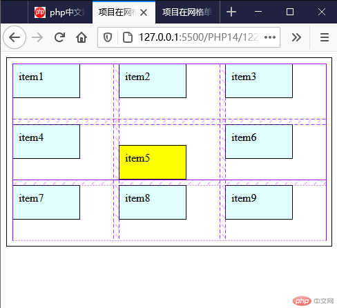
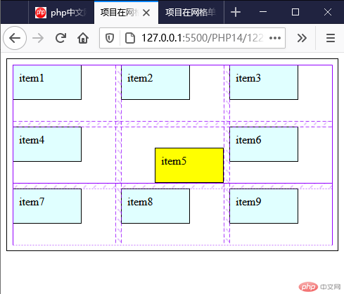
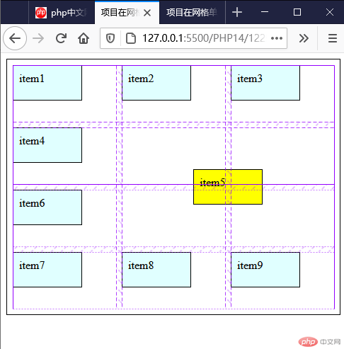
<!DOCTYPE html><html lang="en"><head><meta charset="UTF-8"><meta name="viewport" content="width=device-width, initial-scale=1.0"><title>项目在网格单元中的对齐方式</title><style>.container{border: 1px solid #000;padding: 0.5em;/* grid布局 */display: grid;/* 轨道宽度 */grid-template-columns: repeat(3,1fr);/* 轨道高度 */grid-template-rows: repeat(2,5em);/* 隐式轨道高度 */grid-auto-rows: 5em;/* 轨道间隙 */gap: 0.5em;}.container> .item{background-color: lightcyan;border: 1px solid#000;padding: 0.5em;}/* 项目在网格单元中存在剩余空间,对齐才有必要且有意义 */.container> .item{width: 5em;height: 2em;}/* 所有某个项目在网格单元中的对齐方式 */.container> .item:nth-of-type(5){background-color: yellow;/* place-self: center center; */place-self: center;}</style></head><body><div class="container"><div class="item">item1</div><div class="item">item2</div><div class="item">item3</div><div class="item">item4</div><div class="item">item5</div><div class="item">item6</div><div class="item">item7</div><div class="item">item8</div><div class="item">item9</div></div></body></html>
.container> .item:nth-of-type(5){background-color: yellow;place-self: end start;}
.container> .item:nth-of-type(5){background-color: yellow;/* place-self: end end; */place-self: end;}
.container> .item:nth-of-type(5){background-color: yellow;grid-area: span 2/span 2;place-self: center;}
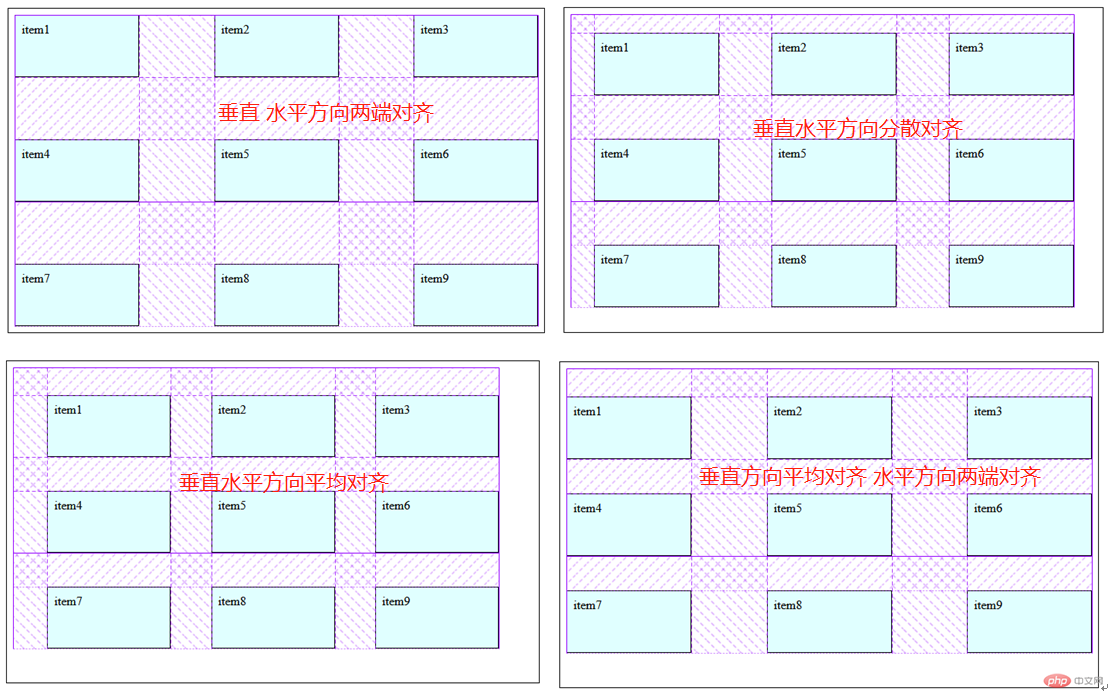
<!DOCTYPE html><html lang="en"><head><meta charset="UTF-8"><meta name="viewport" content="width=device-width, initial-scale=1.0"><title>项目在网格单元中的对齐方式</title><style>.container{height: 25em;border: 1px solid #000;padding: 0.5em;/* grid布局 */display: grid;/* 轨道宽度 */grid-template-columns: repeat(3,10em);/* 轨道高度 */grid-template-rows: repeat(2,5em);/* 隐式轨道高度 */grid-auto-rows: 5em;/* 轨道间隙 */gap: 0.5em;}.container> .item{background-color: lightcyan;border: 1px solid#000;padding: 0.5em;}/* 设置所有项目在容器中的对其方式 place-content: 垂直方向 水平方向; */.container{/* 默认 */place-content: start start;/* 靠上居中 */place-content: start center;/* 水平垂直居中 */place-content: center center;/* 右下角对其 */place-content: end end;}</style></head><body><div class="container"><div class="item">item1</div><div class="item">item2</div><div class="item">item3</div><div class="item">item4</div><div class="item">item5</div><div class="item">item6</div><div class="item">item7</div><div class="item">item8</div><div class="item">item9</div></div></body></html>
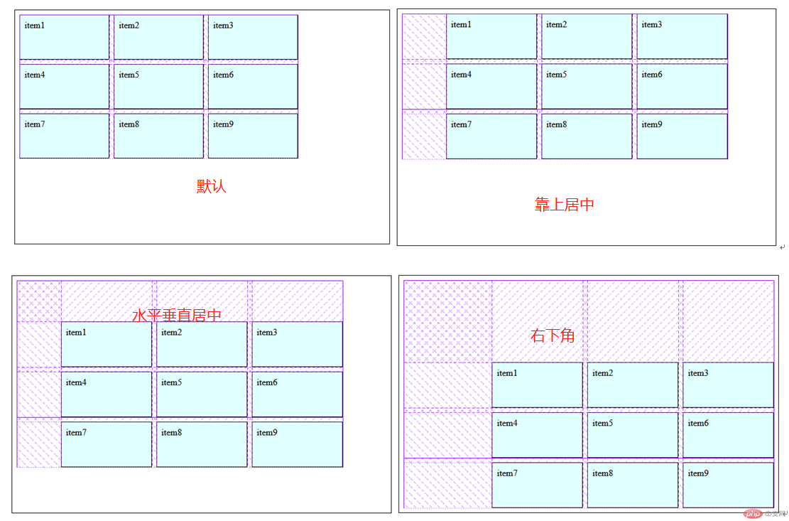
<!DOCTYPE html><html lang="en"><head><meta charset="UTF-8"><meta name="viewport" content="width=device-width, initial-scale=1.0"><title>项目在网格单元中的对齐方式</title><style>.container{height: 25em;border: 1px solid #000;padding: 0.5em;/* grid布局 */display: grid;/* 轨道宽度 */grid-template-columns: repeat(3,10em);/* 轨道高度 */grid-template-rows: repeat(2,5em);/* 隐式轨道高度 */grid-auto-rows: 5em;/* 轨道间隙 */gap: 0.5em;}.container> .item{background-color: lightcyan;border: 1px solid#000;padding: 0.5em;}/* 设置所有项目在容器中的对其方式 place-content: 垂直方向 水平方向; */.container{/* 水平垂直方向两端对其 */place-content: space-between space-between;/* 水平垂直方向分散对其 */place-content: space-around space-around;/* 水平垂直方向平均对其 */place-content: space-evenly space-evenly;/* 水平方向两端对其 垂直方向平均对其 */place-content: space-evenly space-between;}</style></head><body><div class="container"><div class="item">item1</div><div class="item">item2</div><div class="item">item3</div><div class="item">item4</div><div class="item">item5</div><div class="item">item6</div><div class="item">item7</div><div class="item">item8</div><div class="item">item9</div></div></body></html>
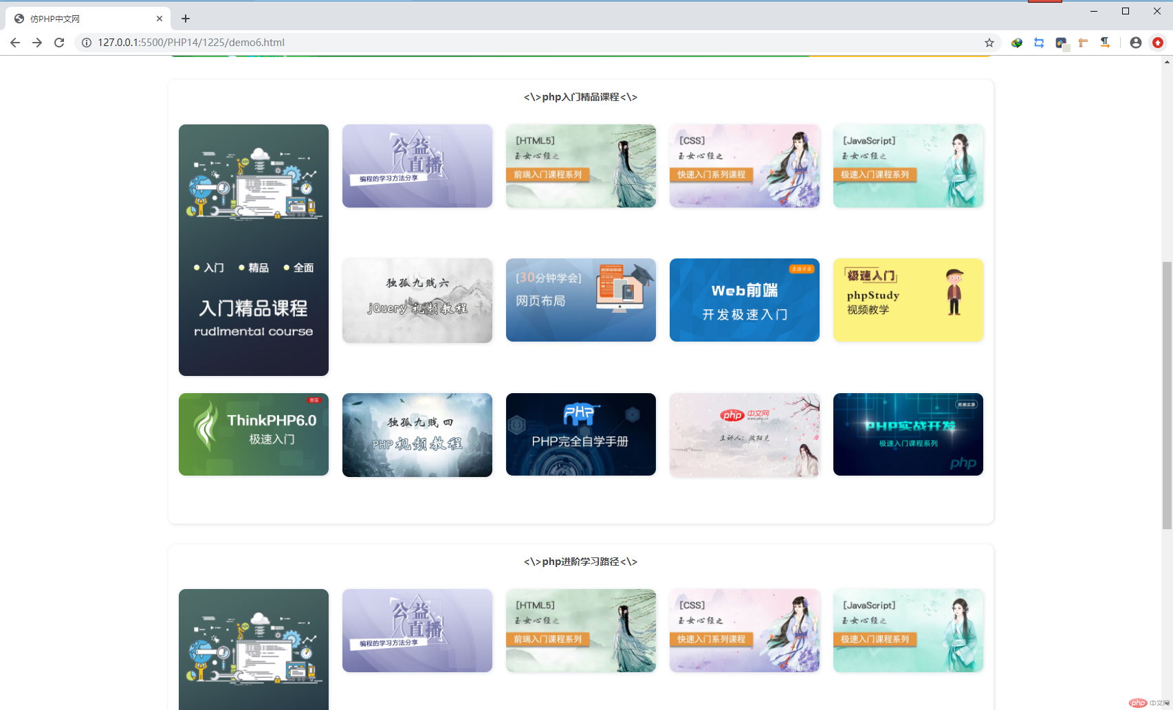
<!DOCTYPE html><html lang="en"><head><meta charset="UTF-8"><meta name="viewport" content="width=device-width, initial-scale=1.0"><title>仿PHP中文网</title><style>/* 页面初始化 */*{margin: 0;padding: 0;box-sizing: border-box;}/* 去除小黑点 */li{list-style: none;}/* 设置a标签字体颜色及去除下划线 */a{color: #444444;text-decoration: none;}header{height: 60px;background-color: #000;margin-bottom: 30px;display: grid;grid-template-columns: 140px 1fr;}header .logo img{height: 60px;width: 140px;}header .menus-top .navs-top{display: grid;grid-template-columns: repeat(9,100px);line-height: 60px;font-size: 14px;margin-left: 40px;}header .menus-top .navs-top li:first-of-type{background-color: rgba(255,255,255,.3);width: 70px;padding-left: 20px;}header .menus-top .navs-top a{color: #B3B3B3;}footer{height: 165px;background-color: #393D49;color: #eee;}.main-top{height: 510px;width: 1200px;margin-bottom: 30px;display: grid;grid-template-columns: 216px 1fr;grid-template-rows: 60px 1fr 120px;margin: auto;border-radius: 10px;}/* 左侧导航区 */.main-top>nav.menus{grid-area: span 3;background-color: #2b333b;border-radius: 10px 0 0 10px;padding-top: 15px;box-shadow: 1px 1px 5px #DCDFE2;}.main-top>nav.menus .navs-left>li{height: 60px;line-height: 60px;cursor: pointer;padding-left: 12px;display: grid;position: relative;}.main-top>nav.menus .navs-left>li:hover{background-color: rgba(255,255,255,.3);}.main-top>nav.menus .navs-left>li span{position: absolute;padding-right: 20px;font-size: 20px;right: 0;}.main-top>nav.menus .navs-left>li a{color: rgba(255,255,255,.6);padding: 0 15px;font-size: 16px;}/* 顶部导航区 */.main-top>ul.navs {background-color:#fff;display: grid;grid-template-columns: repeat(7,83px) 1fr;place-items: center;border-radius: 0 10px 0 0;box-shadow: 1px 1px 5px#DCDFE2;font-size: 14px;gap: 0 10px;padding-left: 10px;}/* 顶部导航区搜索框 */.main-top>ul.navs>li:last-of-type {place-self: center start;padding-left: 50px;}.main-top>ul.navs>li a .hong{background-color: #FF5722;color: #fff;border-radius: 3px;padding: 0 5px;font-size: 12px;}.main-top>ul.navs>li a .hui{background-color: #2F4056;color: #fff;border-radius: 3px;padding: 0 5px;font-size: 12px;}.main-top>ul.navs>li a .huang{background-color: #FFB800;color: #fff;border-radius: 3px;padding: 0 5px;font-size: 12px;}.main-top>ul.navs>li input{width: 260px;height: 40px;border: none;background-color: #F1F0F0;padding: 10px;}/* 轮播图 */.main-top .slider{background-image: url('https://img.php.cn/upload/article/000/000/001/5fabba9a8557c153.jpg');}/* 推荐课程 */.main-top>ul.course {display: grid;grid-template-columns: repeat(4,1fr);padding: 10px;gap: 10px;border-radius: 0 0 10px 0;box-shadow: 1px 1px 5px#DCDFE2;}.main-top>ul.course>* {cursor: pointer;}.main-top>ul.course img{border-radius: 10px;width: 236px;height: 90px;}/* 广告图片 */.gg_img {margin: 15px auto;display: grid;width: 1200px;cursor: pointer;}.gg_img>a>img{border-radius: 10px;}/* 课程列表区 */.mian-courses {width: 1200px;height: 646px;padding: 15px;background-color: #FFFFFF;margin: 30px auto;display: grid;grid-template-rows: 50px 1fr;border-radius: 10px;box-shadow: 1px 1px 5px#DCDFE2;}.mian-courses h3{color: #444444;text-align: center;}.mian-courses .course-list {display: grid;grid-template-columns: repeat(5,1fr);grid-template-rows: repeat(3,1fr);gap: 20px;}.mian-courses .course-list>* {border-radius: 10px;/* box-shadow: 1px 1px 5px#DCDFE2; */}.mian-courses .course-list img{border-radius: 10px;box-shadow: 1px 1px 5px#DCDFE2;width: 100%;}.mian-courses .course-list>li:first-of-type{grid-area: span 2;}</style></head><body><header class="top"><div class="logo"><img src="https://www.php.cn/static/images/logo.png" alt=""></div><nav class="menus-top"><ul class="navs-top"><li><a href="">首页</a></li><li><a href="">视频教程</a></li><li><a href="">入门教程</a></li><li><a href="">社区问答</a></li><li><a href="">技术文章</a></li><li><a href="">资源下载</a></li><li><a href="">编程词典</a></li><li><a href="">工具下载</a></li><li><a href="">PHP培训</a></li></ul></nav></header><div class="main-top"><!-- 左边菜单 --><nav class="menus"><ul class="navs-left"><li><a href="">php开发<span>></span></a></li><li><a href="">前端开发<span>></span></a></li><li><a href="">服务端开发<span>></span></a></li><li><a href="">移动开发<span>></span></a></li><li><a href="">数据库<span>></span></a></li><li><a href="">服务器运维&下载<span>></span></a></li><li><a href="">在线工具箱<span>></span></a></li><li><a href="">常用类库<span>></span></a></li></ul></nav><!-- 顶部菜单 --><ul class="navs"><li><a href="">PHP头条<span class="hong">新</span></a></li><li><a href="">独孤九贱</a></li><li><a href="">学习路线<span class="hui">新</span></a></li><li><a href="">在线工具</a></li><li><a href="">趣味课堂<span class="huang">新</span></a></li><li><a href="">社区问答</a></li><li><a href="">课程直播</a></li><li><input type="text" placeholder="输入关键词搜索"></li></ul><div class="slider"></div><!-- 底部推荐课程 --><ul class="course"><li><a href=""><img src="https://www.php.cn/static/images/index_yunv.jpg" alt=""></a></li><li><a href=""><img src="https://www.php.cn/static/images/index_php_item2_.png?1" alt=""></a></li><li><a href=""><img src="https://www.php.cn/static/images/index_php_item3.jpg?1" alt=""></a></li><li><a href=""><img src="https://www.php.cn/static/images/index_php_new4.jpg?1" alt=""></a></li></ul></div><!-- 广告 --><div class="gg_img"><a href="https://www.php.cn/k.html" target="view_window"><img src="https://img.php.cn/upload/article/000/000/001/5fb478ce65c09239.jpg" alt=""></a></div><!-- 课程列表区 --><div class="mian-courses"><h3><\>php入门精品课程<\></h3><ul class="course-list"><li><a href=""><img src="https://www.php.cn/static/images/index_learn_first.jpg" alt=""></a></li><li><a href=""><img src="https://img.php.cn/upload/course/000/000/001/5b63c72c61569244.png" alt=""></a></li><li><a href=""><img src="https://img.php.cn/upload/course/000/126/153/5aa23f0ded921649.jpg" alt=""></a></li><li><a href=""><img src="https://img.php.cn/upload/course/000/126/153/5ab346fc62ce4221.jpg" alt=""></a></li><li><a href=""><img src="https://img.php.cn/upload/course/000/126/153/5acc118f11d6b969.jpg" alt=""></a></li><li><a href=""><img src="https://img.php.cn/upload/course/000/000/001/5d1c6e0d2b744633.jpg" alt=""></a></li><li><a href=""><img src="https://img.php.cn/upload/course/000/001/120/5a9fb97057b15707.jpeg" alt=""></a></li><li><a href=""><img src="https://img.php.cn/upload/course/000/000/001/5d24019911a24370.jpg" alt=""></a></li><li><a href=""><img src="https://img.php.cn/upload/course/000/000/003/5a699f1b2da2b398.jpg" alt=""></a></li><li><a href=""><img src="https://img.php.cn/upload/course/000/000/001/5cecd27a4348b582.jpg" alt=""></a></li><li><a href=""><img src="https://img.php.cn/upload/course/000/000/001/5d1c6dfc9eb09885.jpg" alt=""></a></li><li><a href=""><img src="https://img.php.cn/upload/course/000/000/003/5a13c87351613730.jpg" alt=""></a></li><li><a href=""><img src="https://img.php.cn/upload/course/000/171/829/5b19ef2990649817.jpg" alt=""></a></li><li><a href=""><img src="https://img.php.cn/upload/course/000/000/001/5d240300be85b731.jpg" alt=""></a></li></ul></div><div class="mian-courses"><h3><\>php进阶学习路径<\></h3><ul class="course-list"><li><a href=""><img src="https://www.php.cn/static/images/index_learn_first.jpg" alt=""></a></li><li><a href=""><img src="https://img.php.cn/upload/course/000/000/001/5b63c72c61569244.png" alt=""></a></li><li><a href=""><img src="https://img.php.cn/upload/course/000/126/153/5aa23f0ded921649.jpg" alt=""></a></li><li><a href=""><img src="https://img.php.cn/upload/course/000/126/153/5ab346fc62ce4221.jpg" alt=""></a></li><li><a href=""><img src="https://img.php.cn/upload/course/000/126/153/5acc118f11d6b969.jpg" alt=""></a></li><li><a href=""><img src="https://img.php.cn/upload/course/000/000/001/5d1c6e0d2b744633.jpg" alt=""></a></li><li><a href=""><img src="https://img.php.cn/upload/course/000/001/120/5a9fb97057b15707.jpeg" alt=""></a></li><li><a href=""><img src="https://img.php.cn/upload/course/000/000/001/5d24019911a24370.jpg" alt=""></a></li><li><a href=""><img src="https://img.php.cn/upload/course/000/000/003/5a699f1b2da2b398.jpg" alt=""></a></li><li><a href=""><img src="https://img.php.cn/upload/course/000/000/001/5cecd27a4348b582.jpg" alt=""></a></li><li><a href=""><img src="https://img.php.cn/upload/course/000/000/001/5d1c6dfc9eb09885.jpg" alt=""></a></li><li><a href=""><img src="https://img.php.cn/upload/course/000/000/003/5a13c87351613730.jpg" alt=""></a></li><li><a href=""><img src="https://img.php.cn/upload/course/000/171/829/5b19ef2990649817.jpg" alt=""></a></li><li><a href=""><img src="https://img.php.cn/upload/course/000/000/001/5d240300be85b731.jpg" alt=""></a></li></ul></div><footer>页脚</footer></body></html>

用法:@media 媒体类型 and (媒体特性) {样式}作业内容: