


![[Web front-end] Node.js quick start](https://img.php.cn/upload/course/000/000/067/662b5d34ba7c0227.png)


 天蓬老师
天蓬老师Correction status:qualified
Teacher's comments:这些知识点很零散也很基础,先学会怎么用, 至于用到哪,到项目中就明白了


 Collection
 Collection
首先登录https://www.iconfont.cn/ 平台,选择我们要用的图片
图片示例: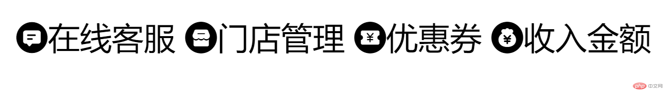
html代码实现:
<!DOCTYPE html><html lang="en"><head><meta charset="UTF-8" /><meta http-equiv="X-UA-Compatible" content="IE=edge" /><meta name="viewport" content="width=device-width, initial-scale=1.0" /><title>Document</title><link rel="stylesheet" href="./icon/iconfont.css" /></head><body><span class="iconfont icon-zaixiankefu">在线客服</span><span class="iconfont icon-mendianliebiao">门店管理</span><span class="iconfont icon-woyaofaquan">优惠券</span><span class="iconfont icon-shouruguanli">收入金额</span></body></html>
css代码:
@font-face {font-family: "iconfont"; /* Project id */src: url('iconfont.ttf?t=1625204533062') format('truetype');}.iconfont {font-family: "iconfont" !important;font-size: 16px;font-style: normal;-webkit-font-smoothing: antialiased;-moz-osx-font-smoothing: grayscale;}.icon-zaixiankefu:before {content: "\e76e";}.icon-mendianliebiao:before {content: "\e76f";}.icon-woyaofaquan:before {content: "\e771";}.icon-shouruguanli:before {content: "\e770";}
我们的可视化窗口是一个二维空间,所以我们的布局要么是横着要么就是竖着的。
元素默认的排列方式都是以文档流为主由左至右由上之下
1.块状元素块状元素在网页中就是以块的形式显示,所谓块状就是元素显示为矩形区域。默认情况下,块状元素都会占据一行,按顺序自上而下排列。通俗地说,两个相临的块状元素不会出现并列显示的现象。块状元素,还可以定义自己的宽度和高度。块状元素,一般都作为其他元素的容器。他可以容纳其他内联元素和块状元素。我们可以把这个容器比喻成一个盒子。2.内联元素内联元素(行内元素)。内联元素的表示方式,始终以行内逐个进行显示。内联元素没有自己的形状,不能定义自己的宽高。他的宽高要以里面的内容决定。内联元素也会遵循盒模型基本原则,但个别属性不能正确显示
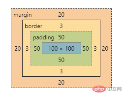
margin外边距border边框padding内边距width宽height高
图示: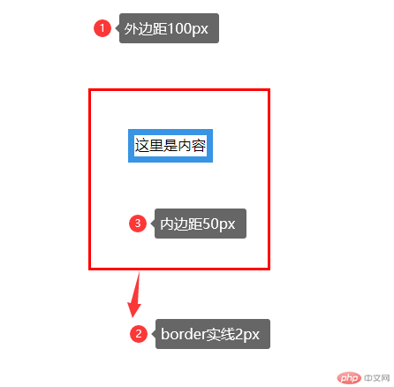
代码实现:
<!DOCTYPE html><html lang="en"><head><meta charset="UTF-8" /><meta http-equiv="X-UA-Compatible" content="IE=edge" /><meta name="viewport" content="width=device-width, initial-scale=1.0" /><title>盒子模型常用属性</title></head><style>body {margin: auto;}body [class="div"] {width: 100px;height: 100px;margin: 100px;border: solid;border-color: red;padding: 50px;}</style><body><div class="div">这里是内容</div></body></html>
box-sizing属性的解决了什么问题?解决了布局的简化和计算的方便
图示(没有使用box-sizing前):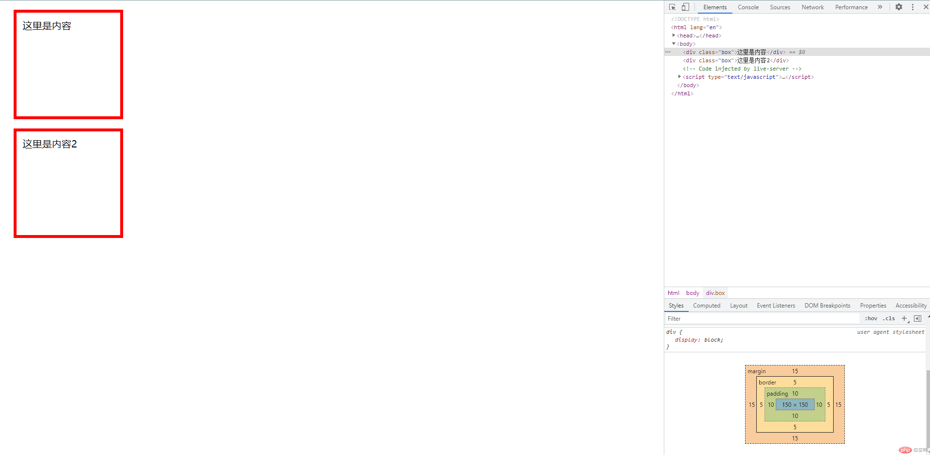
图示(使用box-sizing后):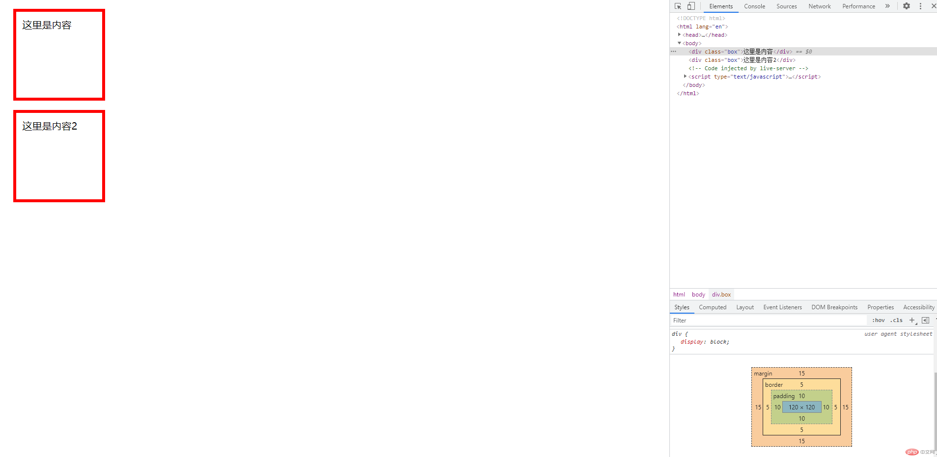
代码:
<!DOCTYPE html><html lang="en"><head><meta charset="UTF-8" /><meta http-equiv="X-UA-Compatible" content="IE=edge" /><meta name="viewport" content="width=device-width, initial-scale=1.0" /><title>盒子模型常用属性</title></head><style>.box {width: 150px;height: 150px;margin: 15px;padding: 10px;border: red solid 5px;}.box {box-sizing: border-box;}</style><body><div class="box">这里是内容</div><div class="box">这里是内容2</div></body></html>
天蓬老师