


![[Web front-end] Node.js quick start](https://img.php.cn/upload/course/000/000/067/662b5d34ba7c0227.png)


 PHPz
PHPzCorrection status:qualified
Teacher's comments:


 Collection
 Collection

赶进度简写,但源码不能减,赶上就好了
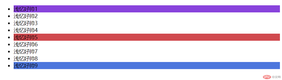
<!DOCTYPE html><html lang="zh-CN"><head><meta charset="UTF-8" /><meta http-equiv="X-UA-Compatible" content="IE=edge" /><meta name="viewport" content="width=device-width, initial-scale=1.0" /><title>伪类选择器</title></head><!-- :nth-of-type(5)是第5个选择 --><!-- :last-of-type是底部选择 --><!-- :first-of-type是顶部选择 --><style>.five > li:nth-of-type(5) {background: rgb(212, 75, 75);}.five > li:first-of-type {background: rgb(136, 69, 223);}.five > li:last-of-type {background: rgb(69, 118, 223);}</style><body><ul class="five"><li>浅忆好帅1</li><li>浅忆好帅2</li><li>浅忆好帅3</li><li>浅忆好帅4</li><li>浅忆好帅5</li><li>浅忆好帅6</li><li>浅忆好帅7</li><li>浅忆好帅8</li><li>浅忆好帅9</li></ul></body></html>
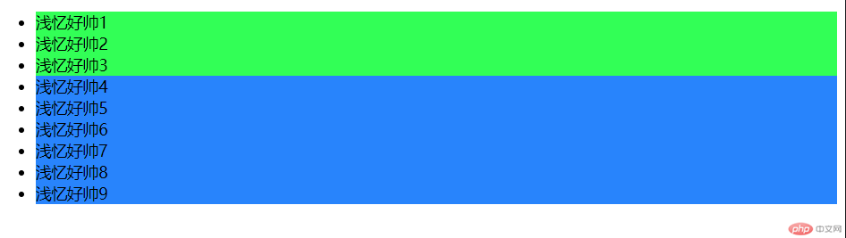
<!DOCTYPE html><html lang="zh-CN"><head><meta charset="UTF-8" /><meta http-equiv="X-UA-Compatible" content="IE=edge" /><meta name="viewport" content="width=device-width, initial-scale=1.0" /><title>伪类选择器</title></head><!-- :nth-of-type(n + 3) n代表以下属性都选择,从上往下数,第3个以后都会选择上 --><!-- :nth-of-type(-n + 3)n代表以上属性都选择,从上往下数,第3个以后都会选择上 --><style>.five > li:nth-of-type(n + 3) {background: rgb(1, 132, 255);}.five > li:nth-of-type(-n + 3) {background: rgb(1, 255, 77);}</style><body><ul class="five"><li>浅忆好帅1</li><li>浅忆好帅2</li><li>浅忆好帅3</li><li>浅忆好帅4</li><li>浅忆好帅5</li><li>浅忆好帅6</li><li>浅忆好帅7</li><li>浅忆好帅8</li><li>浅忆好帅9</li></ul></body></html>
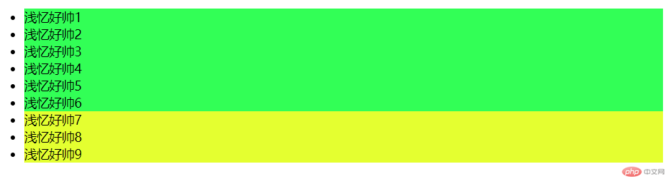
<!DOCTYPE html><html lang="zh-CN"><head><meta charset="UTF-8" /><meta http-equiv="X-UA-Compatible" content="IE=edge" /><meta name="viewport" content="width=device-width, initial-scale=1.0" /><title>伪类选择器</title></head><!-- :nth-last-of-type是底部选择 --><!-- :nth-first-of-type是顶部选择 --><!-- :nth-last-of-type(3)从底部数第三个 --><!-- :nth-last-of-type(n+3)从底部数第三个,以上属性都属于他 --><!-- :nth-last-of-type(-n+3)从底部数第三个,以下属性都属于他 --><style>.five > li:nth-last-of-type(n + 3) {background: rgb(1, 255, 77);}.five > li:nth-last-of-type(-n + 3) {background: rgb(229, 255, 0);}</style><body><ul class="five"><li>浅忆好帅1</li><li>浅忆好帅2</li><li>浅忆好帅3</li><li>浅忆好帅4</li><li>浅忆好帅5</li><li>浅忆好帅6</li><li>浅忆好帅7</li><li>浅忆好帅8</li><li>浅忆好帅9</li></ul></body></html>
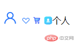
<!DOCTYPE html><html lang="zh-CN"><head><meta charset="UTF-8" /><meta http-equiv="X-UA-Compatible" content="IE=edge" /><meta name="viewport" content="width=device-width, initial-scale=1.0" /><title>icon的使用的方法</title><link rel="stylesheet" href="/0701/font-icon/iconfont.css" /><style>.icon-user {color: rgb(207, 47, 247);font-size: 2em;}.icon-gongyi {color: rgb(28, 240, 255);font-size: 2em;}</style></head><body><h3></h3><span class="iconfont icon-user"></span><span class="iconfont"></span><span class="iconfont icon-gouwuche"></span><span class="iconfont icon-wo">个人</span></body></html>
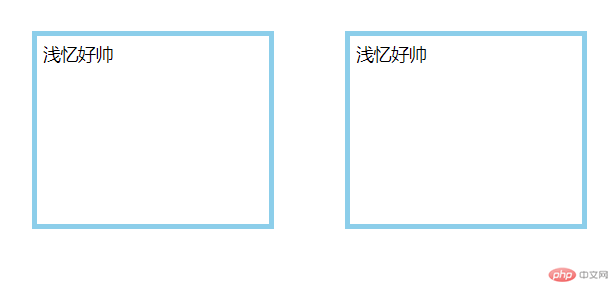
<!DOCTYPE html><html lang="zh-CN"><head><meta charset="UTF-8" /><meta http-equiv="X-UA-Compatible" content="IE=edge" /><meta name="viewport" content="width=device-width, initial-scale=1.0" /><title>盒模型</title><style>.box {height: 160px;width: 200px;display: inline-block;border: 5px solid skyblue;padding: 5px;margin: 30px;/* box-sizing: border-box;最常用 */box-sizing: content-box;/* 盒模型常用属性1. width2. height3. border4. padding5. marginbox-sizing: 改变了盒子大小的计算方式 *//*box-sizing: border-box; 计算盒子大小时,将内边距与边框全部计算在内所以, width,height就是最终大小, 从而简化布局 *//* 实现所有元素样式的初始化 *//* * {padding: 0;margin: 0;box-sizing: border-box;} *//*display: inline-block;默认块元素,可将块变成内联元素 */}</style></head><body><div class="box">浅忆好帅</div><div class="box">浅忆好帅</div></body></html><!DOCTYPE html><html lang="zh-CN"><head><meta charset="UTF-8" /><meta http-equiv="X-UA-Compatible" content="IE=edge" /><meta name="viewport" content="width=device-width, initial-scale=1.0" /><title>盒模型</title><style>.box {height: 160px;width: 200px;display: inline-block;border: 5px solid skyblue;padding: 5px;margin: 30px;/* box-sizing: border-box;最常用 */box-sizing: content-box;/* 盒模型常用属性1. width2. height3. border4. padding5. marginbox-sizing: 改变了盒子大小的计算方式 *//*box-sizing: border-box; 计算盒子大小时,将内边距与边框全部计算在内所以, width,height就是最终大小, 从而简化布局 *//* 实现所有元素样式的初始化 *//* * {padding: 0;margin: 0;box-sizing: border-box;} *//*display: inline-block;默认块元素,可将块变成内联元素 */}</style></head><body><div class="box">浅忆好帅</div><div class="box">浅忆好帅</div></body></html>
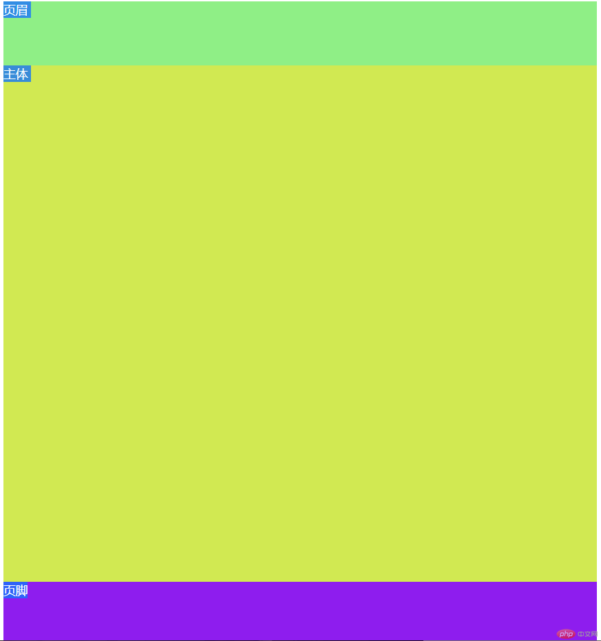
<!DOCTYPE html><html lang="zh-CN"><head><meta charset="UTF-8" /><meta http-equiv="X-UA-Compatible" content="IE=edge" /><meta name="viewport" content="width=device-width, initial-scale=1.0" /><title>百分比设置元素大小</title><style>/* vh=占据屏幕高度的百分比 *//* vw=占据屏幕宽度的百分比 */.container {}header {height: 10vh;width: 90vw;background-color: rgb(139, 238, 130);}main {height: 80vh;width: 90vw;background-color: rgb(209, 233, 71);}footer {height: 10vh;width: 90vw;background-color: rgb(142, 35, 241);}/* 100 - (10+10) = 80 */</style></head><body><div class="container"><header>页眉</header><main>主体</main><footer>页脚</footer></div></body></html>
哪里不对请多多指教!!!
您将可能改变我的一生!!
勇敢浅忆,不怕困难!!!