


![[Web front-end] Node.js quick start](https://img.php.cn/upload/course/000/000/067/662b5d34ba7c0227.png)


 PHPz
PHPzCorrection status:qualified
Teacher's comments:


 Collection
 Collection
<!DOCTYPE html><html lang="en"><head><meta charset="UTF-8"><meta http-equiv="X-UA-Compatible" content="IE=edge"><meta name="viewport" content="width=device-width, initial-scale=1.0"><title>Document</title><style>/*字体代码引入*/@font-face {font-family: 'iconfont';src: url('./icon/iconfont.ttf?t=1625494972187') format('truetype');}.iconfont {font-family: "iconfont" !important;font-size: 16px;font-style: normal;-webkit-font-smoothing: antialiased;-moz-osx-font-smoothing: grayscale;}/********************************************/li:nth-of-type(n) {list-style-type: none;}</style></head><body><ul><li><span class="iconfont"> Rust</span></li><li><span class="iconfont"> PHP</span></li><li><span class="iconfont"> User</li></ul></body></html>
html 文档的元素默认在浏览器的文档流中,一般从左向右。
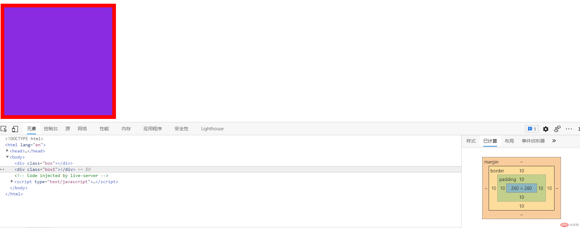
元素可分为两类, 行内元素, 和块内元素。对应的排列方式与页面元素的排列方式是一致 所有页面是一个二维的空间, 只有宽和高二维空间中的元素排列只有二种方式: 水平, 垂直 默认先水平, 排列不下,再换行按垂直方向排列,只要这个元素的类型确定,例如是一个内联元素 display: inline,则这个元素 就水平排列, 一行显示不行就换行显示,如果这个元素的display:block, 就是一个块级元素,块元素二边默认会自动添加换行, 二边不允许存在其它元素,总是独占一行。
盒子模型常用属性有:width height border padding margin
<!DOCTYPE html><html lang="en"><head><meta charset="UTF-8"><meta http-equiv="X-UA-Compatible" content="IE=edge"><meta name="viewport" content="width=device-width, initial-scale=1.0"><title>Document</title><style>.box {/***margin是盒子的外边距,本事不在盒子大小的计算内。简写模式按顺时针。*/margin: 10px 10px 10px 10px;/***border是盒子的边框,改变他的值会改变真个盒子的大小。*/border: solid 1px red;/***padding是盒子的内边距,改变他的值会改变真个盒子的大小。简写模式按顺时针。*/padding: 10px 10px 10px 10px;/***width&height是元素的宽高,改变他的值会改变真个盒子的大小。*/width: 300px;height: 300px;background-color: blueviolet;}.box1 {/*box-sizing: 会更改width, height 的计算方式将值设置为border-box, width的计算讲包括:border, padding*/box-sizing: border-box;width: 300px;height: 300px;padding: 10px;border: 10px solid red;background-color: blueviolet;}</style></head><body><div class="box"></div><div class="box1"></div></body></html>