


![[Web front-end] Node.js quick start](https://img.php.cn/upload/course/000/000/067/662b5d34ba7c0227.png)


 PHPz
PHPzCorrection status:qualified
Teacher's comments:


 Collection
 Collection
盒模型属性
常用的盒模型属性有margin padding border
div的尺寸计算方式为(margin+padding+border)*2+width
内容裁切:background-clip: content-box
padding margin 属性值的顺序是:上 右 下 左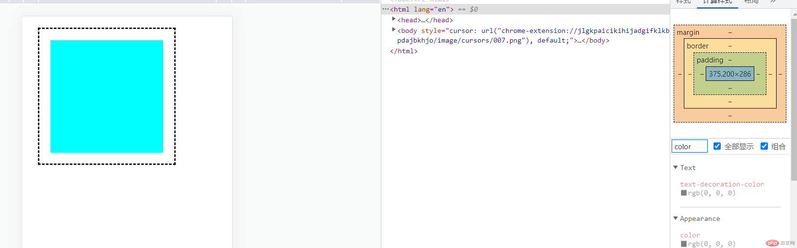
.box {width: 200px;height: 200px;margin: 20px;padding: 20px;border: 3px dashed;background-color: aqua;background-clip: content-box;}
媒体查询
@media (max-width: 450px) {.min {background: #bdc200;}}@media (min-width: 450px) and (max-width: 800px) {.min {background: pink;width: 100px;height: 50px;}}@media (min-width: 800px) {.min {background: red;width: 200px;height: 100px;}}
通过像素变化做手机端适应。
em rem的区别
em是相对于父元素的大小
rem是相对于根元素的大小