


![[Web front-end] Node.js quick start](https://img.php.cn/upload/course/000/000/067/662b5d34ba7c0227.png)


 PHPz
PHPzCorrection status:qualified
Teacher's comments:


 Collection
 Collection
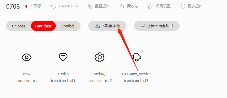
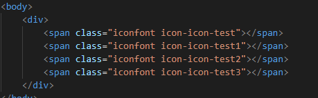
字体图标引用.
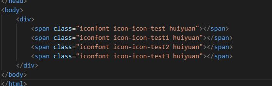
自定义字体图标样式
看下效果: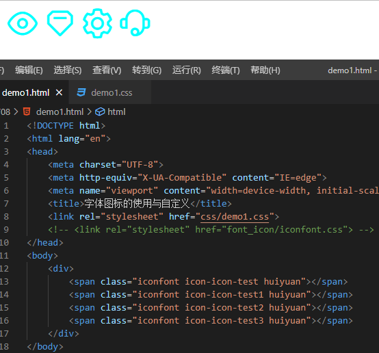
附上代码:
<!--HTML部分代码--><body><div><span class="iconfont icon-icon-test huiyuan"></span><span class="iconfont icon-icon-test1 huiyuan"></span><span class="iconfont icon-icon-test2 huiyuan"></span><span class="iconfont icon-icon-test3 huiyuan"></span></div></body>
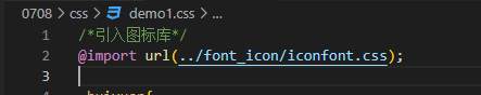
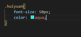
/*css部分代码*//*引入图标库*/@import url(../font_icon/iconfont.css);/*设置图标自定义样式*/.huiyuan{font-size: 50px;color: aqua;}
媒体查询@media :使用media可以查询媒体元素的宽高并且可以根据宽高作为限定条件更改某一个元素的值
使用到的属性:max-width min-width
max-width:设置一个最大宽度
min-width:设置一个最小宽度
@media (min-width:1200px){....} 语句的意思是指设置一个最小宽度为1200px当页面宽度大于1200px后会执行{…}更改某一个元素的属性或者操作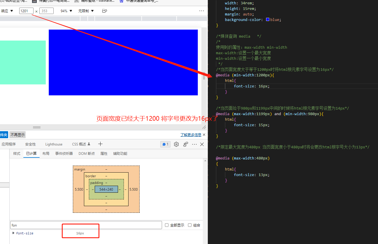
<!--HTML部分代码--><div class="box"><div class="item1"></div><div class="item2"></div><div class="item3"></div></div>
/*CSS部分代码*//*设置根目录字号大小*/html{font-size: 10px;}/*设置box盒子为flex布局*/.box{display: flex;}/*定义三个盒子的默认样式*/.item1{width: 14rem;height: 5rem;margin: auto;background-color: aqua;}.item2{width: 24rem;height: 10rem;margin: auto;background-color: aquamarine;}.item3{width: 34rem;height: 15rem;margin: auto;background-color: blue;}/*媒体查询 media *//*使用到的属性:max-width min-widthmax-width:设置一个最大宽度min-width:设置一个最小宽度*//*当页面宽度大于等于1200px时将html根元素字号设置为16px*/@media (min-width:1200px){html{font-size: 16px;}}/*当页面处于980px和1199px中间的时候将html根元素字号设置为14px*/@media (max-width:1199px) and (min-width:980px){html{font-size: 15px;}}/*限定最大宽度为480px 当页面宽度小于480px时将会更改html根字号大小为13px*/@media (max-width:680px){html{font-size: 13px;}}