


![[Web front-end] Node.js quick start](https://img.php.cn/upload/course/000/000/067/662b5d34ba7c0227.png)


 PHPz
PHPzCorrection status:qualified
Teacher's comments:


 Collection
 Collection
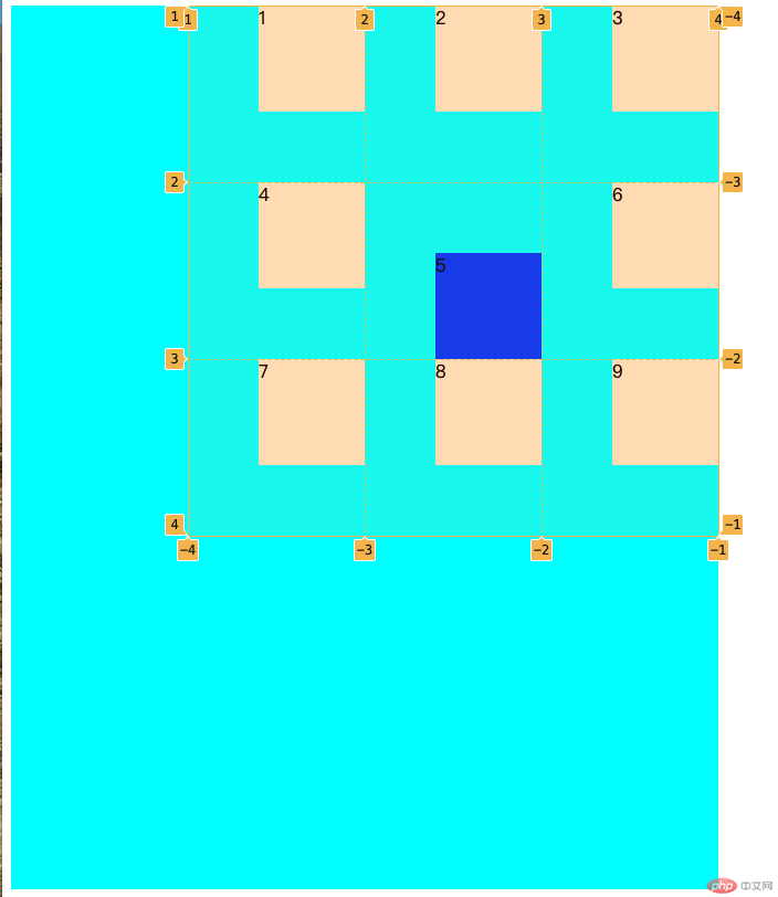
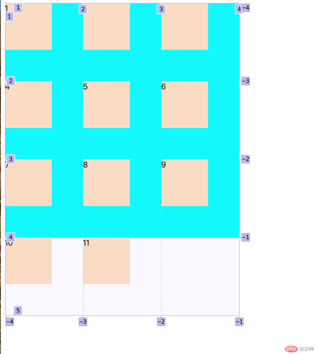
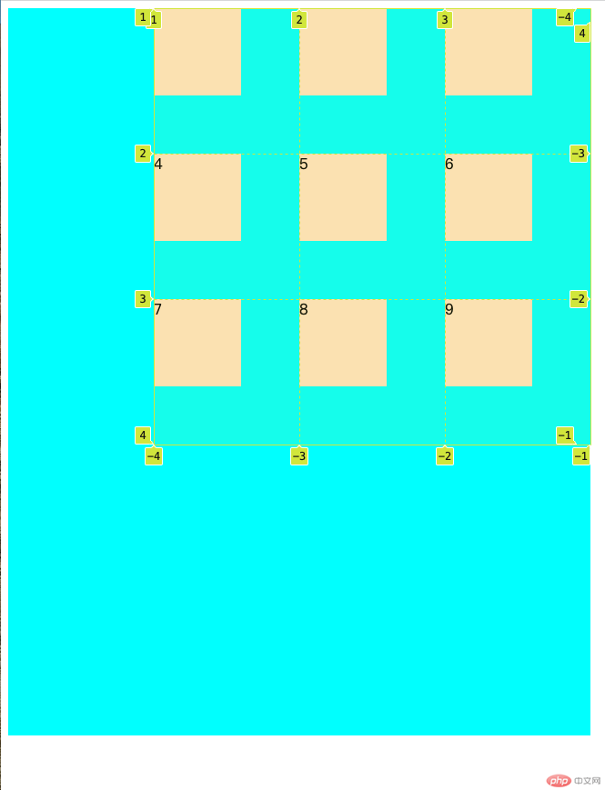
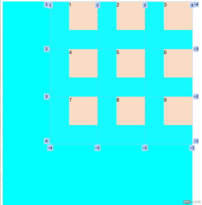
<div class="container"><div class="item"></div><div class="item"></div><div class="item"></div><div class="item"></div><div class="item"></div></div>
grid-template-columns: 10em 10em 10em;grid-template-rows: 10em 10em 10em;
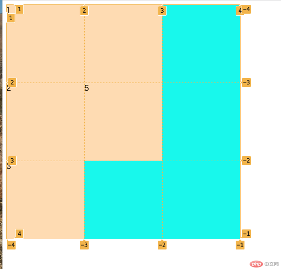
.container > .item:first-of-type{background-color: bisque;grid-row: 2 /3;grid-column: 2 /4;}
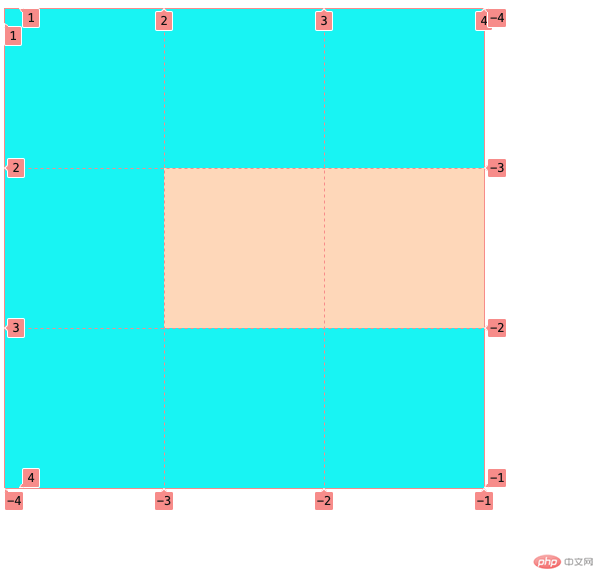
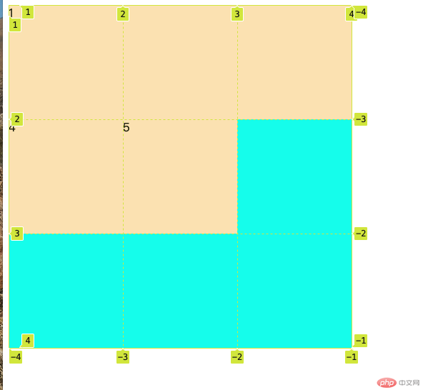
grid-area: 2 / 2 / span 3 / span 2;
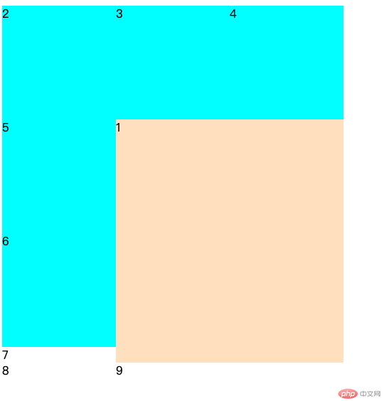
grid-auto-flow: row;grid-auto-flow: column;
grid-auto-rows: 10em;
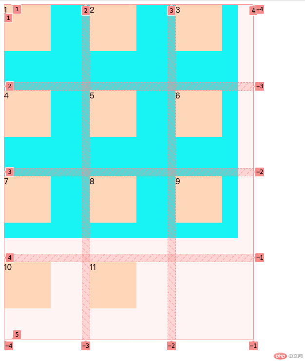
gap:1em;
place-content:start right;
place-items: start right;
place-self:end right;