Multi-column layout - Columns
In order to facilitate the implementation of multi-column layouts similar to newspapers and magazines in Web pages, W3C specially added a multi-column layout module (CSS Multi Column Layout Module) to CSS3. It is mainly used in multi-column layout of text. This layout has been used in newspapers and magazines for decades, but it is still quite difficult to achieve such an effect on a Web page. Fortunately, CSS3 Multi-column layouts can be easily implemented. Next, let’s learn about multi-column layout together.
Syntax:
columns:<column-width> || <column-count>
Example: To display 2 columns, the width of each column is 200px, The code is:
columns: 200px 2;
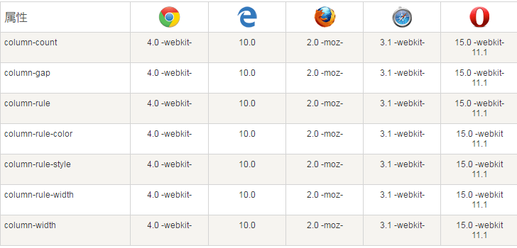
So far most mainstream browsers support it:

CSS3 multi-column properties
In this chapter we will learn the following multi-column properties of CSS3:
column-count
column-gap
column-rule-style
column-rule-width
column-rule-color
column-rule
column-span
column- width


